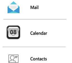
Use Consistent Icons Across the Product
What is an icon for anyway? An icon is a visual shorthand—a way for the user to glance at the screen, and in a few milliseconds, understand the purpose of a button. The user will not learn their way around a UI from icons alone, but once learned they can speed up recognition and recall massively.
A UI packed with seemingly random, disparate icons is a UX disaster. I know what happened: you started using an icon set because it looked cool, then you realized it didn’t have an icon for “upload” or “download.” The UI review meeting is later today and you’d better get an icon in there quick! So, you use  and
and  instead. But they look different to the rest of the app and users must spend those extra few seconds working out that, yes, they are actually part of the UI too.

Figure 34.1: Inconsistent icon styles looks unprofessional and is confusing for the user to recognize and recall
Don...


