Understanding the workspace
Once you create a new document or open an existing document after launching the Photopea application, you will see the user interface. The interface has a similar setup to most image editing programs. It can be broken down into four sections to help make it a little easier to navigate and follow along.
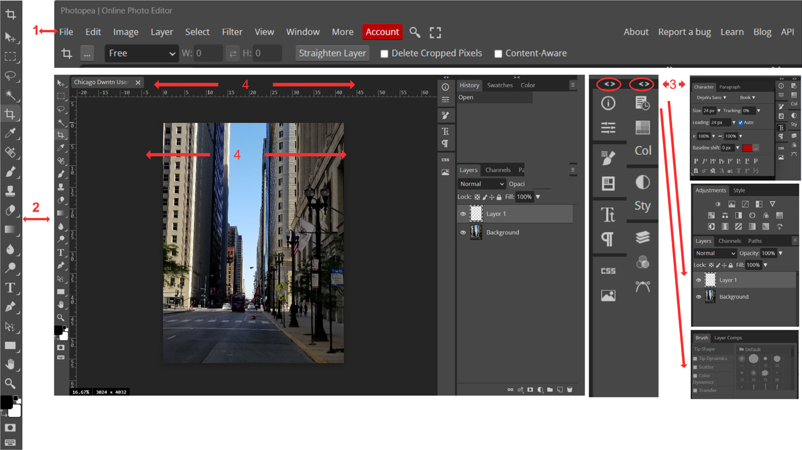
See Figure 3.1 for Photopea’s interface breakdown:

Figure 3.1 – Workspace
Now, let’s navigate the four sections of the workspace:
- 1 Top menu: This is located at the top of the user interface.
2 Toolbar: This is located on the left side of the user interface. It enables you to access editing tools such as the Brush Tool, Eraser, Clone tool, Pen tool, Dodge tool, Burn tool, and Spot Healing Brush tool, to name a few.
- 3 Sidebar: This is located on the right side of the user interface and consists of tabs you can access such as the Layers panel, Channels, Paths, Brush Properties, Colors, Swatches...


