Search icon CANCEL
Subscription
0
Cart icon
Your Cart (0 item)
Close icon
You have no products in your basket yet
Save more on your purchases! discount-offer-chevron-icon
Savings automatically calculated. No voucher code required.
Arrow left icon
Explore Products
Best Sellers
New Releases
Books
Videos
Audiobooks
Learning Hub
Free Learning
Arrow right icon
Arrow up icon
GO TO TOP
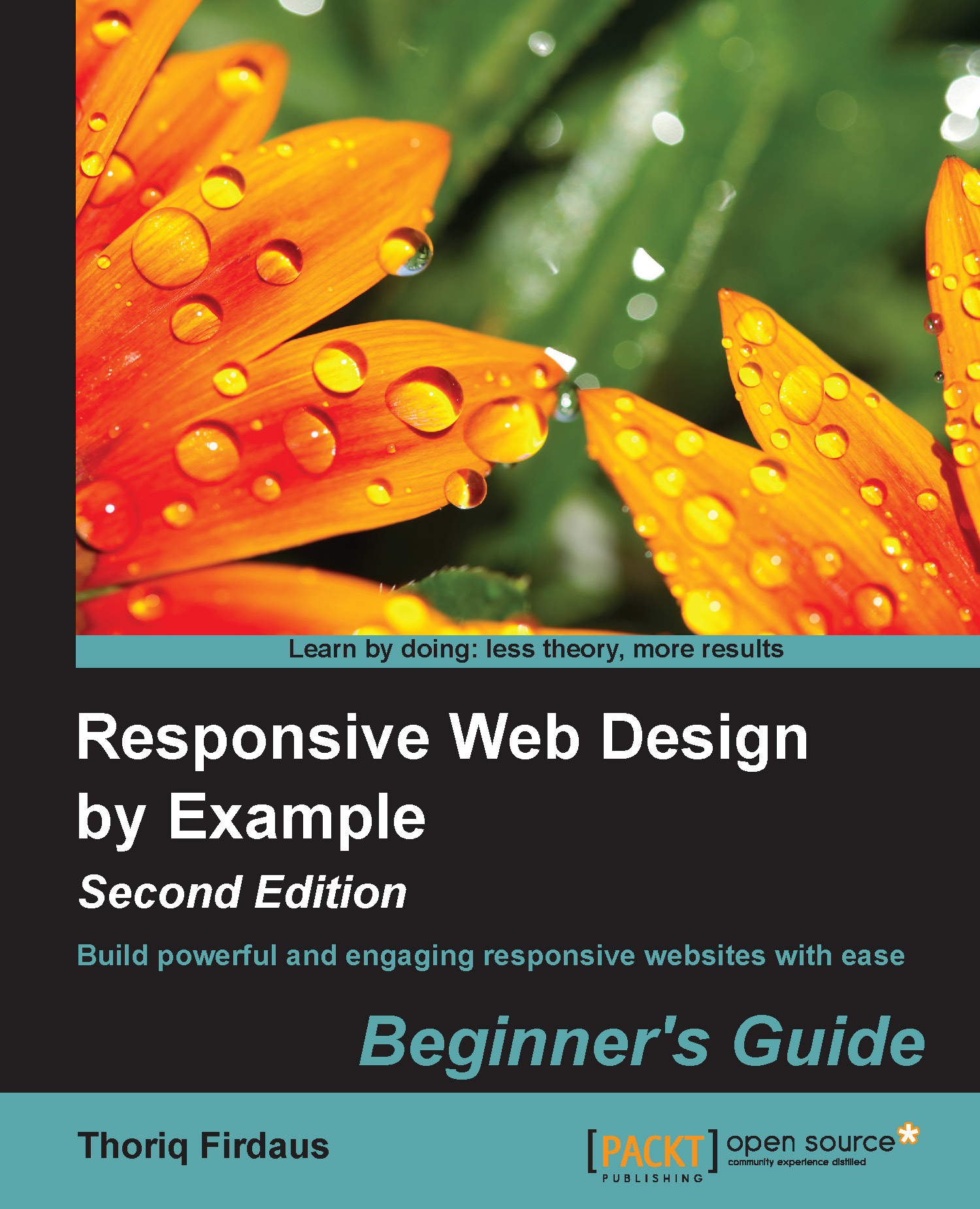
Responsive Web Design by Example : Beginner's Guide - Second Edition

You're reading from   Responsive Web Design by Example : Beginner's Guide - Second Edition Build powerful and engaging responsive websites with ease

Arrow left icon
Product type Paperback
Published in Nov 2014
Publisher
ISBN-13 9781783553259
Length 258 pages
Edition 2nd Edition
Languages
Arrow right icon
Author (1):
Arrow left icon
Thoriq Firdaus Thoriq Firdaus
Author Profile Icon Thoriq Firdaus
Thoriq Firdaus
Arrow right icon
View More author details
Toc

Table of Contents (11) Chapters Close

Preface 1. Responsive Web Design 2. Web Development Tools FREE CHAPTER 3. Constructing a Simple Responsive Blog with Responsive.gs 4. Enhancing the Blog Appearance 5. Developing a Portfolio Website with Bootstrap 6. Polishing the Responsive Portfolio Website with LESS 7. A Responsive Website for Business with Foundation 8. Extending Foundation A. Pop Quiz Answers Index

Responsive.gs components

As we mentioned in Chapter 1, Responsive Web Design, Responsive.gs is a lightweight CSS framework. It comes only with the bare minimum requirements for building responsive websites. In this section, we are going to see what is included in Responsive.gs.

The classes

Responsive.gs is shipped with a series of reusable classes to form the responsive grid that makes it easier and faster for web designers to build web page layout. These classes contain preset style rules that have been carefully calibrated and tested. So we can simply drop in these classes within the HTML element to construct the responsive grid. The following is a list of the classes in Responsive.gs:

Class name

Usage

container

We use this class to set the web page container and align it to the center of the browser window. This class, however, does not give the element width. Responsive.gs gives us the flexibility to set the width as per our requirement.

row, group

We use these two classes to...

lock icon The rest of the chapter is locked
Register for a free Packt account to unlock a world of extra content!
A free Packt account unlocks extra newsletters, articles, discounted offers, and much more. Start advancing your knowledge today.
Unlock this book and the full library FREE for 7 days
Get unlimited access to 7000+ expert-authored eBooks and videos courses covering every tech area you can think of
Renews at $19.99/month. Cancel anytime
Banner background image