Visualizing data using Matplotlib
We shall learn about visualizing the data in a later chapter. For now, let's try loading two sample datasets and building a basic plot. First, install the sklearn library from which we shall load the data using the following command:
$ pip3 install scikit-learn
Import the datasets using the following command:
from sklearn.datasets import load_iris
from sklearn.datasets import load_boston
Import the Matplotlib plotting module:
from matplotlib import pyplot as plt
%matplotlib inline
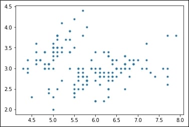
Load the iris dataset, print the description of the dataset, and plot column 1 (sepal length) as x and column 2 (sepal width) as y:
iris = load_iris()
print(iris.DESCR)
data=iris.data
plt.plot(data[:,0],data[:,1],".")
The resulting plot will look like the following image:
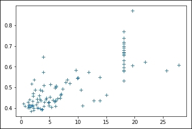
Load the boston dataset, print the description of the dataset and plot column 3 (proportion of non-retail business) as x and column 5 (nitric oxide concentration) as y, each point on the plot marked with a + sign:
boston = load_boston()
print(boston.DESCR)
data=boston.data
plt.plot(data[:,2],data[:,4],"+")
The resulting plot will look like the following image:
