Master-detail UI design
There are various ways to implement navigation within an app. In our app’s navigation design, we employ the master-detail pattern.
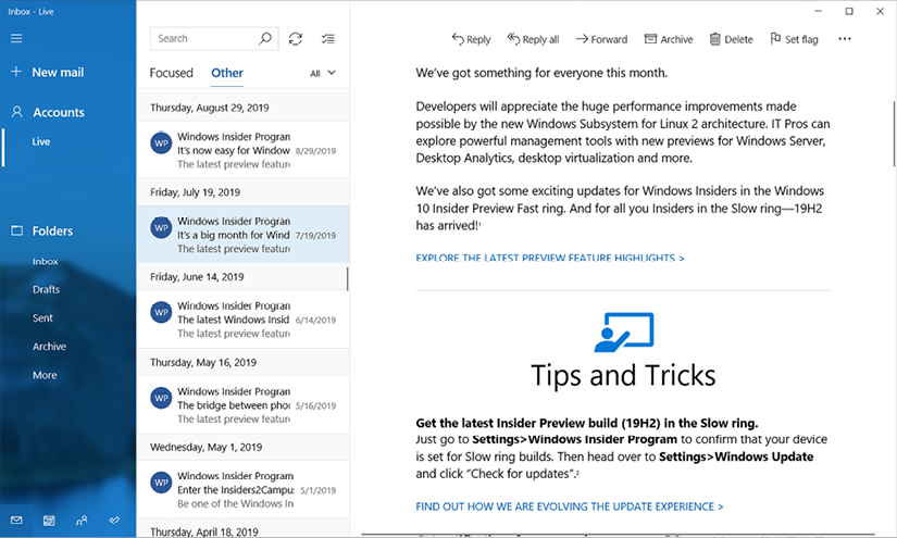
The master-detail pattern is a widely utilized user interface design approach. Many examples of it can be found in frequently used apps. For instance, in the Mail app on Windows, a list of emails is displayed in the master view along with the details of the selected email:

Figure 3.4: Mail in Windows
In Figure 3.4, three panels are present in the design. The left panel resembles a navigation drawer. When selecting a folder from the left panel, a list of emails is shown in the middle panel. The currently selected email is displayed in the right panel.
Note
Navigation drawers provide access to destinations and app functionality, such as the menu in the desktop environment. It typically slides in from the left and is triggered by tapping an icon in the top-left corner of the screen. It displays...


