Creating an incident tracking solution – building the user interface
Before designing interfaces, we must ask ourselves which requirements our application will solve. This analysis will help us decide which technology we will use, what infrastructure holds every piece of our solution, and even how our end-users will consume it.
Getting ready
With the help of the previous recipe, we have the data source section of our infrastructure solved. It’s time to leverage Power Apps to automate the creation of the building blocks of our application.
Power Apps deeply integrates with SharePoint as a tool to build solutions rapidly with its low-code principles. This integration allows the creation of a completely functional application in a few steps.
How to do it…
- Go to the SharePoint site that has your lists. Click the gear icon in the top-right corner, select Site contents, and select the Incidents list.
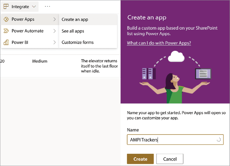
- On the list’s toolbar, select Integrate | Power Apps | Create an app. This action will open up a dialog asking for the name of your application:

Figure 1.3: Power Apps integration inside SharePoint
- After a little while, a brand-new application gets created with the base functionalities: data manipulation, search, listing, and sorting. It’s now time to polish the application to have the desired results.
- First, let’s edit the application title to be different than the list’s name. Go to Tree view, expand BrowseScreen1, and select the LblAppName1 label. Change the label’s value on the right pane by changing the Text value. Do the same for the rest of the screens.
- If you followed the example list data, you might see that some of the incident’s text is not complete. To fix this, select the Title1 label from BrowseScreen1 and, in its properties, deselect Wrap. This change will add an ellipsis, making the user aware that there is more information:

Figure 1.4: Disabling wrap for long text
- Next, let’s improve EditScreen1 to allow more space for the comments data card. At this moment, we won’t be using the attachments data card, so by expanding EditForm1 and selecting Attachments_DataCard1, we can uncheck its visible property on the properties pane.
- Increase Comments_DataCard2’s Height value and then increase the DataCardValue10 control to match the new size, and finally, set the Mode property to Multiline to fix the text’s vertical alignment. Do the same for the Incident data card if you want it to have more space as well.
- Finish up by changing the colors, fonts, and control alignment to match your style. Chapter 6, Improving User Experience, will cover some techniques to apply a style makeover to your application.
How it works…
Now that we have created an application from SharePoint data, we can take it for a test drive. Power Apps Studio gives you a preview functionality for testing. You can do it in two ways:
- Go back to BrowseScreen1 and then press the play button in the top right of the Studio interface. This action will execute the application so you can interact with it, just as if you were running it from your device of choice.

Figure 1.5: Power Apps Studio preview feature
- Press the Alt key (Option on a Mac) to test a particular control. For example, if you press Alt and click on a button, it will perform its
OnSelectaction. This way, you can test a specific control without leaving the design mode of the studio.
Never rely on these testing methods to deploy a production application. Power Apps Studio gives you a responsive simulator to test your app based on a low resolution. While it serves you well for functionality testing, it’s no match for accurate device testing. You need to check your app on the user medium of consumption. Examples include SharePoint, Teams, and mobile devices.
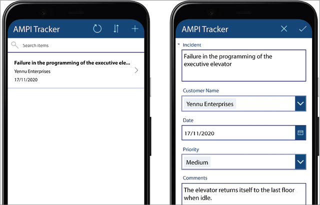
This application is now ready to perform incident tracking for your organization. You can now test it by creating new incidents or editing existing ones. The Power Apps template should have already taken care of the core functionality, so verify your specific requirements, such as maximum text length, user interface design changes, and the like. Making subtle user interface changes such as font names and sizes can improve the overall look of the application:

Figure 1.6: User interface changes for the incident tracking solution


