Understanding special grid-related units, keywords, and functions
Let’s now look at the units and CSS functions that CSS Grid has introduced. Many of these are specifically for CSS Grid; however, some might be useful for Flexbox layouts and other use cases.
The fractional unit
The only actual unit that was introduced with CSS Grid is fr—this stands for fractional unit and denotes a fraction of the total space. Think of it like a cooking recipe—for example, two parts of oil mixed with three parts of flour. So, when we want to have a total mixture of 500 grams, we can divide it by five and multiply by the number of parts. So, with 500 grams, we have 200 grams of oil (two parts) and 300 grams of flour (three parts). Now, replace parts with fr, and you’ve understood how the unit works.
When defining grid templates, we can mix in other units, such as px or rem, to denote fixed-size grid cells. CSS Grid will then take the total width, deduct the fixed-size cells, and then calculate the parts again. Returning to the cooking example, say that our recipes tell us to mix two parts of oil with three parts of flour, bake, and then add 100 grams of rosemary as decoration.
If our finished product weighs 600 grams, and we need to calculate the amount of flour and oil, we first subtract the 100 grams of rosemary from the 600 grams and then calculate the weight of the parts again.
The main difference between percentages and fractional units is their basis of calculation. While percentages use the entire size of the grid to calculate their exact values, fr uses what is left over after all fixed-size elements are subtracted.
Sizing keywords and functions
Not only can we use units when defining grid column and row sizes, but we can also give them a general behavior. For that, CSS Grid offers four different keywords and three functions we can use. Most of them are related to the content of the grid cell and will be calculated once the size of the content is known, allowing us to have different-sized grids for each content variant.
The four keywords are min-content, max-content, fit-content, and auto. We can use these keywords as values for grid-template-columns and grid-template-rows instead of using any value with a unit.
The three functions are min(), max(), and minmax(). We can also use these as a substitute for any value with a unit.
First, we can tell the cell to always fit its absolute possible minimum size with min-content. This can be useful if we have images and text aligned in a grid, and the image sizes should define the grid sizes. For the following screenshot, we used an image with a fixed width of 200x200 pixels.
The grid columns are defined as min-content 1fr 4fr. The min-content sizing keyword ensures that the grid cell’s width does not go below 200px, the smallest non-wrappable content:
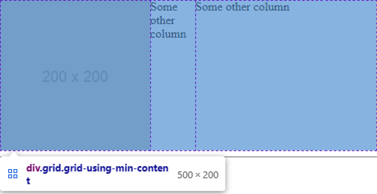
Figure 1.19 – An image resizing a grid cell
As well as images, min-content also takes text into account. If the minimum width of a grid cell, for example, is determined by the longest word in that cell, that word’s pixel width will then be the minimum size. This can have funny effects when paired with word-break: break-all; as the minimum width is then calculated by the widest character:
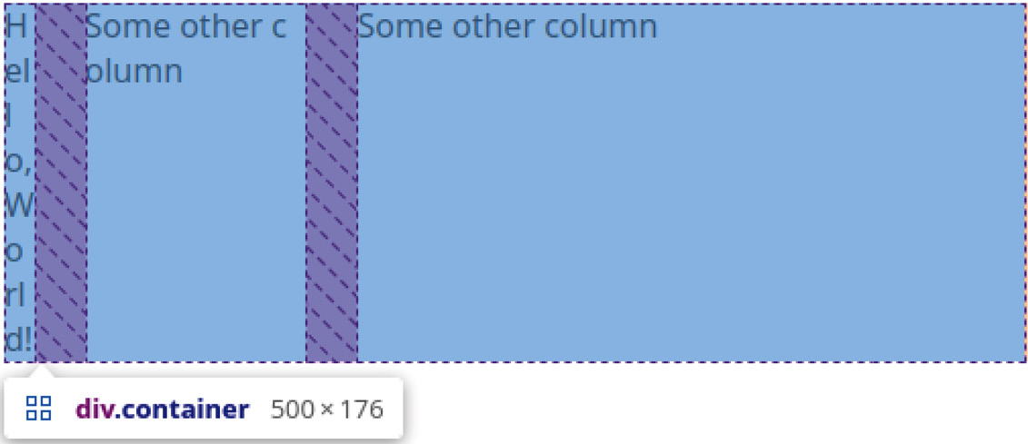
Figure 1.20 – CSS Grid breaks the text—the widest character, “W”, defines the cell’s width
The second keyword we can use is max-content, which will calculate the maximum possible content size and use this as the grid-cell sizing. So, instead of using the longest word, this will calculate the width of the entire sentence and use that. When paired with images, it will use the image’s max-width or max-height value, depending on if we’re sizing a row or column.
The third keyword is fit-content, a mixture of min-content and max-content. It will behave like the fr unit, but with a minimum value of min-content and a maximum value of max-content.
To illustrate, let’s think about a grid with four columns and a total of 200px width. Each column is evenly spaced with 1fr, except for the first column, which has a sizing of fit-content(50px). We now put an image of 80px width in that first column. Instead of resizing the image to 50px width, it will increase the size of the cell to 80px and reduce the size of all the others by 10px each.
To summarize, we would use the following CSS code:
.fit-content-grid {  display: grid;
  width: 200px;
  grid-template-columns: fit-content(50px) 1fr 1fr 1fr;
}
And we apply it to the following HTML structure:
<div class="fit-content-grid">  <img src="assets/80.png" alt="80x80">
  <div>A</div>
  <div>B</div>
  <div>C</div>
</div>
We can see how the image stays the same size in the following screenshot:
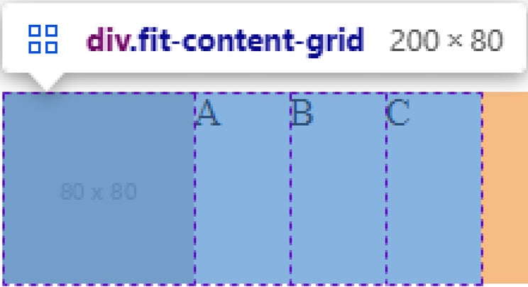
Figure 1.21 – A grid using fit-content to allow a cell to grow if the content does not fit
We can see that the entire width stays at 200px. The columns containing letters are significantly smaller than the one containing an image. The cell has expanded to fit the content.
However, if we removed the image—for example, with JavaScript—the cell size would go back to 50px. If we used max-content instead, it would result in a column width of 0px since there is no content.
The last keyword is auto. This also behaves a lot like the fr unit but with a little twist. It is interchangeable with 1fr if only 1fr is used. Consider the following grid declaration:
.grid {  display: grid;
  grid-template-columns: 1fr 1fr 1fr;
}
This declaration behaves the same as the following one:
.grid {  display: grid;
  grid-template-columns: auto auto auto;
}
The following screenshot shows the equivalence:

Figure 1.22 – Two grids: one of them uses fr units, and the other uses the auto keyword
Both grids are the same width and share the same number of columns. The top one uses fr units, and the bottom one uses the auto keyword. We can see that all columns are the same size.
However, when we mix the two, auto receives a different share of the available space than the columns using fr: instead of taking up a unit of space, the auto-sized cell will resize to fit its content and the fr cells will take up that remaining space. This behavior is equivalent to using a fixed unit value: fr will always divide the leftover space.
To illustrate this behavior, let’s consider the following declaration:
.grid {  display: grid;
  width: 500px;
  grid-template-columns: auto 1fr 3fr;
}
The size of the first column depends on its content. An image with a width of 120px means that the grid cell will be 120px wide. 1fr of space would therefore be 95px, a quarter of the remaining space. Likewise, if we use an image with a size of 40px, the first column will be 40px wide and 1fr of space would equal 115px, a quarter of the remaining 460px of the entire grid.
The same applies to text. When we consider the previous grid definition and apply it to the following HTML, CSS Grid will make the first column the largest and squeeze in the other two, which will only take up as much space as their content needs:
<div class="grid">  <div>
    Lorem ipsum dolor sit amet
    Lorem ipsum dolor sit amet
    Lorem ipsum dolor sit amet
  </div>
  <div>
    Short
  </div>
  <div>
    Text
  </div>
</div>
The result looks like this:

Figure 1.23 – Spacing with auto and the fr unit
If we want to explicitly state a minimum and maximum size for our grid cells, we can use a function called minmax(). This function does precisely what one would think: it sets a minimum and a maximum for the size of a value. When paired with the fr unit, we can give cells relative sizes but keep them at a minimum and maximum size. Remember the example with word-break: break-all;?
The min-content keyword, in combination with word-break: break-all;, resized the column to the width of the largest character, which is undesirable. We can mitigate such issues by using minmax() and assigning it a minimum value, as shown here:
<style>.container {
   width: 500px;
   display: grid;
   grid-template-columns: minmax(50px, min-content) 1fr 3fr;
   gap: 25px;
}
div {
   word-break: break-all;
}
</style>
<div class="container">
  <div>
    Hello, World!
  </div>
  <div>
    Some other column
  </div>
  <div>
    Some other column
  </div>
</div>
From this code, the first column has a width of 50px, the defined minimum size:

Figure 1.24 – Spacing with minmax
However, if larger content is found within the cell, such as an image, it will be enlarged:
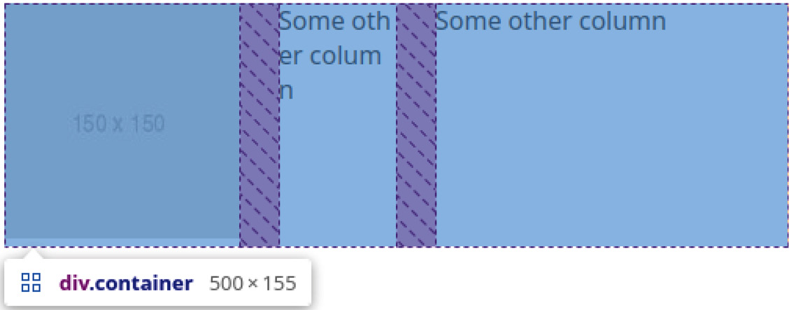
Figure 1.25 – Spacing with minmax and larger content in the first cell
We can also use the min() and max() functions for grid sizing. min() takes the smaller of two values and is often used with a relative and an absolute value, while max() takes the larger of two values, respectively.
For example, a column with min(50vw, 200px) sizing would result in a width of 50% up to a screen size of 400px. From 401px onward, the column would stay at 200px since that would be smaller than 50% of 401px, behaving like a combination of max-width and width.
Likewise, a column with max(50vw, 200px) sizing would result in a 200px-wide column for all screen sizes smaller than 400px. It thus behaves like a combination of min-width and width.
Repetitive column and row definitions
Imagine a gallery of images: it should be 800px wide and 1600px tall. Each image should take up 100px by 100px, resulting in 8 columns and 16 rows, all equally sized. If we wrote out this grid definition, it would look like this:
.gallery-container {  width: 800px;
  height: 1600px;
  display: grid;
  grid-template-columns: 1fr 1fr 1fr 1fr 1fr 1fr 1fr 1fr;
  grid-template-rows: 1fr 1fr 1fr 1fr 1fr 1fr 1fr 1fr 1fr
    1fr 1fr 1fr 1fr 1fr 1fr 1fr;
}
This grid definition has several issues. The first is its readability. The brain can only quickly count about four items at a glance—a concept known as subitizing—and so when more than four or five similar items occur at once in an unfamiliar pattern, the brain doesn’t immediately know the number of items and has to count manually.
The second problem is its maintainability. Code repetition is usually not good for maintainability since it forces us to change the same thing multiple times. For example, imagine that we now got the requirement to fix the image width to 100px but keep the container at 100vw.
To do that, we would adjust every row and column to be 100px instead of 1fr. The resulting code would be even less readable since each cell now takes five instead of three characters to define. The result would look roughly like this:
.gallery-container {  width: 100vw;
  display: grid;
  grid-template-columns: 100px 100px 100px 100px 100px
    100px 100px 100px;
  grid-template-rows: 100px 100px 100px 100px 100px 100px
    100px 100px 100px 100px 100px 100px 100px 100px 100px
      100px;
}
Grid definitions such as these do work—don’t get me wrong—but there’s a tool that allows us to define multiple columns and rows in a much cleaner way: the repeat() function. Instead of writing 100px 24 times, we would rewrite the code using repeat(number, size definition), as shown in the next code snippet:
.gallery-container {  width: 100vw;
  display: grid;
  grid-template-columns: repeat(8, 100px);
  grid-template-rows: repeat(16, 100px);
}
Essentially, the repeat() function replaces the use of multiple identical columns.
We can even mix it with other cell definitions. For example, a grid-column-template value of 100px repeat(10, 1fr) 100px would result in 10 equally sized columns, surrounded by 2 columns of 100px width each:

Figure 1.26 – The repeat() function mixed with other sizing definitions
When we need to define large amounts of alternating sizes, such as 50px 100px 50px 100px 50px 100px, we can also use the repeat() function: repeat(3, 50px 100px). Any valid size definition works, except repeat() itself. Sadly, we cannot nest repeat() calls, so something such as repeat(3 100px repeat(3, 1fr) 100px) won’t work.
The repeat() function already seems very useful, but it gets much fancier with its two accompanying keywords, auto-fill and auto-fit. We use these instead of numbers to define how many grid cells we want. So, instead of repeat(3, 100px), we would write repeat(auto-fill, 100px) or repeat(auto-fit, 100px).
The auto-fill value will add as many grid cells as possible to a row or column. For example, if a container is 375px wide and we define the grid-template-columns rule as repeat(auto-fill, 100px), there will be three columns with a left-over value of 75px. The number of rows and columns is, therefore, dependent on the size of the container. The following code example illustrates this:
<style>  .container {
    display: grid;
    grid-template-columns: repeat(auto-fill, 100px);
    gap: 5px;
    height: 50px;
    margin-bottom: 100px;
  }
  .small {
    width: 375px;
  }
  .large {
    width: 750px;
  }
  .container div {
    background-color: darkred;
    height: 20px;
  }
</style>
<p>Width: 375px;</p>
<div class="container small">
  <div></div>
  <!-- Repeat 10x -->
</div>
<p>Width: 750px;</p>
<div class="container large">
  <div></div>
  <!-- Repeat 10x -->
</div>
The result of the previous code would look like this:
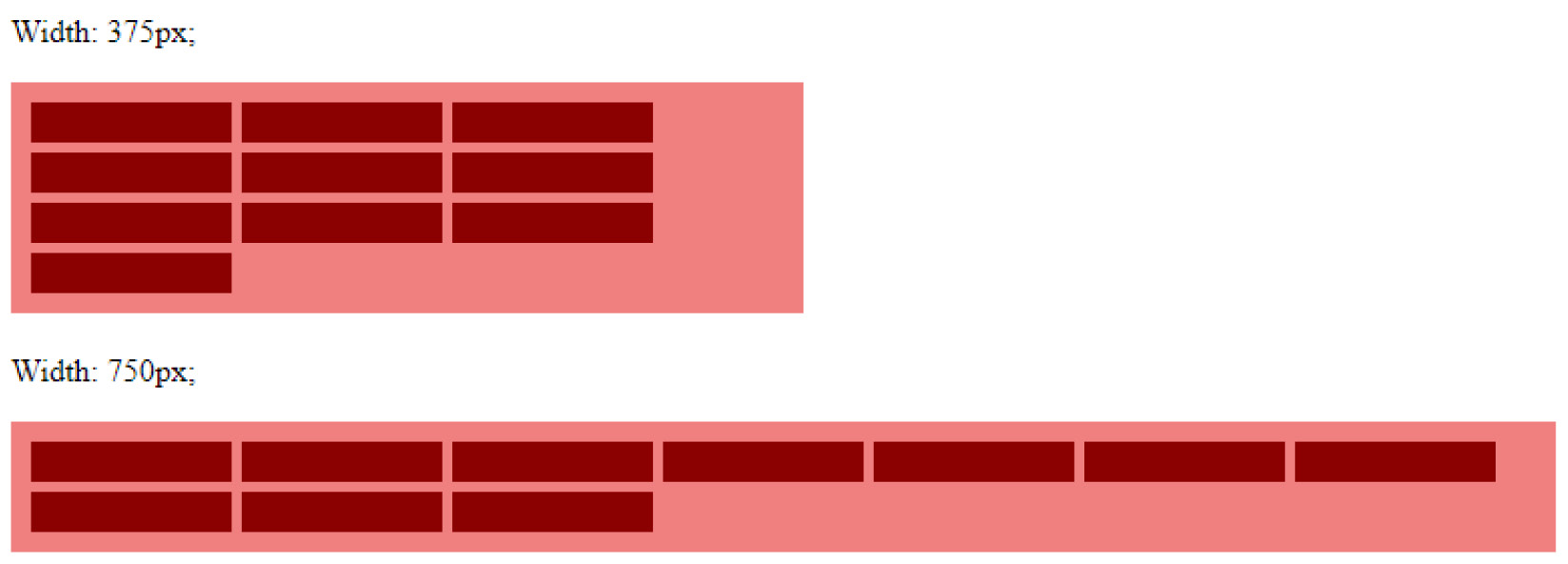
Figure 1.27 – The repeat() function mixed with other sizing definitions and using auto-fill
On the other hand, we have auto-fit. This keyword tries to fill the entire grid width (when used for grid-template-columns) or height (when used for grid-template-rows). This value is generally practical when working with minmax() and fr as the size definitions, as we allow the grid cells to grow and shrink.
The repeat(auto-fit, minmax(100px, 1fr)),)) value, for example, will result in a minimum column width of 100px. If the container is smaller than the current amount of columns times 100px, it will remove one column, rearrange the layout, and fill the entire width again by enlarging the columns. These values already allow us to build very responsive grids that are useful for article listings or image galleries.
The following screenshot shows the difference in behavior:
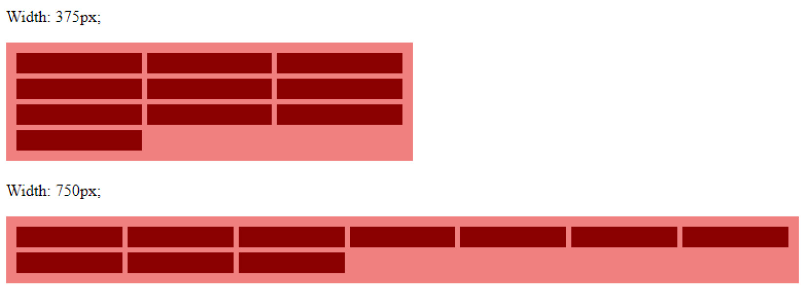
Figure 1.28 – The repeat() function using auto-fit
We can see that the columns now fill the entire container, whereas they were the same size when using auto-fill, auto-fit adapts the width of all columns.
CSS Grid offers us many possibilities to define the sizes of grid rows and columns and even allows us to add responsiveness without the need for media queries. To summarize, CSS Grid offers us an extra unit to define relative sizes, keywords to react size grid cells according to their content, and functions to keep sizes in defined ranges and to simplify repetitive grid definitions, with even more keywords to steer the number of grid cells.


