Search icon CANCEL
Subscription
0
Cart icon
Your Cart (0 item)
Close icon
You have no products in your basket yet
Arrow left icon
Explore Products
Best Sellers
New Releases
Books
Videos
Audiobooks
Learning Hub
Free Learning
Arrow right icon
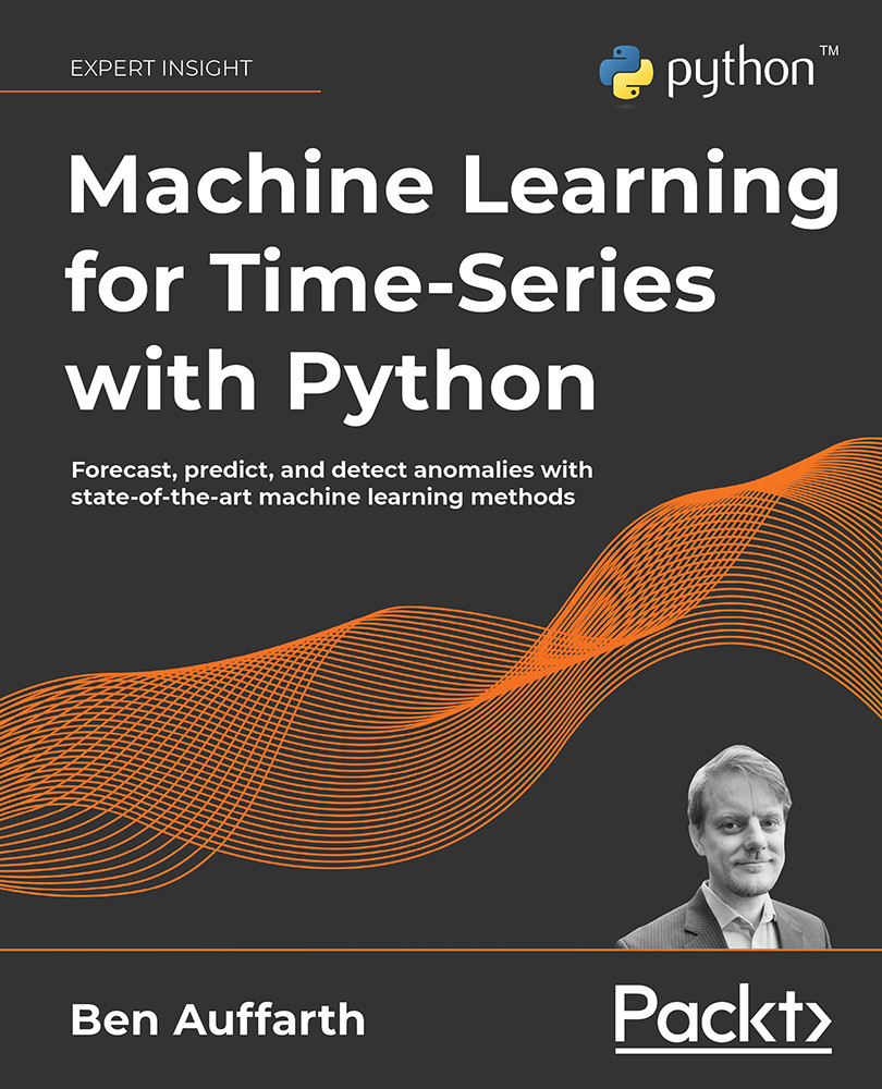
Machine Learning for Time-Series with Python

Machine Learning for Time-Series with Python: Forecast, predict, and detect anomalies with state-of-the-art machine learning methods

eBook
₹799 ₹3276.99
Paperback
₹4096.99
Subscription
Free Trial
Renews at ₹800p/m

What do you get with eBook?

Product feature icon Instant access to your Digital eBook purchase
Product feature icon Download this book in EPUB and PDF formats
Product feature icon Access this title in our online reader with advanced features
Product feature icon DRM FREE - Read whenever, wherever and however you want
Product feature icon AI Assistant (beta) to help accelerate your learning
OR
Modal Close icon
Payment Processing...
tick Completed

Billing Address

Table of content icon View table of contents Preview book icon Preview Book

Machine Learning for Time-Series with Python

Time-Series Analysis with Python

Time-Series analysis revolves around getting familiar with a dataset and coming up with ideas and hypotheses. It can be thought of as "storytelling for data scientists" and is a critical step in machine learning, because it can inform and help shape tentative conclusions to test while training a machine learning model. Roughly speaking, the main difference between time-series analysis and machine learning is that time-series analysis does not include formal statistical modeling and inference.

While it can be daunting and seem complex, it is a generally very structured process. In this chapter, we will go through the fundamentals in Python for dealing with time-series patterns. In Python, we can do time-series analysis by interactively querying our data using a number of tools that we have at our fingertips. This starts from creating and loading time-series datasets to identifying trend and seasonality. We'll outline both the structure of time-series analysis, and the constituents both in terms of theory and practice in Python by going through examples.

The main example will use a dataset of air pollution in London and Delhi. You can find this example as a Jupyter notebook in the book's GitHub repository.

We're going to cover the following topics:

  • What is time-series analysis?
  • Working with time-series in Python
  • Understanding the variables
  • Uncovering relationships between variables
  • Identifying trend and seasonality

We'll start with a characterization and an attempt at a definition of time-series analysis.

What is time-series analysis?

The term time-series analysis (TSA) refers to the statistical approach to time-series or the analysis of trend and seasonality. It is often an ad hoc exploration and analysis that usually involves visualizing distributions, trends, cyclic patterns, and relationships between features, and between features and the target(s).

More generally, we can say TSA is roughly exploratory data analysis (EDA) that's specific to time-series data. This comparison can be misleading however since TSA can include both descriptive and exploratory elements.

Let's see quickly the differences between descriptive and exploratory analysis:

  • Descriptive analysis summarizes characteristics of a dataset
  • Exploratory analysis analyzes for patterns, trends, or relationships between variables

Therefore, TSA is the initial investigation of a dataset with the goal of discovering patterns, especially trend and seasonality, and obtaining initial insights, testing hypotheses, and extracting meaningful summary statistics.

Definition: Time-Series Analysis (TSA) is the process of extracting a summary and other statistical information from time-series, most importantly, the analysis of trend and seasonality.

Since an important part of TSA is gathering statistics and representing your dataset graphically through visualization, we'll do a lot of plots in this chapter. Many statistics and plots described in this chapter are specific to TSA, so even if you are familiar with EDA, you'll find something new.

A part of TSA is collecting and reviewing data, examining the distribution of variables (and variable types), and checking for errors, outliers, and missing values. Some errors, variable types, and anomalies can be corrected, therefore EDA is often performed hand in hand with preprocessing and feature engineering, where columns and fields are selected and transformed. The whole process from data loading to machine learning is highly iterative and may involve multiple instances of TSA at different points.

Here are a few crucial steps for working with time-series:

  • Importing the dataset
  • Data cleaning
  • Understanding variables
  • Uncovering relationships between variables
  • Identifying trend and seasonality
  • Preprocessing (including feature engineering)
  • Training a machine learning model

Importing the data can be considered prior to TSA, and data cleaning, feature engineering, and training a machine learning model are not strictly part of TSA.

Importing the data includes parsing, for example extracting dates. The three steps that are central to TSA are understanding variables, uncovering relationships between variables, and identifying trend and seasonality. There's a lot more to say about each of them, and in this chapter, we'll talk about them in more detail in their dedicated sections.

The steps belonging to TSA and leading to preprocessing (feature engineering) and machine learning are highly iterative, and can be visually appreciated in the following time-series machine learning flywheel:

Flywheel%20-%20page%201.png

Figure 2.1: The time-series machine learning flywheel

This flywheel emphasizes the iterative nature of the work. For example, data cleaning comes often after loading the data, but will come up again after we've made another discovery about our variables. I've highlighted TSA in dark, while steps that are not strictly part of TSA are grayed out.

Let's go through something practical! We'll start by loading a dataset. Right after importing the data, we'd ask questions like what's the size of the dataset (the number of observations)? How many features or columns do we have? What are the column types?

We'll typically look at histograms or distribution plots. For assessing relationships between features and target variables, we'd calculate correlations and visualize them as a correlation heatmap, where the correlation strength between variables is mapped to colors.

We'd look for missing values – in a spreadsheet, these would be empty cells – and we'd clean up and correct these irregularities, where possible.

We are going to be analyzing relationships between variables, and in TSA, one of its peculiarities is that we need to investigate the relationship of time with each variable.

Generally, a useful way of distinguishing different types of techniques could be between univariate and multivariate analysis, and between graphical and non-graphical techniques. Univariate analysis means we are looking at a single variable. This means we could be inspecting values to get the means and the variance, or – for the graphical side – plotting the distribution. We summarize these techniques in the Understanding the variables section.

On the other hand, multivariate analysis means we are calculating correlations between variables, or – for the graphical side – drawing a scatter plot, for example. We'll delve into these techniques in the Uncovering relationships between variables section.

Before we continue, let's go through a bit of the basics of time-series with Python. This will cover the basic operations with time-series data as an introduction. After this, we'll go through Python commands with an actual dataset.

Working with time-series in Python

Python has a lot of libraries and packages for time-series, such as datetime, time, calendar, dateutil, and pytz, which can be highly confusing for beginners. At the same time, there are many different data types like date, time, datetime, tzinfo, timedelta, relativedelta, and more.

When it comes to using them, the devil is in the details. Just to name one example: many of these types are insensitive to the timezone. You should feel reassured, however, knowing that to get started, familiarity with a small subset of these libraries and data types is enough.

Requirements

In this chapter, we'll use several libraries, which we can quickly install from the terminal (or similarly from Anaconda Navigator):

pip install -U dython scipy numpy pandas seaborn scikit-learn

We'll execute the commands from the Python (or IPython) terminal, but equally we could execute them from a Jupyter notebook (or a different environment).

It's a good start if we at least know datetime and pandas, two very prominent libraries, which we'll cover in the following two sections. We'll create basic objects and do simple manipulations on them.

Datetime

The date and datetime data types are not primitive types in Python the way that numbers (float and int), string, list, dictionary, tuple, or file are. To work with date and datetime objects, we have to import datetime, a library that is part of the Python Standard Library, and the libraries that come by default with CPython and other main Python distributions.

datetime comes with objects such as date, datetime, time, and timedelta, among others. The difference between datetime and date objects is that the datetime object includes time information in addition to a date.

To get a date, we can do this:

from datetime import date

To get today's date:

today = date.today()

To get some other date:

other_date = date(2021, 3, 24)

If we want a datetime object (a timestamp) instead, we can do this as well:

from datetime import datetime
now = datetime.now()

This will get the current timestamp. We can create a datetime for a specific date and time as well:

some_date = datetime(2021, 5, 18, 15, 39, 0)
some_date.isoformat()

We can get a string output in isoformat:

'2021-05-18T15:39:00'

isoformat, short for the ISO 8601 format, is an international standard for representing dates and times.

We can also work with time differences using timedelta:

from datetime import timedelta 
year = timedelta(days=365)

These timedelta objects can be added to other objects for calculations. We can do calculations with a timedelta object, for example:

year * 10

This should give us the following output:

datetime.timedelta(days=3650) 

The datetime library can parse string inputs to date and datetime types and output these objects as string:

from datetime import date
some_date = date.fromisoformat('2021-03-24')

Or:

some_date = datetime.date(2021, 3, 24)

We can format the output with string format options, for example like this:

some_date.strftime('%A %d. %B %Y')

This would give us:

'Wednesday 24. March 2021'

Similarly, we can read in a date or datetime object from a string, and we can use the same format options:

from datetime import datetime
dt = datetime.strptime('24/03/21 15:48', '%d/%m/%y %H:%M')

You can find a complete list of formatting options that you can use both for parsing strings and printing datetime objects here: https://strftime.org/.

A few important ones are listed in this table:

Format string

Meaning

%Y

Year as 4 digits

%y

Year as 2 digits

%m

Month as a number

%d

Day

%H

Hour as 2 digits

%M

Minute as 2 digits

Figure 2.2: Format strings for dates

It's useful to remember these strings with formatting options. For example, the format string for a US date separated by slashes would look like this:

'%d/%m/%Y'

pandas

We introduced the pandas library in the previous chapter. pandas is one of the most important libraries in the Python ecosystem for data science, used for data manipulation and analysis. Initially released in 2008, it has been a major driver of Python's success.

pandas comes with significant time-series functionality such as date range generation, frequency conversion, moving window statistics, date shifting, and lagging.

Let's go through some of these basics. We can create a time-series as follows:

import pandas as pd
pd.date_range(start='2021-03-24', end='2021-09-01')

This gives us a DateTimeIndex like this:

DatetimeIndex(['2021-03-24', '2021-03-25', '2021-03-26', '2021-03-27',
               '2021-03-28', '2021-03-29', '2021-03-30', '2021-03-31',
               '2021-04-01', '2021-04-02',
               ...
               '2021-08-23', '2021-08-24', '2021-08-25', '2021-08-26',
               '2021-08-27', '2021-08-28', '2021-08-29', '2021-08-30',
               '2021-08-31', '2021-09-01'],
              dtype='datetime64[ns]', length=162, freq='D') 

We can also create a time-series as follows:

pd.Series(pd.date_range("2021", freq="D", periods=3))

This would give us a time-series like this:

0   2021-01-01
1   2021-01-02
2   2021-01-03
dtype: datetime64[ns]

As you can see, this type is called a DatetimeIndex. This means we can use this data type for indexing a dataset.

One of the most important functionalities is parsing to date or datetime objects from either string or separate columns:

import pandas as pd
df = pd.DataFrame({'year': [2021, 2022],
    'month': [3, 4],
    'day': [24, 25]}
)
ts1 = pd.to_datetime(df)
ts2 = pd.to_datetime('20210324', format='%Y%m%d')

We've created two time-series.

You can take a rolling window for calculations like this:

s = pd.Series([1, 2, 3, 4, 5])
s.rolling(3).sum()

Can you guess the result of this? If not, why don't you put this into your Python interpreter?

A time-series would usually be an index with a time object and one or more columns with numeric or other types, such as this:

import numpy as np 
rng = pd.date_range('2021-03-24', '2021-09-01', freq='D')
ts = pd.Series(np.random.randn(len(rng)), index=rng)

We can have a look at our time-series:

2021-03-24   -2.332713
2021-03-25    0.177074
2021-03-26   -2.136295
2021-03-27    2.992240
2021-03-28   -0.457537
                 ...
2021-08-28   -0.705022
2021-08-29    1.089697
2021-08-30    0.384947
2021-08-31    1.003391
2021-09-01   -1.021058
Freq: D, Length: 162, dtype: float64

We can index these time-series datasets like any other pandas Series or DataFrame. ts[:2].index would give us:

DatetimeIndex(['2021-03-24', '2021-03-25'], dtype='datetime64[ns]', freq='D')

Interestingly, we can index directly with strings or datetime objects. For example, ts['2021-03-28':'2021-03-30'] gives us:

2021-03-28   -0.457537
2021-03-29   -1.089423
2021-03-30   -0.708091
Freq: D, dtype: float64

You can shift or lag the values in a time-series back and forward in time using the shift method. This changes the alignment of the data:

ts.shift(1)[:5]

We can also change the resolution of time-series objects, for example like this:

ts.asfreq('M')

Please note the difference between datetime and pd.DateTimeIndex. Even though they encode the same kind of information, they are different types and they might not always play well with each other. Therefore, I'd recommend to always explicitly convert types when doing comparisons.

In the next section, let's go through a basic example of importing a time-series dataset, getting summary statistics, and plotting some variables.

Understanding the variables

We're going to load up a time-series dataset of air pollution, then we are going to do some very basic inspection of variables.

This step is performed on each variable on its own (univariate analysis) and can include summary statistics for each of the variables, histograms, finding missing values or outliers, and testing stationarity.

The most important descriptors of continuous variables are the mean and the standard deviation. As a reminder, here are the formulas for the mean and the standard deviation. We are going to build on these formulas later with more complex formulas. The mean usually refers to the arithmetic mean, which is the most commonly used average and is defined as:

The standard deviation is the square root of the average squared difference to this mean value:

The standard error (SE) is an approximation of the standard deviation of sampled data. It measures the dispersion of sample means around the population mean, but normalized by the root of the sample size. The more data points involved in the calculation, the smaller the standard error tends to be. The SE is equal to the standard deviation divided by the square root of the sample size:

An important application of the SE is the estimation of confidence intervals of the mean. A confidence interval gives a range of values for a parameter. For example, the 95th percentile upper confidence limit, , is defined as:

Similarly, replacing the plus with a minus, the lower confidence interval is defined as:

The median is another average, particularly useful when the data can't be described accurately by the mean and standard deviations. This is the case when there's a long tail, several peaks, or a skew in one or the other direction. The median is defined as:

This assumes that X is ordered by value in ascending or descending direction. Then, the value that lies in the middle, just at , is the median. The median is the 50th percentile, which means that it is higher than exactly half or 50% of the points in X. Other important percentiles are the 25th and the 75th, which are also the first quartile and the third quartile. The difference between these two is called the interquartile range.

These are the most common descriptors, but not the only ones even by a long stretch. We won't go into much more detail here, but we'll see a few more descriptors later.

Let's get our hands dirty with some code!

We'll import datetime, pandas, matplotlib, and seaborn to use them later. Matplotlib and seaborn are libraries for plotting. Here it goes:

import datetime
import pandas as pd
import matplotlib.pyplot as plt

Then we'll read in a CSV file. The data is from the Our World in Data (OWID) website, a collection of statistics and articles about the state of the world, maintained by Max Roser, research director in economics at the University of Oxford.

We can load local files or files on the internet. In this case, we'll load a dataset from GitHub. This is a dataset of air pollutants over time. In pandas you can pass the URL directly into the read_csv() method:

pollution = pd.read_csv(
    'https://raw.githubusercontent.com/owid/owid-datasets/master/datasets/Air%20pollution%20by%20city%20-%20Fouquet%20and%20DPCC%20(2011)/Air%20pollution%20by%20city%20-%20Fouquet%20and%20DPCC%20(2011).csv'
)
len(pollution)
331
pollution.columns
Index(['Entity', 'Year', 'Smoke (Fouquet and DPCC (2011))',
       'Suspended Particulate Matter (SPM) (Fouquet and DPCC (2011))'],
      dtype='object')

If you have problems downloading the file, you can download it manually from the book's GitHub repository from the chapter2 folder.

Now we know the size of the dataset (331 rows) and the column names. The column names are a bit long, let's simplify it by renaming them and then carry on:

pollution = pollution.rename(
    columns={
        'Suspended Particulate Matter (SPM) (Fouquet and DPCC (2011))':            'SPM',
           'Smoke (Fouquet and DPCC (2011))' : 'Smoke',
        'Entity': 'City'
    }
)
pollution.dtypes

Here's the output:

City                                object
Year                                 int64
Smoke                              float64
SPM                                float64
dtype: object
pollution.City.unique()
array(['Delhi', 'London'], dtype=object)
pollution.Year.min(), pollution.Year.max()

The minimum and the maximum year are these:

(1700, 2016)

pandas brings lots of methods to explore and discover your dataset – min(), max(), mean(), count(), and describe() can all come in very handy.

City, Smoke, and SPM are much clearer names for the variables. We've learned that our dataset covers two cities, London and Delhi, and over a time period between 1700 and 2016.

We'll convert our Year column from int64 to datetime. This will help with plotting:

pollution['Year'] = pollution['Year'].apply(
    lambda x: datetime.datetime.strptime(str(x), '%Y')
)
pollution.dtypes
City             object
Year     datetime64[ns]
Smoke           float64
SPM             float64
dtype: object

Year is now a datetime64[ns] type. It's a datetime of 64 bits. Each value describes a nanosecond, the default unit.

Let's check for missing values and get descriptive summary statistics of columns:

pollution.isnull().mean()
City                               0.000000
Year                               0.000000
Smoke                              0.090634
SPM                                0.000000
dtype: float64
pollution.describe()
              Smoke    SPM
count    301.000000    331.000000
mean     210.296440    365.970050
std      88.543288     172.512674
min      13.750000     15.000000
25%      168.571429    288.474026
50%      208.214286    375.324675
75%      291.818182    512.609209
max      342.857143    623.376623

The Smoke variable has 9% missing values. For now, we can just focus on the SPM variable, which doesn't have any missing values.

The pandas describe() method gives us counts of non-null values, mean and standard deviation, 25th, 50th, and 75th percentiles, and the range as the minimum and maximum.

A histogram, first introduced by Karl Pearson, is a count of values within a series of ranges called bins (or buckets). The variable is first divided into a series of intervals, and then all points that fall into each interval are counted (bin counts). We can present these counts visually as a barplot.

Let's plot a histogram of the SPM variable:

n, bins, patches = plt.hist(
    x=pollution['SPM'], bins='auto',
    alpha=0.7, rwidth=0.85
)
plt.grid(axis='y', alpha=0.75)
plt.xlabel('SPM')
plt.ylabel('Frequency')

This is the plot we get:

pollution_hist.png

Figure 2.3: Histogram of the SPM variable

A histogram can help if you have continuous measurements and want to understand the distribution of values. Further, a histogram can indicate if there are outliers.

This closes the first part of our TSA. We'll come back to our air pollution dataset later.

Uncovering relationships between variables

If we are not dealing with a univariate time-series where there's only a single variable, the relationship between the variables needs to be investigated. This includes the direction and rough size of any correlations. This is important to avoid feature leakage and collinearity.

Feature leakage is when a variable unintentionally gives away the target. For example, the variable named amount_paid would give away the label has_paid. A more complex example would be if we were analyzing data for an online supermarket, and our dataset consisted of customer variables such as age, number of purchases in the past, length of visit, and finally the contents of their cart. What we want to predict, our target, is the result of their buying decision as either abandoned (when they canceled their purchase) or paid. We could find that a purchase is highly correlated with bags in their cart due to just the simple fact that bags are added at the last step. However, concluding we should offer bags to customers when they land on our site would probably miss the point, when it's the length of their stay that could be, in fact, the determining variable, and an intervention through a widget or customer service agent might be much more effective.

Collinearity means that independent variables (features) are correlated. The latter case can be problematic in linear models. Therefore, if we carry out linear regression and find two variables that are highly correlated between themselves, we should remove one of them or use dimensionality reduction techniques such as Principal Component Analysis (PCA).

The Pearson correlation coefficient was developed by Karl Pearson, whom we've discussed in the previous chapter, and named in his honor to distinguish it from other correlation coefficients. The Pearson correlation coefficient between two variables X and Y is defined as follows:

is the covariance between the two variables defined as the expected value (the mean) between the differences of each point to the variable mean:

is the standard deviation of the variable X.

Expanded, the formula looks like this:

There are three types of correlation: positive, negative, and no correlation. Positive correlation means that as one variable increases the other does as well. In the case of the Pearson correlation coefficient, the increase of one variable to the other should be linear.

If we looked at a plot of global life expectancy from 1800 onward, we'd see an increase of years lived with the time axis. You can see the plot of global life expectancy based on data on OWID:

life_expectancy.png

Figure 2.4: Life expectancy from 1800 to today

We can see how life expectancy has been increasing steadily since the end of the 19th century until today.

This plot is called a run chart or temporal line chart.

In order to calculate the Pearson correlation, we can use a function from SciPy:

from scipy import stats
def ignore_nans(a, b):
    index = ~a.isnull() & ~b.isnull()
    return a[index], b[index]
stats.pearsonr(*ignore_nans(pollution['Smoke'], pollution['SPM']))

Here's the Pearson correlation and the p-value that indicates significance (the lower, the more significant)

(0.9454809183096181, 3.313283689287137e-10

We see a very strong positive correlation of time with life expectancy, 0.94, at very high significance (the second number in the return). You can find more details about the dataset on the OWID website.

Conversely, we would see a negative correlation of time with child mortality – as the year increases, child mortality decreases. This plot shows the child mortality per 1,000 children on data taken from OWID:

child_mortality.png

Figure 2.5: Child mortality from 1800 to today in the UK, France, and the USA

In this plot, we can see that in all three countries child mortality has been decreasing since the start of the 19th century until today.

In the case of the United States, we'll find a negative correlation of -0.95 between child mortality and time.

We can also compare the countries to each other. We can calculate correlations between each feature. In this case, each feature contains the values for the three countries.

This gives a correlation matrix of 3x3, which we can visualize as a heatmap:

correlation_heatmap.png

Figure 2.6: Correlation heatmap of child mortality between the UK, France, and the USA

In this correlation heatmap, we can see that countries are highly correlated (for example, a correlation of 0.78 between France and the United Kingdom).

The diagonal of the correlation matrix is always 1.0, and the matrix is symmetrical across the diagonal. Therefore, sometimes we only show the lower triangle below the diagonal (or sometimes the upper triangle). We can see that child mortality in the United Kingdom is more similar to that of the United States than that of France.

Does this mean that the UK went through a similar development as the United States? These statistics and visualizations can often generate questions to answer, or hypotheses that we can test.

As mentioned before, the full notebooks for the different datasets are available on GitHub, however, here's the snippet for the heatmap:

import dython
dython.nominal.associations(child_mortality[countries], figsize=(12, 6));

The correlation coefficient struggles with cases where the increases are non-linear or non-continuous, or (because of the squared term) when there are outliers. For example, if we looked at air pollution from the 1700s onward, we'd see a steep increase in air pollutants from coal and – with the introduction of the steam engine – a decrease in pollutants.

A scatter plot can be used for showing and comparing numeric values. It plots values of two variables against each other. Usually, the variables are numerical – otherwise, we'd call this a table. Scatter plots can be crowded in certain areas, and therefore are deceptive if this can't be appreciated visually. Adding jitter and transparency can help to some degree, however, we can combine a scatter plot with the histograms of the variables we are plotting against each other, so we can see how many points on one or the other variable are being displayed. Scatter plots often have a best-fit line superimposed in order to visualize how one variable is the function of another variable.

Here's an example of how to plot a scatter plot with marginal histograms of the two variables in the pollution dataset:

plt.figure(figsize=(12, 6))
sns.jointplot(
    x="Smoke", y="SPM",
    edgecolor="white",
    data=pollution
)
plt.xlabel("Smoke")
plt.ylabel("SPM");

Here's the resulting plot:

Machine-Learning%20for%20Time-Series%20with%20Python/spm_scatter.png

Figure 2.7: Scatter plot with marginal histograms of Smoke against SPM

In the scatter plot, we can see that the two variables are extremely similar – the values are all on the diagonal. The correlation between these two variables is perfect, 1.0, which means that they are in fact identical.

We've seen the dataset of Suspended Particulate Matter (SPM) before. Let's plot SPM over time:

pollution = pollution.pivot("Year", "City", "SPM")
plt.figure(figsize=(12, 6))
sns.lineplot(data=pollution)
plt.ylabel('SPM');

Here's the plot:

Machine-Learning%20for%20Time-Series%20with%20Python/spm_1700_to_today.png

Figure 2.8: Suspended particle matter from the 1700s to today

We can see in the plot that the air quality (measured as suspended particle matter) in London was getting worse until around 1880 (presumably because of heating materials such as wood and coal), however, has since been improving.

We find a correlation coefficient of -0.36 with high significance. The steep decline of pollutants from 1880 onward dominates over the 180 years of slow growth. If we looked separately at the time from 1700 to 1880 and from 1880 to the present, we'd find 0.97 and -0.97 respectively, examples of very strong correlation and very strong anti-correlation.

The Spearman rank correlation can handle outliers and non-linear relationships much better than the Pearson correlation coefficient – although it can't handle non-continuous cases like the one above. The Spearman correlation is the Pearson correlation, only applied on ranks of variables' values instead of the variables' values directly. The Spearman correlation of the time-series for air pollution is -0.19, and for the two time periods before and after 1880 we get 0.99 and -0.99, respectively.

In the case of the Spearman correlation coefficient, the numerical differences are ignored – what counts is the order of the points. In this case, the order of the points within the two time periods aligns nearly perfectly.

In the next section, we'll talk about trend and seasonality.

Identifying trend and seasonality

Trend, seasonality, and cyclic variations are the most important characteristics of time-series. A trend is the presence of a long-term increase or decrease in the sequence. Seasonality is a variation that occurs at specific regular intervals of less than a year. Seasonality can occur on different time spans such as daily, weekly, monthly, or yearly. Finally, cyclic variations are rises and falls that are not of a fixed frequency.

An important characteristic of time-series is stationarity. This refers to a property of time-series not to change distribution over time, or in other words, that the process that produces the time-series doesn't change with time. Time-Series that don't change over time are called stationary (or stationary processes). Many models or measures assume stationarity and might not work properly if the data is not stationary. Therefore, with these algorithms, the time-series should be decomposed first into the main signal, and then the seasonal and trend components. In this decomposition, we would subtract the trend and seasonal components from the original time-series.

In this section, we'll first go through an example of how to estimate trend and seasonality using curve fitting. Then, we'll look at other tools that can help discover trends, seasonality, and cyclic variations. These include statistics such as autocorrelation and the augmented Dickey–Fuller test, and visualizations such as the autocorrelation plot (also: lag plot) and the periodogram.

Let's start with a hopefully clear example of how seasonality and trend can be estimated in just a few lines of Python. For this, we'll come back to the GISS Surface Temperature Analysis dataset released by NASA. We'll load the dataset, and we'll do curve fitting, which comes straight out of the box in NumPy.

We'll download the dataset from Datahub (https://datahub.io/core/global-temp) or you can find it from the book's GitHub repository (in the chapter2 folder).

Then, we can load it up and pivot it:

temperatures = pd.read_csv('/Users/ben/Downloads/monthly_csv.csv')
temperatures['Date'] = pd.to_datetime(temperatures['Date'])
temperatures = temperatures.pivot('Date', 'Source', 'Mean')

Now we can use NumPy's polyfit functionality. It fits a polynomial of the form:

In this formula, k is the degree of the polynomial and b is the coefficients we are trying to find.

It is just a function in NumPy to fit the coefficients. We can use the same function to fit seasonal variation and trend. Since trend can dominate over seasonality, before estimating seasonality, we remove the trend:

from numpy import polyfit
def fit(X, y, degree=3):
    coef = polyfit(X, y, degree)
    trendpoly = np.poly1d(coef)
    return trendpoly(X)
def get_season(s, yearly_periods=4, degree=3):
    X = [i%(365/4) for i in range(0, len(s))]
    seasonal = fit(X, s.values, degree)
    return pd.Series(data=seasonal, index=s.index)
def get_trend(s, degree=3):
    X = list(range(len(s)))
    trend = fit(X, s.values, degree)
    return pd.Series(data=trend, index=s.index)

Let's plot seasonality and trend on top of our global temperature increases!

import seaborn as sns
plt.figure(figsize=(12, 6))
temperatures['trend'] = get_trend(temperatures['GCAG'])
temperatures['season'] = get_season(temperatures['GCAG'] - temperatures['trend'])
sns.lineplot(data=temperatures[['GCAG', 'season', 'trend']])
plt.ylabel('Temperature change');

This is the graph that we get:

temperatures_trend_seasonality.png

Figure 2.9: Temperature change from the late 19th century to today

This was to show that you can use plug-in functionality in NumPy for curve fitting in order to find both trend and seasonality. If you want to experiment further, you can play with the degree of the polynomial or with the seasonality component to see if you can get a better fit, or find another seasonality component. We could have used functionality from other libraries such as seasonal.seasonal_decompose() in statsmodels, or Facebook's Prophet, which decomposes using Fourier coefficients for the seasonal components.

Now that we've seen how to estimate seasonality and trend, let's move on to other statistics and visualizations. Continuing with the pollution dataset, and picking up the EEG dataset we saw in Chapter 1, we'll show practically in Python how to get these statistics and plots, and how to identify trend and seasonality.

Autocorrelation is the correlation of a signal with a lagged version of itself. The autocorrelation plot draws the autocorrelation as a function of lag. The autocorrelation plot can help find repeating patterns, and is often used in signal processing. The autocorrelation can help spot a periodic signal. Let's plot the autocorrelation of the pollution data:

pollution = pollution.pivot("Year", "City", "SPM")
pd.plotting.autocorrelation_plot(pollution['London'])

Here's the plot that we get:

autocorrelation.png

Figure 2.10: Autocorrelaton plot of pollution in London

We can see high autocorrelations with a lag of only a few years. There is a negative autocorrelation at around 100 years, after which point the autocorrelation stays around 0.

The plot of SPM clearly shows that air pollution is not a stationary process, since the autocorrelation is not flat. You can also compare the run of pollution that shows there's a trend, and therefore the mean also changes – another indication that the series is not stationary.

We can also test this statistically. A test for stationarity is the augmented Dickey–Fuller test:

from statsmodels.tsa import stattools
stattools.adfuller(pollution['London'])
(-0.33721640804242853,
 0.9200654843183897,
 13,
 303,
 {'1%': -3.4521175397304784,
  '5%': -2.8711265007266666,
  '10%': -2.571877823851692},
 1684.6992663493872)

The second return value is the p-value that gives the significance or the probability of obtaining test results at least as extreme as the observation given the null hypothesis. With p-values below 5% or 0.05 we would typically reject the null hypothesis, and we could assume that our time-series is stationary. In our case, we can't assume that the series is stationary.

We saw the graph of electroencephalography (EEG) signals in Chapter 1, Introduction to Time-Series with Python, and we mentioned that EEG signals show brain waves at several frequency ranges.

We can visualize this nicely. Let's go through it step by step in Python. We first need to do a few imports:

import pandas as pd
import matplotlib.pyplot as plt
from matplotlib.dates import DateFormatter
import seaborn as sns
from sklearn.datasets import fetch_openml

OpenML is a project that provides benchmark datasets and a website for comparison of machine learning algorithms. The scikit-learn library provides an interface to OpenML that allows us to fetch data from OpenML. The whole measurement spans 117 seconds. So we need to set this up correctly as an index in pandas:

eeg = fetch_openml(data_id=1471, as_frame=True)
increment = 117 / len(eeg['data'])
import numpy as np
index = np.linspace(
    start=0,
    stop=increment*len(eeg['data']),
    num=len(eeg['data'])
)
ts_index = pd.to_datetime(index, unit='s')
v1 = pd.Series(name='V1', data=eeg['data']['V1'].values, index=ts_index)

We can slice our dataset directly. Please note that the DatetimeIndex is anchored in 1970, but we can ignore this safely here:

slicing = (v1.index >= '1970-01-01 00:00:08') & (v1.index <='1970-01-01 00:01:10.000000000')
v1[slicing]

Here's the slice:

1970-01-01 00:00:08.006208692    4289.74
1970-01-01 00:00:08.014019627    4284.10
1970-01-01 00:00:08.021830563    4280.00
1970-01-01 00:00:08.029641498    4289.74
1970-01-01 00:00:08.037452433    4298.46
                                  ...   
1970-01-01 00:01:09.962547567    4289.74
1970-01-01 00:01:09.970358502    4283.08
1970-01-01 00:01:09.978169437    4284.62
1970-01-01 00:01:09.985980373    4289.23
1970-01-01 00:01:09.993791308    4290.77
Name: V1, Length: 7937, dtype: float64

This slicing avoids an artifact, a strong spike, occurring at around 1:20.

The graph we saw in Chapter 1, we can plot as follows:

date_formatter = DateFormatter("%S")
ax = v1[slicing].plot(figsize=(12, 6))
ax.xaxis.set_major_formatter(date_formatter)
plt.ylabel('voltage')

Here's the graph again:

Machine-Learning%20for%20Time-Series%20with%20Python/voltage_over_time.png

Figure 2.11: Voltage over time in an EEG signal

This is the plot of the EEG signal over time.

We can also resample the data to look at the series more coarsely, with less resolution, for example like this:

plt.subplot(311)
ax1 = v1[slicing].resample('1s').mean().plot(figsize=(12, 6))
ax1.xaxis.set_major_formatter(date_formatter)
plt.subplot(312)
ax1 = v1[slicing].resample('2s').mean().plot(figsize=(12, 6))
ax1.xaxis.set_major_formatter(date_formatter)
plt.subplot(313)
ax2 = v1[slicing].resample('5s').mean().plot(figsize=(12, 6))
ax2.xaxis.set_major_formatter(date_formatter) 
plt.xlabel('seconds');

This is the graph with three subplots we get from resampling to frequencies of 1 second, 2 seconds, and 5 seconds, respectively:

eeg_resampled.png

Figure 2.12: Resampled EEG signals

Each of the resampled signals in the plot could be more or less useful for analysis depending on the application. For high-frequency analysis, we shouldn't resample at all, while if we are trying to remove as much noise as possible, we should resample to a more coarse time resolution.

We can look at cyclic activity on a plot of spectral density. We can do this by applying a Fourier transform. Here, we go with the Welch method, which averages over time before applying the discrete Fourier transform:

from scipy import signal
fs = len(eeg['data']) // 117
f, Pxx_den = signal.welch(
    v1[slicing].values,
    fs,
    nperseg=2048,
    scaling='spectrum'
)
plt.semilogy(f, Pxx_den)
plt.xlabel('frequency [Hz]')
plt.ylabel('PSD [V**2/Hz]')

The spectral density plot, the periodogram, looks like this:

spectral_eeg.png

Figure 2.13: Periodogram of the EEG signals

The information in this plot is like the autocorrelation plot that we drew for pollution, however, it gives us information about how prominent certain frequencies are. In this case we see that low frequencies are particularly powerful. In other words, the signal shows a slow oscillation.

This brings the chapter to an end. Let's summarize what we've covered.

Summary

In this chapter, we introduced TSA as the process of extracting summary and other statistical information from time-series. We broke this process down into understanding the variables, uncovering relationships between variables, and identifying trend and seasonality.

We introduced datetime and pandas, the libraries sine qua non in TSA, and their functionalities for time-series; for example, resampling. Throughout the chapter, we listed and defined many summary statistics including mean, standard deviation, median, SE, confidence interval, Pearson correlation, and covariance.

We also talked about the concepts of seasonality, cyclic variation, and stationarity. We discussed why stationarity is important, and how to test for stationarity.

We also showed plotting functionality with Matplotlib and Seaborn, and how to generate different plots such as run charts, temporal line charts, correlation heatmaps, histograms, scatter plots, autocorrelation plots, and periodograms. In the practical example, we used an autocorrelation plot, which shows the correlation between different time steps, and the periodogram, which visualizes the power spectral density.

Left arrow icon Right arrow icon
Download code icon Download Code

Key benefits

  • Explore popular and modern machine learning methods including the latest online and deep learning algorithms
  • Learn to increase the accuracy of your predictions by matching the right model with the right problem
  • Master time series via real-world case studies on operations management, digital marketing, finance, and healthcare

Description

The Python time-series ecosystem is huge and often quite hard to get a good grasp on, especially for time-series since there are so many new libraries and new models. This book aims to deepen your understanding of time series by providing a comprehensive overview of popular Python time-series packages and help you build better predictive systems. Machine Learning for Time-Series with Python starts by re-introducing the basics of time series and then builds your understanding of traditional autoregressive models as well as modern non-parametric models. By observing practical examples and the theory behind them, you will become confident with loading time-series datasets from any source, deep learning models like recurrent neural networks and causal convolutional network models, and gradient boosting with feature engineering. This book will also guide you in matching the right model to the right problem by explaining the theory behind several useful models. You’ll also have a look at real-world case studies covering weather, traffic, biking, and stock market data. By the end of this book, you should feel at home with effectively analyzing and applying machine learning methods to time-series.

Who is this book for?

This book is ideal for data analysts, data scientists, and Python developers who want instantly useful and practical recipes to implement today, and a comprehensive reference book for tomorrow. Basic knowledge of the Python Programming language is a must, while familiarity with statistics will help you get the most out of this book.

What you will learn

  • Understand the main classes of time series and learn how to detect outliers and patterns
  • Choose the right method to solve time-series problems
  • Characterize seasonal and correlation patterns through autocorrelation and statistical techniques
  • Get to grips with time-series data visualization
  • Understand classical time-series models like ARMA and ARIMA
  • Implement deep learning models, like Gaussian processes, transformers, and state-of-the-art machine learning models
  • Become familiar with many libraries like Prophet, XGboost, and TensorFlow

Product Details

Country selected
Publication date, Length, Edition, Language, ISBN-13
Publication date : Oct 29, 2021
Length: 370 pages
Edition : 1st
Language : English
ISBN-13 : 9781801816106
Category :

What do you get with eBook?

Product feature icon Instant access to your Digital eBook purchase
Product feature icon Download this book in EPUB and PDF formats
Product feature icon Access this title in our online reader with advanced features
Product feature icon DRM FREE - Read whenever, wherever and however you want
Product feature icon AI Assistant (beta) to help accelerate your learning
OR
Modal Close icon
Payment Processing...
tick Completed

Billing Address

Product Details

Publication date : Oct 29, 2021
Length: 370 pages
Edition : 1st
Language : English
ISBN-13 : 9781801816106
Category :

Packt Subscriptions

See our plans and pricing
Modal Close icon
₹800 billed monthly
Feature tick icon Unlimited access to Packt's library of 7,000+ practical books and videos
Feature tick icon Constantly refreshed with 50+ new titles a month
Feature tick icon Exclusive Early access to books as they're written
Feature tick icon Solve problems while you work with advanced search and reference features
Feature tick icon Offline reading on the mobile app
Feature tick icon Simple pricing, no contract
₹4500 billed annually
Feature tick icon Unlimited access to Packt's library of 7,000+ practical books and videos
Feature tick icon Constantly refreshed with 50+ new titles a month
Feature tick icon Exclusive Early access to books as they're written
Feature tick icon Solve problems while you work with advanced search and reference features
Feature tick icon Offline reading on the mobile app
Feature tick icon Choose a DRM-free eBook or Video every month to keep
Feature tick icon PLUS own as many other DRM-free eBooks or Videos as you like for just ₹400 each
Feature tick icon Exclusive print discounts
₹5000 billed in 18 months
Feature tick icon Unlimited access to Packt's library of 7,000+ practical books and videos
Feature tick icon Constantly refreshed with 50+ new titles a month
Feature tick icon Exclusive Early access to books as they're written
Feature tick icon Solve problems while you work with advanced search and reference features
Feature tick icon Offline reading on the mobile app
Feature tick icon Choose a DRM-free eBook or Video every month to keep
Feature tick icon PLUS own as many other DRM-free eBooks or Videos as you like for just ₹400 each
Feature tick icon Exclusive print discounts

Frequently bought together


Stars icon
Total 12,141.97
Machine Learning with PyTorch and Scikit-Learn
₹4096.99
Machine Learning for Time-Series with Python
₹4096.99
Modern Time Series Forecasting with Python
₹3947.99
Total 12,141.97 Stars icon
Banner background image

Table of Contents

14 Chapters
Introduction to Time-Series with Python Chevron down icon Chevron up icon
Time-Series Analysis with Python Chevron down icon Chevron up icon
Preprocessing Time-Series Chevron down icon Chevron up icon
Introduction to Machine Learning for Time-Series Chevron down icon Chevron up icon
Forecasting with Moving Averages and Autoregressive Models Chevron down icon Chevron up icon
Unsupervised Methods for Time-Series Chevron down icon Chevron up icon
Machine Learning Models for Time-Series Chevron down icon Chevron up icon
Online Learning for Time-Series Chevron down icon Chevron up icon
Probabilistic Models for Time-Series Chevron down icon Chevron up icon
Deep Learning for Time-Series Chevron down icon Chevron up icon
Reinforcement Learning for Time-Series Chevron down icon Chevron up icon
Multivariate Forecasting Chevron down icon Chevron up icon
Other Books You May Enjoy Chevron down icon Chevron up icon
Index Chevron down icon Chevron up icon

Customer reviews

Top Reviews
Rating distribution
Full star icon Full star icon Full star icon Full star icon Empty star icon 4
(12 Ratings)
5 star 41.7%
4 star 33.3%
3 star 16.7%
2 star 0%
1 star 8.3%
Filter icon Filter
Top Reviews

Filter reviews by


Trebor Jan 19, 2022
Full star icon Full star icon Full star icon Full star icon Full star icon 5
The author has a great way of walking you through the content by starting with basic overview and then begins to delve into the details from preprocessing towards the models that are used then into the machine learning methods and models themselves. All while providing easy to read Python examples. Great for novice and advanced readers!
Amazon Verified review Amazon
WU. Mar 24, 2022
Full star icon Full star icon Full star icon Full star icon Full star icon 5
As close to a one-stop-shop for time series analysis in Python.Pedagogically, the author does an excellent job of walking the reader through the basics (time-series definition, preprocessing, python-specific packages, use cases, etc), to the classical models (ARCH, GARCH, Moving Average, Autoregressive, etc.), all the way to SOTA models using probabilistic techniques and RL. Throughout, he explains the output of the various packages and compares performance. Extra points for going over online-training and giving perhaps the most concise definitions of the different types of data drift I've read thus far.The accompanying code is clear and easy to follow, even when there's an occasional typo here or there.Highest recommendation!
Amazon Verified review Amazon
Dwaraknaath Varadharajan Jan 09, 2022
Full star icon Full star icon Full star icon Full star icon Full star icon 5
What's new?The author has touched upon state of the art tools that exist today for preprocessing time series data and latest Machine Learning algorithms for time series such as ROCKET, Shapelets, Time Series Forest etc. There are a very few books dedicated to time series forecasting using Deep Learning, but this book has filled the void by covering a wide range of Deep Learning techniques that's been used in M4, M5 competitions.Summary:Overall, I think this book is pretty much like a literature review on recent advances in times series forecasting and readers will certainly get more than what they asked for.Suggestions:Chapters 1 and 2 covers basics of time series analysis and forecasting which can be found in many time series textbooks today. Time Series analysis could have been a little extensive by covering how lags, and rolling windows/fixed windows are useful. Even though I really liked the part where ROCKET and Shapelets are used to perform feature engineering, I think further explanation is required.
Amazon Verified review Amazon
daniel yoo Jan 05, 2022
Full star icon Full star icon Full star icon Full star icon Full star icon 5
Here are some of the major points I would like to point out in reading this book.1. The author created a very good reference manual for "everything" time series. He goes into talking about classical time series models and also talks about more novel approaches such as combining classical time series models with machine learning models . This stretched me to think about time series in a new and different way. (I have been working with classical time series for a long time).2. He provides solid coding examples with python packages that could help the reader immediately implement what they have learned in every chapter. This helps reinforce concepts, and ideas.3. The writing is very clear and fluid. Some historical context is given as well as reference to academic articles (original sources), where major concepts are summarized and made more palatable for the reader.Buy this book!
Amazon Verified review Amazon
Amazon Customer Feb 18, 2022
Full star icon Full star icon Full star icon Full star icon Full star icon 5
This is one of the best books to study and understand about Time series with Machine Learning. The author has put a lot of effort get the master class material for the time series. This book covers all the libraries available for time series with different domains like Statistics, online learning, Machine learning, statistics, Deep Learning, and, Reinforcement learning.
Amazon Verified review Amazon
Get free access to Packt library with over 7500+ books and video courses for 7 days!
Start Free Trial

FAQs

How do I buy and download an eBook? Chevron down icon Chevron up icon

Where there is an eBook version of a title available, you can buy it from the book details for that title. Add either the standalone eBook or the eBook and print book bundle to your shopping cart. Your eBook will show in your cart as a product on its own. After completing checkout and payment in the normal way, you will receive your receipt on the screen containing a link to a personalised PDF download file. This link will remain active for 30 days. You can download backup copies of the file by logging in to your account at any time.

If you already have Adobe reader installed, then clicking on the link will download and open the PDF file directly. If you don't, then save the PDF file on your machine and download the Reader to view it.

Please Note: Packt eBooks are non-returnable and non-refundable.

Packt eBook and Licensing When you buy an eBook from Packt Publishing, completing your purchase means you accept the terms of our licence agreement. Please read the full text of the agreement. In it we have tried to balance the need for the ebook to be usable for you the reader with our needs to protect the rights of us as Publishers and of our authors. In summary, the agreement says:

  • You may make copies of your eBook for your own use onto any machine
  • You may not pass copies of the eBook on to anyone else
How can I make a purchase on your website? Chevron down icon Chevron up icon

If you want to purchase a video course, eBook or Bundle (Print+eBook) please follow below steps:

  1. Register on our website using your email address and the password.
  2. Search for the title by name or ISBN using the search option.
  3. Select the title you want to purchase.
  4. Choose the format you wish to purchase the title in; if you order the Print Book, you get a free eBook copy of the same title. 
  5. Proceed with the checkout process (payment to be made using Credit Card, Debit Cart, or PayPal)
Where can I access support around an eBook? Chevron down icon Chevron up icon
  • If you experience a problem with using or installing Adobe Reader, the contact Adobe directly.
  • To view the errata for the book, see www.packtpub.com/support and view the pages for the title you have.
  • To view your account details or to download a new copy of the book go to www.packtpub.com/account
  • To contact us directly if a problem is not resolved, use www.packtpub.com/contact-us
What eBook formats do Packt support? Chevron down icon Chevron up icon

Our eBooks are currently available in a variety of formats such as PDF and ePubs. In the future, this may well change with trends and development in technology, but please note that our PDFs are not Adobe eBook Reader format, which has greater restrictions on security.

You will need to use Adobe Reader v9 or later in order to read Packt's PDF eBooks.

What are the benefits of eBooks? Chevron down icon Chevron up icon
  • You can get the information you need immediately
  • You can easily take them with you on a laptop
  • You can download them an unlimited number of times
  • You can print them out
  • They are copy-paste enabled
  • They are searchable
  • There is no password protection
  • They are lower price than print
  • They save resources and space
What is an eBook? Chevron down icon Chevron up icon

Packt eBooks are a complete electronic version of the print edition, available in PDF and ePub formats. Every piece of content down to the page numbering is the same. Because we save the costs of printing and shipping the book to you, we are able to offer eBooks at a lower cost than print editions.

When you have purchased an eBook, simply login to your account and click on the link in Your Download Area. We recommend you saving the file to your hard drive before opening it.

For optimal viewing of our eBooks, we recommend you download and install the free Adobe Reader version 9.