Plotting graphs
As we have seen in previous sections, graphs are intuitive data structures represented graphically. Nodes can be plotted as simple circles, while edges are lines connecting two nodes.
Despite their simplicity, it could be quite difficult to make a clear representation when the number of edges and nodes increases. The source of this complexity is mainly related to the position (space/Cartesian coordinates) to assign to each node in the final plot. Indeed, it could be unfeasible to manually assign to a graph with hundreds of nodes the specific position of each node in the final plot.
In this section, we will see how we can plot graphs without specifying coordinates for each node. We will exploit two different solutions: networkx and Gephi.
networkx
networkx offers a simple interface to plot graph objects through the nx.draw library. In the following code snippet, we show how to use the library in order to plot graphs:
def draw_graph(G, nodes_position, weight):
      nx.draw(G, pos_ position, with_labels=True, font_size=15, node_size=400, edge_color='gray', arrowsize=30)
             if plot_weight:
             edge_labels=nx.get_edge_attributes(G,'weight')
         nx.draw_networkx_edge_labels(G, pos_ position, edge_labels=edge_labels)
Here, nodes_position is a dictionary where the keys are the nodes and the value assigned to each key is an array of length 2, with the Cartesian coordinate used for plotting the specific node.
The nx.draw function will plot the whole graph by putting its nodes in the given positions. The with_labels option will plot its name on top of each node with the specific font_size value. node_size and edge_color will respectively specify the size of the circle, representing the node and the color of the edges. Finally, arrowsize will define the size of the arrow for directed edges. This option will be used when the graph to be plotted is a digraph.
In the following code example, we show how to use the draw_graph function previously defined in order to plot a graph:
G = nx.Graph()
V = {'Paris', 'Dublin','Milan', 'Rome'}
E = [('Paris','Dublin', 11), ('Paris','Milan', 8),
     ('Milan','Rome', 5), ('Milan','Dublin', 19)]
G.add_nodes_from(V)
G.add_weighted_edges_from(E)
node_position = {"Paris": [0,0], "Dublin": [0,1], "Milan": [1,0], "Rome": [1,1]}
draw_graph(G, node_position, True)
The result of the plot is available to view in the following screenshot:
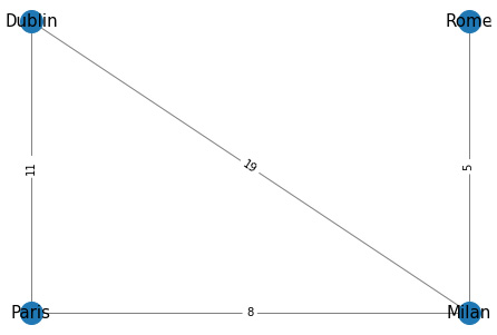
Figure 1.8 – Result of the plotting function
The method previously described is simple but unfeasible to use in a real scenario since the node_position value could be difficult to decide. In order to solve this issue, networkx offers a different function to automatically compute the position of each node according to different layouts. In Figure 1.9, we show a series of plots of an undirected graph, obtained using the different layouts available in networkx. In order to use them in the function we proposed, we simply need to assign node_position to the result of the layout we want to use—for example, node_position = nx.circular_layout(G). The plots can be seen in the following screenshot:

Figure 1.9 – Plots of the same undirected graph with different layouts
networkx is a great tool for easily manipulating and analyzing graphs, but it does not offer good functionalities in order to perform complex and good-looking plots of graphs. In the next section, we will investigate another tool to perform complex graph visualization: Gephi.
Gephi
In this section, we will show how Gephi (an open source network analysis and visualization software) can be used for performing complex, fancy plots of graphs. For all the examples showed in this section, we will use the Les Miserables.gexf sample (a weighted undirected graph), which can be selected in the Welcome window when the application starts.
The main interface of Gephi is shown in Figure 1.10. It can be divided into four main areas, as follows:
- Graph: This section shows the final plot of the graph. The image is automatically updated each time a filter or a specific layout is applied.
- Appearance: Here, it is possible to specify the appearance of nodes and edges.
- Layout: In this section, it is possible to select the layout (as in
networkx) to adjust the node position in the graph. Different algorithms, from a simple random position generator to a more complex Yifan Hu algorithm, are available. - Filters & Statistics: In this set area, two main functions are available, outlined as follows:
a. Filters: In this tab, it is possible to filter and visualize specific subregions of the graph according to a set property computed using the Statistics tab.
b. Statistics: This tab contains a list of available graph metrics that can be computed on the graph using the Run button. Once metrics are computed, they can be used as properties to specify the edges' and nodes' appearance (such as node and edge size and color) or to filter a specific subregion of the graph.
You can see the main interface of Gephi in the following screenshot:
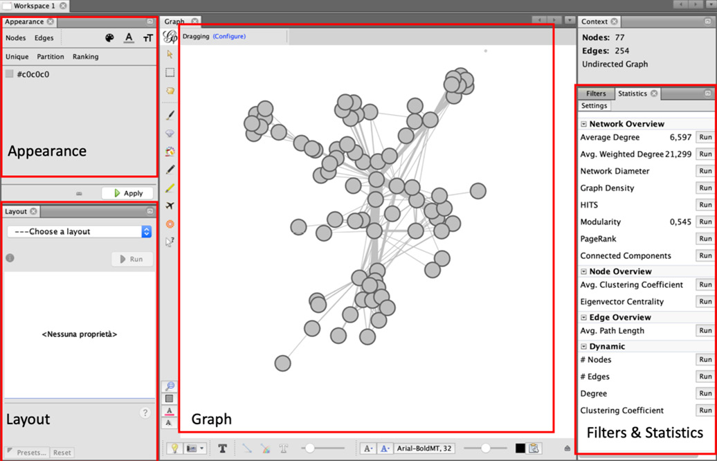
Figure 1.10 – Gephi main window
Our exploration of Gephi starts with the application of different layouts to the graph. As previously described, in networkx the layouts allow us to assign to each node a specific position in the final plot. In Gephi 1.2, different layouts are available. In order to apply a specific layout, we have to select from the Layout area one of the available layouts, and then click on the Run button that appears after the selection.
The graph representation, visible in the Graph area, will be automatically updated according to the new coordinates defined by the layout. It should be noted that some layouts are parametric, hence the final graph plot can significantly change according to the parameters used. In the following screenshot, we propose several examples for the application of three different layouts:
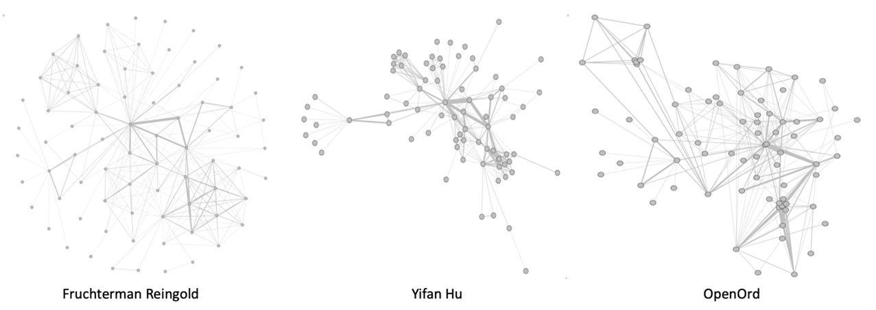
Figure 1.11 – Plot of the same graph with different layout
We will now introduce the available options in the Appearance menu visible in Figure 1.10. In this section, it is possible to specify the style to be applied to edges and nodes. The style to be applied can be static or can be dynamically defined by specific properties of the nodes/edges. We can change the color and the size of the nodes by selecting the Nodes option in the menu.
In order to change the color, we have to select the color palette icon and decide, using the specific button, if we want to assign a Unique color, a Partition (discrete values), or a Ranking (range of values) of colors. For Partition and Ranking, it is possible to select from the drop-down menu a specific Graph property to use as reference for the color range. Only the properties computed by clicking Run in the Statistics area are available in the drop-down menu. The same procedure can be used in order to set the size of the nodes. By selecting the concentric circles icon, it is possible to set a Unique size to all the nodes or to specify a Ranking of size according to a specific property.
As for the nodes, it is also possible to change the style of the edges by selecting the Edges option in the menu. We can then select to assign a Unique color, a Partition (discrete values), or a Ranking (range of values) of colors. For Partition and Ranking, the reference value to build the color scale is defined by a specific Graph property that can be selected from the drop-down menu.
It is important to remember that in order to apply a specific style to the graph, the Apply button should be clicked. As a result, the graph plot will be updated according to the style defined. In the following screenshot, we show an example where the color of the nodes is given by the Modularity Class value and the size of each node is given by its degree, while the color of each edge is defined by the edge weight:
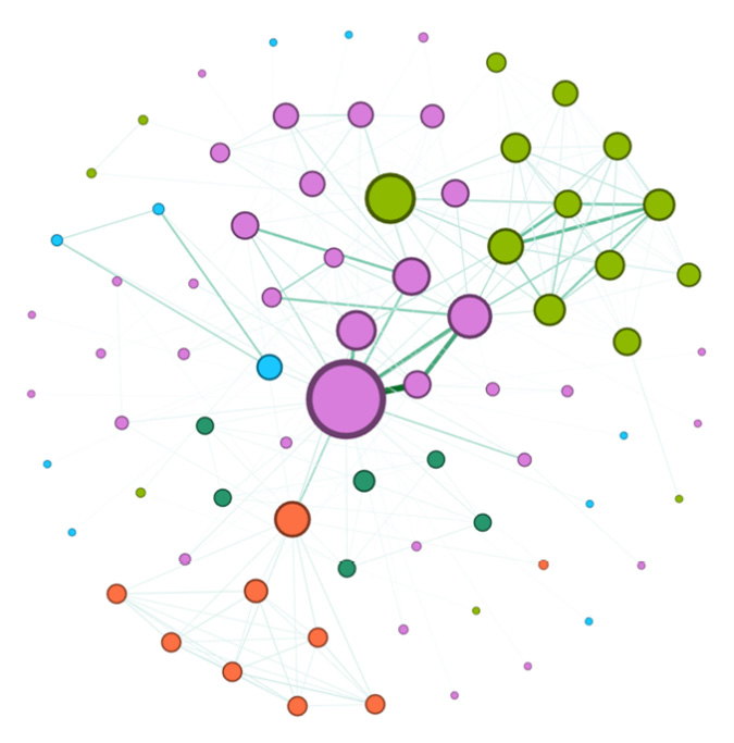
Figure 1.12 – Example of graph plot changing nodes' and edges' appearance
Another important section that needs to be described is Filters & Statistics. In this menu, it is possible to compute some statistics based on graph metrics.
Finally, we conclude our discussion on Gephi by introducing the functionalities available in the Statistics menu, visible in the right panel in Figure 1.10. Through this menu, it is possible to compute different statistics on the input graph. Those statistics can be easily used to set some properties of the final plot, such as nodes'/edges' color and size, or to filter the original graph to plot just a specific subset of it. In order to compute a specific statistic, the user then needs to explicitly select one of the metrics available in the menu and click on the Run button (Figure 1.10, right panel).
Moreover, the user can select a subregion of the graph, using the options available in the Filters tab of the Statistics menu, visible in the right panel in Figure 1.10. An example of filtering a graph can be seen in Figure 1.13. To provide more details of this, we build and apply to the graph a filter, using the Degree property. The result of the filters is a subset of the original graph, where only the nodes (and their edges) having the specific range of values for the degree property are visible.
This is illustrated in the following screenshot:
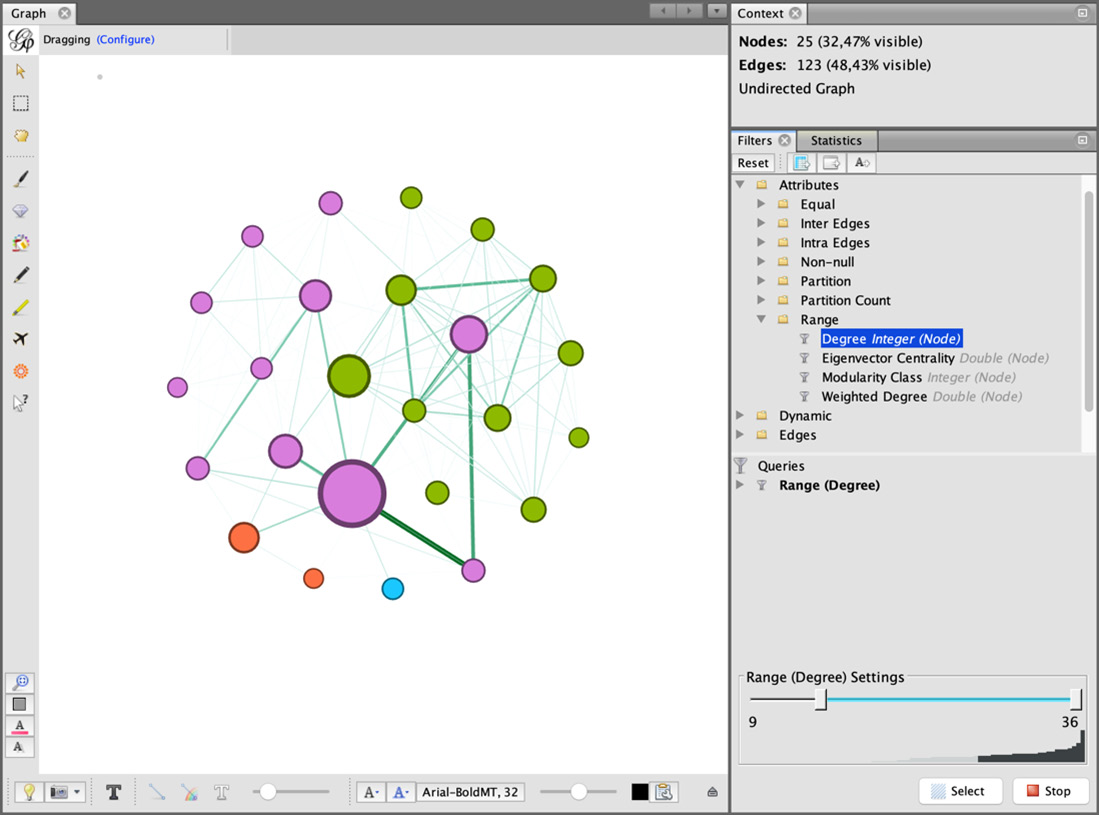
Figure 1.13 – Example of a graph filtered according to a range of values for Degree
Of course, Gephi allows us to perform more complex visualization tasks and contains a lot of functionalities that cannot be fully covered in this book. Some good references to better investigate all the features available in Gephi are the official Gephi guide (https://gephi.org/users/) or the Gephi Cookbook book by Packt Publishing.