Search icon CANCEL
Subscription
0
Cart icon
Your Cart (0 item)
Close icon
You have no products in your basket yet
Arrow left icon
Explore Products
Best Sellers
New Releases
Books
Videos
Audiobooks
Learning Hub
Free Learning
Arrow right icon
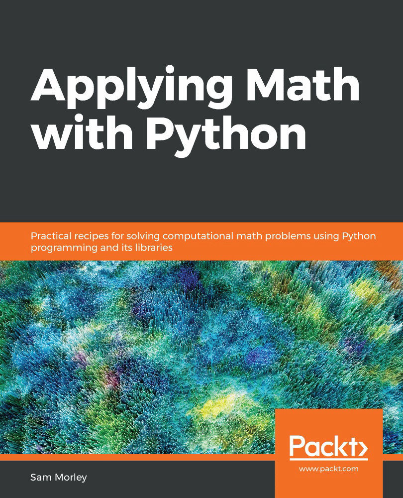
Applying Math with Python

Applying Math with Python: Practical recipes for solving computational math problems using Python programming and its libraries

eBook
₹799 ₹2323.99
Paperback
₹2904.99
Subscription
Free Trial
Renews at ₹800p/m

What do you get with eBook?

Product feature icon Instant access to your Digital eBook purchase
Product feature icon Download this book in EPUB and PDF formats
Product feature icon Access this title in our online reader with advanced features
Product feature icon DRM FREE - Read whenever, wherever and however you want
Product feature icon AI Assistant (beta) to help accelerate your learning
OR
Modal Close icon
Payment Processing...
tick Completed

Billing Address

Table of content icon View table of contents Preview book icon Preview Book

Applying Math with Python

Mathematical Plotting with Matplotlib

Plotting is a fundamental tool in all of mathematics. A good plot can reveal hidden details, suggest future directions, verify results, or reinforce an argument. It is no surprise, then, that the scientific Python stack features a powerful and flexible plotting library called Matplotlib.

In this chapter, we will plot functions and data in a variety of styles and create figures that are fully labeled and annotated. We will create three-dimensional plots, customize the appearance of figures, create figures that contain multiple plots using subplots, and save figures directly to files for applications that are not running in an interactive environment.

In this chapter, we will cover the following recipes:

  • Basic plotting with Matplotlib
  • Changing the plotting style
  • Adding labels and legends to plots
  • Adding subplots
  • Saving Matplotlib figures
  • Surface and contour plots
  • Customizing three-dimensional plots

Technical requirements

The main plotting package for Python is Matplotlib, which can be installed using your favorite package manager, such as pip:

          python3.8 -m pip install matplotlib
        

This will install the most recent version of Matplotlib, which, at the time of writing this book, is version 3.2.1.

Matplotlib contains numerous sub-packages, but the main user interface is the matplotlib.pyplotpackage, which, by convention, is imported under the pltalias. This is achieved using the following import statement:

import matplotlib.pyplot as plt

Many of the recipes in this chapter also require NumPy, which, as usual, is imported under the npalias.

The code for this chapter can be found in the Chapter 02 folder of the GitHub repository at https://github.com/PacktPublishing/Applying-Math-with-Python/tree/master/Chapter%2002.

Check out the following video to see the Code in Action: https://bit.ly/2ZOSuhs.

Basic plotting with Matplotlib

Plotting is an important part of understanding behavior. So much can be learned by simply plotting a function or data that would otherwise be hidden. In this recipe, we will walk through how to plot a simple function or data using Matplotlib.

Matplotlib is a very powerful plotting library, which means it can be rather intimidating to perform simple tasks with it. For users who are used to working with MATLAB and other mathematical software packages, there is a state-based interface called pyplot. There is also an object-orientated interface, which might be more appropriate for more complex plots. The pyplot interface is a convenient way to create basic objects.

Getting ready

Most commonly, the data that you wish to plot will be stored in two separate NumPy arrays, which we will label xand yfor clarity (although this naming does not matter in practice). We will demonstrate plotting the graph of a function, so we will generate an array of x values and use the function to generate the corresponding y values. We define the function that we will plot as follows:

def f(x):
return x*(x - 2)*np.exp(3 - x)

How to do it...

Before we can plot the function, we must generate the x and y data to be plotted. If you are plotting existing data, you can skip these commands. We need to create a set of the x values that cover the desired range, and then use the function to create the y values:

  1. The linspace routine from NumPy is ideal for creating arrays of numbers for plotting. By default, it will create 50 equally spaced points between the specified arguments. The number of points can be customized by providing an additional argument, but 50 is sufficient for most cases:
x = np.linspace(-0.5, 3.0)  # 100 values between -0.5 and 3.0
  1. Once we have created the x values, we can generate the y values:
y = f(x)  # evaluate f on the x points
  1. To plot the data, we simply need to call the plot function from the pyplot interface, which is imported under the plt alias. The first argument is the xdata and the second is the y data. The function returns a handle to the axes object on which the data is plotted:
plt.plot(x, y)
  1. This will plot the y values against the x values on a new figure. If you are working within IPython or with a Jupyter notebook, then the plot should automatically appear at this point; otherwise, you might need to call the plt.show function to make the plot appear:
plt.show()

If you use plt.show, the figure should appear in a new window. The resulting plot should look something like the plot in Figure 2.1. The default plot color might be different on your plot. It has been changed for high visibility for this book:

Figure 2.1: Plot of a function produced using Matplotlib without any additional styling parameters

We won't add this command to any further recipes in this chapter, but you should be aware that you will need to use it if you are not working in an environment where plots will be rendered automatically, such as an IPython console or Jupyter Notebook.

How it works...

If there are currently no Figure or Axes objects, the plt.plot routine creates a new Figure object, adds a new Axes object to the figure, and populates this Axes object with the plotted data. A list of handles to the plotted lines is returned. Each of these handles is a Lines2D object. In this case, this list will contain a single Lines2D object. We can use this Lines2D object to customize the appearance of the line later (see the Changing the plotting style recipe).

The object layer of Matplotlib interacts with a lower-level backend, which does the heavy lifting of producing the graphical plot. The plt.show function issues an instruction to the backend to render the current figure. There are a number of backends that can be used with Matplotlib, which can be customized by setting the MPLBACKEND environment variable, modifying the matplotlibrc file, or by calling matplotlib.use from within Python with the name of an alternative backend.

The plt.show function does more than simply call the show method on a figure. It also hooks into an event loop to correctly display the figure. The plt.show routine should be used to display a figure, rather than the show method on a Figure object.

There's more...

It is sometimes useful to manually instantiate a Figure object prior to calling the plot routine—for instance, to force the creation of a new figure. The code in this recipe could instead have been written as follows:

fig = plt.figure()  # manually create a figure
lines = plt.plot(x, y) # plot data

The plt.plot routine accepts a variable number of positional inputs. In the preceding code, we supplied two positional arguments that were interpreted as x values and y values (in that order). If we had instead provided only a single array, the plot routine would have plotted the values against their position in the array; that is, the x values are taken to be 0, 1, 2, and so on. We could also supply multiple pairs of arrays to plot several sets of data on the same axes:

x = np.linspace(-0.5, 3.0)
lines = plt.plot(x, f(x), x, x**2, x, 1 - x)

The output of the preceding code is as follows:

Figure 2.2: Multiple plots on a single figure, produced using a single call to the plot routine in Matplotlib

It is occasionally useful to create a new figure and explicitly create a new set of axes in this figure together. The best way to accomplish this is to use the subplots routine in the pyplot interface (refer to the Adding subplots recipe). This routine returns a pair, where the first object is Figure and the second is an Axes object:

fig, ax = plt.subplots()
l1 = ax.plot(x, f(x))
l2 = ax.plot(x, x**2)
l3 = ax.plot(x, 1 - x)

This sequence of commands produces the same plot as the preceding one displayed in Figure 2.2.

Matplotlib has many other plotting routines besides the plot routine described here. For example, there are plotting methods that use a different scale for the axes, including the logarithmic x or y axes separately (semilogx or semilogy, respectively) or together (loglog). These are explained in the Matplotlib documentation.

Changing the plotting style

The basic style of Matplotlib plots is fine for plotting functions or data that is ordered, but it is less appropriate for plotting discrete data that is not presented in any order. To prevent Matplotlib from drawing lines between each data point, we can change the plotting style to "turn off" the line drawing. In this recipe, we will customize the plotting style for each line on the axes by adding a format string argument to the plot method.

Getting ready

You will need to have your data stored in pairs of arrays. For the purposes of this demonstration, we will define the following data:

y1 = np.array([1.0, 2.0, 3.0, 4.0, 5.0])
y2 = np.array([1.2, 1.6, 3.1, 4.2, 4.8])
y3 = np.array([3.2, 1.1, 2.0, 4.9, 2.5])

We will plot these points against their position in the array (that is, the x coordinate will be 0, 1, 2, 3, or 4, respectively, for each array).

How to do it...

The easiest way to control the style of a plot is to use a format string, which is provided as an optional argument after the x-y pair or the ydata in the plot command. When plotting multiple sets of data, a different format string can be provided for each set of arguments. The following steps give a general procedure for creating a new figure and plotting data on this figure:

  1. We first create the Figure and Axes objects explicitly using the subplots routine from pyplot:
fig, ax = plt.subplots()
  1. Now that we have created the Figure and Axes objects, we can plot the data using the plot method on the Axes object. This method takes the same arguments as the plot routine from pyplot:
lines = ax.plot(y1, 'o', y2, 'x', y3, '*')

This plots the first dataset (y1) with a circle marker, the second (y2) with an x marker, and the third (y3) with a star (*) marker. The output of this command is shown in Figure 2.3. The format string can specify a number of different marker lines and color styles. The same applies if we instead used the plot routine from the pyplot interface, which has the same calling signature as the plot method:

Figure 2.3: Plot of three sets of data, each plotted using a different marker style

How it works...

The format string has three optional parts, each consisting of one or more characters. The first part controls the marker style, which is the symbol that is printed at each data point; the second controls the style of the line that connects the data points; and the third controls the color of the plot. In this recipe, we onlyspecified the marker style, which means that no connecting line is drawn between adjacent data points. This is useful for plotting discrete data where no interpolation between points is necessary. Four line style parameters are available: a solid line (-); a dashed line (--); a dash-dot line (-.); or a dotted line (:). Only a limited number of colors can be specified in the format string; they are red, green, blue, cyan, yellow, magenta, black, and white. The character used in the format string is the first letter of each color (with the exception of black), so the corresponding characters arer, g, b, c, y,m, k, and w, respectively.

For example, if we want to change the marker style only, as we did in this recipe, to a plus character, we would use the "+"format string. If we also want to change the line style to a dash-dot line, we would use the "+-."format string. Finally, if we also wish to change the color of the marker to red, we would use the "+-.r"format string. These specifiers can also be provided in other configurations, such as specifying the color before the marker style, but this might lead to ambiguities in the way Matplotlib parses the format string.

If you are using a Jupyter notebook and the subplots command, you must include the call to subplots within the same cell as the plotting commands or the figure will not be produced.

There's more...

The plot method also accepts a number of keyword arguments that can also be used to control the style of a plot. Keyword arguments take precedence over format string parameters if both are present, and they apply to all sets of data plotted by the call. The keyword to control the marker style is marker, the keyword for the line style is linestyle, and the keyword for color is color. The color keyword argument accepts a number of different formats to specify a color, which includes RGB values as a (r, g, b)tuple, where each character is a float between 0 and 1 or is a hex string. The width of the line plotted can be controlled using the linewidthkeyword, which should be provided with afloat value. There are many other keyword arguments that can be passed to plot; a list is given in the Matplotlib documentation. Many of these keyword arguments have a shorter version, such as c for color and lw for linewidth.

For example, we could set the color of all of the markers in the recipe by using the color keyword argument in the call to plot using the following command:

ax.plot(y1, 'o', y2, 'x', y3, '*', color="k")

The Line2D objects returned from calls to the plot method (or the plt.plot routine) can also be used to customize the appearance of each set of data. For example, the set_linestyle method in a Line2D object can be used, with the appropriate line style format string, to set the line style.

Other aspects of the plot can be customized by using methods on the Axes object. The axes ticks can be modified using the set_xticks and set_yticks methods on the Axes object, and the grid appearance can be configured using the grid method. There are also convenient methods in the pyplot interface that apply these modifications to the current axes (if they exist).

For example, we modify the axis limits, set the ticks at every multiple of 0.5 in both the x and y direction, and add a grid to the plot by using the following commands:

ax.axis([-0.5, 5.5, 0, 5.5]) # set axes
ax.set_xticks([0.5*i for i in range(9)]) # set xticks
ax.set_yticks([0.5*i for i in range(11)] # set yticks
ax.grid() # add a grid

Notice how we set the limits slightly larger than the extent of the plot. This is to avoid markers being placed on the boundary of the plot window.

The scatter plotting routine may be better if you wish to plot discrete data on axes without connecting the points with a line. This allows more control over the style of the marker. For example, you can scale the marker according to some additional information.

Adding labels and legends to plots

Every plot should have a title, and the axes should be properly labeled. For plots displaying multiple sets of data, legends are a good way to help the reader quickly identify the marker, the line, and the color of different datasets. In this recipe, we will add axes labels and a title to a plot, and then add a legend to help distinguish between the different sets of data. To keep the code simple, we will plot the data from the previous recipe.

How to do it...

Follow these steps to add labels and a legend to your plots to help distinguish the sets of data that they represent:

  1. We first recreate the plot from the previous recipe using the following plot command:
fig, ax = plt.subplots()
ax = ax.plot(y1, "o-", y2, "x--", y3, "*-.")
  1. Now, we have a reference to the Axes object on which our data is plotted, and so we can start to customize these axes by adding labels and titles. The title and axes labels can be added to a figure by using the set_title, set_xlabel, and set_ylabel methods on the ax object created by the subplots routine. In each case, the argument is a string that contains the text to be displayed:
ax.set_title("Plot of the data y1, y2, and y3")
ax.set_xlabel("x axis label")
ax.set_ylabel("y axis label")

Here, we plot the three datasets with a different style. The marker style is the same as in the previous recipe, but we have added a solid line for the first dataset, a dashed line for the second, and a dash-dot line for the third.

  1. To add a legend, we call the legend method on the ax object. The argument should be a tuple or list containing the description to be placed in the legend for each set of data:
ax.legend(("data y1", "data y2", "data y3"))

The result of the preceding sequence of commands is shown here:

Figure 2.4: A plot with axes labels, a title, and a legend produced using Matplotlib

How it works...

The set_title, set_xlabel, and set_ylabel methods simply add the text argument to the corresponding position of the Axes object. The legend method, as called in the preceding code, adds the labels to the datasets in the order that they were added to the plot—in this case, y1, y2, and then y3.

There are a number of keyword arguments that can be supplied to the set_title, set_xlabel, and set_ylabelroutines to control the style of the text. For example, the fontsizekeyword can be used to specify the size of the label font in the usual ptpoint measure. The text argument can also be rendered using TeX for additional formatting by supplying usetex=Trueto the routine. The TeX formatting of labels is demonstrated in Figure 2.5. This is especially useful if the title or axis label contains a mathematical formula. Unfortunately, the usetexkeyword argument cannot be used if TeX is not installed on the system—it will cause an error in this case. However, it is still possible to use the TeX syntax for formatting mathematical text within labels, but this will be typeset by Matplotlib, rather than by TeX.

We can use a different font by using the fontfamily keyword, the value of which can be the name of a font or serif, sans-serif, or monospace, which will choose the appropriate built-in font. A complete list of modifiers can be found in the Matplotlib documentation for the matplotlib.text.Text class.

To add separate text annotations to a plot, you can use the annotate method on the Axes object. This routine takes two arguments—the text to display as a string and the coordinates of the point at which the annotation should be placed. This routine also accepts the previously mentioned styling keyword arguments.

Adding subplots

Occasionally, it is useful to place multiple related plots within the same figure side by side but not on the same axes. Subplots allow us to produce a grid of individual plots within a single figure. In this recipe, we will see how to create two plots side by side on a single figure using subplots.

Getting ready

You will need the data to be plotted on each subplot. As an example, we will plot the first five iterates of Newton's method applied to the f(x) = x2-1functionwith an initial value of x0 = 2on the first subplot, and for the second, we will plot the error of the iterate. We first define a generator function to get the iterates:

def generate_newton_iters(x0, number):
iterates = [x0]
errors = [abs(x0 - 1.)]
for _ in range(number):
x0 = x0 - (x0*x0 - 1.)/(2*x0)
iterates.append(x0)
errors.append(abs(x0 - 1.))
return iterates, errors

This routine generates two lists. The first list contains iterates of Newton's method applied to the function, and the second contains the error in the approximation:

iterates, errors = generate_newton_iters(2.0, 5)

How to do it...

The following steps show how to create a figure that contains multiple subplots:

  1. We use the subplots routine to create a new figure and references to all of the Axes objects in each subplot, arranged in a grid with one row and two columns. We also set the tight_layout keyword argument to True to fix the layout of the resulting plots. This isn't strictly necessary, but it is in this case as it produces a better result than the default:
fig, (ax1, ax2) = plt.subplots(1, 2, tight_layout=True) # 1 row, 2 columns

  1. Once the Figure and Axes objects are created, we can populate the figure by calling the relevant plotting method on each Axes object. For the first plot (displayed on the left), we use the plot method on the ax1 object, which has the same signature as the standard plt.plot routine. We can then call the set_title, set_xlabel, and set_ylabel methods on ax1 to set the title and the x and ylabels. We also use TeX formatting for the axes labels by providing the usetex keyword argument; you can ignore this if you don't have TeX installed on your system:
ax1.plot(iterates, "x")
ax1.set_title("Iterates")
ax1.set_xlabel("$i$", usetex=True)
ax1.set_ylabel("$x_i$", usetex=True)
  1. Now, we can plot the error values on the second plot (displayed on the right) using the ax2 object. We use an alternative plotting method that uses a logarithmic scale on the y-axis, called semilogy. The signature for this method is the same as the standard plot method. Again, we set the axes labels and the title. Again, the use of usetex can be left out if you don't have TeX installed:
ax2.semilogy(errors, "x") # plot y on logarithmic scale
ax2.set_title("Error")
ax2.set_xlabel("$i$", usetex=True)
ax2.set_ylabel("Error")

The result of this sequence of commands is shown here:

Figure 2.5: Matplotlib subplots

The left-hand side plots the first five iterates of Newton's method and the right-hand side is the approximation error plotted on a logarithmic scale.

How it works...

A Figure object in Matplotlib is simply a container for plot elements, such as Axes, of a certain size. A Figure object will usually onlyhold a single Axesobject, which occupies the entire figure area, but it can contain any number of Axesobjects in the same area. The subplotsroutine does several things. It first creates a new figure and then creates a grid with the specified shape in the figure area. Then, a new Axesobject is added to each position of the grid. The new Figureobject and one or more Axesobjects are then returned to the user. If a single subplot is requested (one row and one column, with no arguments) then a plainAxesobject is returned. If a single row or column is requested (with more than one column or row, respectively), then a list of the Axesobjects is returned. If more than one row and column is requested, a list of lists, with rows represented by inner lists filled with the Axesobjects, will be returned. We can then use the plotting methods on each of the Axesobjects to populate the figure with the desired plots.

In this recipe, we used the standard plot method for the left-hand side plot, as we have seen in previous recipes. However, for the right-hand side plot, we used a plot where the y-axis had been changed to a logarithmic scale. This means that each unit on the y-axis represents a change of a power of 10, rather than a change of one unit, so that 0 represents 100 = 1, 1 represents 10, 2 represents 100, and so on. The axes labels are automatically changed to reflect this change in scale. This type of scaling is useful when the values change by an order of magnitude, such as the error in an approximation, as we use more and more iterations. We can also plot with a logarithmic scale for x only by using the semilogx method, or both axes on a logarithmic scale by using the loglog method.

There's more...

There are several ways to create subplots in Matplotlib. If you have already created a Figure object, then subplots can be added using the add_subplot method of the Figure object. Alternatively, you can use the subplot routine from matplotlib.pyplot to add subplots to the current figure. If one does not yet exist, it will be created when this routine is called. The subplot routine is a convenience wrapper of the add_subplot method on the Figure object.

To create a new figure with one or more subplots, you can also use the subplots routine from the pyplot interface—as we saw in the Changing the plotting style recipe—which returns a new figure object and an array of the Axes objects, one for each position. All three of these methods require the number of rows and columns for the subplot matrix. The add_subplot method and the subplot routine also require a third argument, which is the index of the subplot to modify. The Axes object of the current subplot is returned.

In the preceding example, we created two plots with differently scaled y-axes. This demonstrates one of the many possible uses of subplots. Another common use is for plotting data in a matrix where columns have a common x label and rows have a common y label, which is especially common in multivariate statistics when investigating the correlation between various sets of data. The plt.subplots routine for creating subplots accepts the sharex and shareykeyword parameters, which allows the axes to be shared among all the subplots or among a row or column. This setting affects the scale and ticks of the axes.

See also

Matplotlib supports more advanced layouts by providing the gridspec_kw keyword arguments to the subplots routine. See the documentation for matplotlib.gridspec for more information.

Saving Matplotlib figures

When you work in an interactive environment, such as an IPython console or a Jupyter notebook, displaying a figure at runtime is perfectly normal. However, there are plenty of situations where it would be more appropriate to store a figure directly to a file, rather than rendering it on screen. In this recipe, we will see how to save a figure directly to a file, rather than displaying it on screen.

Getting ready

You will need the data to be plotted and the path or file object in which you wish to store the output. We store the result in savingfigs.png in the current directory. In this example, we will plot the following data:

x = np.arange(1, 5, 0.1)
y = x*x

How to do it...

The following steps show how to save a Matplotlib plot directly to a file:

  1. The first step is to create the figure, as usual, and add any labels, titles, and annotations that are necessary. The figure will be written to the file in its current state, so any changes to the figure should be made before saving:
fig, ax = plt.subplots()
ax.plot(x, y)
ax.set_title("Graph of $y = x^2$", usetex=True)
ax.set_xlabel("$x$", usetex=True)
ax.set_ylabel("$y$", usetex=True)
  1. Then, we use the savefigmethod on fig to save this figure to a file. The only required argument is the path to output to or a file-like object that the figure can be written to. We can adjust various settings for the output format, such as the resolution, by providing the appropriate keyword arguments. We'll set the Dots per Inch (DPI) of the output figure to 300, which is a reasonable resolution for most applications:
fig.savefig("savingfigs.png", dpi=300)

Matplotlib will infer that we wish to save the image in the Portable Network Graphics (PNG) format from the extension of the file given. Alternatively, a format can be explicitly provided as a keyword argument (by using the formatkeyword), or it will fall back to the default from the configuration file.

How it works...

The savefig method chooses the appropriate backend for the output format and then renders the current figure in that format. The resulting image data is written to the specified path or file-like object. If you have manually created a Figure instance, the same effect can be achieved by calling the savefig method on that instance.

There's more...

The savefig routine takes a number of additional optional keyword arguments to customize the output image. For example, the resolution of the image can be specified using the dpi keyword. The plots in this chapter have been produced by saving the Matplotlib figures to the file.

The output formats available include PNG, Scalable Vector Graphics (SVG), PostScript (PS), Encapsulated PostScript (EPS), and Portable Document Format (PDF). You can also save to JPEG format if the Pillow package is installed, but Matplotlib does not support this natively since version 3.1. There are additional customization keyword arguments for JPEG images, such as quality and optimize. A dictionary of image metadata can be passed to the metadata keyword, which will be written as image metadata when saving.

See also

The examples gallery on the Matplotlib website includes examples of embedding Matplotlib figures into a Graphical User Interface (GUI) application using several common Python GUI frameworks.

Surface and contour plots

Matplotlib can also plot three-dimensional data in a variety of ways. Two common choices for displaying data like this are by using surface plots or contour plots (think of contour lines on a map). In this recipe, we will see a method for plotting surfaces from three-dimensional data and how to plot contours of three-dimensional data.

Getting ready

To plot three-dimensional data, it needs to be arranged into two-dimensional arrays for the x, y, and z components, where both the x and y components must be of the same shape as the z component. For the sake of this demonstration, we will plot the surface corresponding to the f(x, y) = x2y3function.

How to do it...

We want to plot the f(x, y) = x2y3functionon the -2 ≤ x ≤ 2 and -1 ≤ y ≤ 1range. The first task is to create a suitable grid of (x, y) pairs on which to evaluate this function:

  1. We first use np.linspaceto generate a reasonable number of points in these ranges:
X = np.linspace(-2, 2)
Y = np.linspace(-1, 1)

  1. Now, we need to create a grid on which to create our zvalues. For this, we use the np.meshgridroutine:
x, y = np.meshgrid(X, Y)
  1. Now, we can create the zvalues to plot, which hold the value of the function at each of the grid points:
z = x**2 * y**3
  1. To plot three-dimensional surfaces, we need to load a Matplotlib toolbox, mplot3d, which comes with the Matplotlib package. This won't be used explicitly in the code, but behind the scenes, it makes the three-dimensional plotting utilities available to Matplotlib:
from mpl_toolkits import mplot3d
  1. Next, we create a new figure and a set of three-dimensional axes for the figure:
fig = plt.figure()
ax = fig.add_subplot(projection="3d") # declare 3d plot
  1. Now, we can call the plot_surface method on these axes to plot the data:
ax.plot_surface(x, y, z)
  1. It is extra important to add axis labels to three-dimensional plots because it might not be clear which axis is which on the displayed plot:
ax.set_xlabel("$x$")
ax.set_ylabel("$y$")
ax.set_zlabel("$z$")
  1. We should also set a title at this stage:
ax.set_title("Graph of the function $f(x) = x^2y^3$)

You can use the plt.show routine to display the figure in a new window (if you are using Python interactively and not in a Jupyter notebook or on an IPython console) or plt.savefig to save the figure to a file. The result of the preceding sequence is shown here:

Figure 2.6: A three-dimensional surface plot produced with Matplotlib using the default settings
  1. Contour plots do not require the mplot3d toolkit, and there is a contour routine in the pyplot interface that produces contour plots. However, unlike the usual (two-dimensional) plotting routines, the contour routine requires the same arguments as the plot_surface method. We use the following sequence to produce a plot:
fig = plt.figure()  # Force a new figure
plt.contour(x, y, z)
plt.title("Contours of $f(x) = x^2y^3$")
plt.xlabel("$x$")
plt.ylabel("$y$")

The result is shown in the following plot:

Figure 2.7: Contour plot produced using Matplotlib with the default settings

How it works...

The mplot3d toolkit provides an Axes3D object, which is a three-dimensional version of the Axes object in the core Matplotlib package. This is made available to the axes method on a Figure object when the projection="3d" keyword argument is given. A surface plot is obtained by drawing quadrilaterals, in the three-dimensional projection, between nearby points in the same way that a two-dimensional curve is approximated by straight lines joining adjacent points.

The plot_surface method needs the z values to be provided as a two-dimensional array that encodes the z values on a grid of (x, y) pairs. We created the range of x and y values that we are interested in, but if we simply evaluate our function on the pairs of corresponding values from these arrays, we will get the z values along a line and not over a grid. Instead, we use the meshgrid routine, which takes the two X and Yarrays and creates from them a grid consisting of all the possible combinations of values in Xand Y. The output is a pair of two-dimensional arrays on which we can evaluate our function. We can then provide all three of these two-dimensional arrays to the plot_surfacemethod.

There's more...

The routines described in the preceding section, contour and plot_contour, only work with highly structured data where the x, y, and z components are arranged into grids. Unfortunately, real-life data is rarely so structured. In this case, you need to perform some kind of interpolation between known points to approximate the value on a uniform grid, which can then be plotted. A common method for performing this interpolation is by triangulating the collection of (x, y) pairs and then using the values of the function on the vertices of each triangle to estimate the value on the grid points. Fortunately, Matplotlib has a method that does all of these steps and then plots the result, which is the plot_trisurf routine. We briefly explain how this can be used here:

  1. To illustrate the use of plot_trisurf, we will plot a surface and contours from the following data:
x = np.array([ 0.19, -0.82, 0.8 , 0.95, 0.46, 0.71, 
-0.86, -0.55, 0.75,-0.98, 0.55, -0.17, -0.89,
-0.4 , 0.48, -0.09, 1., -0.03, -0.87, -0.43])
y = np.array([-0.25, -0.71, -0.88, 0.55, -0.88, 0.23,
0.18,-0.06, 0.95, 0.04, -0.59, -0.21, 0.14, 0.94,
0.51, 0.47, 0.79, 0.33, -0.85, 0.19])
z = np.array([-0.04, 0.44, -0.53, 0.4, -0.31, 0.13,
-0.12, 0.03, 0.53, -0.03, -0.25, 0.03, -0.1 ,
-0.29, 0.19, -0.03, 0.58, -0.01, 0.55, -0.06])
  1. This time, we will plot both the surface and contour(approximations) on the same figure as two separate subplots. For this, we supply the projection="3d" keyword argument to the subplot that will contain the surface. We use the plot_trisurf method on the three-dimensional axes to plot the approximated surface, and the tricontour method on the two-dimensional axes to plot the approximated contours:
fig = plt.figure(tight_layout=True)  # force new figure
ax1 = fig.add_subplot(1, 2, 1, projection="3d") # 3d axes
ax1.plot_trisurf(x, y, z)
ax1.set_xlabel("$x$")
ax1.set_ylabel("$y$")
ax1.set_zlabel("$z$")
ax1.set_title("Approximate surface")
  1. We can now plot the contours for the triangulated surface using the following command:
ax2 = fig.add_subplot(1, 2, 2)  # 2d axes
ax2.tricontour(x, y, z)
ax2.set_xlabel("$x$")
ax2.set_ylabel("$y$")
ax2.set_title("Approximate contours")

We include the tight_layout=Truekeyword argument with the figure to save a call to the plt.tight_layoutroutine later. The result is shown here:

Figure 2.8: Approximate surface and contour plots generated from unstructured data using triangulation

In addition to surface plotting routines, the Axes3D object has a plot (or plot3D) routine for simple three-dimensional plotting, which works exactly as the usual plot routine but on the three-dimensional axes. This method can also be used to plot two-dimensional data on one of the axes.

Customizing three-dimensional plots

Contour plots can hide some detail of the surface that they represent since they only show where the "height" is similar and not what the value is, even in relation to the surrounding values. On a map, this is remedied by printing the height onto certain contours. Surface plots are more revealing, but the problem of projecting three-dimensional objects into 2D to be displayed on a screen can itself obscure some details. To address these issues, we can customize the appearance of a three-dimensional plot (or contour plot) to enhance the plot and make sure the detail that we wish to highlight is clear. The easiest way to do this is by changing the colormap of the plot.

In this recipe, we will use the reverse of the binary colormap.

Getting ready

We will generate surface plots for the following function:

We generate the points at which this should be plotted as in the previous recipe:

X = np.linspace(-2, 2)
Y = np.linspace(-2, 2)
x, y = np.meshgrid(X, Y)
t = x**2 + y**2 # small efficiency
z = np.cos(2*np.pi*t)*np.exp(-t)

How to do it...

Matplotlib has a number of built-in colormaps that can be applied to plots. By default, surface plots are plotted with a single color that is shaded according to a light source (see the There's more... section of this recipe). A colormap can dramatically improve the effect of a plot. The following steps show how to add a colormap to surface and contour plots:

  1. To start, we simply apply one of the built-in colormaps, binary_r, which is done by providing the cmap="binary_r" keyword argument to the plot_surface routine:
fig = plt.figure()
ax = fig.add_subplot(projection="3d")
ax.plot_surface(x, y, z, cmap="binary_r")
ax.set_title("Surface with colormap")
ax.set_xlabel("$x$")
ax.set_ylabel("$y$")
ax.set_zlabel("$z$")

The result is a figure (Figure 2.9) where the surface is colored according to its value, with the most extreme values at either end of the colormap—in this case, the larger the z value, the lighter the shade of gray. Note that the jaggedness of the plot in the following diagram is due to the relatively small number of points in the mesh grid:

Figure 2.9: A surface plot with a grayscale colormap applied

Colormaps apply to other plot types in addition to surface plots. In particular, colormaps can be applied to contour plots, which can help to distinguish between the contours that represent higher values and those that represent lower values.

  1. For the contour plot, the method for changing the colormap is the same; we simply specify a value for the cmap keyword argument:
fig = plt.figure()
plt.contour(x, y, z, cmap="binary_r")
plt.xlabel("$x$")
plt.ylabel("$y$")
plt.title("Contour plot with colormap set")

The result of the preceding code is shown here:

Figure 2.10: A contour plot with an alternative colormap set

The darker shades of gray in the diagram correspond to the lower values of z.

How it works...

Color mapping works by assigning an RGB value according to a scale—the colormap. First, the values are normalized so that they lie between 0 and 1, which is typically done by a linear transformation that takes the minimum value to 0 and the maximum value to 1. The appropriate color is then applied to each face of the surface plot (or line, in another kind of plot).

Matplotlib comes with a number of built-in colormaps that can be applied by simply passing the name to the cmapkeyword argument. A list of these colormaps is given in the documentation (https://matplotlib.org/tutorials/colors/colormaps.html), and also comes with a reversed variant, which is obtained by adding the _rsuffix to the name of the chosen colormap.

There's more...

The normalization step in applying a colormap is performed by an object derived from the Normalize class. Matplotlib provides a number of standard normalization routines, including LogNorm and PowerNorm. Of course, you can also create your own subclass of Normalize to perform the normalization. An alternative Normalize subclass can be added using the norm keyword of plot_surface or other plotting functions.

For more advanced uses, Matplotlib provides an interface for creating custom shading using light sources. This is done by importing the LightSource class from the matplotlib.colors package, and then using an instance of this class to shade the surface elements according to the z value. This is done using the shade method on the LightSource object:

from matplotlib.colors import LightSource
light_source = LightSource(0, 45) # angles of lightsource
cmap = plt.get_cmap("binary_r")
vals = light_source.shade(z, cmap)
surf = ax.plot_surface(x, y, z, facecolors=vals)

Complete examples are shown in the Matplotlib gallery should you wish to learn more about how this works.

Further reading

The Matplotlib package is extensive and we can scarcely do it justice in such a short space. The documentation contains far more detail than is provided here. Moreover, there is a large gallery (https://matplotlib.org/gallery/index.html#) of examples covering many more of the capabilities of the package than in this book.

There are other packages that build on top of Matplotlib that offer high-level plotting methods for specific applications. For example, the Seaborn libraries provide routines for visualizing data (https://seaborn.pydata.org/).

Left arrow icon Right arrow icon
Download code icon Download Code

Key benefits

  • Compute complex mathematical problems using programming logic with the help of step-by-step recipes
  • Learn how to utilize Python's libraries for computation, mathematical modeling, and statistics
  • Discover simple yet effective techniques for solving mathematical equations and apply them in real-world statistics

Description

Python, one of the world's most popular programming languages, has a number of powerful packages to help you tackle complex mathematical problems in a simple and efficient way. These core capabilities help programmers pave the way for building exciting applications in various domains, such as machine learning and data science, using knowledge in the computational mathematics domain. The book teaches you how to solve problems faced in a wide variety of mathematical fields, including calculus, probability, statistics and data science, graph theory, optimization, and geometry. You'll start by developing core skills and learning about packages covered in Python’s scientific stack, including NumPy, SciPy, and Matplotlib. As you advance, you'll get to grips with more advanced topics of calculus, probability, and networks (graph theory). After you gain a solid understanding of these topics, you'll discover Python's applications in data science and statistics, forecasting, geometry, and optimization. The final chapters will take you through a collection of miscellaneous problems, including working with specific data formats and accelerating code. By the end of this book, you'll have an arsenal of practical coding solutions that can be used and modified to solve a wide range of practical problems in computational mathematics and data science.

Who is this book for?

This book is for professional programmers and students looking to solve mathematical problems computationally using Python. Advanced mathematics knowledge is not a requirement, but a basic knowledge of mathematics will help you to get the most out of this book. The book assumes familiarity with Python concepts of data structures.

What you will learn

  • Get familiar with basic packages, tools, and libraries in Python for solving mathematical problems
  • Explore various techniques that will help you to solve computational mathematical problems
  • Understand the core concepts of applied mathematics and how you can apply them in computer science
  • Discover how to choose the most suitable package, tool, or technique to solve a certain problem
  • Implement basic mathematical plotting, change plot styles, and add labels to the plots using Matplotlib
  • Get to grips with probability theory with the Bayesian inference and Markov Chain Monte Carlo (MCMC) methods

Product Details

Country selected
Publication date, Length, Edition, Language, ISBN-13
Publication date : Jul 31, 2020
Length: 358 pages
Edition : 1st
Language : English
ISBN-13 : 9781838986568
Category :
Languages :

What do you get with eBook?

Product feature icon Instant access to your Digital eBook purchase
Product feature icon Download this book in EPUB and PDF formats
Product feature icon Access this title in our online reader with advanced features
Product feature icon DRM FREE - Read whenever, wherever and however you want
Product feature icon AI Assistant (beta) to help accelerate your learning
OR
Modal Close icon
Payment Processing...
tick Completed

Billing Address

Product Details

Publication date : Jul 31, 2020
Length: 358 pages
Edition : 1st
Language : English
ISBN-13 : 9781838986568
Category :
Languages :

Packt Subscriptions

See our plans and pricing
Modal Close icon
₹800 billed monthly
Feature tick icon Unlimited access to Packt's library of 7,000+ practical books and videos
Feature tick icon Constantly refreshed with 50+ new titles a month
Feature tick icon Exclusive Early access to books as they're written
Feature tick icon Solve problems while you work with advanced search and reference features
Feature tick icon Offline reading on the mobile app
Feature tick icon Simple pricing, no contract
₹4500 billed annually
Feature tick icon Unlimited access to Packt's library of 7,000+ practical books and videos
Feature tick icon Constantly refreshed with 50+ new titles a month
Feature tick icon Exclusive Early access to books as they're written
Feature tick icon Solve problems while you work with advanced search and reference features
Feature tick icon Offline reading on the mobile app
Feature tick icon Choose a DRM-free eBook or Video every month to keep
Feature tick icon PLUS own as many other DRM-free eBooks or Videos as you like for just ₹400 each
Feature tick icon Exclusive print discounts
₹5000 billed in 18 months
Feature tick icon Unlimited access to Packt's library of 7,000+ practical books and videos
Feature tick icon Constantly refreshed with 50+ new titles a month
Feature tick icon Exclusive Early access to books as they're written
Feature tick icon Solve problems while you work with advanced search and reference features
Feature tick icon Offline reading on the mobile app
Feature tick icon Choose a DRM-free eBook or Video every month to keep
Feature tick icon PLUS own as many other DRM-free eBooks or Videos as you like for just ₹400 each
Feature tick icon Exclusive print discounts

Frequently bought together


Stars icon
Total 9,086.97
Applying Math with Python
₹2904.99
The Statistics and Calculus with Python Workshop
₹2904.99
Hands-On Mathematics for Deep Learning
₹3276.99
Total 9,086.97 Stars icon
Banner background image

Table of Contents

11 Chapters
Basic Packages, Functions, and Concepts Chevron down icon Chevron up icon
Mathematical Plotting with Matplotlib Chevron down icon Chevron up icon
Calculus and Differential Equations Chevron down icon Chevron up icon
Working with Randomness and Probability Chevron down icon Chevron up icon
Working with Trees and Networks Chevron down icon Chevron up icon
Working with Data and Statistics Chevron down icon Chevron up icon
Regression and Forecasting Chevron down icon Chevron up icon
Geometric Problems Chevron down icon Chevron up icon
Finding Optimal Solutions Chevron down icon Chevron up icon
Miscellaneous Topics Chevron down icon Chevron up icon
Other Books You May Enjoy Chevron down icon Chevron up icon

Customer reviews

Rating distribution
Full star icon Full star icon Full star icon Full star icon Half star icon 4.3
(4 Ratings)
5 star 75%
4 star 0%
3 star 0%
2 star 25%
1 star 0%
Viktor Kis Aug 27, 2020
Full star icon Full star icon Full star icon Full star icon Full star icon 5
With a mechanical engineering background this was a 100% relatable python book for me. There are many intro to python books out there that lightly touch on a wide variety of topics for the hopes of engaging a wider audience; there will be topics of pandas and numpy followed by a chapter on web APIs. That might be great for someone that wants to know a little bit about everything but I found this book to be just right in terms of what was covered. Sure i could have bought a book just on pandas but exposure to sympy for symbolic math, scipy for integration and difEqs, matplotlib (networks), Bokeh for interactive plots was just want i wanted to see. I particularly liked the section on performance and using cython for speeding up your projects. The Monte Carlo estimating was great and also directly applicable to my work - it gave me some ideas to expand my project. The one issue i have run into in my projects is memory management, and i would have like to see some more suggestions on best practices for large projects. Overall solid book for folks working in the engineering field, and i am sure with all the examples listed it is very applicable to the financial and medical fields.
Amazon Verified review Amazon
Akul Sep 23, 2020
Full star icon Full star icon Full star icon Full star icon Full star icon 5
I bought an ebook version and it’s definitely worth reading. I am an ML Practitioner and sometimes I have to scroll through tons of web pages to find the right code for solving a math problem pertaining to optimization, linear algebra and calculus but with this book, everything seems straight forward and concise. It’s a great read for those who would like to understand the math behind ML and code in python.
Amazon Verified review Amazon
rami krispin Nov 28, 2020
Full star icon Full star icon Full star icon Full star icon Full star icon 5
The book provides a great introduction to Python math/stats functionality such as differential equations, probability, regression analysis, time series, and forecasting, etc. Highly recommended for R and stats people (like myself) that want to go deeper into Python.
Amazon Verified review Amazon
nh Feb 01, 2022
Full star icon Full star icon Empty star icon Empty star icon Empty star icon 2
I'm not sure about the contents - which at first glance seems a little superficial.But what is really poor is print quality. The are several pictures which are supposed to be in color, but are B&W instead.The book seems to be out of an old Xerox machine (or a poor laser office printer).Not the quality I was expecting, unfortunately.
Amazon Verified review Amazon
Get free access to Packt library with over 7500+ books and video courses for 7 days!
Start Free Trial

FAQs

How do I buy and download an eBook? Chevron down icon Chevron up icon

Where there is an eBook version of a title available, you can buy it from the book details for that title. Add either the standalone eBook or the eBook and print book bundle to your shopping cart. Your eBook will show in your cart as a product on its own. After completing checkout and payment in the normal way, you will receive your receipt on the screen containing a link to a personalised PDF download file. This link will remain active for 30 days. You can download backup copies of the file by logging in to your account at any time.

If you already have Adobe reader installed, then clicking on the link will download and open the PDF file directly. If you don't, then save the PDF file on your machine and download the Reader to view it.

Please Note: Packt eBooks are non-returnable and non-refundable.

Packt eBook and Licensing When you buy an eBook from Packt Publishing, completing your purchase means you accept the terms of our licence agreement. Please read the full text of the agreement. In it we have tried to balance the need for the ebook to be usable for you the reader with our needs to protect the rights of us as Publishers and of our authors. In summary, the agreement says:

  • You may make copies of your eBook for your own use onto any machine
  • You may not pass copies of the eBook on to anyone else
How can I make a purchase on your website? Chevron down icon Chevron up icon

If you want to purchase a video course, eBook or Bundle (Print+eBook) please follow below steps:

  1. Register on our website using your email address and the password.
  2. Search for the title by name or ISBN using the search option.
  3. Select the title you want to purchase.
  4. Choose the format you wish to purchase the title in; if you order the Print Book, you get a free eBook copy of the same title. 
  5. Proceed with the checkout process (payment to be made using Credit Card, Debit Cart, or PayPal)
Where can I access support around an eBook? Chevron down icon Chevron up icon
  • If you experience a problem with using or installing Adobe Reader, the contact Adobe directly.
  • To view the errata for the book, see www.packtpub.com/support and view the pages for the title you have.
  • To view your account details or to download a new copy of the book go to www.packtpub.com/account
  • To contact us directly if a problem is not resolved, use www.packtpub.com/contact-us
What eBook formats do Packt support? Chevron down icon Chevron up icon

Our eBooks are currently available in a variety of formats such as PDF and ePubs. In the future, this may well change with trends and development in technology, but please note that our PDFs are not Adobe eBook Reader format, which has greater restrictions on security.

You will need to use Adobe Reader v9 or later in order to read Packt's PDF eBooks.

What are the benefits of eBooks? Chevron down icon Chevron up icon
  • You can get the information you need immediately
  • You can easily take them with you on a laptop
  • You can download them an unlimited number of times
  • You can print them out
  • They are copy-paste enabled
  • They are searchable
  • There is no password protection
  • They are lower price than print
  • They save resources and space
What is an eBook? Chevron down icon Chevron up icon

Packt eBooks are a complete electronic version of the print edition, available in PDF and ePub formats. Every piece of content down to the page numbering is the same. Because we save the costs of printing and shipping the book to you, we are able to offer eBooks at a lower cost than print editions.

When you have purchased an eBook, simply login to your account and click on the link in Your Download Area. We recommend you saving the file to your hard drive before opening it.

For optimal viewing of our eBooks, we recommend you download and install the free Adobe Reader version 9.