Don’t Use a Vanity Splash Screen
The splash screen—the full-screen graphic that appears when your user opens your iOS or Android app—is a great place for your company logo, brand messaging, or corporate vision statement, right?
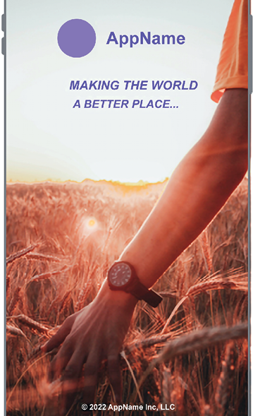
Figure 82.1: Splash screen (Photo by Artem on Unsplash)
No. Do not do this.
Users do not care about how you’re making the world a better place—they just want to open the app to do whatever it is the app does, and you’re just slowing them down by a few seconds every time.
Instead, look at the first screen of your app and offer a splash screen that echoes this layout, but without content. This is called a “skeleton screen” or “content skeleton,” as seen below:
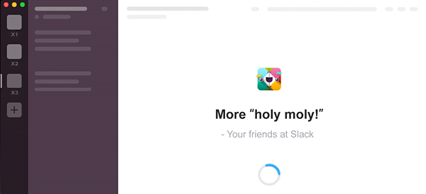
Figure 82.2: Slack makes great use of a content skeleton to get users straight into the product while it loads, rather than showing a vanity splash screen
Users will feel like the app is loading quicker...