Table-based layouts
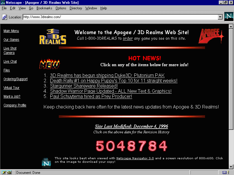
Web design became more interesting with the introduction of table markups in HTML. Web designers saw the opportunity to structure their design with the original table markup (sneaky as they always are). Sites were still text heavy, but at least they could separate the content into different columns, rows, and other navigation elements. The usage of spacer GIFs, introduced in David's Siegel's book Creating Killer Sites in 1996, allowed web designers to play with white space (basically, small transparent GIFs were placed in between the content), and by incorporating a sliced image background, users would have an illusion of a simple structure, whereas in reality there was a table layout behind it. Designers could finally play around with some graphic design elements as it grew rapidly in popularity, such as having visit counters, animated GIFs, and so on. Texts and images were literally dancing across websites everywhere.
We can see this in this website from 3drealms in 1996, which shows all the fancy elements designers used to add to their websites:
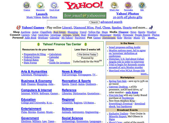
We can also see the evolution of the Yahoo web page in 2002:
