
For this example, we will use the Iris dataset. Iris is built into R installations and is available directly. Let's just pull in the data, gather some simple statistics, and plot the data. This will show R accessing a dataset in Jupyter, using an R built-in package, as well as some available statistics (since we have R), and the interaction with R graphics.
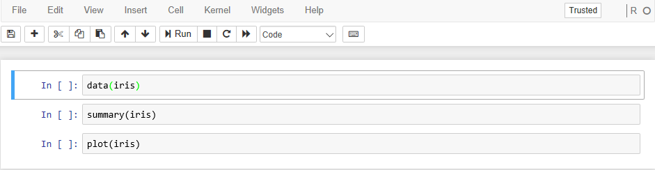
The script we will use is as follows:
data(iris)
summary(iris)
plot(iris)
If we enter this small script into a new R Notebook, we get an initial display that looks like the following:
I would expect the standard R statistical summary as output, and I know that the Iris plot is pretty interesting. We can see exactly what happened in the following screenshot:

The plot continues in the following screenshot, as it wouldn't fit into a single page: