Understanding the Flutter layout algorithm
In Flutter, the layout phase is an essential part of the widget-building process. It is during this phase that the engine calculates how the widgets are positioned and sized on the screen. The layout phase starts after the build process that we discussed in Chapter 1 is done and is followed by the painting and composition steps of the rendering pipeline.
This layout process is critical to the overall performance and user experience of the app. If the layout is incorrect, widgets may overlap or be positioned in unexpected locations on the screen, leading to a confusing and frustrating experience for the user.
In Flutter, the layout process is handled by the RenderObject class. Each RenderObjectWidget in the widget tree has a corresponding RenderObject that is responsible for handling the layout and rendering of that widget. The RenderObject calculates its size based on information provided by its parent RenderObject and the position of its child render objects. This information passed by the parent to its child is called constraints. Let’s learn why constraints are so important.
Understanding BoxConstraints
To understand the layout process, we first need to understand the concept of constraints. In Flutter, each widget has a set of constraints that define its minimum and maximum allowable size. While the abstract version of Constraints is not bound to anything and allows the implementer to be as creative as needed, it will be easier to understand constraints if we use a more concrete example. The BoxConstraints method is the implementation that describes the constraints based on the notion of a box that can have a minimum and maximum width and height. It is used for many, if not most, of the widgets that you will encounter. There are multiple possibilities for such constraints. For example, a widget could have a minimum 0 size and a maximum infinite size. To set such constraints, we would specify them in a BoxConstraints constructor like this:
BoxConstraints(
  minWidth: 0,
  minHeight: 0,
  maxWidth: double.infinity,
  maxHeight: double.infinity,
);
These constraints would mean that the sizing options are endless and that our widget is free to choose the size it wants. On the other hand, we could be more strict and force the widget to match only a specific size, with a width of 10 and a height of 20. The BoxConstraints need to be applied to a widget that accepts constraints as a parameter, such as ConstrainedBox. We can specify a colorful child, such as a ColoredBox. Our code would look like this:
lib/example_constraints.dart
void main() {
  runApp(
    MaterialApp(
      home: Scaffold(
        body: ConstrainedBox(
          constraints: BoxConstraints(
            minWidth: 10,
            minHeight: 20,
            maxWidth: 10,
            maxHeight: 20,
          ),
          child: ColoredBox(color: Colors.red),
        ),
      ),
    ),
  );
}
In this case, the widget will be forced to have a width of 10 and height of 20, with no other option, since the minimum allowed size is the same as the maximum. The size of the widget will always need to satisfy its constraint conditions.
Fun fact
In the preceding snippet, we have done what Container does under the hood by wrapping different kinds of box widgets based on parameters such as constraints, size, and color.
How do constraints determine the child widget’s size?
The Flutter layout algorithm can be summarized as follows:
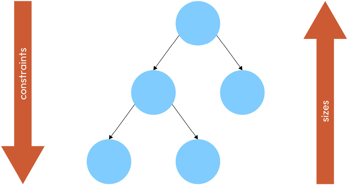
This easy and catchy rule describes the three key steps that are needed to position and lay out any widget.
Let’s break it down in more detail:
- Constraints go down: A widget gets its own constraints from its parent. This widget also passes new constraints to its children one by one (these can be different for each child). This process walks down the entire render tree until it reaches the last child. Once every
RenderObjecthas constraints, the next step is to define the actual size. - Sizes go up: The child picks a size that satisfies the constraints received by the parent. The sizing algorithm is defined by each
RenderObjectdepending on their own needs. In this step, together with step 3, the framework walks back up the render tree passing the defined geometry. - Parent sets the position: Once all children have had their size defined, the parent will position its children (horizontally on the x axis and vertically on the y axis) one by one. Once all children have been positioned, the parent will move to step 2 again until we reach the
RenderObjectroot.
This can be visualized with the following diagram:

Figure 2.1 – Constraints going down from the parent to its children and sizes going up from the children to the parent
In the diagram, you can see that the constraints are passed all the way down from the root to the leaf nodes of the render object tree. Then the sizes are passed all the way up from the leaf nodes to the root. This also demonstrates the efficiency of Flutter’s layout algorithm: the layout process is a single-pass process. This means that the render tree is walked at most once in each direction: down to pass constraints and up to pass sizes. Now let’s look at some specific examples.
The parent widget limits the size of the child with the passed constraints but it is the child that decides its final size.
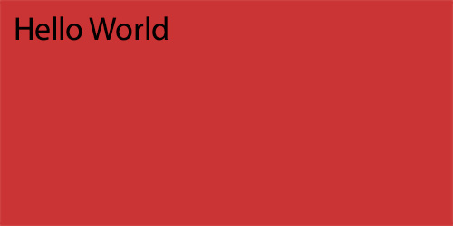
Let’s see this through a simple example of a container and a Text widget as its child:

Figure 2.2 – A red container with Hello World text aligned to the top-left corner
For brevity, we will only look at the code of the relevant widget. You can find the fully runnable example in the filename mentioned at the start of the code snippet. Until you see otherwise otherwise, keep in mind that the Container that we’re working with is a child of a Scaffold.
The code to generate this widget is as follows:
      Container(
          constraints: BoxConstraints(
            minWidth: 200,
            minHeight: 100,
            maxWidth: 200,
            maxHeight: 100,
          ),
          color: Colors.red,
          child: Text('Hello World'),
        )
In the preceding code, the Container allows any child that can fit inside it, as long as the child satisfies the constraints. As a result, the RenderObject used by Text will take these constraints into consideration when calculating its geometry.
Something interesting that you may have noticed in this code is that we set the same values for minWidth and maxWidth, as well as for minHeight and maxHeight. In terminology, this is known as tight constraints because there is quite literally no wiggle room. The size is tightly constrained. For this, BoxConstraints has a BoxConstraints.tight constructor. Instead of accepting four values, this requires just two. Code like this will produce the same result as the previous snippet:
        Container(
          constraints: BoxConstraints.tight(
            const Size(200, 100),
          ),
          color: Colors.red,
          child: Text('Hello World'),
        )
On the other hand, if we want to specify only the maximum size and let the minimum size be 0 so that the child widget can decide for itself, this is called loose constraints. In a similar way, to avoid specifying all four values, we can use the BoxConstraints.loose constructor like this:
        Container(
          constraints: BoxConstraints.loose(
            const Size(200, 100),
          ),
          color: Colors.red,
          child: Text('Hello World'),
        )
The result will be exactly the same if we’ve written it like this:
        Container(
          constraints: BoxConstraints(
            minWidth: 0,
            minHeight: 0,
            maxWidth: 200,
            maxHeight: 100,
          ),
          color: Colors.red,
          child: Text('Hello World'),
        )
With loose constraints, our text would only take up as much space as it requires. Hence, the container will do the same. Instead of being the 100x200 size, it will wrap the text tightly like this:

Figure 2.3 – A red container with Hello World text wrapped with loose constraints
Once the child knows its size, the parent will take care of positioning it. The parent defines how its children will be allocated on the screen. It is important to remark that a child does not know its own position. In the previous example, the container decided to position the Text widget child in the top left of the screen, while the child only knows its size.
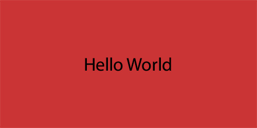
Now we can modify the position of the child by adding or modifying its parents. Imagine that we want to center the text inside the container in the previous example, as shown in the following figure.

Figure 2.4 – A red container with Hello World text aligned to the center
As the container is the one that defines the position, we will have to either modify it or wrap the text with a more appropriate parent that has a different positioning algorithm. In this case, we will change the alignment field of this widget as follows:
lib/example_container_5.dart
   Container(
     alignment: Alignment.center,
     constraints: BoxConstraints.tight(Size(200, 100)),
     color: Colors.red,
     child: Text('Hello World'),
   );
Container is a very flexible widget and presents us with many customization options. In the preceding code, we added a property called alignment with the Alignment.center value. There are many more options such as Alignment.topRight or Alignment.bottomLeft. However, not all widgets are as flexible as Container, or maybe you can’t use the alignment property for another reason. In that case, you can wrap your child widget, as we did with our Text, in a special widget called Align. Its sole purpose is to align the child widget. Having multiple options for various use cases is great and Flutter gives us just that. Here’s how we could use the Align widget to achieve the same effect:
         Container(
          constraints: BoxConstraints.tight(
            const Size(200, 100),
          ),
          color: Colors.red,
          child: Align(
            alignment: Alignment.center,
            child: Text('Hello World'),
          ),
        ),
Aside from the Align widget, there is also a very specific one called Center, which aligns the child widget in the center and provides the developer with a more concise API.
Note
There are endless scenarios that can occur when defining constraints and positioning children. To see more examples, you can check out https://docs.flutter.dev/development/ui/layout/constraints.
Understanding the limitations of the layout rule
While the layout algorithm has quite a lot of benefits, such as only needing one pass through the whole tree, it also comes with some limitations. It is important to be aware of the limitations so that we don’t try to fight against them. Let’s see what some of them are:
- A widget might not have its desired size: A child is forced to follow its parent’s constraints, yet the child’s desired size might not fit in those constraints, so the child’s final size might not match the desired one. One scenario where this can create conflicts is when the parent forces its child to fit a tight size. In our previous experiments with the
Containerwidget, it has always been a child of theScaffold. TheScaffoldimposes its own constraints, which is why the results we have seen have corresponded with our expectations. However, there are use cases that might surprise you. In the following code, we set a container as the root widget, with a desired size of10x10:
lib/example_container_7.dart
runApp(
  Container(
    height: 10,
    width: 10,
    color: Colors.red,
  ),
);
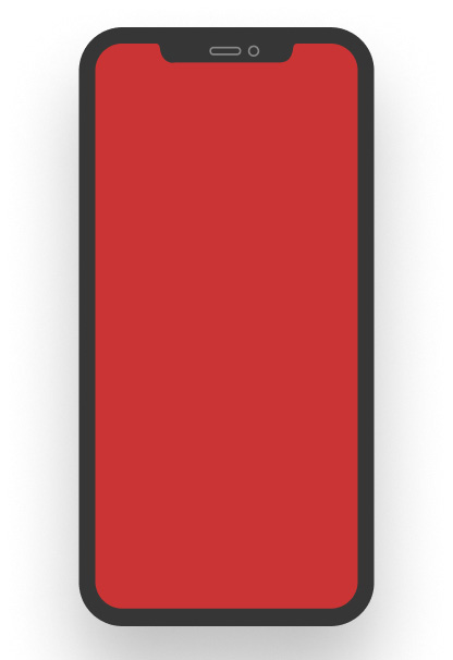
While we would expect the Container to have a 10x10 size, this won’t be the actual case and the Container will cover the full screen. It will look like this:

Figure 2.5 – A red container filling the full screen
The height and width params in the preceding code are in reality a shortcut to define the constraints of its child. They are defined withBoxConstraints.tightFor(width: width, height: height).
So, let’s see what is happening in the preceding code based on what we have learned so far. First, the Container receives constraints from its parent. As this Container is the top widget, it is a special case. The RenderObject root will have a tight constraint that enforces the minimum and maximum to be the size of the screen. Therefore, when the Container is sizing itself, the only option available is the size of the screen.
- A widget is not aware of its own position on the screen: Another interesting limitation is that we cannot learn the position of a widget from the widget itself. Its parent contains that information. While this looks like a huge disadvantage, it has a huge performance benefit for algorithms that do not have to recalculate child size each time they want to position their items (for example,
GridView). In the upcoming sections of this chapter, we will learn how we can create widgets that can be positioned relative to others and therefore mitigate this inconvenience. - Final size and position are relative to a parent: The final consideration is that a widget’s size and position depend on its parent. This parent widget also depends on its own parent. It is impossible to define the size and position of a specific widget without taking the whole tree into consideration.
Now that we know the general rule and its limitations, let’s learn about the layout solutions that implement these basic concepts. We will learn how we can use them to create our own layouts. When in doubt, always remember: constraints go down, sizes go up, parent sets the position.


