Make Interactive Elements Obvious and Discoverable
The flat design aesthetic, born out of Microsoft’s Metro user interface, rose to near ubiquity in the late 2000s. In iOS 7 and Android’s Material Design, these extremely minimal visuals are still the go-to look for modern web applications. Although, the flat design of the late 2000s has “softened” over the years to introduce more visual affordances. Flat design has performed poorly in user testing over the years. It’s style over substance and it forces your users to think more about every interaction they make with your product. Stop making it hard for your customers to find the buttons:
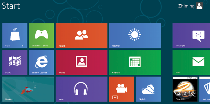
Figure 13.1: The “Metro” user interface in all its “what is clickable?” splendor
There are parts of your UI that can be interacted with, but your user neither knows which parts these are, nor wants to spend time learning this. They have used buttons in real life, many times...


