Adding a Bootstrap-powered markup
Let's add basic styling to our application by adding Bootstrap and using its classes.
First of all, let's include Bootstrap's CSS and JS files from Bootstrap's CDN. We will use the upcoming version 4, which is still in alpha. Open the index.html file and add the necessary link and script tags inside the <head> section:
//index.html
<link
rel="stylesheet"
href="https://maxcdn.bootstrapcdn.com/bootstrap/4.0.0-alpha.6/css/bootstrap.min.css"crossorigin="anonymous">
<script src="https://code.jquery.com/jquery-3.2.1.min.js"crossorigin="anonymous"></script>
<script src="https://npmcdn.com/tether@1.2.4/dist/js/tether.min.js">
</script>
<script src="https://maxcdn.bootstrapcdn.com/bootstrap/4.0.0-alpha.6/js/bootstrap.min.js"crossorigin="anonymous">
</script>
You've probably noticed that I added jQuery and Tether dependencies as well; this is because Bootstrap depends on them.
Now, we can use Bootstrap classes and components in our application. Let's start by adding a bit of styling using Bootstrap's classes.
I will wrap the whole app div tag into the jumbotron class, and then, I will wrap the content of it into the container class. So, the template will look a bit different:
//App.vue
<template>
  <div id="app" class="jumbotron">
    <div class="container">
      <h1>Hello! Nice to meet you!</h1>
    <hr />
    <div v-for="message in messages">
    <...>
    </div>
  </div>
</div>
</template>
Check out the page; doesn't it look different? Now, I would like to wrap up the content of each message into the card class. Cards seem to be an appropriate container for this kind of things. Check out the official Bootstrap documentation regarding cards at https://v4-alpha.getbootstrap.com/components/card/. I will add div tag with a card-group class and put all the cards with messages inside this container. Thus, I don't need to be worried about the positioning and layout. Everything becomes responsive just by itself! So, the markup for the messages will look like this:
//App.vue
<template>
<...>
  <div class="card-group">
    <div class="card" v-for="message in messages">
      <div class="card-block">
        <h5 class="card-title">{{ message.title }}</h5>
        <p class="card-text">{{ message.text }}</p>
        <p class="card-text"><small class="text-muted">Added on {{ message.timestamp }}</small></p>
      </div>
    </div>
  </div>
</template>
Check out the page. It's almost looking nice! In a few steps, we were able to nicely display the messages that are stored in our Firebase database. Try to add another message using the Firebase real-time database dashboard. Keep the web page open! Fill in the Firebase database fields:
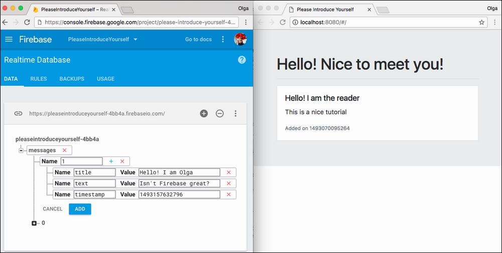
Adding an entry to the Firebase database
Now, click on the ADD button. The new message automatically appears on your web page:
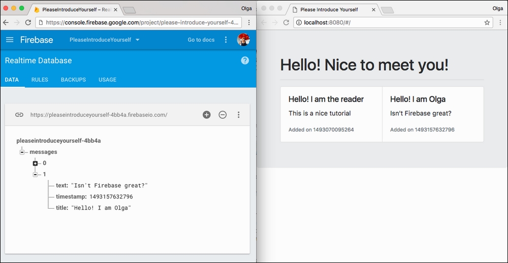
Once we click on the ADD button, the new message immediately appears on our web page
Isn't it great? Now, we can add as many messages as we want. We can also delete them and manipulate them, and all changes will be automatically propagated to our web page. This is pretty nice, but do we really want to keep playing with our backend database to see something changing on the web page? Of course, not! We want the users of our page to be able to add their messages using our page and not our database dashboard. Let's go back to our Vue.js application and add a form that will allow us to add new messages.
Adding a form using Bootstrap
Let's add a simple form to our application that will enable us to add new messages to our message board. Check Bootstrap's documentation regarding forms at https://v4-alpha.getbootstrap.com/components/forms/.
Let's add a form just before the list of messages. This form will contain the input for the title, the text area for the message, and the submit button. It will look like this:
//App.vue
<template>
  <div id="app" class="jumbotron">
    <div class="container">
      <h1>Hello! Nice to meet you!</h1>
      <hr />
      <form>
        <div>
          <input maxlength="40" autofocus placeholder="Please introduce yourself :)" />
        </div>
        <div>
          <textarea placeholder="Leave your message!"  rows="3">
          </textarea>
        </div>
        <button type="submit">Send</button>
      </form>
      <hr />
      <...>
    </div>
  </div>
</template>
Look at the page. Doesn't look that beautiful, does it?
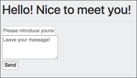
Our form doesn't look so beautiful
In fact, let's be honest, it just looks ugly! However, with Bootstrap classes, it is really easy to fix it. If we add the form-control class to the input and textarea elements, the form-group class to each div tag that surrounds these elements, and probably the btn btn-primary class to the submit button…well, we will have something nicer!

The form looks really nice with the Bootstrap classes
OK, so now we have a nice-looking form, but if we try to fill it out, nothing will happen. We have to make it functional, and for that, we will use the power of Vue.js.


