Nowadays, people (and not necessarily analysts, or statisticians) get exposed to lots of data, whether it's business data (such as acquisitions, campaign revenue, or payments) or sensor data (such as average temperature, humidity, and barometric pressure).
In addition to the fact that the amount of data can be large, the data can contain noise, which obscures your insight. In most cases, the data comes unnormalized and has no proper reference points, which makes it harder to gain an insight into, especially for inexperienced analysts, or people who don't come from a statistical background.
These are the places where visualizing data comes in handy.
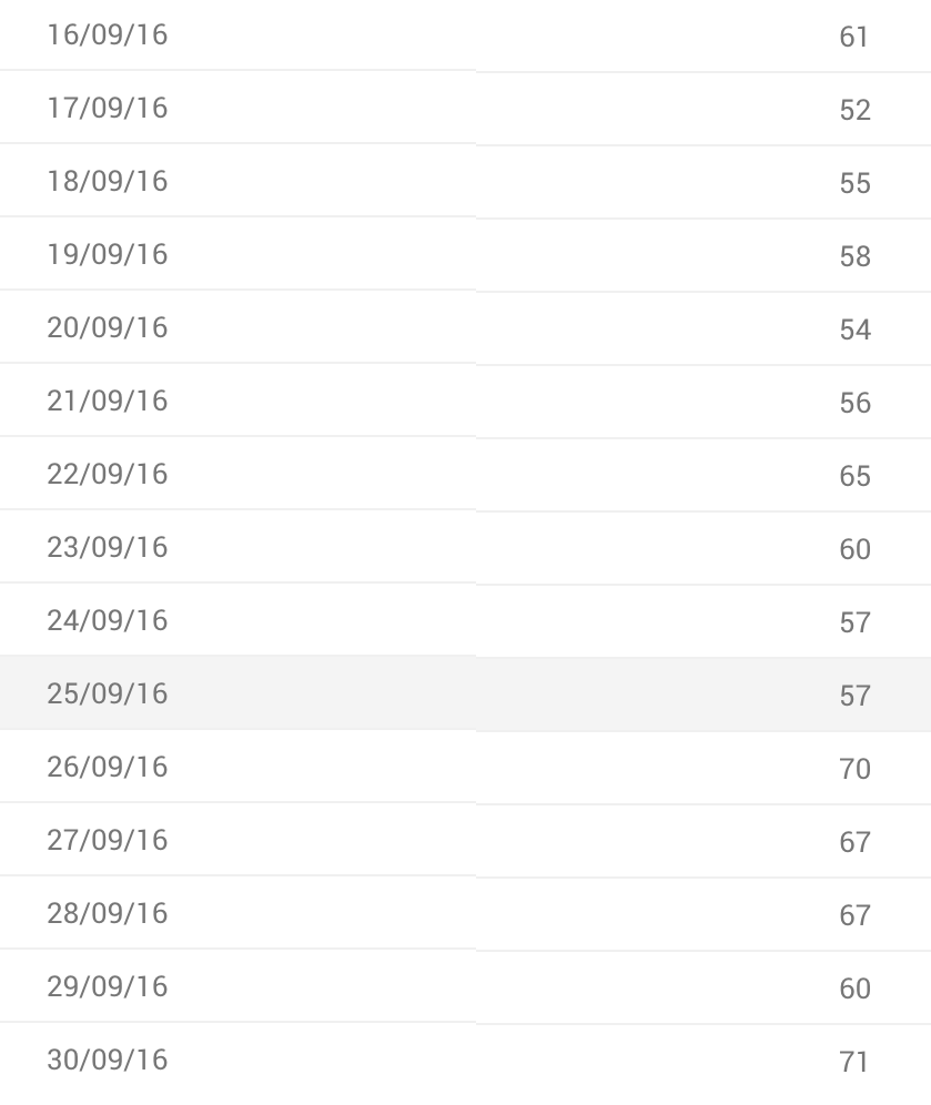
Consider the following example of daily active users (number of active users per day), as seen in the following table:

And in the following chart (the green arrows and red trend lines are drawn...


