Responsive admin
First off, Drupal 8 is responsive out of the box, meaning that the default Bartik theme, the Seven administration theme, and even the Admin toolbar scale and resize based on the device we are viewing our site on.
We can see this in action by logging in to our Drupal instance and then navigating to our homepage. If we begin to resize the browser window, eventually we will notice the orientation of the Admin toolbar change from a horizontal bar to a vertical bar:
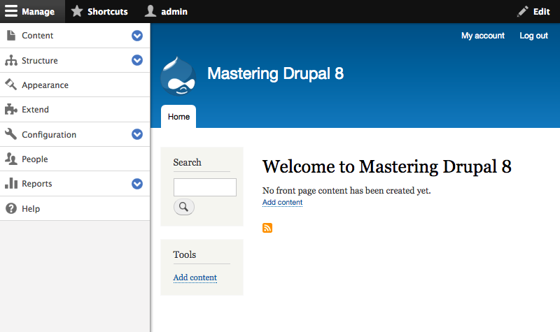
Once the Admin toolbar is at a vertical orientation, we can collapse it into the horizontal bar by clicking on the Manage link at the top left-hand side. This allows for more administration space on the screen.
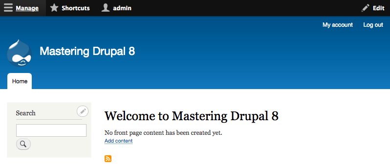
Clicking on the Manage link again will re-open the toolbar to allow us to continue navigating to anywhere within Drupal.
By expanding the browser window back to a normal desktop orientation, the Admin toolbar will convert back to a horizontal orientation.
The Admin toolbar is not the only responsive change. If we...


