Search icon CANCEL
Subscription
0
Cart icon
Your Cart (0 item)
Close icon
You have no products in your basket yet
Save more on your purchases! discount-offer-chevron-icon
Savings automatically calculated. No voucher code required.
Arrow left icon
Explore Products
Best Sellers
New Releases
Books
Videos
Audiobooks
Learning Hub
Free Learning
Arrow right icon
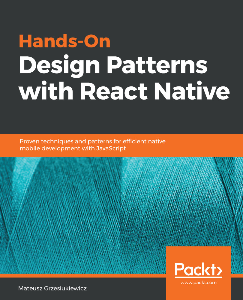
Hands-On Design Patterns with React Native

Hands-On Design Patterns with React Native: Proven techniques and patterns for efficient native mobile development with JavaScript

Arrow left icon
Profile Icon Grzesiukiewicz
Arrow right icon
€18.99 per month
Full star icon Full star icon Full star icon Half star icon Empty star icon 3.5 (2 Ratings)
Paperback Sep 2018 302 pages 1st Edition
eBook
€8.99 €26.99
Paperback
€32.99
Subscription
Free Trial
Renews at €18.99p/m
Arrow left icon
Profile Icon Grzesiukiewicz
Arrow right icon
€18.99 per month
Full star icon Full star icon Full star icon Half star icon Empty star icon 3.5 (2 Ratings)
Paperback Sep 2018 302 pages 1st Edition
eBook
€8.99 €26.99
Paperback
€32.99
Subscription
Free Trial
Renews at €18.99p/m
eBook
€8.99 €26.99
Paperback
€32.99
Subscription
Free Trial
Renews at €18.99p/m

What do you get with a Packt Subscription?

Free for first 7 days. $19.99 p/m after that. Cancel any time!
Product feature icon Unlimited ad-free access to the largest independent learning library in tech. Access this title and thousands more!
Product feature icon 50+ new titles added per month, including many first-to-market concepts and exclusive early access to books as they are being written.
Product feature icon Innovative learning tools, including AI book assistants, code context explainers, and text-to-speech.
Product feature icon Thousands of reference materials covering every tech concept you need to stay up to date.
Subscribe now
View plans & pricing
Table of content icon View table of contents Preview book icon Preview Book

Hands-On Design Patterns with React Native

React Component Patterns

Developing Android and iOS has never been easier than it is now. React Native has changed how fast we develop new apps and deliver value to the end user. Knowing this technology will give you a great edge in the market. I'm Matt and I'm happy to show you the best practices I have learned while working in a React Native ecosystem. Through this book, we will explore design patterns by example. In just this first chapter, we will create over 10 small applications. Later on in this book, we will create more complex applications, using the patterns that I will gradually introduce to you.

In this chapter, we will explore React patterns that also apply to the React Native world. The most crucial patterns you need to understand are stateless and stateful components. Understanding how to use these will make you a much better React Native developer and empower you with standard patterns in every React Native application.

When it comes to components, it is crucial to make them as reusable as possible and follow the well-known programmer principle—Don't Repeat Yourself (DRY). Presentational components and container components are meant to do just that. We will dive into them with a couple of examples to learn how to split features into reusable pieces.

To be more precise, in this first chapter, we will look at the following topics:

  • Stateless and stateful components, using short and then more complex examples
  • How to create reusable and easily configurable presentational components
  • Container components and their role in the encapsulation of features
  • When to compose components and how to create Higher Order Components (HOCs)

It's time to act on your side. Prepare your environment for React Native development right now if you want to follow along and play with the examples. Most of the code samples that you will see in this book can be run and displayed either on a simulator or on a real mobile device. Now, make sure that you can launch the Hello World example on your mobile or simulator.

Code examples are checked into a Git repository on GitHub, which can be found at https://github.com/Ajdija/hands-on-design-patterns-with-react-native.
Please follow the readme.md instructions to set up your machine and launch our first example. The Hello World example can be found in the following directory src/Chapter_1_React_component_patterns/Example_1_Hello_World.

Stateless and stateful components

First of all, let's look at the first stateless component that has been created for us. It has been automatically generated by Create React Native App (CRNA) for our Hello World application. This component was created using the class syntax that was introduced in ECMAScript 2015 (ES6). Such components are usually called class components:

// src/ Chapter 1/ Example 1_Hello World/ App.js

export default class
App extends React.Component {
render() {
return (
<View style={styles.container}>
<Text>Hands-On Design Patterns with React Native</Text>
<Text>Chapter 1: React Component Patterns</Text>
<Text style={styles.text}>You are ready to start the journey.
Fun fact is, this text is rendered by class component called
App. Check App.js if you want to look it up.</Text>
</View>
);
}

}

Class components can be used to create stateful components.

The code samples provided in this book use ECMAScript 2018 syntax with Stage 3 feature class field declarations. Babel is the transpiler that supports such code by relevant plugins that are pre-configured for us by the CRNA toolbox. If you decide not to use CRNA, then you may need to configure Babel yourself.

However, in this case, the class component is unnecessary. We can safely use a stateless one, as it's simpler. Let's see how we can declare a stateless component. The most common approach is by using ES6 arrow syntax. Such components are called functional components. Check out the following code to see what our rewritten component looks like:

const App = () => (
<View style={styles.container}>
<Text>Hands-On Design Patterns with React Native</Text>
<Text>Chapter 1: React Component Patterns</Text>
<Text style={styles.text}>You are ready to start the journey. Fun
fact is, this text is rendered by Functional Component called
App. Check App.js if you want to look it up.</Text>
</View>
);
export default App;

If you are not a fan of arrow syntax, you can also use regular function syntax:

// src/ Chapter 1/ Example_2_Functional_Components/ App.js

export default function
App() {
return (
<View style={styles.container}>
...
</View>
);
}

The very first question that pop ups is: why is it stateless? The answer is simple: it doesn't contain any inner state. This means that we are not storing any private data inside it. Everything the component needs to render itself is provided from the external world, which the component does not care about.

In this little example, we actually never pass any external data to the component. Let's do that now. To do so, we will create another component called HelloText that consumes one property: text to display. The usual convention to pass the text to such a component is to place the text between the opening and closing tag, for instance, <HelloText> example text that is passed </HelloText>. Hence, to retrieve such a prop within our functional component, we will need to use a special key called children:

// src/ Chapter 1/ Example_3_Functional_Components_with_props/ App.js

const
HelloText = ({children, ...otherProps}) => (
<Text {...otherProps}>{children}</Text>
);
const App = () => (
<View style={styles.container}>
<HelloText>
Hands-On Design Patterns with React Native
</HelloText>
<HelloText>Chapter 1: React Component Patterns</HelloText>
<HelloText style={styles.text}>
You are ready to start the journey. Fun fact is, this text
is rendered by Functional Component called HelloText.
Check App.js if you want to look it up.
</HelloText>
</View>
);
export default App;

Using the children prop makes our HelloText component way more powerful. Props are a very flexible mechanism. Using props, you can send any valid JavaScript type. In this case, we have sent just text, but you can send other components, too.

It's time to add some vitality to our component. We will make it expand the third text block, but only after pressing the chapter or title text. For this functionality, we need to store a state that remembers if the component is expanded or collapsed.

Here is what you need to do:

  1. Change the component to the class syntax.
  2. Leverage the state object of the React library. We must initialize the state within the class constructor and make the text collapsed by default.
  3. Add conditional rendering to the component render function.
  4. Add the press handler, which will change the state once we tap on the title or chapter text.

The solution is presented in the following code:

// src/ Chapter 1/ Example_4_Stateful_expandable_component/ App.js

export default class App extends React.Component {
constructor() {
super();
this.state = {
// default state on first render
expanded:
false
}
}

expandOrCollapse() {
// toggle expanded: true becomes false, false becomes true
this.setState({expanded: !this.state.expanded})
;
}

render = () => (
<View style={styles.container}>
<HelloText onPress={() => this.expandOrCollapse()}>
Hands-On Design Patterns with React Native
</HelloText>
<HelloText onPress={() => this.expandOrCollapse()}>
Chapter 1: React Component Patterns
</HelloText>
{
this.state.expanded &&
<HelloText style={styles.text}>
You can expand and collapse this text by clicking
the Title or Chapter text. Bonus: Check Chapter 4
to learn how to animate expanding andcollapsing.
</HelloText>
}
</View>
);
}

Congratulations—we have made our first stateless and stateful components!

Note the && operator that displays the component. If a Boolean value on the left side of the operator is true, then the component on the right-hand side will be displayed. The whole expression needs to be wrapped into curly brackets. We will explore more of its capabilities in Chapter 3, Style Patterns.

It's time to create something more challenging: Task list. Please start over and prepare your code. Clean up App.js so that it only includes the App class component:

  1. The constructor should initialize the task list in its state. In my example, the task list will be an array of strings.
  2. Iterate over the tasks to create the Text component for each task. This should happen in the render function of the App component. Please note that you can simplify iteration by using the map function instead of a regular for loop. Doing this should become second nature, since it's became a standard in almost every JS project.

My solution is presented in the following code:

// src/ Chapter 1/ Example 5_Task_list/ App.js

export default class App extends React.Component {
constructor() {
super();
// Set the initial state, tasks is an array of strings
this.state = {
tasks: ['123', '456']
}
}

render = () => (
<View style={styles.container}>
{
this.state.tasks
.map((task, index) => (

<Text key={index} style={styles.text}>{task}</Text>
))

}
</View>
);
}

Iterating using map is a nice feature, but the whole component doesn't look like a task list yet. Don't worry, you will learn how to style components in Chapter 3, Style Patterns.

What are the advantages of stateless components?

It may seem tempting to only use stateful class components and develop a whole application like that. Why would we even bother with stateless functional components? The answer is performance. Stateless functional components can be rendered faster. One of the reasons why this is the case is because stateless functional components do not require some of the life cycle hooks.

What are life cycle hooks? React components have life cycles. This means that they have different stages like mounting, unmounting, and updating. You can hook each stage and even sub stage. Please check the official React documentation to see the full list of available life cycle methods: https://reactjs.org/docs/state-and-lifecycle.html.
These are useful to trigger fetching data from the API or to update the view.

Please note that if you are using React v16 or later, it is not true that functional components are wrapped into class components internally within the React library:

"Functional components in React 16 don't go through the same code path as class components, unlike in the previous version where they were converted to classes and would have the same code path. Class components have additional checks that are required and overhead in creating the instances that simple functions don't have. These are micro-optimizations though and shouldn't make a huge difference in real-world apps – unless your class component is overly complex."

- Dominic Gannaway, engineer on the React core team at Facebook (https://github.com/reactjs/reactjs.org/issues/639#issuecomment-367858928)

Functional components are faster, but in most cases are outperformed by class components extending React.PureComponent:

"Still, to be clear, they don't bail out of rendering like PureComponent does when props are shallowly equal."

- Dan Abramov, co-author of Redux and Create React App, engineer on the React core team at Facebook (https://twitter.com/trueadm/status/916706152976707584)

Functional components are not only more concise, but they usually are also pure functions. We will explore this concept further in Chapter 9, Elements of Functional Programming Patterns. Pure functions provide a lot of benefits, such as a predictable UI and easy tracking of user behavior. The application can be implemented in a certain way to record user actions. Such data helps with debugging and reproducing errors in tests. We will dig into this topic later on in this book.

Component composition

If you have learned any Object-Oriented (OO) language, you may have used inheritance extensively. In JavaScript, this concept is a little bit different. JavaScript inheritance is based on prototypes, and so we call it prototypal inheritance. Functionalities are not copied to the object itself—they are inherited from the prototype of the object and possibly even through other prototypes in the prototype tree. We call this a prototype chain.

However, in React, using inheritance is not very common. Thanks to components, we can embrace another pattern called component composition. Instead of creating a new class and inheriting from the base class, we will create a new parent component that will use its child component to make itself more specific or more powerful. Let's look at an example:

// src/ Chapter 1/ Example_6_Component_composition_red_text/ App.js

const
WarningText = ({style, ...otherProps}) => (
<Text style={[style, {color: 'orange'}]} {...otherProps} />
);

export default class App extends React.Component {
render = () => (
<View style={styles.container}>
<Text style={styles.text}>Normal text</Text>
<WarningText style={styles.text}>Warning</WarningText>
</View>
);
}

The App component is being built out of three components: View, Text, and WarningText. It is a perfect example of how one component, through composition, can reuse the capabilities of others.

The WarningText component uses composition to enforce the orange text color in the Text component. It makes the generic Text component more specific. Now, we can reuse WarningText in any place of the app where it is necessary. If our app designer decides to alter the warning text, we can quickly adapt to the new design in one place.

Note the implicit pass of a special prop called children. It represents the children of the component. In Example 6_ Component composition - red text, we first pass warning text as children to the WarningText component and then using the spread operator it is passed to the Text component, which WarningText encapsulates.

Composing the application layout

Let's suppose we have to create a welcome screen for our application. It should be divided into three sections—header, main content, and footer. We would like to have consistent margins and styling for both logged and anonymous users. However, the header and footer content will differ. Our next task is to create a component that supports these requirements.

Let's create a welcome screen that will use a generic component for encapsulating an app layout.

Follow this step-by-step guide to do so:

  1. Create the AppLayout component that enforces some styling. It should accept three props: header, MainContent, and Footer:
const AppLayout = ({Header, MainContent, Footer}) => (
// These three props can be any component that we pass.
// You can think of it as a function that
// can accept any kind of parameter passed to it.

<View style={styles.container}>
<View style={styles.layoutHeader}>{Header}</View>
<View style={styles.layoutContent}>{MainContent}</View>
<View style={styles.layoutFooter}>{Footer}</View>
</View>
);
  1. It's now time to create placeholders for header, footer, and content. We have created three components: WelcomeHeader, WelcomeContent, and WelcomeFooter. If you wish, you can extend them to be more complex than a trivial piece of text:
const WelcomeHeader = () => <View><Text>Header</Text></View>;
const WelcomeContent = () => <View><Text>Content</Text></View>;
const WelcomeFooter = () => <View><Text>Footer</Text></View>;
  1. We should connect AppLayout with our placeholder components. Create the WelcomeScreen component, which will pass placeholder components (from step 2) down to the AppLayout as props:
const WelcomeScreen = () => (
<AppLayout
Header={<WelcomeHeader />}
MainContent={<WelcomeContent />}
Footer={<WelcomeFooter />}
/>
);
  1. The last step is going to be creating the root component for our app and adding some styles:
// src/ Chapter 1/ Example_7_App_layout_and_Welcome_screen/ App.js

// root component
export default class
App extends React.Component {
render = () => <WelcomeScreen />;
}

// styles
const styles = StyleSheet.create({
container: {
flex: 1,
marginTop: 20
},
layoutHeader: {
width: '100%',
height: 100,
backgroundColor: 'powderblue'
},
layoutContent: {
flex: 1,
width: '100%',
backgroundColor: 'skyblue'
},
layoutFooter: {
width: '100%',
height: 100,
backgroundColor: 'steelblue'
}
});

Please note the use of StyleSheet.create({...}). This creates a style object that represents our app styles. In this case, we have created four different styles (container, layoutHeader, layoutContent, and layoutFooter) that will be available to use with the markup we defined. We previously customized styles using keys such as width, height, and backgroundColor, which are trivial. In this example, however, we also use flex, which comes from the term flexbox pattern. We will explain this approach in detail in Chapter 3, Style Patterns, where we focus primarily on StyleSheet patterns.

This is pretty good. We have made a trivial layout for our application and then created the welcome screen with it.

What about component inheritance?

"At Facebook, we use React in thousands of components, and we haven't found any use cases where we would recommend creating component inheritance hierarchies."
- React official documentation (https://reactjs.org/docs/composition-vs-inheritance.html)

I have not come across a situation where I had to step away from component composition in favor of inheritance. Neither have developers at Facebook (as per the preceding quotation). Hence, I highly recommend you get used to composition.

Testing components on high-level patterns

Testing is something very important when it comes to creating reliable and stable applications. First of all, let's look at the most common three types of tests you will need to write:

  • Trivial unit tests: I don't understand it, but is it working or not working at all? Usually, tests that check whether the component renders or whether the function runs with no errors are called trivial unit tests. If you do this manually, you call these tests smoke tests. Such tests are vital to have. Whether you like it or not, you should write trivial tests, at least to know if every feature is somehow working.
  • Unit tests: Does the code work as I expect it to? Does it work in all of the code branches? By branch, we mean places in the code where it branches, for instance, if statements are branching code into different code paths, which is similar to switch-case statements. Unit testing refers to testing a single unit of code. In crucial features of an application, unit tests should cover whole function code (as a principle: 100% code coverage for crucial features).
  • Snapshot tests: Testing if the previous and actual version produce the same result is called snapshot testing. Snapshot tests are just creating text output, but once the output is proven to be correct (through developer assessment and code review), it may work as a comparison tool. Try to use snapshot tests a lot. Such tests should be committed into your repository and undergo review process. This new feature in Jest saves a lot of time for developers:
    • Image snapshot tests: In Jest, snapshot tests compare text (JSON to JSON), however, you may encounter references to snapshot tests on mobile devices, where this means comparing images to images. This is a more advanced topic, but is commonly used by big websites. Taking such a screenshot most likely requires building the whole app instead of a single component. Building the whole app is time-consuming, so some companies only run these type of tests when they plan for a release, for instance, on a release candidate build. This strategy can be automated to follow continuous integration and continuous delivery principles.

Since we are using the CRNA toolbox in this book, the testing solution you want to check is Jest (https://facebook.github.io/jest/).

Watch out if you come from a React web development background. React Native, as the name suggests, operates in a native environment and hence has many components, such as react-native-video package, which may need special testing solutions. In many cases, you will need to mock (create placeholders/mimic behaviour) these packages.
Check out https://facebook.github.io/jest/docs/en/tutorial-react-native.html#mock-native-modules-using-jestmock for more information.
We will address some of these concerns in Chapter 10, Managing Dependencies.

There are usually some metrics to testing, such as code coverage (the number of lines covered by tests), the number of reported bugs, and the number of registered errors.

Although very valuable, these may create a false belief that the application is well-tested.

There are a few utterly wrong practices that I need to mention when it comes to testing patterns:

  • Relying only on unit tests: Unit tests mean testing just a single piece of code in isolation, for instance, a function by passing arguments to it and checking the output. This is great and saves you from a lot of bugs, but no matter what code coverage you have, you may bump into problems with the integration of well-tested components. The real-life example I like to use is a video of two sliding doors that are placed too close to each other, which causes them to keep on opening and closing forever.
  • Relying on code coverage too much: Stop stressing yourself or other developers to reach that 100% or 90% code coverage mark. If you can afford it, great, but usually it makes developers write less valuable tests. Sometimes, it is crucial to send different integer values to functions; for instance, when testing division, it is not enough to send two positive integers. You need to also check what happens when you divide by zero. Coverage won't tell you that.
  • Not tracking how your testing metrics influence the number of bugs: If you just rely on some metrics, whether it be code coverage or any other, please reassess if the metrics tell the truth, for instance, whether increase in the metric causes less bugs. To give you a nice example, I've heard developers from many different companies say that the code coverage increasing above 80% didn't help them much.
If you are a product owner and have checked the point Not tracking how your testing metrics influence the number of bugs above, please also consult with the tech leader or senior developers of your project. There may be certain specifics that influence this process, for instance, development schedule shifting to more repeatable code. Please don't jump to conclusions too quickly.

Snapshot testing expandable components

This time, we will demonstrate a tricky part of snapshot testing.

Let's start by creating our first snapshot test. Go to Chapter_1/Example 4_Stateful_expandable_component and run yarn test in the command line. You should see that one test passes. What kind of test is it? It's a trivial unit test that's located in the App.test.js file.

It's time to create our first snapshot test. Replace expect(rendered).toBeTruthy(); with expect(rendered).toMatchSnapshot();. It should look like this:

it('renders', () => {
const rendered = renderer.create(<App />).toJSON();
expect(rendered).toMatchSnapshot();
});

Once you have this, rerun yarn test. A new directory called __snapshots__ should be created with the App.test.js.snap file inside it. Take a look at its contents. This is your first snapshot.

It's time to test the app's coverage. You can do this with the following command:

yarn test -- --coverage

It yields something a little concerning:

File     |  % Stmts | % Branch |  % Funcs |  % Lines | Uncovered Line #s
All files| 66.67 | 50 | 50 | 66.67
App.js | 66.67 | 50 | 50 | 66.67 | 18,23,26

We have one component that has one branch (if), and after performing a snapshot test, the coverage is not even near 100%. What's wrong?

There is obviously a problem with the branch that relies on state, but would it account for over 30% of the lines? Let's see the full report. Open the ./coverage/lcov-report/App.js.html file:

The coverage report file. You can see that the code has been uncovered with the tests marked in red.

Now, you see what is wrong. The answer is pretty simple—snapshot tests do not test prop functions. Why? First of all, this does not make much sense. Why would we convert a function to JSON, and how would it help? Secondly, tell me how to serialize the function. Shall I return function code as text or compute output in some other way?

Take this example as a lesson that snapshot tests are not enough.

Test-driven development approach

You will often hear about the test-driven development (TDD) approach, which basically means writing tests first. To simplify this, let's summarize this in the following three steps:

  1. Write tests and watch them fail.
  2. Implement functionality until you see your tests passing.
  3. Refactor to the best practices (optional).

I must admit that I really love this approach. However, the truth is that most developers will glorify this approach and barely any will use it. This is usually because it's time-consuming and it is hard to predict what the thing you are about to test looks like.

Going further, you will find that one of the test types is against TDD. Snapshot tests can only be created if the component is implemented, as they rely on its structure. This is another reason why snapshot tests are more of an addition to your tests rather than a replacement.

This approach works best in huge applications that go on for years, where a team of tech architects plan the interfaces and patterns to be used. This is most likely in backend projects, and you will have a general idea of how all of the classes and patterns connect to each other. Then, you simply take the interface and write the tests. Next, you follow up with implementation. If you want to create interfaces in React Native, you will need to support TypeScript.

Some argue that TDD is great in small projects, and you may quickly find such threads on Stack Overflow. Don't get me wrong; I'm happy that some people are happy. However, small projects tend to be very unstable and are likely to change often. If you are building a Minimum Viable Product (MVP), it doesn't work very well with TDD. You are better off relying on the fact that the libraries you use are well-tested and deliver the project on time, while quickly testing it with snapshots.

To summarize: abandoning TDD should not mean writing less tests.

Presentational components

It's time to learn how to make components reusable. For this goal, we will use the best tool in our hands: the presentational component pattern. It decouples components from logic and makes them flexible.

The presentational component is a pattern name that you will hear very often, if, later on, you decide to use the Redux library. For instance, presentational components are heavily used in Dan Abramov's Redux course.

I like to explain that the presentational component pattern is a website's world. For a long time now, there has been three leading blocks for every website: CSS, HTML, and JavaScript. React, however, introduced a bit of a different approach, that is, the automated generation of HTML based on JavaScript. HTML became virtual. Hence, you may have heard of the Virtual Document Object Model (Virtual DOM). This separation of concerns—HTML (view), CSS (styles), and JavaScript (logic, sometimes called the controller)—should remain untouched in our JavaScript-only world. Therefore, use presentational components to mimic HTML and container components for logic.

Approach this problem in the same fashion in React Native applications. The markup you write should be separated from the logic it consumes.

Let's see this in action. Do you remember Example 4_Stateful expandable component? It has one presentational component already:

const HelloText = ({children, ...otherProps}) => (
<Text {...otherProps}>{children}</Text>
);

This component does not introduce any logic and contains only markup, which is very short in this case. Any logic that can be useful is hidden within props and passed along, as this component does not need to consume it. In more complex examples, you may need to destructure props to pass them to the right components; for example, when using the spread operator above, all props that are not destructured are being passed.

But, instead of focusing on this simple example, let's start refactoring the App component. First of all, we will move the markup to the separate presentational component:

// src/ Chapter_1_React_component_patterns/
// Example_9_Refactoring_to_presentational_component/ App.js
// Text has been replaced with "..." to save space.

export const
HelloBox = ({ isExpanded, expandOrCollapse }) => (
<View style={styles.container}>
<HelloText onPress={() => expandOrCollapse()}>...</HelloText>
{
isExpanded &&
<HelloText style={styles.text}>...</HelloText>
}
</View>
);

Now, we need to replace the render function in the App component with the following:

render = () => (
<HelloBox
isExpanded={this.state.expanded}
expandOrCollapse={this.expandOrCollapse}
/>
);

However, if you run the code now, you will end up with an error on the HelloText press event. This is due to how JavaScript handles the this keyword. In this refactor, we pass the expandOrCollapse function to another object, and there, this refers to a completely different object. Therefore, it cannot access state.

There are a few solutions to this problem, and one is by using the arrow function. I will stick to the best approach performance-wise. It comes down to adding the following line to your constructor:

this.expandOrCollapse = this.expandOrCollapse.bind(this);

There we go; the application is fully functional, just as before. We have refactored one component into two—one presentational and one responsible for logic. Sweet.

Imagine that we had only shallow unit tests of two components.
Would we identify the problem with the this keyword?
Perhaps not. This simple gotcha may catch you in big projects, where you will be too busy to rethink every single component. Watch out and remember integration tests.

Decoupling styles

In the preceding examples, you may have noticed that styles are tightly coupled to presentational components. Why tightly? Because we explicitly include them by using style={styles.container}, but the styles object is not configurable. We cannot replace any style part with props, and that tightly couples us to the existing implementation. In some cases, this is a desired behavior, but in others, it is not.

If you are interested in how styles work, we will deep dive into patterns involving them in Chapter 3, Styling Patterns. You will also learn about the flexbox pattern from CSS and many other conventions.

You will bump into this problem if you have tried to split code into separate files. How can we fix this issue?

Let the styles be the optional prop. If styles are not provided, then we can fall back to the default values:

// src/ Chapter_1/ Example_10_Decoupling_styles/ App.js

export const
HelloBox = ({
isExpanded,
expandOrCollapse,
containerStyles,
expandedTextStyles
}) => (
<View style={containerStyles || styles.container}>
<HelloText onPress={() => expandOrCollapse()}>...</HelloText>
{
isExpanded &&
<HelloText style={expandedTextStyles || styles.text}>
...

</HelloText>
}
</View>
);

Notice the use of the || operator. In the preceding example (expandedTextStyles || styles.text), it first checks if expandedTextStyles is defined and if so returns that value. If expandedTextStyles is undefined, then it return styles.text, which is a default style object that was hard-coded by us.

Now, if we wish, in some places, we can override our styles by passing respective props:

render = () => (
<HelloBox
isExpanded={this.state.expanded}
expandOrCollapse={this.expandOrCollapse}
expandedTextStyles={{ color: 'red' }}
/>
);

This is how we split markup, styles, and logic. Remember to use presentational components as often as possible to make your features truly reusable across many screens/views.

If you come from a backend background, you may quickly jump into assumptions that it is just like the MVC pattern: Model, View, and Controller. It is not necessarily 1:1 relation, but in general, you may simplify it to the following:
  • View: This is a presentational component.
  • Model: This is a data representation, which in our case is the state that is built either in a stateful component or using so-called store and reducers (check Chapter 5, Store Patterns, to learn more details about what Redux is and how to use it).
  • Controller: This is a container component that is responsible for application logic, including event handlers and services. It should be lean and import logic from the respective files.

Container component

The container component pattern was introduced a long time ago and was popularized within the React community by Dan Abramov. So far, we have created one container component when we refactored the contents of the App component to become a presentational component. It turns out that the App component became a container component—it contains the HelloBox component and implements the necessary logic for it. What did we gain from this approach? We gained the following:

  • We can implement expanding and collapsing in a different way and reuse the markup of the HelloBox component
  • HelloBox does not contain logic
  • The container component encapsulates logic and hides it from the other components
I highly recommend reading Dan Abramov's medium post on this. Check out https://medium.com/@dan_abramov/smart-and-dumb-components-7ca2f9a7c7d0 for more information. Container components are very useful tools when it comes to dependency injection patterns. Have a look at Chapter 10, Managing Dependencies, to learn more.

HOC

The HOC is a pattern that exists to enhance components with additional props or functionality, for instance, if you want to make the component expandable. Instead of just creating a stateful container as we did previously, we could use the HOC pattern. Let's refactor our stateful container component to a HOC and name it makeExpandable:

// src/ Chapter_1/ Example_12_Higher_order_component_makeExpandable/ App.js

const makeExpandable = (ComponentToEnrich) => (

class HelloBoxContainer extends React.Component {
constructor() {
super();
this.state = {
// default state on first render
expanded: false
};
this.expandOrCollapse = this.expandOrCollapse.bind(this);
}

expandOrCollapse() {
// toggle expanded: true becomes false, false becomes true
this.setState({expanded: !this.state.expanded});
}

render = () => (
<ComponentToEnrich
isExpanded={this.state.expanded}
expandOrCollapse={this.expandOrCollapse}
/>
);
}
);

The makeExpandable component accepts ComponentToEnrich. So, we can create a root component (App) like this:

export default makeExpandable(HelloBox);

Cool, isn't it? Now, let's create some other component and enrich it with our HOC. This will be a small button that displays the text hide or show. If the user presses the button, it should show or hide a small colored box. For this task, you can use the following styles:

box: {
width: 100,
height: 100,
backgroundColor: 'powderblue',
}

Place them within StyleSheet.create({ ... }). My solution is pretty straightforward:

// src/ Chapter_1/
// Example_13_Higher_order_component_show_hide_button/ App.js

export const
SomeSection = ({
isExpanded,
expandOrCollapse,
containerStyles,
boxStyle
}) => (
<View style={containerStyles || styles.container}>
<Button
onPress={expandOrCollapse}

title={isExpanded ? "Hide" : "Show"}
color="#841584"
/>
{isExpanded && <View style={boxStyle || styles.box} />}

</View>
);

export default makeExpandable(SomeSection);

In the preceding example, the SomeSection component is wrapped by the makeExpandable HOC, and receives the isExpanded and expandOrCollapse props.

Great! We have just made a reusable HOC, and it is working flawlessly.

Now, I will show you a rather unknown but sometimes useful technique to push your HOC to be even more flexible. Imagine that you are about to enhance a component that is strict about props naming, as in the following example:

export const SomeSection = ({
showHideBox,
isVisible,
containerStyles,
boxStyle
}) => {...};

Unfortunately, our HOC, makeExpandable, is passing the wrong prop names. Let's fix that:

// src/ Chapter_1/ Example_14_Flexible_prop_names_in_HOC/ App.js
render
= () => {
const props = {
[propNames && propNames.isExpanded || 'isExpanded']: this.state.expanded,
[propNames && propNames.expandOrCollapse || 'expandOrCollapse']: this.expandOrCollapse
};
return <ComponentToEnrich {...props} />
};

This is a tricky example. It provides a capability to rename props that are passed down by HOC. To rename it, we need to pass a configuration object called propNames to HOC. If such an object is passed, and it contains a certain key, then we override the name. If the key is not present, then we fall back to the default prop name, for instance, isExpanded.

Notice the use of [] inside of the object. It allows you to dynamically name keys in the object. In this example, the key was dynamically chosen based on the presence of propNames.

To make everything work, we also need to accept the optional argument propNames in the makeExpandable HOC:

const makeExpandable = (ComponentToEnrich, propNames) => (
...
)

Cool! Now our HOC is more flexible when it comes to prop names! We can use it with the aforementioned strict SomeSection component:

export default makeExpandable(SomeSection, {
isExpanded: 'isVisible',
expandOrCollapse:
'showHideBox'
});

Beware of the performance implications when creating variables inside the render function. It will slow your application down. Sometimes, patterns can sacrifice performance a little and sometimes they cannot. Use them wisely. You could also the inline propNames variable as two props.

Make sure to check the next section for a cleaner and decoupled approach.

HOC composition

The primary reason to create HOCs it to have the ability to compose the features they provide.

Look at the problem from the previous section again. What if we could delegate work to another HOC? For instance, having a mapper HOC called mapPropNames, you can compose it with our previous HOC like this:

makeExpandable(mapPropNames(SomeSection));

Here is the implementation of mapPropNames:

// src/ Chapter_1/ Example_15_HOC_Composition/ App.js

const
mapPropNames = (Component) => (props) => (
<Component
{...props}
isVisible={props.isExpanded}
showHideBox={props.expandOrCollapse}
/>
);

Nice and quick, isn't it? This is a common pattern and is also used when working with backend data sent as JSON. It may adapt the data format to our representation on the frontend layer. As you see, we can employ this great idea when working with HOCs as well!

If you come from an object-oriented background, please notice that the HOC pattern is very similar to the decorator pattern. The decorator, however, also relies on inheritance and needs to implement the interface that it decorates.

Please check https://en.wikipedia.org/wiki/Decorator_pattern for examples.

You can also compose decorators. It works in a similar way.

Examples of useful HOCs

Do you need a quick logger that will show you how your app behaves? Or maybe you are preparing a live presentation and you want to show some dynamic information on a screen? Here we go:

// src/ Chapter_1/ Example_16_Useful_HOCs/ App.js

const
logPropChanges = Component => props => {
console.log('[Actual props]:', props);
return <Component {...props} />;
};
// Use: makeExpandable(logPropChanges(mapPropNames(SomeSection)));

Okay, good. Now, let's suppose that you are waiting on some data to load. Here comes the spinner:

// src/ Chapter_1/ Example_16_Useful_HOCs/ App.js

import {ActivityIndicator} from 'react-native';
const
withSpinner = Component => props => (
props.shouldSpin
? <View style={styles.container}>
<Text>Your fav spinner f.in. on data load.</Text>
<ActivityIndicator size="large" color="#0000ff" />
</View>
: <Component {...props} />
);
// Needs a HOC that provides prop shouldSpin (true/false)

You might want to ask a user to five star your app. You need a modal to do this:

const withModalOpener = Component => props => (
// Replace with your favourite Modal box implementation
<Component {...props} openModal={() => console.log('opening...')} />
);

Sometimes, modals should be intelligent enough to maintain their visibility, too:

// src/ Chapter_1/ Example_16_Useful_HOCs/ App.js

const
withModalOpener = OriginalComponent => (
class ModalExample extends React.Component {
// Check this shorter way to init state
state = {
modalVisible: true,
}
;

setModalVisible(visible) {
this.setState({modalVisible: visible});
}

render() {
return (
// Replace with your favourite Modal box implementation
<View style={styles.container}>
<OriginalComponent
{...this.props}
openModal={() => this.setModalVisible(true)}
closeModal={() =>
this.setModalVisible(false)}
/>
<Modal
animationType="slide"
visible={this.state.modalVisible}
onRequestClose={() => {
alert('Modal has been closed.');
}}>
<View style={styles.container}>
<Text>Example modal!</Text>

<TouchableHighlight
onPress={() => {
this.setModalVisible(false);
}}>
<Text style={{fontSize: 30}}>
Hide Modal
</Text>
</TouchableHighlight>
</View>
</Modal>
</View>
);
}
}
);

In this example, we enriched the component with Modal. Modal can be opened or closed using the props that are named openModal and closeModal. The information regarding whether the modal is opened or closed is stored within a private state of the HOC and, in this example, is not exposed to the original component. Nice separation, right? This HOC is also reusable.

Time for your homework: how do we make Modal open along with the box show? You cannot change SomeComponent.

Summary

In this chapter, you have learned how to create basic components with React in the React Native environment. Now, you should be fairly comfortable with stateless and stateful components. In addition, you learned about presentational and container components. You know that these patterns serve to decouple markup and logic. You have also learned how to enhance component features by using HOCs. Hopefully, you have also played with the ready-to-run examples that I collected for you in the Git repository.

In Chapter 2, View Patterns, we will focus more on the markup. You will also learn about a handful of tags that you can use.

Left arrow icon Right arrow icon
Download code icon Download Code

Key benefits

  • Mobile development in React Native should be done in a reusable way.
  • Learn how to build scalable applications using JavaScript patterns that are battle tested.
  • Try effective techniques on your own using over 80 standalone examples.

Description

React Native helps developers reuse code across different mobile platforms like iOS and Android. This book will show you effective design patterns in the React Native world and will make you ready for professional development in big teams. The book will focus only on the patterns that are relevant to JavaScript, ECMAScript, React and React Native. However, you can successfully transfer a lot of the skills and techniques to other languages. I call them “Idea patterns”. This book will start with the most standard development patterns in React like component building patterns, styling patterns in React Native and then extend these patterns to your mobile application using real world practical examples. Each chapter comes with full, separate source code of applications that you can build and run on your phone. The book is also diving into architectural patterns. Especially how to adapt MVC to React environment. You will learn Flux architecture and how Redux is implementing it. Each approach will be presented with its pros and cons. You will learn how to work with external data sources using libraries like Redux thunk and Redux Saga. The end goal is the ability to recognize the best solution for a given problem for your next mobile application.

Who is this book for?

The ideal target audience for this book are people eager to learn React Native design patterns who already know the basics of JavaScript. We can assume that the target audience already knows how to write Hello World in JavaScript and know what are the functions, recursive functions, JavaScript types and loops.

What you will learn

  • Explore the design Patterns in React Native
  • Learn the best practices for React Native development
  • Explore common React patterns that are highly used within React Native development
  • Learn to decouple components and use dependency injection in your applications
  • Explore the best ways of fetching data from the backend systems
  • Learn the styling patterns and how to implement custom mobile designs
  • Explore the best ways to organize your application code in big codebases

Product Details

Country selected
Publication date, Length, Edition, Language, ISBN-13
Publication date : Sep 29, 2018
Length: 302 pages
Edition : 1st
Language : English
ISBN-13 : 9781788994460
Vendor :
Facebook
Category :
Languages :
Tools :

What do you get with a Packt Subscription?

Free for first 7 days. $19.99 p/m after that. Cancel any time!
Product feature icon Unlimited ad-free access to the largest independent learning library in tech. Access this title and thousands more!
Product feature icon 50+ new titles added per month, including many first-to-market concepts and exclusive early access to books as they are being written.
Product feature icon Innovative learning tools, including AI book assistants, code context explainers, and text-to-speech.
Product feature icon Thousands of reference materials covering every tech concept you need to stay up to date.
Subscribe now
View plans & pricing

Product Details

Publication date : Sep 29, 2018
Length: 302 pages
Edition : 1st
Language : English
ISBN-13 : 9781788994460
Vendor :
Facebook
Category :
Languages :
Tools :

Packt Subscriptions

See our plans and pricing
Modal Close icon
€18.99 billed monthly
Feature tick icon Unlimited access to Packt's library of 7,000+ practical books and videos
Feature tick icon Constantly refreshed with 50+ new titles a month
Feature tick icon Exclusive Early access to books as they're written
Feature tick icon Solve problems while you work with advanced search and reference features
Feature tick icon Offline reading on the mobile app
Feature tick icon Simple pricing, no contract
€189.99 billed annually
Feature tick icon Unlimited access to Packt's library of 7,000+ practical books and videos
Feature tick icon Constantly refreshed with 50+ new titles a month
Feature tick icon Exclusive Early access to books as they're written
Feature tick icon Solve problems while you work with advanced search and reference features
Feature tick icon Offline reading on the mobile app
Feature tick icon Choose a DRM-free eBook or Video every month to keep
Feature tick icon PLUS own as many other DRM-free eBooks or Videos as you like for just €5 each
Feature tick icon Exclusive print discounts
€264.99 billed in 18 months
Feature tick icon Unlimited access to Packt's library of 7,000+ practical books and videos
Feature tick icon Constantly refreshed with 50+ new titles a month
Feature tick icon Exclusive Early access to books as they're written
Feature tick icon Solve problems while you work with advanced search and reference features
Feature tick icon Offline reading on the mobile app
Feature tick icon Choose a DRM-free eBook or Video every month to keep
Feature tick icon PLUS own as many other DRM-free eBooks or Videos as you like for just €5 each
Feature tick icon Exclusive print discounts

Frequently bought together


Stars icon
Total 106.97
React Cookbook
€36.99
Learn React with TypeScript 3
€36.99
Hands-On Design Patterns with React Native
€32.99
Total 106.97 Stars icon
Banner background image

Table of Contents

12 Chapters
React Component Patterns Chevron down icon Chevron up icon
View Patterns Chevron down icon Chevron up icon
Styling Patterns Chevron down icon Chevron up icon
Flux Architecture Chevron down icon Chevron up icon
Store Patterns Chevron down icon Chevron up icon
Data Transfer Patterns Chevron down icon Chevron up icon
Navigation Patterns Chevron down icon Chevron up icon
JavaScript and ECMAScript Patterns Chevron down icon Chevron up icon
Elements of Functional Programming Patterns Chevron down icon Chevron up icon
Managing Dependencies Chevron down icon Chevron up icon
Type Checking Patterns Chevron down icon Chevron up icon
Other Books You May Enjoy Chevron down icon Chevron up icon

Customer reviews

Rating distribution
Full star icon Full star icon Full star icon Half star icon Empty star icon 3.5
(2 Ratings)
5 star 0%
4 star 50%
3 star 50%
2 star 0%
1 star 0%
Darron Brown Dec 30, 2018
Full star icon Full star icon Full star icon Full star icon Empty star icon 4
If you are new to React Native I would advise you not to purchase this book. The book is poorly written and the code being used is highly complex.If you are a seasoned React Native Developer this is a must buy. Although the book is poorly written you should be able to follow the examples and get a feel for what the author is trying to accomplish. You can also google the code source if you get lost. I learned a lot after the 1st chapter.This is a MUST BUY for seasoned developers.
Amazon Verified review Amazon
Filipe Ramos Aug 04, 2020
Full star icon Full star icon Full star icon Empty star icon Empty star icon 3
Not an very good book. It has some good information on it, but the way it’s presented is not optimal. Some key concepts are not very well explained.Also, if you don’t know JavaScript well enough, you need to start with a different book.Still, it’s worth reading.
Amazon Verified review Amazon
Get free access to Packt library with over 7500+ books and video courses for 7 days!
Start Free Trial

FAQs

What is included in a Packt subscription? Chevron down icon Chevron up icon

A subscription provides you with full access to view all Packt and licnesed content online, this includes exclusive access to Early Access titles. Depending on the tier chosen you can also earn credits and discounts to use for owning content

How can I cancel my subscription? Chevron down icon Chevron up icon

To cancel your subscription with us simply go to the account page - found in the top right of the page or at https://subscription.packtpub.com/my-account/subscription - From here you will see the ‘cancel subscription’ button in the grey box with your subscription information in.

What are credits? Chevron down icon Chevron up icon

Credits can be earned from reading 40 section of any title within the payment cycle - a month starting from the day of subscription payment. You also earn a Credit every month if you subscribe to our annual or 18 month plans. Credits can be used to buy books DRM free, the same way that you would pay for a book. Your credits can be found in the subscription homepage - subscription.packtpub.com - clicking on ‘the my’ library dropdown and selecting ‘credits’.

What happens if an Early Access Course is cancelled? Chevron down icon Chevron up icon

Projects are rarely cancelled, but sometimes it's unavoidable. If an Early Access course is cancelled or excessively delayed, you can exchange your purchase for another course. For further details, please contact us here.

Where can I send feedback about an Early Access title? Chevron down icon Chevron up icon

If you have any feedback about the product you're reading, or Early Access in general, then please fill out a contact form here and we'll make sure the feedback gets to the right team. 

Can I download the code files for Early Access titles? Chevron down icon Chevron up icon

We try to ensure that all books in Early Access have code available to use, download, and fork on GitHub. This helps us be more agile in the development of the book, and helps keep the often changing code base of new versions and new technologies as up to date as possible. Unfortunately, however, there will be rare cases when it is not possible for us to have downloadable code samples available until publication.

When we publish the book, the code files will also be available to download from the Packt website.

How accurate is the publication date? Chevron down icon Chevron up icon

The publication date is as accurate as we can be at any point in the project. Unfortunately, delays can happen. Often those delays are out of our control, such as changes to the technology code base or delays in the tech release. We do our best to give you an accurate estimate of the publication date at any given time, and as more chapters are delivered, the more accurate the delivery date will become.

How will I know when new chapters are ready? Chevron down icon Chevron up icon

We'll let you know every time there has been an update to a course that you've bought in Early Access. You'll get an email to let you know there has been a new chapter, or a change to a previous chapter. The new chapters are automatically added to your account, so you can also check back there any time you're ready and download or read them online.

I am a Packt subscriber, do I get Early Access? Chevron down icon Chevron up icon

Yes, all Early Access content is fully available through your subscription. You will need to have a paid for or active trial subscription in order to access all titles.

How is Early Access delivered? Chevron down icon Chevron up icon

Early Access is currently only available as a PDF or through our online reader. As we make changes or add new chapters, the files in your Packt account will be updated so you can download them again or view them online immediately.

How do I buy Early Access content? Chevron down icon Chevron up icon

Early Access is a way of us getting our content to you quicker, but the method of buying the Early Access course is still the same. Just find the course you want to buy, go through the check-out steps, and you’ll get a confirmation email from us with information and a link to the relevant Early Access courses.

What is Early Access? Chevron down icon Chevron up icon

Keeping up to date with the latest technology is difficult; new versions, new frameworks, new techniques. This feature gives you a head-start to our content, as it's being created. With Early Access you'll receive each chapter as it's written, and get regular updates throughout the product's development, as well as the final course as soon as it's ready.We created Early Access as a means of giving you the information you need, as soon as it's available. As we go through the process of developing a course, 99% of it can be ready but we can't publish until that last 1% falls in to place. Early Access helps to unlock the potential of our content early, to help you start your learning when you need it most. You not only get access to every chapter as it's delivered, edited, and updated, but you'll also get the finalized, DRM-free product to download in any format you want when it's published. As a member of Packt, you'll also be eligible for our exclusive offers, including a free course every day, and discounts on new and popular titles.