Using the pivot control
Now that you have used the panorama control, you will find the pivot control almost identical in usage. Where the panorama control acts almost as one unified control, the pivot control acts almost like a traditional tab control that you would see in any other application.
Getting ready
Similar to the panorama control, there is a project template for creating a pivot control application. Let's start by creating a Pivot Control Application in Visual Studio. Also, because these items are so similar, let's actually repeat the steps of changing the sample data and the view model runtime data in the project that you did in the previous example.
How to do it...
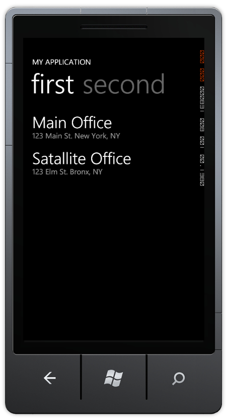
Now that you have updated the application to almost mimic the panorama control, let's actually run it. You should get something that looks like the following screenshot:

Now when you click on the word second, it jumps to the second content and the tab for the first moves to left and off the screen after the second tab. Unlike the pivot control that acts as a tab control, the panorama acts as a single sliding image. The pivot control also does not have the option for the background that moves independently from the content.
How it works...
If you begin to look at the XAML, you will notice that it is almost identical to the panorama control, as you can see below:
<phone:PhoneApplicationPage
x:Class="PivotExample.MainPage"
xmlns="http://schemas.microsoft.com/winfx/2006/xaml/presentation"
xmlns:x="http://schemas.microsoft.com/winfx/2006/xaml"
xmlns:phone="clr-namespace:Microsoft.Phone. Controls;assembly=Microsoft.Phone"
xmlns:shell="clr-namespace:Microsoft.Phone. Shell;assembly=Microsoft.Phone"
xmlns:controls="clr-namespace:Microsoft.Phone. Controls;assembly=Microsoft.Phone.Controls"
xmlns:d="http://schemas.microsoft.com/expression/blend/2008"
xmlns:mc="http://schemas.openxmlformats.org/ markup-compatibility/2006"
mc:Ignorable="d" d:DesignWidth="480" d:DesignHeight="768"
d:DataContext="{d:DesignData SampleData/MainViewModelSampleData. xaml}"
FontFamily="{StaticResource PhoneFontFamilyNormal}"
FontSize="{StaticResource PhoneFontSizeNormal}"
Foreground="{StaticResource PhoneForegroundBrush}"
SupportedOrientations="Portrait" Orientation="Portrait"
shell:SystemTray.IsVisible="True">
<!--LayoutRoot is the root grid where all page content is placed-->
<Grid x:Name="LayoutRoot" Background="Transparent">
<!--Pivot Control-->
<controls:Pivot Title="MY APPLICATION">
<!--Pivot item one-->
<controls:PivotItem Header="first">
<!--Double line list with text wrapping-->
<ListBox x:Name="FirstListBox" Margin="0,0,-12,0" ItemsSource="{Binding Items}">
<ListBox.ItemTemplate>
<DataTemplate>
<StackPanel Margin="0,0,0,17" Width="432">
<TextBlock Text="{Binding LineOne}" TextWrapping="Wrap" Style="{StaticResource PhoneTextExtraLargeStyle}"/>
<TextBlock Text="{Binding LineTwo}" TextWrapping="Wrap" Margin="12,-6,12,0" Style="{StaticResource PhoneTextSubtleStyle}"/>
</StackPanel>
</DataTemplate>
</ListBox.ItemTemplate>
</ListBox>
</controls:PivotItem>
<!--Pivot item two-->
<controls:PivotItem Header="second">
<!--Triple line list no text wrapping-->
<ListBox x:Name="SecondListBox" Margin="0,0,-12,0" ItemsSource="{Binding Items}">
<ListBox.ItemTemplate>
<DataTemplate>
<StackPanel Margin="0,0,0,17">
<TextBlock Text="{Binding LineOne}" TextWrapping="NoWrap" Margin="12,0,0,0" Style="{StaticResource PhoneTextExtraLargeStyle}"/>
<TextBlock Text="{Binding LineThree}" TextWrapping="NoWrap" Margin="12,-6,0,0" Style="{StaticResource PhoneTextSubtleStyle}"/>
</StackPanel>
</DataTemplate>
</ListBox.ItemTemplate>
</ListBox>
</controls:PivotItem>
</controls:Pivot>
</Grid>
<!--Sample code showing usage of ApplicationBar-->
<!--<phone:PhoneApplicationPage.ApplicationBar>
<shell:ApplicationBar IsVisible="True" IsMenuEnabled="True">
<shell:ApplicationBarIconButton IconUri="/Images/ appbar_button1.png" Text="Button 1"/>
<shell:ApplicationBarIconButton IconUri="/Images/ appbar_button2.png" Text="Button 2"/>
<shell:ApplicationBar.MenuItems>
<shell:ApplicationBarMenuItem Text="MenuItem 1"/>
<shell:ApplicationBarMenuItem Text="MenuItem 2"/>
</shell:ApplicationBar.MenuItems>
</shell:ApplicationBar>
</phone:PhoneApplicationPage.ApplicationBar>-->
</phone:PhoneApplicationPage>
The main thing to note is where it declares the pivot control. It essentially is declared as controls:Pivot instead of controls:Panorama. So now you are probably asking yourself "When should I use which one?". There are a couple of rules to consider:
Use the panorama control:
When you want to use a sliding background image
When you want to have all the child controls to be almost dragable to where you can peek at them from another control
Use the pivot control:
When you need to have the application bar (panorama control cannot have an application bar on the same screen)
You want to create the illusion of a tab control
Other things to keep in mind:
The panorama control can be much more memory intensive to use, especially depending on the number of panorama items and the background used
The pivot control is much more memory optimized for when you want a great number of child pivot items


