


Exploring and customizing the ZBrush UI
The ZBrush UI contains a 3D canvas, where you can view and work on your models. By default, it should look like this (though I have changed the UI color to allow for better readability in print):
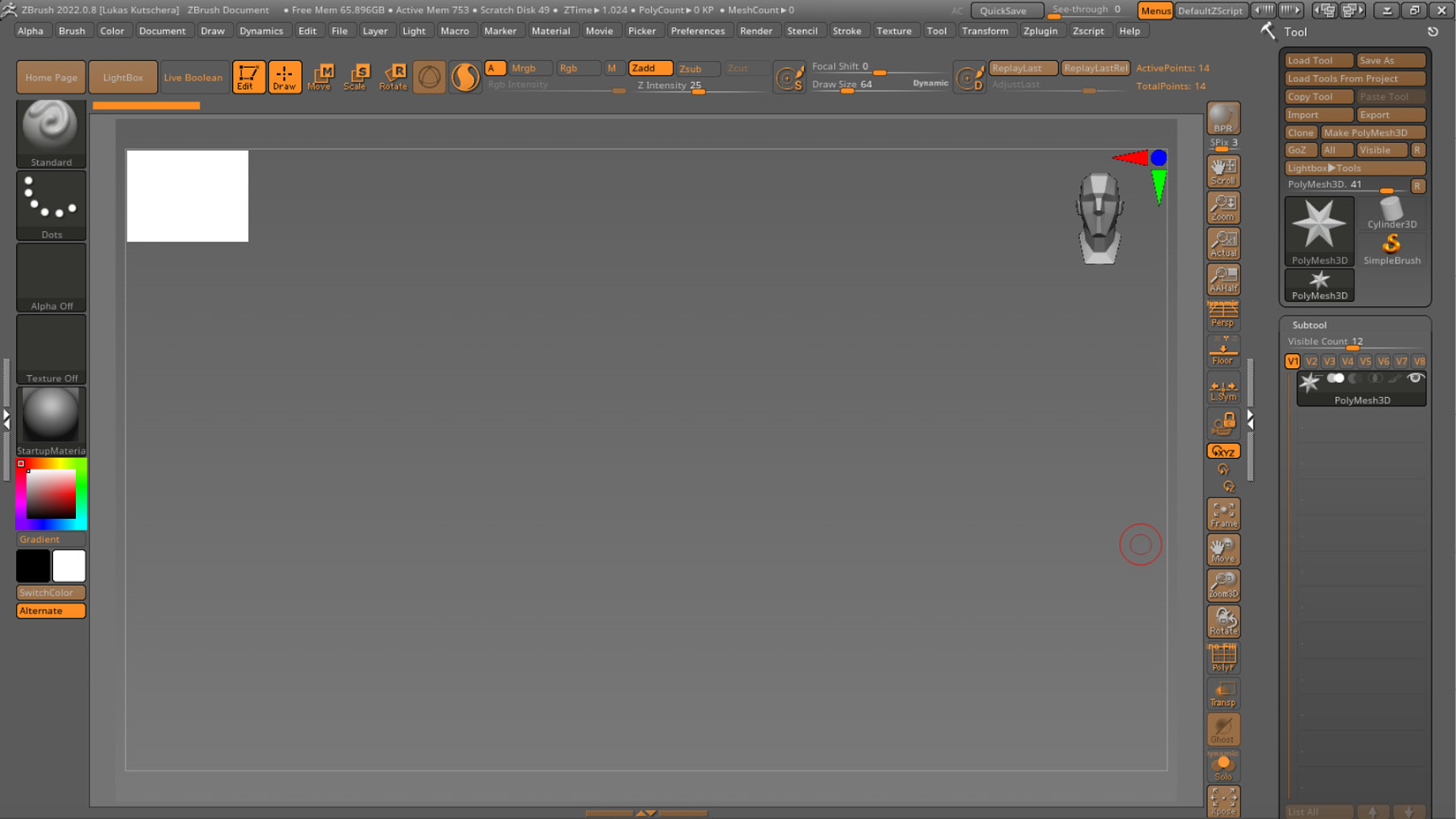
Figure 1.9 – The ZBrush UI
The buttons around the canvas are assembled there to be easily accessible; however, these same buttons can also be found in the ZBrush menus. If you click on a menu, it will open and show multiple sub-menus for you to explore.
Clicking on the Divider Space icon on the left and right sides of the screen (marked with a circle in the following screenshot) will create additional space, allowing you to drag and dock menus onto this space and keep them open and easily accessible:
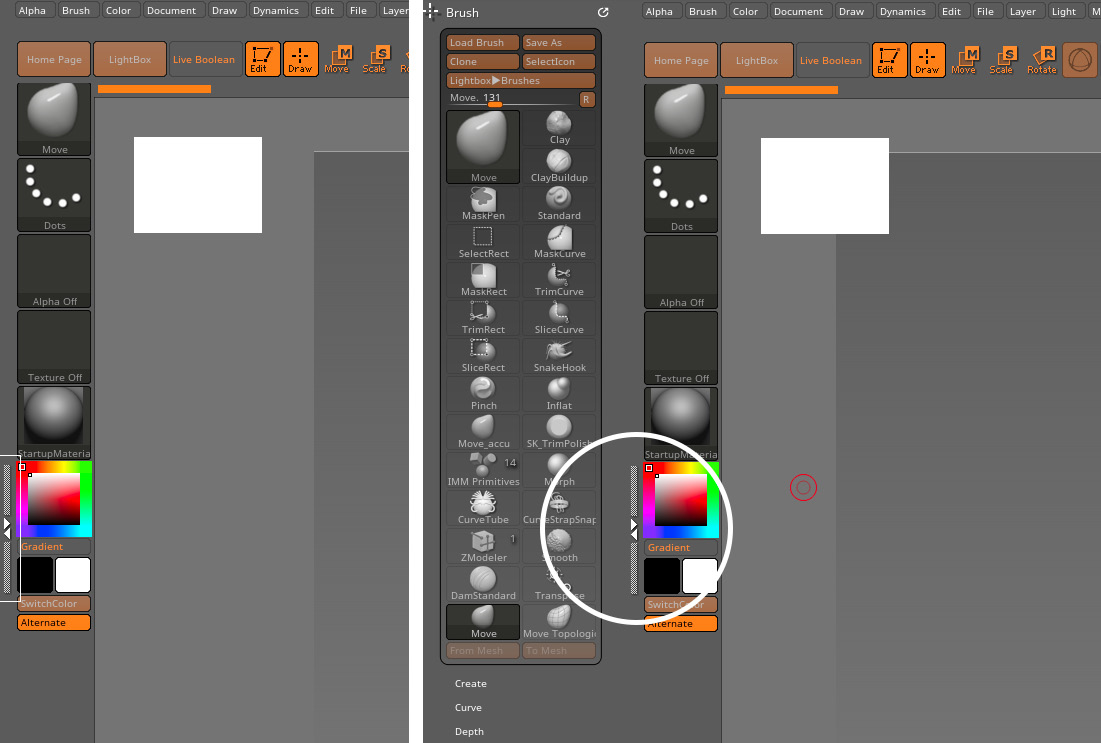
Figure 1.10 – Before (left) and after (right) adding space on the left side of the canvas
To do so, left-click and drag the circle symbol in the upper-left corner of the menu, move...


