Flexbox is a module for laying out portions of a page, and it currently has great browser support, starting with Internet Explorer 10. Technically, it's not designed for full-page layout; it's more for layout of portions of your page, or a given component.
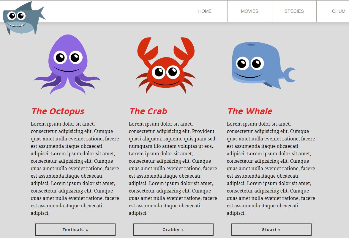
For instance, the following three columns (The Octopus, The Crab, and The Whale) were laid out using floats, but we're going to use flexbox to do the exact same thing:

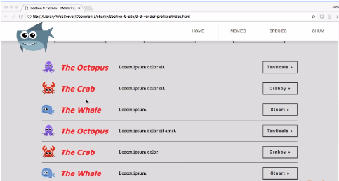
Flexbox is a big topic, so we're going to be covering it across two chapters. This chapter will cover the basics, we'll tackle implementing flexbox, switching from floats to flexbox, and go through all the flexbox properties and shorthands. In the next chapter we'll build a new section—the following product listing—to demonstrate how we can build different things with flexbox:


