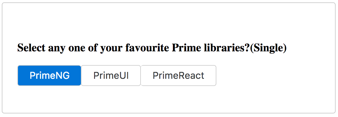
The SelectButton component is used to choose single or multiple items from a list in the form of buttons. Each item in the list of options is defined as the SelectItem interface with a label-value pair properties. The options are binding through the ngModel property with a two-way binding, which results in the default selection based on the backend component data. A basic example of the select button usage would be as follows:
<p-selectButton [options]="types" [(ngModel)]="selectedType"
  name="basic">
</p-selectButton>
In the preceding example, all the Prime libraries are collected as an array for the options property. The following screenshot shows a snapshot result of the select button example:

In the preceding example, only one item is selected at a time (single selection) but there is also a possibility to select multiple items using the multiple property (that is, multiple="true"). In this scenario, the selected...


