Overview
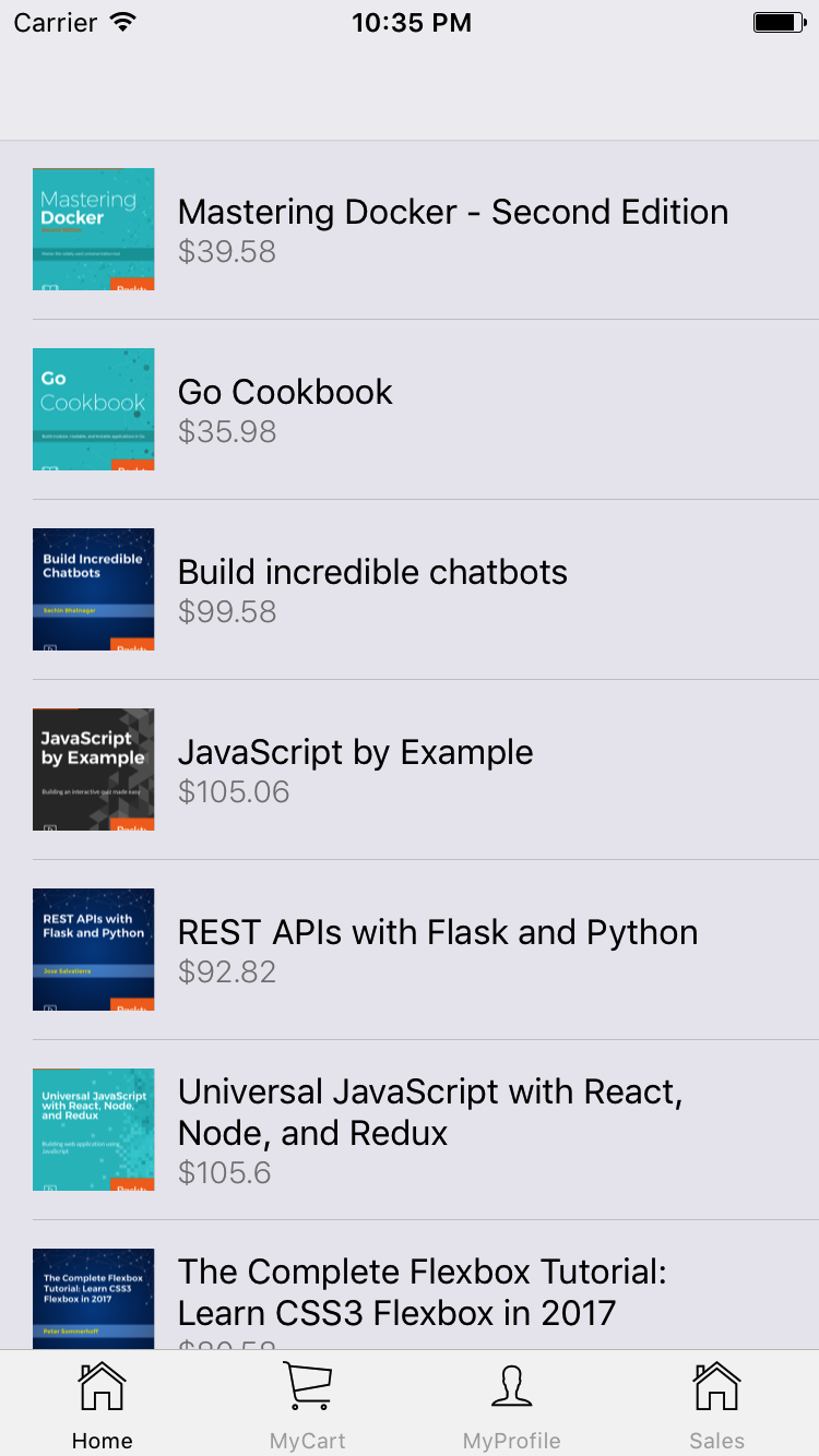
Instead of putting much effort into the app's look and feel, as we did in previous chapters, we will focus on functionality and code quality for this one. Nevertheless, we will build it in a way which will allow any developer to style it easily at a later stage. With that in mind, let's take a look at what the app will look like once finished.
Let's start from the home screen where all the books are displayed:
In Android, we will add a drawer navigation pattern instead of a tabbed one as Android users are more used to it:
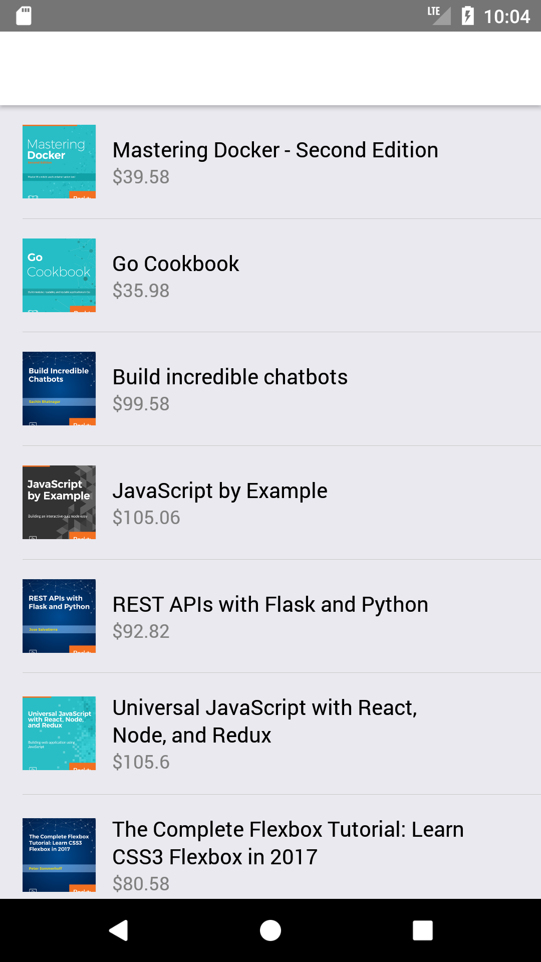
The drawer can be opened by swiping the screen from the left edge to the right:
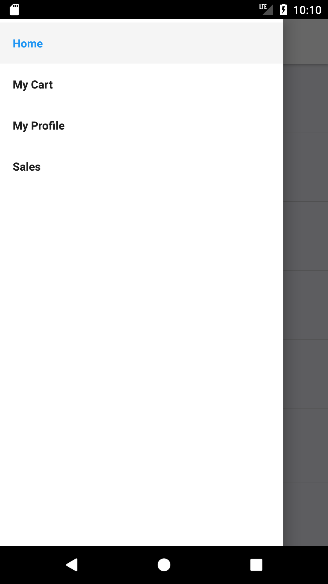
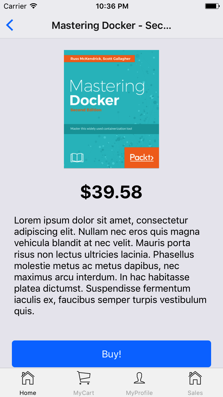
Now, let's see what happens when a user taps on one of the books from the home screen (list of books available):
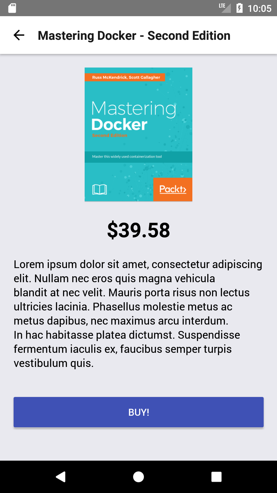
The Android version for this screen will be similar, as only a couple of native components will adopt a different styling, depending on which platform the app is executed:
Only logged-in users will be able to buy books from our app. This means that we need to pop up a login/registration...


