Overview
When building mobile apps, we need to make sure we reduce the interface complexity to the minimum, as it's often punishing to present the user intrusive manuals or tooltips once the app is open. It is a good practice to make our app self-explanatory, so the user can understand the usage just by going through the app screens. That's why using standard components such as drawer menus or standard lists is always a good idea, but is not always possible (as it happens in our current app) due to the kind of data we want to present to the user.
In our case, we put all the functionality in the main screen plus in a modal box. Let's take a look at what the app will look like on iOS devices:
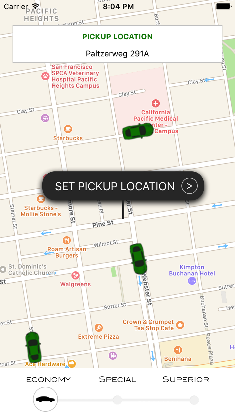
The background on our main screen is the maps component itself where we will show all the available cars as markers in the map. On the maps, we will display three components:
- The pickup location box displaying the selected pickup location
- The location pin, which can be dragged around the maps to select a...


