The Users report gives administrators the ability to focus on a particular user or a particular activity, as well as to compare users by selecting different metrics and filters.
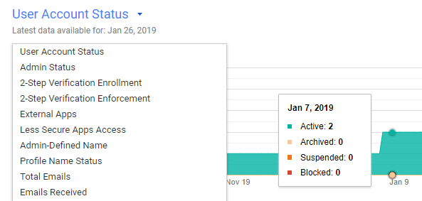
Above the account activity report, you will see a dynamic timeline that shows your users' activity through time; this can give you many insights into your team's activities. Click on the name of the metric to see a list with all the available options:

Below the timeline, you will see a dynamic table with aggregate information that will allow you to easily compare your users:

If you click on a column name, the chart will show the timeline for that metric, and you can select the columns on display by clicking on the Select columns  icon (the icon that looks like three gray lines) and choosing the metrics you are looking for.
Since there are so many metrics that...


