The basic style of Matplotlib plots is fine for plotting functions or data that is ordered, but it is less appropriate for plotting discrete data that is not presented in any order. To prevent Matplotlib from drawing lines between each data point, we can change the plotting style to "turn off" the line drawing. In this recipe, we will customize the plotting style for each line on the axes by adding a format string argument to the plot method.
Getting ready
You will need to have your data stored in pairs of arrays. For the purposes of this demonstration, we will define the following data:
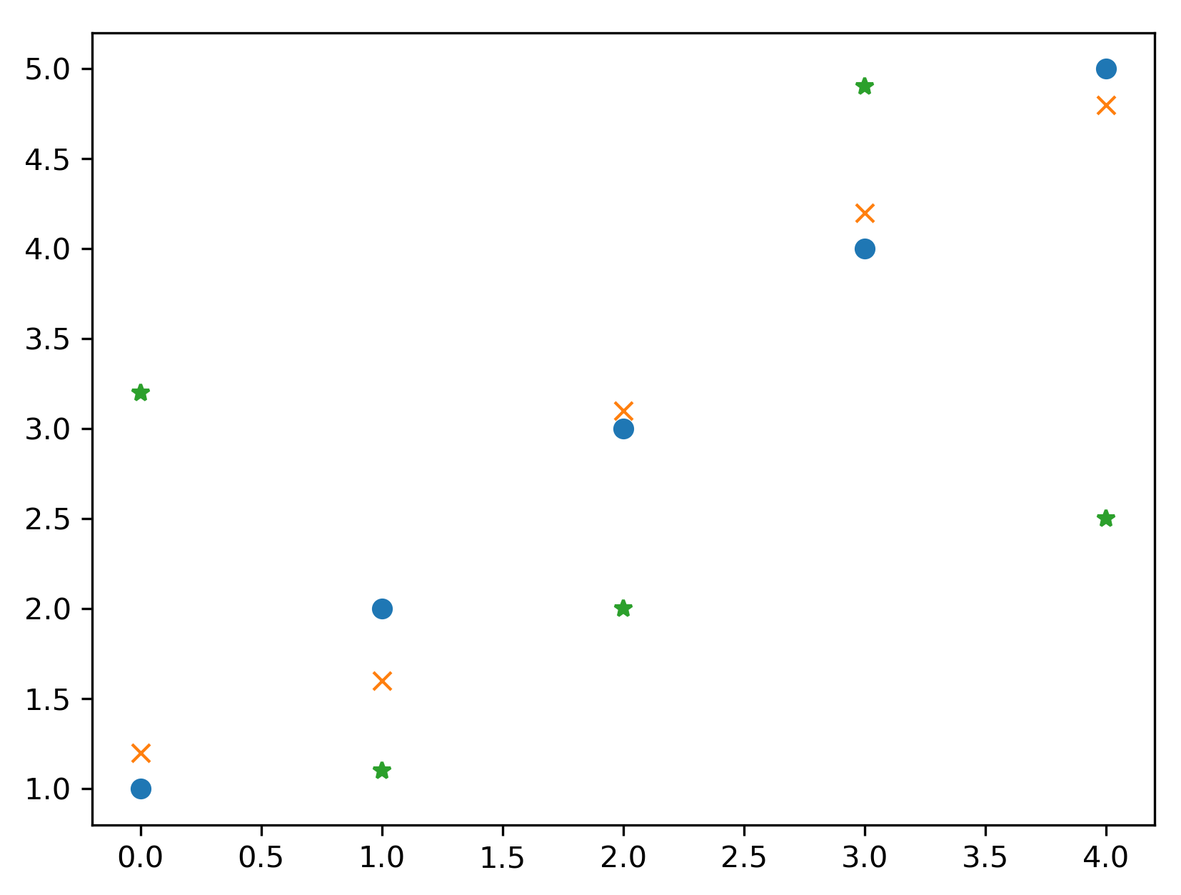
y1 = np.array([1.0, 2.0, 3.0, 4.0, 5.0])
y2 = np.array([1.2, 1.6, 3.1, 4.2, 4.8])
y3 = np.array([3.2, 1.1, 2.0, 4.9, 2.5])
We will plot these points against their position in the array (that is, the x coordinate will be 0, 1, 2, 3, or 4, respectively, for each array).
How to do it...
The easiest way to control the style of a plot is to use a format string, which is provided as an optional argument after the x-y pair or the ydata in the plot command. When plotting multiple sets of data, a different format string can be provided for each set of arguments. The following steps give a general procedure for creating a new figure and plotting data on this figure:
- We first create the Figure and Axes objects explicitly using the subplots routine from pyplot:
fig, ax = plt.subplots()
- Now that we have created the Figure and Axes objects, we can plot the data using the plot method on the Axes object. This method takes the same arguments as the plot routine from pyplot:
lines = ax.plot(y1, 'o', y2, 'x', y3, '*')
This plots the first dataset (y1) with a circle marker, the second (y2) with an x marker, and the third (y3) with a star (*) marker. The output of this command is shown in Figure 2.3. The format string can specify a number of different marker lines and color styles. The same applies if we instead used the plot routine from the pyplot interface, which has the same calling signature as the plot method:
How it works...
The format string has three optional parts, each consisting of one or more characters. The first part controls the marker style, which is the symbol that is printed at each data point; the second controls the style of the line that connects the data points; and the third controls the color of the plot. In this recipe, we onlyspecified the marker style, which means that no connecting line is drawn between adjacent data points. This is useful for plotting discrete data where no interpolation between points is necessary. Four line style parameters are available: a solid line (-); a dashed line (--); a dash-dot line (-.); or a dotted line (:). Only a limited number of colors can be specified in the format string; they are red, green, blue, cyan, yellow, magenta, black, and white. The character used in the format string is the first letter of each color (with the exception of black), so the corresponding characters arer, g, b, c, y,m, k, and w, respectively.
For example, if we want to change the marker style only, as we did in this recipe, to a plus character, we would use the "+"format string. If we also want to change the line style to a dash-dot line, we would use the "+-."format string. Finally, if we also wish to change the color of the marker to red, we would use the "+-.r"format string. These specifiers can also be provided in other configurations, such as specifying the color before the marker style, but this might lead to ambiguities in the way Matplotlib parses the format string.
There's more...
The plot method also accepts a number of keyword arguments that can also be used to control the style of a plot. Keyword arguments take precedence over format string parameters if both are present, and they apply to all sets of data plotted by the call. The keyword to control the marker style is marker, the keyword for the line style is linestyle, and the keyword for color is color. The color keyword argument accepts a number of different formats to specify a color, which includes RGB values as a (r, g, b)tuple, where each character is a float between 0 and 1 or is a hex string. The width of the line plotted can be controlled using the linewidthkeyword, which should be provided with afloat value. There are many other keyword arguments that can be passed to plot; a list is given in the Matplotlib documentation. Many of these keyword arguments have a shorter version, such as c for color and lw for linewidth.
For example, we could set the color of all of the markers in the recipe by using the color keyword argument in the call to plot using the following command:
ax.plot(y1, 'o', y2, 'x', y3, '*', color="k")
The Line2D objects returned from calls to the plot method (or the plt.plot routine) can also be used to customize the appearance of each set of data. For example, the set_linestyle method in a Line2D object can be used, with the appropriate line style format string, to set the line style.
Other aspects of the plot can be customized by using methods on the Axes object. The axes ticks can be modified using the set_xticks and set_yticks methods on the Axes object, and the grid appearance can be configured using the grid method. There are also convenient methods in the pyplot interface that apply these modifications to the current axes (if they exist).
For example, we modify the axis limits, set the ticks at every multiple of 0.5 in both the x and y direction, and add a grid to the plot by using the following commands:
ax.axis([-0.5, 5.5, 0, 5.5]) # set axes
ax.set_xticks([0.5*i for i in range(9)])  # set xticks
ax.set_yticks([0.5*i for i in range(11)] # set yticks
ax.grid()  # add a grid
Notice how we set the limits slightly larger than the extent of the plot. This is to avoid markers being placed on the boundary of the plot window.
The scatter plotting routine may be better if you wish to plot discrete data on axes without connecting the points with a line. This allows more control over the style of the marker. For example, you can scale the marker according to some additional information.