Plotting is an important part of understanding behavior. So much can be learned by simply plotting a function or data that would otherwise be hidden. In this recipe, we will walk through how to plot a simple function or data using Matplotlib.
Matplotlib is a very powerful plotting library, which means it can be rather intimidating to perform simple tasks with it. For users who are used to working with MATLAB and other mathematical software packages, there is a state-based interface called pyplot. There is also an object-orientated interface, which might be more appropriate for more complex plots. The pyplot interface is a convenient way to create basic objects.
Getting ready
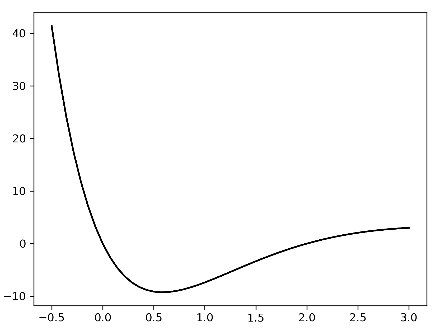
Most commonly, the data that you wish to plot will be stored in two separate NumPy arrays, which we will label xand yfor clarity (although this naming does not matter in practice). We will demonstrate plotting the graph of a function, so we will generate an array of x values and use the function to generate the corresponding y values. We define the function that we will plot as follows:
def f(x):
    return x*(x - 2)*np.exp(3 - x)
How to do it...
Before we can plot the function, we must generate the x and y data to be plotted. If you are plotting existing data, you can skip these commands. We need to create a set of the x values that cover the desired range, and then use the function to create the y values:
- The linspace routine from NumPy is ideal for creating arrays of numbers for plotting. By default, it will create 50 equally spaced points between the specified arguments. The number of points can be customized by providing an additional argument, but 50 is sufficient for most cases:
x = np.linspace(-0.5, 3.0) # 100 values between -0.5 and 3.0
- Once we have created the x values, we can generate the y values:
y = f(x) # evaluate f on the x points
- To plot the data, we simply need to call the plot function from the pyplot interface, which is imported under the plt alias. The first argument is the xdata and the second is the y data. The function returns a handle to the axes object on which the data is plotted:
plt.plot(x, y)
- This will plot the y values against the x values on a new figure. If you are working within IPython or with a Jupyter notebook, then the plot should automatically appear at this point; otherwise, you might need to call the plt.show function to make the plot appear:
plt.show()
If you use plt.show, the figure should appear in a new window. The resulting plot should look something like the plot in Figure 2.1. The default plot color might be different on your plot. It has been changed for high visibility for this book:
We won't add this command to any further recipes in this chapter, but you should be aware that you will need to use it if you are not working in an environment where plots will be rendered automatically, such as an IPython console or Jupyter Notebook.
How it works...
If there are currently no Figure or Axes objects, the plt.plot routine creates a new Figure object, adds a new Axes object to the figure, and populates this Axes object with the plotted data. A list of handles to the plotted lines is returned. Each of these handles is a Lines2D object. In this case, this list will contain a single Lines2D object. We can use this Lines2D object to customize the appearance of the line later (see the Changing the plotting style recipe).
The object layer of Matplotlib interacts with a lower-level backend, which does the heavy lifting of producing the graphical plot. The plt.show function issues an instruction to the backend to render the current figure. There are a number of backends that can be used with Matplotlib, which can be customized by setting the MPLBACKEND environment variable, modifying the matplotlibrc file, or by calling matplotlib.use from within Python with the name of an alternative backend.
There's more...
It is sometimes useful to manually instantiate a Figure object prior to calling the plot routine—for instance, to force the creation of a new figure. The code in this recipe could instead have been written as follows:
fig = plt.figure()  # manually create a figure
lines = plt.plot(x, y)  # plot data
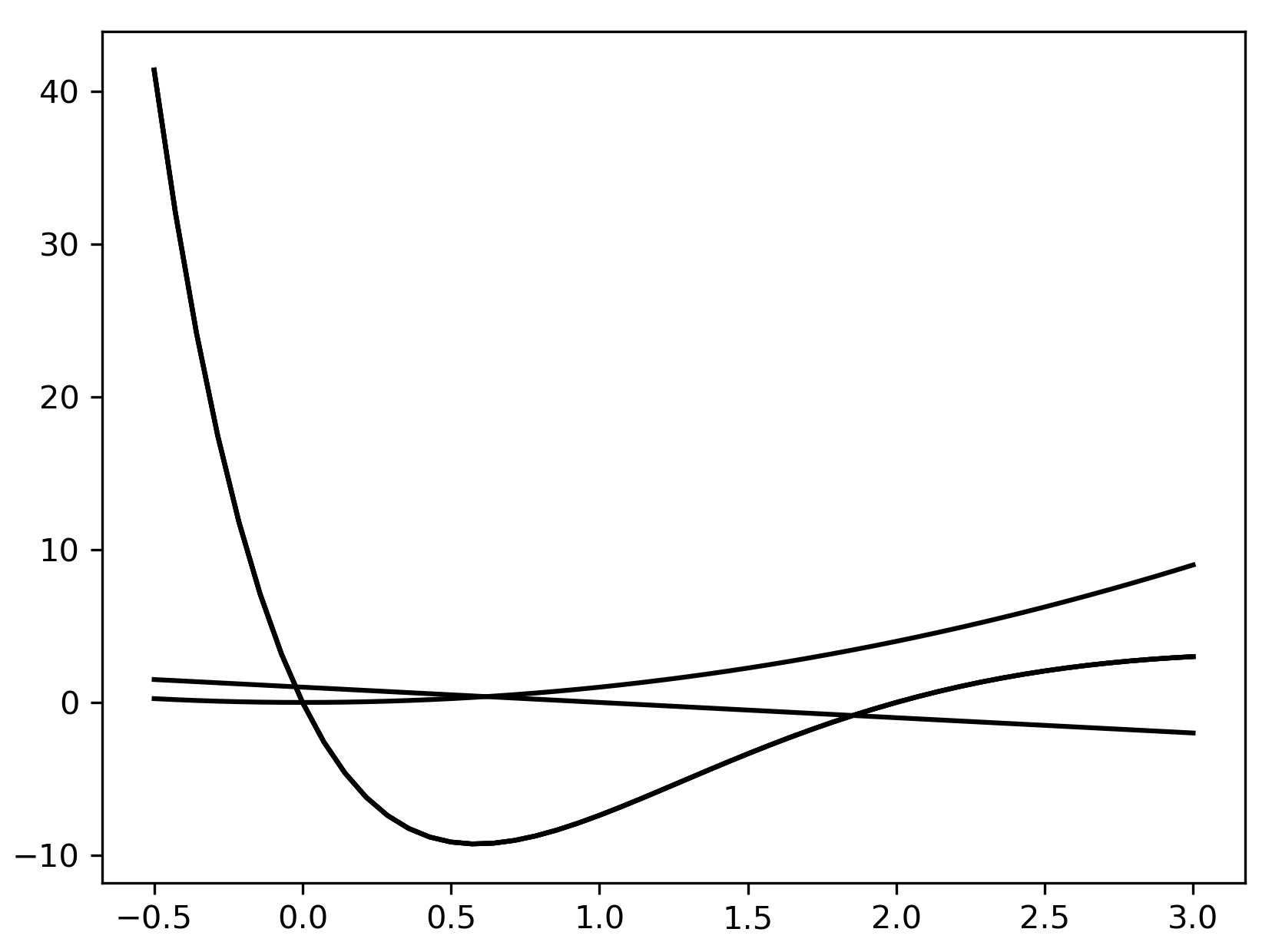
The plt.plot routine accepts a variable number of positional inputs. In the preceding code, we supplied two positional arguments that were interpreted as x values and y values (in that order). If we had instead provided only a single array, the plot routine would have plotted the values against their position in the array; that is, the x values are taken to be 0, 1, 2, and so on. We could also supply multiple pairs of arrays to plot several sets of data on the same axes:
x = np.linspace(-0.5, 3.0)
lines = plt.plot(x, f(x), x, x**2, x, 1 - x)
The output of the preceding code is as follows:
It is occasionally useful to create a new figure and explicitly create a new set of axes in this figure together. The best way to accomplish this is to use the subplots routine in the pyplot interface (refer to the Adding subplots recipe). This routine returns a pair, where the first object is Figure and the second is an Axes object:
fig, ax = plt.subplots()
l1 = ax.plot(x, f(x))
l2 = ax.plot(x, x**2)
l3 = ax.plot(x, 1 - x)
This sequence of commands produces the same plot as the preceding one displayed in Figure 2.2.
Matplotlib has many other plotting routines besides the plot routine described here. For example, there are plotting methods that use a different scale for the axes, including the logarithmic x or y axes separately (semilogx or semilogy, respectively) or together (loglog). These are explained in the Matplotlib documentation.