Search icon CANCEL
Subscription
0
Cart icon
Your Cart (0 item)
Close icon
You have no products in your basket yet
Save more on your purchases! discount-offer-chevron-icon
Savings automatically calculated. No voucher code required.
Arrow left icon
Explore Products
Best Sellers
New Releases
Books
Videos
Audiobooks
Learning Hub
Free Learning
Arrow right icon
Arrow up icon
GO TO TOP
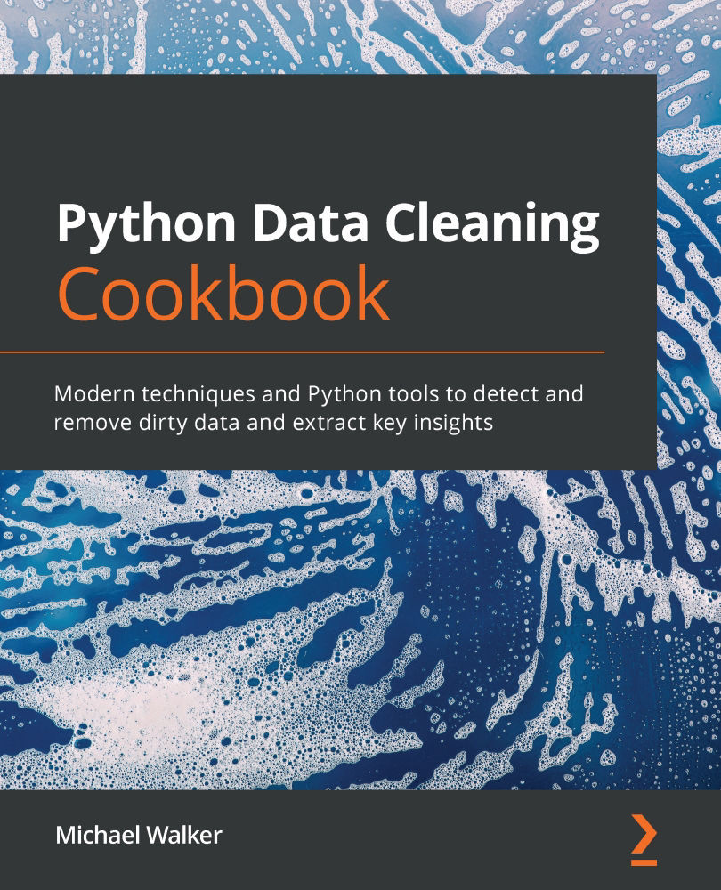
Python Data Cleaning Cookbook

You're reading from   Python Data Cleaning Cookbook Modern techniques and Python tools to detect and remove dirty data and extract key insights

Arrow left icon
Product type Paperback
Published in Dec 2020
Publisher Packt
ISBN-13 9781800565661
Length 436 pages
Edition 1st Edition
Languages
Tools
Arrow right icon
Authors (2):
Arrow left icon
Michael B Walker Michael B Walker
Author Profile Icon Michael B Walker
Michael B Walker
Michael Walker Michael Walker
Author Profile Icon Michael Walker
Michael Walker
Arrow right icon
View More author details
Toc

Table of Contents (12) Chapters Close

Preface 1. Chapter 1: Anticipating Data Cleaning Issues when Importing Tabular Data into pandas 2. Chapter 2: Anticipating Data Cleaning Issues when Importing HTML and JSON into pandas FREE CHAPTER 3. Chapter 3: Taking the Measure of Your Data 4. Chapter 4: Identifying Missing Values and Outliers in Subsets of Data 5. Chapter 5: Using Visualizations for the Identification of Unexpected Values 6. Chapter 6: Cleaning and Exploring Data with Series Operations 7. Chapter 7: Fixing Messy Data when Aggregating 8. Chapter 8: Addressing Data Issues When Combining DataFrames 9. Chapter 9: Tidying and Reshaping Data 10. Chapter 10: User-Defined Functions and Classes to Automate Data Cleaning 11. Other Books You May Enjoy

Chapter 5: Using Visualizations for the Identification of Unexpected Values

We dipped our toes in the water with visualizations in several recipes in the previous chapter. We used histograms and QQ plots to examine the distribution of a single variable, and scatter plots to view how two variables are related. But we were just scratching the surface of the rich visualization tools available in the Matplotlib and Seaborn libraries. Getting comfortable with these tools, and their seemingly inexhaustible capabilities, can help us uncover patterns and oddities that are not obvious when we run the standard battery of descriptives.

Boxplots, for example, are a great tool for visualizing values outside of a certain range. These can be extended with grouped boxplots or violin plots that allow us to compare distributions across subsets of data. We can also do much more with scatter plots than we did in the last chapter, including getting some sense of multivariate relationships. Histograms...

lock icon The rest of the chapter is locked
Register for a free Packt account to unlock a world of extra content!
A free Packt account unlocks extra newsletters, articles, discounted offers, and much more. Start advancing your knowledge today.
Unlock this book and the full library FREE for 7 days
Get unlimited access to 7000+ expert-authored eBooks and videos courses covering every tech area you can think of
Renews at $19.99/month. Cancel anytime
Banner background image