Welcome to the world of Matplotlib 2.0! Follow our simple example in the chapter and draw your first "Hello world" plot.
Hello Matplotlib!
What is Matplotlib?
Matplotlib is a versatile Python library that generates plots for data visualization. With the numerous plot types and refined styling options available, it works well for creating professional figures for presentations and scientific publications. Matplotlib provides a simple way to produce figures to suit different purposes, from slideshows, high-quality poster printing, and animations to web-based interactive plots. Besides typical 2D plots, basic 3D plotting is also supported.
On the development side, the hierarchical class structure and object-oriented plotting interface of Matplotlib make the plotting process intuitive and systematic. While Matplotlib provides a native graphical user interface for real-time interaction, it can also be easily integrated into popular IPython-based interactive development environments, such as Jupyter notebook and PyCharm.
What's new in Matplotlib 2.0?
Matplotlib 2.0 features many improvements, including the appearance of default styles, image support, and text rendering speed. We have selected a number of important changes to highlight later. The details of all new changes can be found on the documentation site at http://matplotlib.org/devdocs/users/whats_new.html.
If you are already using previous versions of Matplotlib, you may want to pay more attention to this section to update your coding habits. If you are totally new to Matplotlib or even Python, you may jump ahead to start using Matplotlib first, and revisit here later.
Changes to the default style
The most prominent change to Matplotlib in version 2.0 is to the default style. You can find the list of changes here: http://matplotlib.org/devdocs/users/dflt_style_changes.html. Details of style setting will be covered in Chapter 2, Figure Aesthetics.
Color cycle
For quick plotting without having to set colors for each data series, Matplotlib uses a list of colors called the default property cycle, whereby each series is assigned one of the default colors in the cycle. In Matplotlib 2.0, the list has been changed from the original red, green, blue, cyan, magenta, yellow, and black, noted as ['b', 'g', 'r', 'c', 'm', 'y', 'k'], to the current category10 color palette introduced by the Tableau software. As implied by the name, the new palette has 10 distinct colors suitable for categorical display. The list can be accessed by importing Matplotlib and calling matplotlib.rcParams['axes.prop_cycle'] in Python.
Colormap
Colormaps are useful in showing gradient. The yellow to blue "viridis" colormap is now the default one in Matplotlib 2.0. This perceptually uniform colormap better represents the transition of numerical values visually than the classic “jet” scheme. This is a comparison between two colormaps:

Besides defaulting to a perceptually continuous colormap, qualitative colormaps are now available for grouping values into categories:

Scatter plot
Points in a scatter plot have a larger default size and no longer have a black edge, giving clearer visuals. Different colors in the default color cycle will be used for each data series if the color is not specified:


Legend
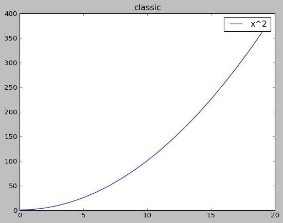
While previous versions set the legend in the upper-right corner, Matplotlib 2.0 sets the legend location as "best" by default. It automatically avoids overlapping of the legend with the data. The legend box also has rounded corners, lighter edges, and a partially transparent background to keep the focus of the readers on the data. The curve of square numbers in the classic and current default styles demonstrates the case:

Line style
Dash patterns in line styles can now scale with the line width to display bolder dashes for clarity:

Patch edges and color
Just like the dots in the scatter plot shown before, most filled elements ("artists", which we will explain more in Chapter 2, Figure Aesthetics) no longer have a black edge by default, making the graphics less cluttered:

Fonts
The default font is now changed from "Bitstream Vera Sans" to "DejaVu Sans". The current font supports additional international, math, and symbol characters, including emojis.
Improved functionality or performance
Matplotlib 2.0 presents new features that improve the user experience, including speed and output quality as well as resource usage.
Improved color conversion API and RGBA support
The alpha channel, which specifies the degree of transparency, is now fully supported in Matplotlib 2.0.
Improved image support
Matplotlib 2.0 now resamples images with less memory and less data type conversion.
Faster text rendering
It is claimed that the speed of text rendering by the Agg backend is increased by 20%. We will discuss more on backends in Chapter 6, Adding Interactivity and Animating Plots.
Change in the default animation codec
To generate a video output of animated plots, a more efficient codec, H.264, is now used by default in place of MPEG-4. As H.264 has a higher compression rate, the smaller output file size permits longer video record time and reduces the time and network data needed to load them. Real-time playback of H.264 videos is generally more fluent and in better quality than those encoded in MPEG-4.
Changes in settings
Some of the settings are changed in Matplotlib v2.0 for convenience or consistency, or to avoid unexpected results.
New configuration parameters (rcParams)
New parameters are added, such as date.autoformatter.year for date time string formatting.
Style parameter blacklist
Style files are no longer allowed to configure settings unrelated to the style to prevent unexpected consequences. These parameters include the following:
'interactive', 'backend', 'backend.qt4', 'webagg.port', 'webagg.port_retries', 'webagg.open_in_browser', 'backend_fallback', 'toolbar', 'timezone', 'datapath', 'figure.max_open_warning', 'savefig.directory', tk.window_focus', 'docstring.hardcopy'
Change in Axes property keywords
The Axes properties axisbg and axis_bgcolor are replaced by facecolor to keep the keywords consistent.


