Updates and new features
2023 marks a decade since Adobe released Creative Cloud, replacing the older Creative Suite in June 2013. Much has changed in that time. Arguably, Adobe’s most significant advances have been digital connectivity between its flagship desktop apps such as Photoshop, and online technology that allows for greater collaboration.
Thanks to a constantly connected workplace, today’s Creative Cloud updates are more of a trickle than a deluge. Outside of Adobe’s annual creativity festival, Adobe MAX, new updates can be installed automatically with little to no fanfare. With this in mind, I’ve summarized the most significant changes to Adobe Photoshop in recent months, just in case they passed you by!
Contextual Task Bar
To reduce the amount of time you spend navigating the interface for tools and features, Photoshop now includes the contextual task bar. Its aim is to predict your next logical step and put those options close to your cursor. The default position of the contextual task bar is often at the bottom of the image window. If, however, you have a text layer active, the contextual task bar will move to the underside of the text frame in the active layer. You can hide, reset, or pin (lock) the position of the contextual task bar by clicking on the More Options icon (shown as A in Figure 1.1) to reveal the options:

Figure 1.1: The Contextual Task Bar
Depending on the kind of layer you have active or the tool you have selected, the options in the contextual task bar will vary. For example, when you create a new document, the contextual task bar displays a button for importing an image, or under the More Options icon, you can reveal the Properties panel.
When you open an existing document containing only a background layer, the contextual task bar will display the Select subject, Remove background, Transform image (shown as B in Figure 1.2), and Create new adjustment layer (C) icons. Clicking on Select subject results in a selection of a prominent region in your image, providing one can be detected, while Remove background goes one step further and conceals the region of the image around your subject with a layer mask.
If an unlocked layer is active, the contextual task bar and the Transform image icon will become available. When you left-click on the Transform image icon, the contextual task bar changes to display Flip Horizontal (D) and Flip Vertical (E) icons. You can subsequently apply or abort your transform edits by clicking on Done or Cancel respectively:

Figure 1.2: Transform and adjustment layer options in the Contextual Task Bar
With a selection active, the contextual task bar displays options to modify your selection (shown as F in Figure 1.3), invert a selection (H), create a layer mask from the selection (G), or fill the selection (I). In addition, you can deselect an existing selection and fill a region with pixels using Generative Fill:
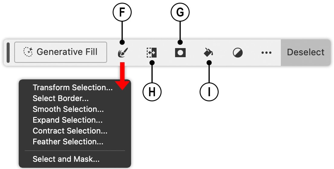
Figure 1.3: Selection options in the Contextual Task Bar
Some of the best time-saving features to be found in the contextual task bar relate to the task of editing layer masks, a process that will be covered in greater depth in Chapter 3 of this book. With a layer active and containing a layer mask, you can now press the Subtract from mask button, which switches you to the Brush tool and sets the foreground color in the Tools panel to black. Then, simply click and drag across parts of your layer to reveal pixel content. You can also achieve the opposite result by clicking on the Add to mask button, which sets the foreground color to white. You can click on the Modify mask feather and density icon (shown as J in Figure 1.4) to reveal a popup. You can also launch the Select and mask workspace to access the full suite of mask refinement features from the same popup. The final two icons are for Hide mask (Figure 1.4, K) and Change mask view (Figure 1.4, L):
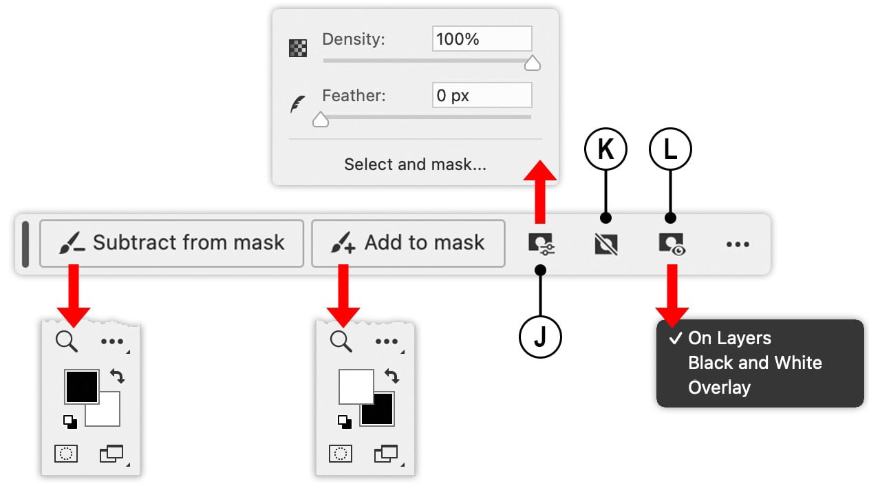
Figure 1.4: Masking options in the Contextual Task Bar
Adobe Firefly
In recent years, there has been growing interest in the practical use of artificial intelligence (AI) in creative industries. AI-driven technology has featured in Photoshop for many years since the arrival of Content-Aware Fill. However, the emergence of imagery that is generated from a text prompt represents a seismic shift in digital image creation.
Adobe Photoshop 2024 includes its own text-to-image AI in the form of Adobe Firefly, allowing you to add content to an existing image using two methods: Generative Fill and Generative Expand. Generative Fill uses an active selection to remove unwanted content or add new pixels via a text prompt, while Generative Expand extends your existing canvas, creating new pixels in the expanded region.
In the example shown in Figure 1.5, the image contained a rickety old chair, which I felt could benefit from a subject to enhance visual interest. I created a basic selection with the Rectangular Marquee tool around the region where I wanted the subject. With the selection in place, the contextual task bar then displayed the Generative text prompt field, into which I typed Seagull and pressed the Generate button:
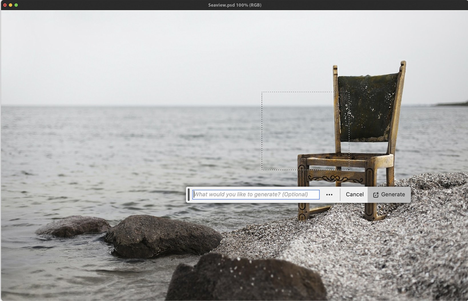
Figure 1.5: Generative Fill options in the Contextual Task Bar
After a few seconds, Photoshop displayed a seagull in a new generative layer. The contextual task bar then changed to display one of three possible results from my text prompt. You can use the Previous and Next buttons to cycle through each version. The Properties panel also displays your text prompt and thumbnails of the three results.
In this scenario, the results Photoshop delivered were impressive, even down to minor details such as the position of the birds’ feet on top of the chair frame. In addition, Photoshop has also matched the light and shade of the original image as well as the angle with a high degree of accuracy. For the best results, try using descriptive nouns and adjectives in your Generative Fill prompts instead of instructive prompts such as “create a landscape.”
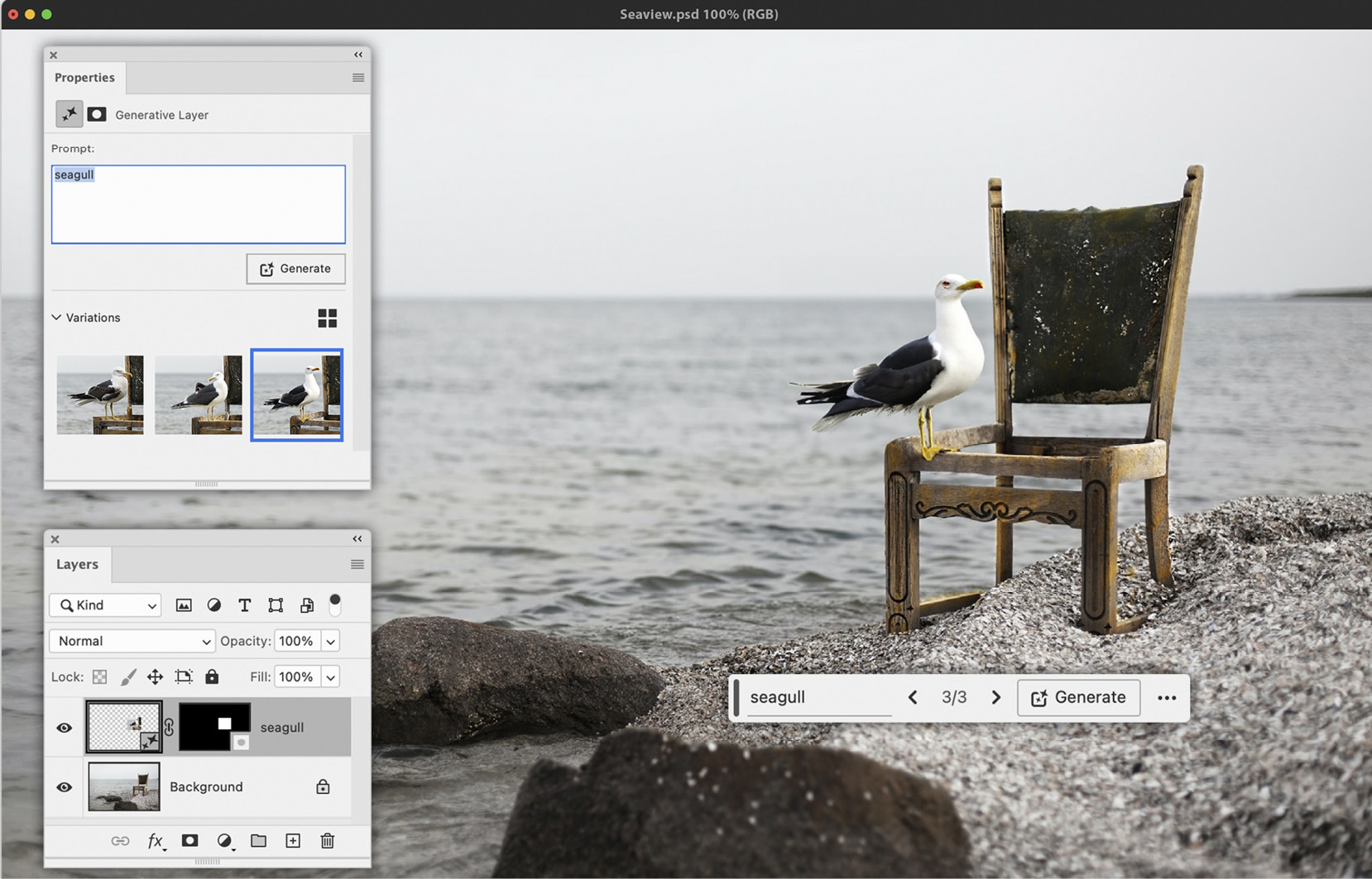
Figure 1.6: Generative Fill used to add a seagull to the image
As with most features, there are limitations. You’ll need an internet connection to use Generative Fill. At the time of writing, shortly after Adobe MAX in October 2023, the maximum resolution Generative Fill can render is 1024 pixels. If you’re trying to fill a large region in a high-quality image, larger than 1024, the results might appear a little blurred.
Creative Cloud users on an All Apps package have 1,000 generative credits included with their monthly subscription. Each text prompt you generate in Photoshop uses one credit. You can monitor your credit usage by logging in to your Creative Cloud account. Adobe’s reason for rationing the use of Generative Fill is that it requires significant computational resources. At the time of writing, you can purchase additional credits for $4.99 (USD) per month for an additional 100 credits.
The Remove tool
For many years, I’ve resorted to using the Spot Healing Brush tool to remove unwanted content from an image. In general, the Spot Healing Brush tool has provided good results, albeit occasionally, it would add back unwanted pixels and require a little finessing. With the addition of the Remove tool in May 2023, the process has become simpler thanks to a simplified workflow when compared to other healing and retouching tools.
Firstly, you don’t have to concern yourself with a full set of brush tip settings, just the brush tip size. This can also be changed by pressing the open ([) and closed (]) bracket keys respectively to make the brush size smaller or larger. Then, click and drag the cursor across the region you wish to remove. Once you release the left mouse button, leave Photoshop to repurpose the surrounding pixels and replace unwanted pixels.
The affected region will be highlighted by a translucent color as you drag across it. You can change this from the Options bar to improve legibility depending on the content within your image. To do so, click on the cog icon in the Options bar to define one of thirteen different highlight colors and the opacity of the color.
Another advantage of the Remove tool is that you can choose to make several brush stroke marks before applying an edit. To do this, turn off the Remove after each stroke checkbox in the Options bar. Then, when you’re ready to apply the edits, click on the Commit button in the Options bar.
You can also use a nifty, hidden feature that is built into the Remove tool, allowing you to paint around the perimeter (shown as B in Figure 1.7) of the region you wish to remove instead of having to paint the entire area (Figure 1.7, A). This technique can be used with or without the Remove after each stroke feature being active. The inset image (Figure 1.7, C) demonstrates the completed edits:
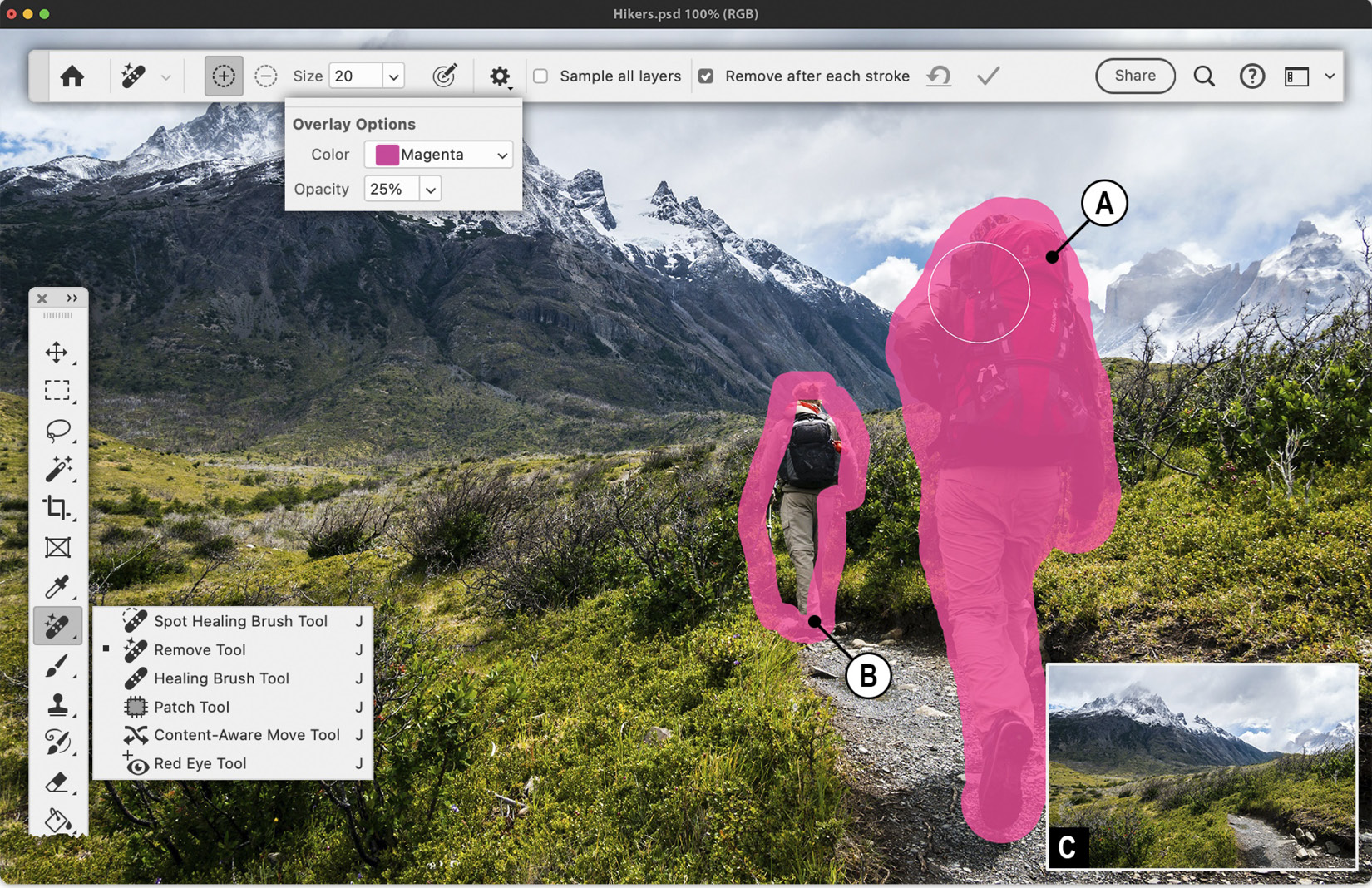
Figure 1.7: The Remove tool and related settings
Adjustment presets
The Adjustments panel now includes a library of presets that allow you to quickly preview how they will appear on your image before adding them to your document. These range from classic black and white for portraiture to split-tone effects:
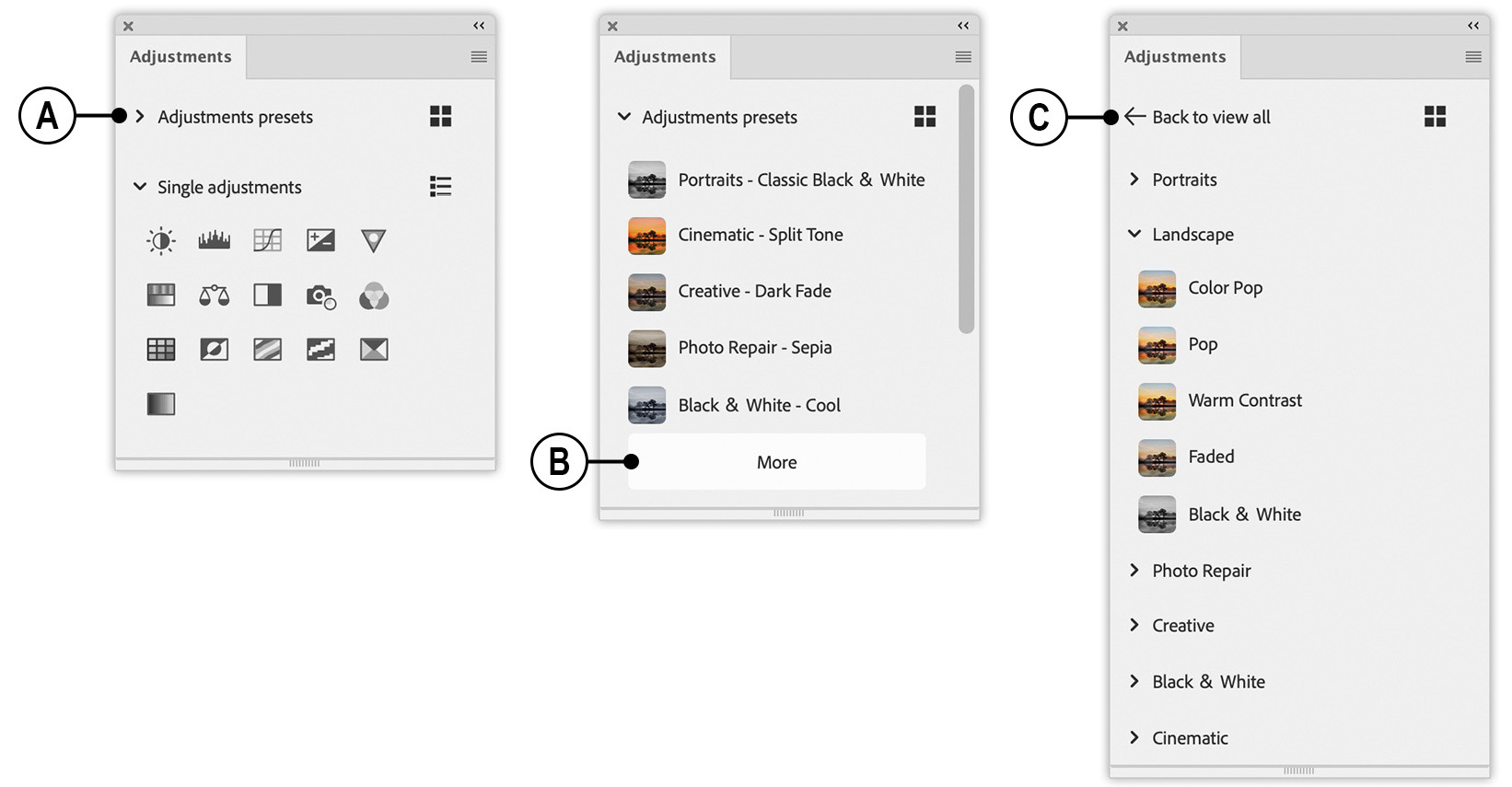
Figure 1.8: The Adjustments panel now includes presets
Go to Window → Adjustments and click on the toggle adjacent to Adjustment presets (shown as A in Figure 1.8) to open a short list of sample presets. To explore additional presets, click on the More button (Figure 1.8, B), where you will be presented with a list of categories that include Portraits, Photo Repair, and Cinematic.
Hover your cursor over one of the presets to preview how it will affect your active document. To apply a preset, simply left-click on the preset name. To exit the library of presets, click on the Back to view all toggle (Figure 1.8, C). Each preset typically consists of two adjustment layers with accompanying layer masks that are neatly organized into layer groups.
You can toggle between list mode, which shows a small thumbnail of each preset in addition to the preset name, or thumbnail-only mode by clicking on the icon located at the top right-hand side of the Adjustments panel (shown as D in Figure 1.9):
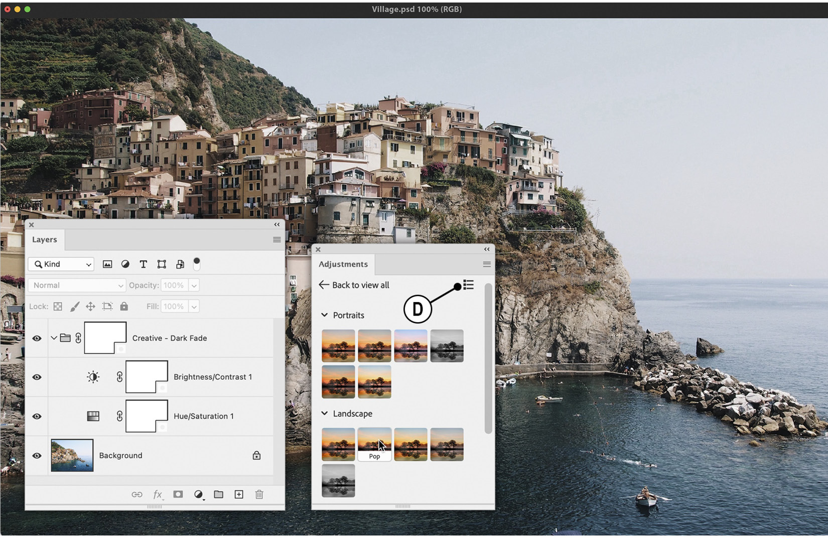
Figure 1.9: Each adjustment preset is organized and added via a layer group


