Search icon CANCEL
Subscription
0
Cart icon
Your Cart (0 item)
Close icon
You have no products in your basket yet
Save more on your purchases! discount-offer-chevron-icon
Savings automatically calculated. No voucher code required.
Arrow left icon
Explore Products
Best Sellers
New Releases
Books
Videos
Audiobooks
Learning Hub
Free Learning
Arrow right icon
Arrow up icon
GO TO TOP
jQuery UI 1.10: The User Interface Library for jQuery

You're reading from   jQuery UI 1.10: The User Interface Library for jQuery Need to learn how to use JQuery UI speedily? Our guide will take you through implementing and customizing each library component in clear, concise steps, all supported by practical examples to make learning faster.

Arrow left icon
Product type Paperback
Published in Dec 2013
Publisher Packt
ISBN-13 9781782162209
Length 502 pages
Edition 4th Edition
Languages
Tools
Arrow right icon
Toc

Table of Contents (22) Chapters Close

jQuery UI 1.10: The User Interface Library for jQuery
Credits
About the Authors
About the Reviewers
www.PacktPub.com
Preface
1. Introducing jQuery UI FREE CHAPTER 2. The CSS Framework and Other Utilities 3. Using the Tabs Widget 4. The Accordion Widget 5. The Dialog 6. The Slider and Progressbar Widgets 7. The Datepicker Widget 8. The Button and Autocomplete Widgets 9. Creating Menus 10. Working with Tooltips 11. Drag and Drop 12. The Resizable Component 13. Selecting and Sorting with jQuery UI 14. UI Effects Help and Support Index

Changing the elements in the datepicker UI


The datepicker API exposes a number of options directly related to adding or removing additional UI elements within the datepicker. To show <select> elements that allow the visitor to choose the month and year, we can use the changeMonth and changeYear configuration options:

$("#date").datepicker({
  changeMonth: true,
  changeYear: true
});

Save this as datePicker4.html. Using the month and year <select> elements, gives the user a much quicker way to navigate to dates that may be far in the past or future. The following screenshot shows how the widget will appear with these two options enabled:
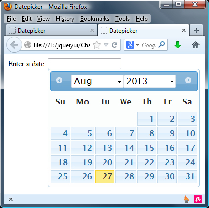
By default, the year select box will include the previous and next 10 years, covering a total range of 20 years. We can navigate further than this using the previous/next arrow links, but if we know beforehand that visitors may be choosing dates very far in the past or future, we can change the range of years using the yearRange option:

$("#date...
lock icon The rest of the chapter is locked
Register for a free Packt account to unlock a world of extra content!
A free Packt account unlocks extra newsletters, articles, discounted offers, and much more. Start advancing your knowledge today.
Unlock this book and the full library FREE for 7 days
Get unlimited access to 7000+ expert-authored eBooks and videos courses covering every tech area you can think of
Renews at $19.99/month. Cancel anytime
Banner background image