Search icon CANCEL
Arrow left icon
Explore Products
Best Sellers
New Releases
Books
Videos
Audiobooks
Learning Hub
Conferences
Free Learning
Arrow right icon
Arrow up icon
GO TO TOP
Data Modeling with Microsoft Excel

You're reading from   Data Modeling with Microsoft Excel Model and analyze data using Power Pivot, DAX, and Cube functions

Arrow left icon
Product type Paperback
Published in Nov 2023
Publisher Packt
ISBN-13 9781803240282
Length 316 pages
Edition 1st Edition
Languages
Tools
Arrow right icon
Author (1):
Arrow left icon
Bernard Obeng Boateng Bernard Obeng Boateng
Author Profile Icon Bernard Obeng Boateng
Bernard Obeng Boateng
Arrow right icon
View More author details
Toc

Table of Contents (16) Chapters Close

Preface 1. Part 1: Overview and Introduction to Data Modeling in Microsoft Excel
2. Chapter 1: Getting Started with Data Modeling – Overview and Importance FREE CHAPTER 3. Chapter 2: Data Structuring for Data Models – What’s the best way to layout your data? 4. Chapter 3: Preparing Your Data for the Data Model – Cleaning and Transforming Your Data Using Power Query 5. Chapter 4: Data Modeling with Power Pivot – Understanding How to Combine and Analyze Multiple Tables Using the Data Model 6. Part 2: Creating Insightful Calculations from your Data Model using DAX and Cube Functions
7. Chapter 5: Creating DAX Calculations from Your Data Model – Introduction to Measures and Calculated Columns 8. Chapter 6: Creating Cube Functions from Your Data Model – a Flexible Alternative to Calculations in Your Data Model 9. Part 3: Putting it all together with a Dashboard
10. Chapter 7: Communicating Insights from Your Data Model Using Dashboards – Overview and Uses 11. Chapter 8: Visualization Elements for Your Dashboard – Slicers, PivotCharts, Conditional Formatting, and Shapes 12. Chapter 9: Choosing the Right Design Themes – Less Is More with Colors 13. Chapter 10: Publication and Deployment – Sharing with Report Users 14. Index 15. Other Books You May Enjoy

Inserting slicers for interaction

We have now created all the primary components of our dashboard. At this point, the visuals are not formatted, and they are only flat displays without any interaction.

To bring in some interaction, we will insert slicers to help users dice and slice to bring out some insights from these charts.

We can insert the slicers directly from the data model. To do that, go to Insert > Slicer > Data Model.
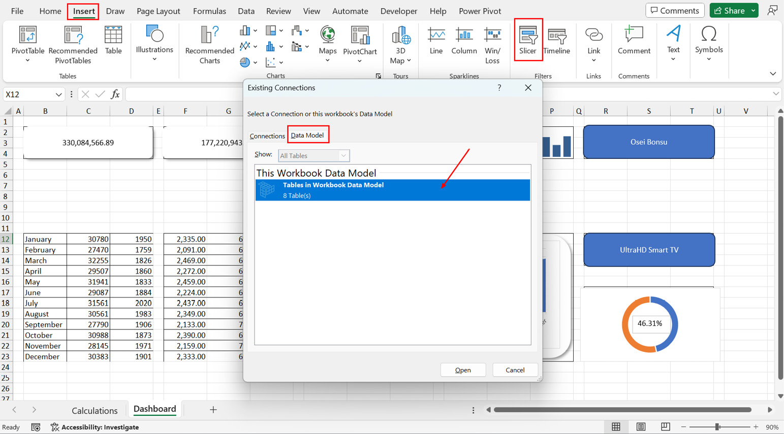
Figure 8.55 – Inserting slicers for interaction

Figure 8.55 – Inserting slicers for interaction

This should bring up all the tables in our data model.

For this dashboard, we want users to slice using Year from the Calendar table and Region from the Location table.

This should bring up the two slicers:
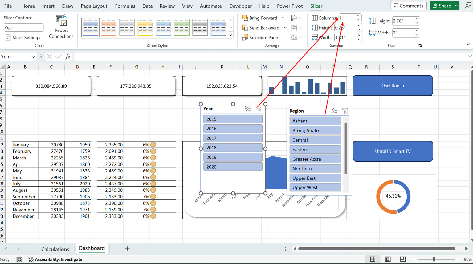
Figure 8.56 – Aligning your slicers

Figure 8.56 – Aligning your slicers

We can split the buttons into columns representing the number of items we have in each slicer. So, we set 6 columns for the Year slicer and 10 for the Region slicer. You can always...

lock icon The rest of the chapter is locked
Register for a free Packt account to unlock a world of extra content!
A free Packt account unlocks extra newsletters, articles, discounted offers, and much more. Start advancing your knowledge today.
Unlock this book and the full library FREE for 7 days
Get unlimited access to 7000+ expert-authored eBooks and videos courses covering every tech area you can think of
Renews at €18.99/month. Cancel anytime