Creating the matchmaking app
In this project, we will learn more about creating reusable controls that can be added to an Extensible Application Markup Language (XAML) page. To keep things simple, we will not be using MVVM, but bare-metal .NET MAUI without any data binding. What we aim to create is an app that allows the user to swipe images, either to the right or the left, just as most popular matchmaking applications do.
Well, let’s get started by creating the project!
Setting up the project
This project, like all the rest, is a File | New | Project...-style project. This means that we will not be importing any code at all. So, this first section is all about creating the project and setting up the basic project structure.
Let’s get started!
Creating the new project
So, let’s begin.
The first step is to create a new .NET MAUI project:
- Open Visual Studio 2022 and select Create a new project:
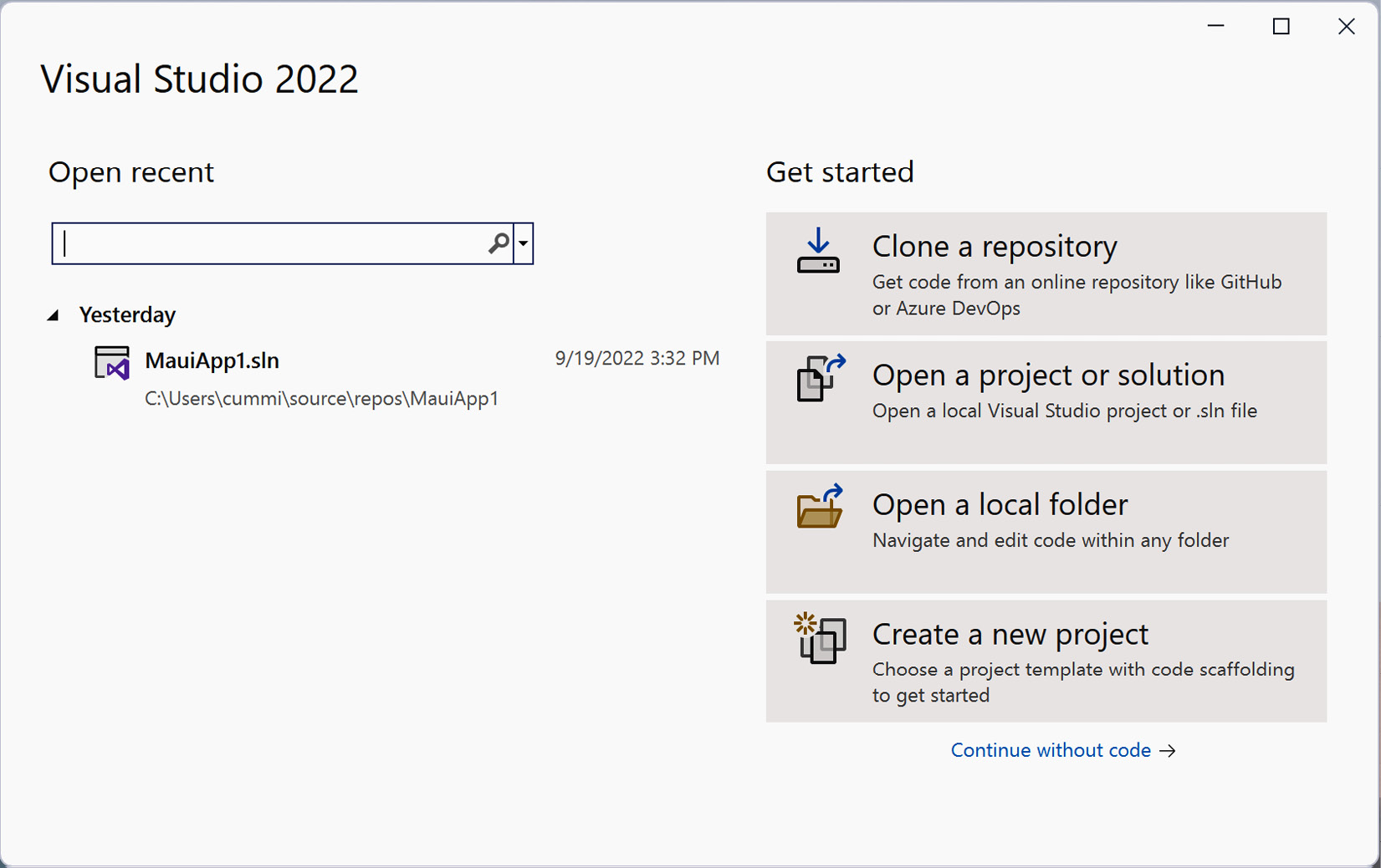
Figure 5.1 – Visual Studio 2022
This will open the Create a new project wizard.
- In the search field, type
maui
and select the .NET MAUI App item from the list:
Figure 5.2 – Create a new project
- Click Next.
- Complete the next step of the wizard by naming your project. We will be calling our application
Swiper
in this case. Move on to the next dialog box by clicking Create, as illustrated in the following screenshot:
Figure 5.3 – Configure your new project
- Click Next.
- The last step will prompt you for the version of .NET Core to support. At the time of writing, .NET 6 is available as Long-Term Support (LTS), and .NET 7 is available as Standard Term Support. For this book, we will assume that you will be using .NET 7:
Figure 5.4 – Additional information
- Finalize the setup by clicking Create and wait for Visual Studio to create the project.
Just like that, the app has been created. Let’s start by designing the MainPage
file.
Designing the MainPage file
A brand new .NET MAUI Shell app named Swiper
has been created, with a single page called MainPage.xaml
. This is in the root of the project. We will need to replace the default XAML template with a new layout that will contain our Swiper
control.
Let’s edit the already existing MainPage.xaml
file by replacing the default content with what we need:
- Open the
MainPage.xaml
file. - Replace the content of the page with the following highlighted XAML code:
<?xml version="1.0" encoding="utf-8"?> <ContentPage xmlns=http://schemas.microsoft.com/dotnet/2021/maui xmlns:x="http://schemas.microsoft.com/winfx/2009/xaml" xmlns:local="clr-namespace:Swiper" x:Class="Swiper.MainPage"> <Grid Padding="0,40" x:Name="MainGrid"> <Grid.RowDefinitions> <RowDefinition Height="400" /> <RowDefinition Height="*" /> </Grid.RowDefinitions> <Grid Grid.Row="1" Padding="30"> <!-- Placeholder for later --> </Grid> </Grid> </ContentPage>
The XAML code within the ContentPage
node defines two grids in the application. A grid is simply a container for other controls. It positions those controls based on rows and columns. The outer grid, in this case, defines two rows that will cover the entire available area of the screen. The first row is 400 units high and the second row, with Height="*"
, uses the rest of the available space.
The inner grid, which is defined within the first grid, is assigned to the second row with the Grid.Row="1"
attribute. The row and column indexes are zero-based, so "1"
actually refers to the second row. We will add some content to this grid later in this chapter, but we’ll leave it empty for now.
Both grids define their padding. You could enter a single number, meaning that all sides will have the same padding, or – as in this case – enter two numbers. We have entered 0,40
, which means that the left- and right-hand sides should have 0
units of padding and the top and bottom should have 40
units of padding. There is also a third option, with four digits, which sets the padding of the left-hand side, the top, the right-hand side, and the bottom, in that specific order.
The last thing to notice is that we give the outer grid a name, x:Name="MainGrid"
. This will make it directly accessible from the code-behind defined in the MainPage.xaml.cs
file. Since we are not using MVVM in this example, we will need a way to access the grid without data binding.
Creating the Swiper control
The main part of this project involves creating the Swiper
control. A control, in a general sense, is a self-contained user interface (UI) with a code-behind to go with it. For .NET MAUI, a control is implemented using ContentView
, as opposed to ContentPage
, which is what XAML pages are. It can be added to any XAML page as an element, or in code in the code-behind file. We will be adding the control from code in this project.
Creating the control
Creating the Swiper
control is a straightforward process. We just need to make sure that we select the correct item template, which is Content View, by doing the following:
- In the
Swiper
project, create a folder calledControls
. - Right-click on the
Controls
folder, select Add, and then click New item.... - Select C# Items and then .NET MAUI from the left pane of the Add New Item dialog box.
- Select the .NET MAUI ContentView (XAML) item. Make sure you don’t select the .NET MAUI ContentView (C#) option; this only creates a C# file and not an XAML file.
- Name the control
SwiperControl.xaml
. - Click Add.
Refer to the following screenshot to view the preceding information:
Figure 5.5 – Add New Item
This adds an XAML file for the UI and a C# code-behind file. It should look as follows:
Figure 5.6 – Solution layout
Defining the main grid
Let’s set the basic structure of the Swiper
control:
- Open the
SwiperControl.xaml
file. - Replace the content with the highlighted code in the following code block:
<?xml version="1.0" encoding="UTF-8"?> <ContentView xmlns=" http://schemas.microsoft.com/dotnet/2021/maui" xmlns:x="http://schemas.microsoft.com/winfx/2009/xaml" x:Class="Swiper.Controls.SwiperControl"> <ContentView.Content> <Grid> <Grid.ColumnDefinitions> <ColumnDefinition Width="100" /> <ColumnDefinition Width="*" /> <ColumnDefinition Width="100" /> </Grid.ColumnDefinitions> <!-- ContentView for photo here --> <!-- StackLayout for like here --> <!-- StackLayout for deny here --> </Grid> </ContentView.Content> </ContentView>
This defines a grid with three columns. The leftmost and rightmost columns will take up 100 units of space, and the center will occupy the rest of the available space. The spaces on the sides will be areas in which we will add labels to highlight the choice that the user has made. We’ve also added three comments that act as placeholders for the XAML code to come in.
We will continue by adding additional XAML to create the photo layout.
Adding a content view for the photo
Now, we will extend the SwiperControl.xaml
file by adding a definition of what we want the photo to look like. Our final result will look like Figure 5.7. Since we are going to pull images off the internet, we’ll display a loading text to make sure that the user gets feedback on what’s going on. To make it look like an instantly printed photo, we added some handwritten text under the photo, as can be seen in the following figure:
Figure 5.7 – The photo UI design
The preceding figure shows what we would like the photo to look like. To make this a reality, we need to add some XAML code to the SwiperControl
file by doing the following:
- Open
SwiperControl.xaml
. - Add the highlighted XAML code following the
<!-- ContentView for photo here -->
comment. Make sure that you do not replace the entireContentView
control for the page; just add this under the comment, as illustrated in the following code block. The rest of the page should be untouched:<!-- ContentView for photo here --> <ContentView x:Name="photo" Padding="40" Grid.ColumnSpan="3" > <Grid x:Name="photoGrid" BackgroundColor="Black" Padding="1" > <Grid.RowDefinitions> <RowDefinition Height="*" /> <RowDefinition Height="40" /> </Grid.RowDefinitions> <BoxView Grid.RowSpan="2" BackgroundColor="White" /> <Image x:Name="image" Margin="10" BackgroundColor="#AAAAAA" Aspect="AspectFill" /> <Label x:Name="loadingLabel" Text="Loading..." TextColor="White" FontSize="Large" FontAttributes="Bold" HorizontalOptions="Center" VerticalOptions="Center" /> <Label Grid.Row="1" x:Name="descriptionLabel" Margin="10,0" Text="A picture of grandpa" FontFamily="Bradley Hand" /> </Grid> </ContentView>
A ContentView
control defines a new area where we can add other controls. One very important feature of a ContentView
control is that it only takes one child control. Most of the time, we would add one of the available layout controls. In this case, we’ll use a Grid
control to lay out the control, as shown in the preceding code.
The grid defines two rows:
- A row for the photo itself, which takes up all the available space when the other rows have been allocated space
- A row for the comment, which will be exactly 40 units in height
The Grid
control itself is set to use a black background and a padding of 1. This, in combination with a BoxView
control, which has a white background, creates the frame that we see around the control. The BoxView
control is also set to span both rows of the grid (Grid.RowSpan="2"
), taking up the entire area of the grid, minus the padding.
The Image
control comes next. It has a background color set to a nice gray tone (#AAAAAA
) and a margin of 40, which will separate it a bit from the frame around it. It also has a hardcoded name (x:Name="image"
), which will allow us to interact with it from the code-behind. The last attribute, called Aspect
, determines what we should do if the image control isn’t of the same ratio as the source image. In this case, we want to fill the entire image area, but not show any blank areas. This effectively crops the image either in terms of height or width.
We finish off by adding two labels, which also have hardcoded names for later reference.
That’s a wrap on the XAML for now; let’s move on to creating a description for the photo.
Creating the DescriptionGenerator class
At the bottom of the image, we can see a description. Since we don’t have any general descriptions of the images from our upcoming image source, we need to create a generator that makes up descriptions. Here’s a simple, yet fun, way to do it:
- Create a folder called
Utils
in theSwiper
project. - Create a new class called
DescriptionGenerator
in that folder. - Add the following code to this class:
internal class DescriptionGenerator { private string[] _adjectives = { "nice", "horrible", "great", "terribly old", "brand new" }; private string[] _other = { "picture of grandpa", "car", "photo of a forest", "duck" }; private static Random random = new(); public string Generate() { var a = _adjectives[random.Next(_adjectives.Count())]; var b = _other[random.Next(_other.Count())]; return $"A {a} {b}"; } }
This class only has one purpose: it takes one random word from the _adjectives
array and combines it with a random word from the _other
array. By calling the Generate()
method, we get a fresh new combination. Feel free to enter your own words in the arrays. Note that the Random
instance is a static field. This is because if we create new instances of the Random
class that are too close to each other in time, they get seeded with the same value and return the same sequence of random numbers.
Now that we can create a fun description for the photo, we need a way to capture the image and description for the photo.
Creating a Picture class
To abstract all the information about the image we want to display, we’ll create a class that encapsulates this information. There isn’t much information in our Picture
class, but it is good coding practice to do this. Proceed as follows:
- Create a new class called
Picture
in theUtils
folder. - Add the following code to the class:
public class Picture { public Uri Uri { get; init; } public string Description { get; init; } public Picture() { Uri = new Uri($"https://picsum.photos/400/400/?random&ts={DateTime.Now.Ticks}"); var generator = new DescriptionGenerator(); Description = generator.Generate(); } }
The Picture
class has the following two public properties:
- The Uniform Resource Identifier (URI) of an image exposed as the
Uri
property, which points to its location on the internet - A description of that image, exposed as the
Description
property
In the constructor, we create a new URI, which points to a public source of test photos that we can use. The width and height are specified in the query string part of the URI. We also append a random timestamp to avoid the images being cached by .NET MAUI. This generates a unique URI each time we request an image.
We then use the DescriptionGenerator
class that we created previously to generate a random description for the image.
Note that the properties don’t define a set
method, but instead use init
. Since we never need to change the values of URL
or Description
after the object is created, the properties can be read-only. init
only allows the value to be set before the constructor completes. If you try to set the value after the constructor has run, the compiler will generate an error.
Now that we have all the pieces we need to start displaying images, let’s start pulling it all together.
Binding the picture to the control
Let’s begin to wire up the Swiper
control so that it starts displaying images. We need to set the source of an image, and then control the visibility of the loading label based on the status of the image. Since we are using an image fetched from the internet, it might take a couple of seconds to download. A good UI will provide the user with proper feedback to help them avoid confusion regarding what is going on.
We will begin by setting the source for the image.
Setting the source
The Image
control (referred to as image
in the code) has a source
property. This property is of the ImageSource
abstract type. There are a few different types of image sources that you can use. The one we are interested in is the UriImageSource
type, which takes a URI, downloads the image, and allows the image control to display it.
Let’s extend the Swiper
control so that we can set the source and description:
- Open the
Controls/Swiper.Xaml.cs
file (the code-behind for theSwiper
control). - Add a
using
statement forSwiper.Utils
(using Swiper.Utils;
) since we will be using thePicture
class from that namespace. - Add the following highlighted code to the constructor:
public SwiperControl() { InitializeComponent(); var picture = new Picture(); descriptionLabel.Text = picture.Description; image.Source = new UriImageSource() { Uri = picture.Uri }; }
Here, we create a new instance of a Picture
class and assign the description to the descriptionLabel
control in the GUI by setting the text property of that control. Then, we set the source of the image to a new instance of the UriImageSource
class, and assign the URI from the picture
instance. This will cause the image to be downloaded from the internet, and display it as soon as it is downloaded.
Next, we will change the visibility of the loading label for positive user feedback.
Controlling the loading label
While the image is downloading, we want to show a loading text centered over the image. This is already in the XAML file that we created earlier, so what we need to do is hide it once the image has been downloaded. We will do this by controlling the IsVisibleProperty
property (yes, the property is actually named IsVisibleProperty
) of the loadingLabel
control by setting a binding to the IsLoading
property of the image. Any time the IsLoading
property is changed on the image, the binding changes the IsVisible
property on the label. This is a nice fire-and-forget approach.
You might have noticed that we are using a binding when we said that we wouldn’t be using bindings at the beginning of this chapter. This is used as a shortcut, to avoid us having to write the code that would do essentially the same thing as this binding does. And to be fair, while we did say no MVVM and data binding, we are binding to ourselves, not between classes, so all the code is self-contained inside the Swiper
control.
Let’s add the code needed to control the loadingLabel
control, as follows:
- Open the
Swiper.xaml.cs
code-behind file. - Add the following code marked in bold to the constructor:
public SwiperControl() { InitializeComponent(); var picture = new Picture(); descriptionLabel.Text = picture.Description; image.Source = new UriImageSource() { Uri = picture.Uri }; loadingLabel.SetBinding(IsVisibleProperty, "IsLoading"); loadingLabel.BindingContext = image; }
In the preceding code, the loadingLabel
control sets a binding to the IsVisibleProperty
property, which belongs to the VisualElement
class that all controls inherit from. It tells loadingLabel
to listen to changes in the IsLoading
property of whichever object is assigned to the binding context. In this case, this is the image control.
Next, we will allow the user to “swipe right” or “swipe left.”
Handling pan gestures
A core feature of this app is the pan gesture. A pan gesture is when a user presses on the control and moves it around the screen. We will also add a random rotation to the Swiper
control to make it look like there are photos in a stack when we add multiple images.
We will start by adding some fields to the SwiperControl
class, as follows:
- Open the
SwiperControl.xaml.cs
file. - Add the following fields in the code to the class:
private readonly double _initialRotation; private static readonly Random _random = new Random();
The first field, _initialRotation
, stores the initial rotation of the image. We will set this in the constructor. The second field is a static
field containing a Random
object. As you might remember, it’s better to create one static random object to make sure multiple random objects don’t get created with the same seed. The seed is based on time, so if we create objects too close in time to each other, they get the same random sequence generated, so it wouldn’t be that random at all.
The next thing we have to do is create an event handler for the PanUpdated
event that we will bind to at the end of this section, as follows:
- Open the
SwiperControl.xaml.cs
code-behind file. - Add the
OnPanUpdated
method to the class, like this:private void OnPanUpdated(object sender, PanUpdatedEventArgs e) { switch (e.StatusType) { case GestureStatus.Started: PanStarted(); break; case GestureStatus.Running: PanRunning(e); break; case GestureStatus.Completed: PanCompleted(); break; } }
This code is straightforward. We handle an event that takes a PanUpdatedEventArgs
object as the second argument. This is a standard method of handling events. We then have a switch
clause that checks which status the event refers to.
A pan gesture can have the following three states:
GestureStatus.Started
: The event is raised once with this state when the panning beginsGestureStatus.Running
: The event is then raised multiple times, once for each time you move your fingerGestureStatus.Completed
: The event is raised one last time when you let go
For each of these states, we call specific methods that handle the different states. We’ll continue with adding those methods now:
- Open the
SwiperControl.xaml.cs
code-behind file. - Add the following three methods to the class, like this:
private void PanStarted() { photo.ScaleTo(1.1, 100); } private void PanRunning(PanUpdatedEventArgs e) { photo.TranslationX = e.TotalX; photo.TranslationY = e.TotalY; photo.Rotation = _initialRotation + (photo.TranslationX / 25); } private void PanCompleted() { photo.TranslateTo(0, 0, 250, Easing.SpringOut); photo.RotateTo(_initialRotation, 250, Easing.SpringOut); photo.ScaleTo(1, 250); }
Let’s start by looking at PanStarted()
. When the user starts dragging the image, we want to add the effect of it raising a little bit over the surface. This is done by scaling the image by 10%. .NET MAUI has a set of excellent functions to do this. In this case, we call the ScaleTo()
method on the image control (named Photo
) and tell it to scale to 1.1
, which corresponds to 10% of its original size. We also tell it to do this within a duration of 100
milliseconds (ms). This call is also awaitable, which means we can wait for the control to finish animating before executing the next call. In this case, we are going to use a fire-and-forget approach.
Next, we have PanRunning()
, which is called multiple times during the pan operation. This takes an argument, called PanUpdatedEventArgs
, from the event handler that PanRunning()
is called from. We could also just pass in X and Y values as arguments to reduce the coupling of the code. This is something that you can experiment with. The method extracts the X and Y components from the TotalX
/TotalY
properties of the event and assigns them to the TranslationX
/TranslationY
properties of the image control. We also adjust the rotation slightly, based on how far the image has been moved.
The last thing we need to do is restore everything to its initial state when the image is released. This can be done in PanCompleted()
. First, we translate (or move) the image back to its original local coordinates (0,0
) in 250
ms. We also added an easing function to make it overshoot the target a bit and then animate back. We can play around with the different predefined easing functions; these are useful for creating nice animations. We do the same to move the image back to its initial rotation. Finally, we scale it back to its original size in 250
ms.
Now, it’s time to add the code in the constructor that will wire up the pan gesture and set some initial rotation values. Proceed as follows:
- Open the
SwiperControl.xaml.cs
code-behind file. - Add the highlighted code to the constructor. Note that there is more code in the constructor, so don’t overwrite the whole method; just add the bold text shown in the following code block:
public SwiperControl() { InitializeComponent(); var panGesture = new PanGestureRecognizer(); panGesture.PanUpdated += OnPanUpdated; this.GestureRecognizers.Add(panGesture); _initialRotation = _random.Next(-10, 10); photo.RotateTo(_initialRotation, 100, Easing.SinOut); var picture = new Picture(); descriptionLabel.Text = picture.Description; image.Source = new UriImageSource() { Uri = picture.Uri }; loadingLabel.SetBinding(IsVisibleProperty, "IsLoading"); loadingLabel.BindingContext = image; }
All .NET MAUI controls have a property called GestureRecognizers
. There are different types of gesture recognizers, such as TapGestureRecognizer
or SwipeGestureRecognizer
. In our case, we are interested in the PanGestureRecognizer
type. We create a new PanGestureRecognizer
instance and subscribe to the PanUpdated
event by hooking it up to the OnPanUpdated()
method we created earlier. Then, we add it to the Swiper
controls GestureRecognizers
collection.
After this, we set an initial rotation of the image and make sure we store the current rotation value so that we can modify the rotation, and then rotate it back to the original state.
Next, we will wire up the control temporarily so that we can test it out.
Testing the control
We now have all the code written to take the control for a test run. Proceed as follows:
- Open
MainPage.xaml.cs
. - Add a
using
statement for theSwiper.Controls
(using Swiper.Controls;
). - Add the following code marked in bold to the constructor:
public MainPage() { InitializeComponent(); MainGrid.Children.Add(new SwiperControl()); }
If all goes well with the build, we should end up with a photo like the one shown in the following figure:
Figure 5.8 – Testing the app
We can also drag the photo around (pan it). Notice the slight lift effect when you begin dragging, and the rotation of the photo based on the amount of translation, which is the total movement. If you let go of the photo, it animates back into place.
Now that we have the control displaying the photo and can swipe it left or right, we need to act on those swipes.
Creating decision zones
A matchmaking app is nothing without those special drop zones on each side of the screen. We want to do a few things here:
- When a user drags an image to either side, text should appear that says
LIKE
orDENY
(the decision zones) - When a user drops an image on a decision zone, the app should remove the image from the page
We will create these zones by adding some XAML code to the SwiperControl.xaml
file and then add the necessary code to make this happen. It is worth noting that the zones are not hotspots for dropping the image, but rather for displaying labels on top of the control surface. The actual drop zones are calculated and determined based on how far you drag the image.
The first step is to add the UI for the left and right swipe actions.
Extending the grid
The Swiper
control has three columns (left, right, and center) defined. We want to add some kind of visual feedback to the user if the image is dragged to either side of the page. We will do this by adding a StackLayout
control with a Label
control on each side.
We will add the right-hand side first.
Adding the StackLayout for liking photos
The first thing we need to do is add the StackLayout
control for liking photos on the right-hand side of the control:
- Open
Controls/SwiperControl.xaml
. - Add the following code under the
<!-- StackLayout for like here -->
comment:<StackLayout Grid.Column="2" x:Name="likeStackLayout" Opacity="0" Padding="0, 100"> <Label Text="LIKE" TextColor="Lime" FontSize="30" Rotation="30" FontAttributes="Bold" /> </StackLayout>
The StackLayout
control is the container of child elements that we want to display. It has a name and is assigned to be rendered in the third column (it says Grid.Column="2"
in the code due to the zero indexing). The Opacity
property is set to 0
, making it completely invisible, and the Padding
property is adjusted to make it move down a bit from the top.
Inside the StackLayout
control, we’ll add the Label
control.
Now that we have the right-hand side, let’s add the left.
Adding the StackLayout for denying photos
The next step is to add the StackLayout
control for denying photos on the left-hand side of the control:
- Open
Controls/SwiperControl.xaml
. - Add the following code under the
<!-- StackLayout for deny here -->
comment:<StackLayout x:Name="denyStackLayout" Opacity="0" Padding="0, 100" HorizontalOptions="Start"> <Label Text="DENY" TextColor="Red" FontSize="30" Rotation="-20" FontAttributes="Bold" /> </StackLayout>
The setup for the left-hand side StackLayout
is the same, except that it should be in the first column, which is the default, so there is no need to add a Grid.Column
attribute. We have also specified HorizontalOptions="End"
, which means that the content should be right-justified.
With the UI all set, we can now work on the logic for providing the user visual feedback by adjusting the opacity of the LIKE
or DENIED
text controls as the photo is panned.
Determining the screen size
To be able to calculate the percentage of how far the user has dragged the image, we need to know the size of the control. This is not determined until the control is laid out by .NET MAUI.
We will override the OnSizeAllocated()
method and add a _screenWidth
field in the class to keep track of the current width of the window:
- Open
SwiperControl.xaml.cs
. - Add the following code to the file, putting the field at the beginning of the class and the
OnSizeAllocated()
method below the constructor:private double _screenWidth = -1; protected override void OnSizeAllocated(double width, double height) { base.OnSizeAllocated(width, height); if (Application.Current.MainPage == null) { return; } _screenWidth = Application.Current.MainPage.Width; }
The _screenWidth
field is used to store the width as soon as we have resolved it. We do this by overriding the OnSizeAllocated()
method that is called by .NET MAUI when the size of the control is allocated. This is called multiple times. The first time it’s called is actually before the width and height have been set and before the MainPage
property of the current app is set. At this time, the width and height are set to -1
, and the Application.Current.MainPage
property is null
. We look for this state by null-checking Application.Current.MainPage
and returning if it is null
. We could also have checked for -1
values on the width. Either method would work. If it does have a value, however, we want to store it in our _screenWidth
field for later use.
.NET MAUI will call the OnSizeAllocated()
method any time the frame of the app changes. This is most relevant for WinUI apps since they are in a window that a user can easily change. Android and iOS apps are less likely to get a call to this method a second time since the app will take up the entire screen’s real estate.
Adding code to calculate the state
To calculate the state of the image, we need to define what our zones are, and then create a function that takes the current amount of movement and updates the opacity of the GUI decision zones based on how far we panned the image.
Defining a method for calculating the state
Let’s add the CalculatePanState()
method to calculate how far we have panned the image, and if it should start to affect the GUI, by following these few steps:
- Open
Controls/SwiperControl.xaml.cs
. - Add the properties at the top and the
CalculatePanState()
method anywhere in the class, as shown in the following code block:private const double DeadZone = 0.4d; private const double DecisionThreshold = 0.4d; private void CalculatePanState(double panX) { var halfScreenWidth = _screenWidth / 2; var deadZoneEnd = DeadZone * halfScreenWidth; if (Math.Abs(panX) < deadZoneEnd) { return; } var passedDeadzone = panX < 0 ? panX + deadZoneEnd : panX - deadZoneEnd; var decisionZoneEnd = DecisionThreshold * halfScreenWidth; var opacity = passedDeadzone / decisionZoneEnd; opacity = double.Clamp(opacity, -1, 1); likeStackLayout.Opacity = opacity; denyStackLayout.Opacity = -opacity; }
We define the following two values as constants:
DeadZone
, which defines that 40% (0.4
) of the available space on either side of the center point is a dead zone when panning an image. If we release the image in this zone, it simply returns to the center of the screen without any action being taken.- The next constant is
DecisionThreshold
, which defines another 40% (0.4
) of the available space. This is used for interpolating the opacity ofStackLayout
on either side of the layout.
We then use these values to check the state of the panning action whenever the panning changes. If the absolute panning value of X (panX
) is less than the dead zone, we return without any action being taken. If not, we calculate how far over the dead zone we have passed and how far into the decision zone we are. We calculate the opacity values based on this interpolation and clamp the value between -1
and 1
.
Finally, we set the opacity to this value for both likeStackLayout
and denyStackLayout
.
Wiring up the pan state check
While the image is being panned, we want to update the state, as follows:
- Open
Controls/SwiperControl.xaml.cs
. - Add the following code in bold to the
PanRunning()
method:private void PanRunning(PanUpdatedEventArgs e) { photo.TranslationX = e.TotalX; photo.TranslationY = e.TotalY; photo.Rotation = _initialRotation + (photo.TranslationX / 25); CalculatePanState(e.TotalX); }
This addition to the PanRunning()
method passes the total amount of movement on the x axis to the CalculatePanState()
method, to determine if we need to adjust the opacity of either StackLayout
on the right or the left of the control.
Adding exit logic
So far, all is well, except for the fact that if we drag an image to the edge and let go, the text stays. We need to determine when the user stops dragging the image, and, if so, whether or not the image is in a decision zone.
Let’s add the code needed to animate the photo back to its original position.
Checking if the image should exit
We want a simple function that determines if an image has panned far enough for it to count as an exit of that image. To create such a function, proceed as follows:
- Open
Controls/SwiperControl.xaml.cs
. - Add the
CheckForExitCriteria()
method to the class, as shown in the following code snippet:private bool CheckForExitCriteria() { var halfScreenWidth = _screenWidth / 2; var decisionBreakpoint = DeadZone * halfScreenWidth; return (Math.Abs(photo.TranslationX) > decisionBreakpoint); }
This function calculates whether we have passed over the dead zone and into the decision zone. We need to use the Math.Abs()
method to get the total absolute value to compare it against. We could have used <
and >
operators as well, but we are using this approach as it is more readable. This is a matter of code style and taste – feel free to do it your way.
Removing the image
If we determine that an image has panned far enough for it to exit, we want to animate it off the screen and then remove the image from the page. To do this, proceed as follows:
- Open
Controls/SwiperControl.xaml.cs
. - Add the
Exit()
method to the class, as shown in the following code block:private void Exit() { MainThread.BeginInvokeOnMainThread(async () => { var direction = photo.TranslationX < 0 ? -1 : 1; await photo.TranslateTo(photo.TranslationX + (_screenWidth * direction), photo.TranslationY, 200, Easing.CubicIn); var parent = Parent as Layout; parent?.Children.Remove(this); }); }
Let’s break down the preceding code block to understand what the Exit()
method does:
- We begin by making sure that this call is done on the UI thread, which is also known as the
MainThread
thread. This is because only the UI thread can do animations. - We also need to run this thread asynchronously so that we can kill two birds with one stone. Since this method is all about animating the image to either side of the screen, we need to determine in which direction to animate it. We do this by determining if the total translation of the image is positive or negative.
- Then, we use this value to await a translation through the
photo.TranslateTo()
call. - We
await
this call since we don’t want the code execution to continue until it’s done. Once it has finished, we remove the control from the parent’s collection of children, causing it to disappear from existence forever.
Updating PanCompleted
The decision regarding whether the image should disappear or simply return to its original state is triggered in the PanCompleted()
method. Here, we will wire up the two methods that we created in the previous two sections. Proceed as follows:
- Open
Controls/SwiperControl.xaml.cs
. - Add the following code in bold to the
PanCompleted()
method:private void PanCompleted() { if (CheckForExitCriteria()) { Exit(); } likeStackLayout.Opacity = 0; denyStackLayout.Opacity = 0; photo.TranslateTo(0, 0, 250, Easing.SpringOut); photo.RotateTo(_initialRotation, 250, Easing.SpringOut); photo.ScaleTo(1, 250); }
The last step in this section is to use the CheckForExitCriteria()
method, and the Exit()
method if those criteria are met. If the exit criteria are not met, we need to reset the state and the opacity of StackLayout
to make everything go back to normal.
Now that we can swipe left or swipe right, let’s add some events to raise when the user has swiped.
Adding events to the control
The last thing we have left to do in the control itself is add some events that indicate whether the image has been liked or denied. We are going to use a clean interface, allowing for simple use of the control while hiding all the implementation details.
Declaring two events
To make the control easier to interact with from the application itself, we’ll need to add events for Like
and Deny
, as follows:
- Open
Controls/SwiperControl.xaml.cs
. - Add two event declarations at the beginning of the class, as shown in the following code snippet:
public event EventHandler OnLike; public event EventHandler OnDeny;
These are two standard event declarations with out-of-the-box event handlers.
Raising the events
We need to add code in the Exit()
method to raise the events we created earlier, as follows:
- Open
Controls/SwiperControl.xaml.cs
. - Add the following code in bold to the
Exit()
method:private void Exit() { MainThread.BeginInvokeOnMainThread(async () => { var direction = photo.TranslationX < 0 ? -1 : 1; if (direction > 0) { OnLike?.Invoke(this, new EventArgs()); } if (direction < 0) { OnDeny?.Invoke(this, new EventArgs()); } await photo.TranslateTo(photo.TranslationX + (_screenWidth * direction), photo.TranslationY, 200, Easing.CubicIn); var parent = Parent as Layout; parent?.Children.Remove(this); }); }
Here, we inject the code to check whether we are liking or denying an image. We then raise the correct event based on this information.
We are now ready to finalize this app; the Swiper
control is complete, so now, we need to add the right initialization code to finish it.
Wiring up the Swiper control
We have now reached the final part of this chapter. In this section, we are going to wire up the images and make our app a closed-loop app that can be used forever. We will add 10 images that we will download from the internet when the app starts up. Each time an image is removed, we’ll simply add another one.
Adding images
Let’s start by creating some code that will add the images to the MainView
class. First, we will add the initial images; then, we will create a logic model for adding a new image to the bottom of the stack each time an image is liked or denied.
Adding initial photos
To make the photos look like they are stacked, we need at least 10 of them. Proceed as follows:
- Open
MainPage.xaml.cs
. - Add the
AddInitalPhotos()
method andInsertPhotoMethod()
to the class, as illustrated in the following code block:private void AddInitialPhotos() { for (int i = 0; i < 10; i++) { InsertPhoto(); } } private void InsertPhoto() { var photo = new SwiperControl(); this.MainGrid.Children.Insert(0, photo); }
First, we create a method called AddInitialPhotos()
that will be called upon startup. This method simply calls the InsertPhoto()
method 10 times and adds a new SwiperControl
to the MainGrid
each time. It inserts the control at the first position in the stack, effectively putting it at the bottom of the pile since the collection of controls is rendered from the beginning to the end.
Making the call from the constructor
We need to call this method for the magic to happen, so follow these steps to do so:
- Open
MainPage.xaml.cs
. - Add the following code in bold to the constructor:
public MainPage() { InitializeComponent(); AddInitialPhotos(); }
There isn’t much to say here. Once the MainPage
object has been initialized, we call the method to add 10 random photos that we will download from the internet.
Adding count labels
We want to add some values to the app as well. We can do this by adding two labels below the collection of Swiper
controls. Each time a user rates an image, we will increment one of two counters and display the result.
So, let’s add the XAML code needed to display the labels:
- Open
MainPage.xaml
. - Replace the
<!-- Placeholder for later -->
comment with the following code marked in bold:<Grid Grid.Row="1" Padding="30"> <Grid.RowDefinitions> <RowDefinition Height="auto" /> <RowDefinition Height="auto" /> <RowDefinition Height="auto" /> <RowDefinition Height="auto" /> </Grid.RowDefinitions> <Label Text="LIKES" /> <Label x:Name="likeLabel" Grid.Row="1" Text="0" FontSize="Large" FontAttributes="Bold" /> <Label Grid.Row="2" Text="DENIED" /> <Label x:Name="denyLabel" Grid.Row="3" Text="0" FontSize="Large" FontAttributes="Bold" /> </Grid>
This code adds a new Grid
control with four auto-height rows. This means that we calculate the height of the content of each row and use this for the layout. It is the same thing as StackLayout
, but we wanted to demonstrate a better way of doing this.
We add a Label
control in each row and name two of them likeLabel
and denyLabel
. These two named labels will hold information about how many images have been liked and how many have been denied.
Subscribing to events
The last step is to wire up the OnLike
and OnDeny
events and display the total count to the user.
Adding methods to update the GUI and respond to events
We need some code to update the GUI and keep track of the count. Proceed as follows:
- Open
MainPage.xaml.cs
. - Add the following code to the class:
private int _likeCount; private int _denyCount; private void UpdateGui() { likeLabel.Text = _likeCount.ToString(); denyLabel.Text = _denyCount.ToString(); } private void Handle_OnLike(object sender, EventArgs e) { _likeCount++; InsertPhoto(); UpdateGui(); } private void Handle_OnDeny(object sender, EventArgs e) { _denyCount++; InsertPhoto(); UpdateGui(); }
The two fields at the top of the preceding code block keep track of the number of likes and denies. Since they are value-type variables, they default to zero.
To make the changes of these labels show up in the UI, we’ve created a method called UpdateGui()
. This takes the value of the two aforementioned fields and assigns it to the Text
properties of both labels.
The two methods that follow are the event handlers that will be handling the OnLike
and OnDeny
events. They increase the appropriate field, add a new photo, and then update the GUI to reflect the change.
Wiring up events
Each time a new SwiperControl
instance is created, we need to wire up the events, as follows:
- Open
MainPage.xaml.cs
. - Add the following code in bold to the
InsertPhoto()
method:private void InsertPhoto() { var photo = new SwiperControl(); photo.OnDeny += Handle_OnDeny; photo.OnLike += Handle_OnLike; this.MainGrid.Children.Insert(0, photo); }
The added code wires up the event handlers that we defined earlier. The events make it easy to interact with our new control. Try it for yourself and have a play around with the app that you have created.