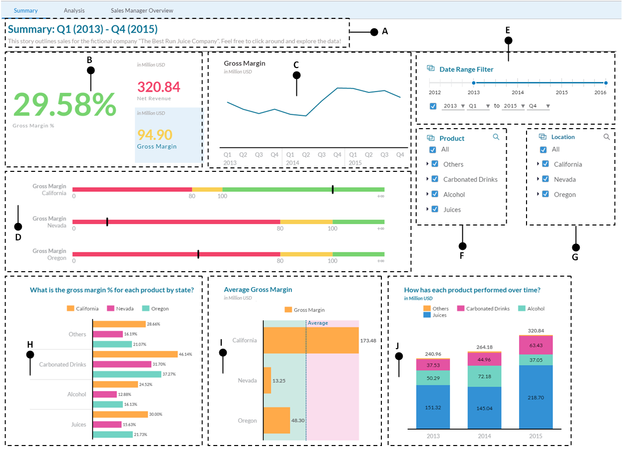
Stories are used in SAP Analytics Cloud to present data graphically using charts, tables, geo maps, text, images, and shapes. In this chapter as well as in the next few chapters, you will learn the use of different types of charts and other objects to create a story page, as illustrated in the following figure:

Here are the briefs of the illustrated story page:
- A: This is the title of the story page that describes its purpose.
- B: These are three separate tiles added to demonstrate how to create Numeric Point charts to dynamically render numeric data in different colors using custom-defined thresholds.
- C: The gross margin chart will be created using a line chart.
- D: The key performance indicator (KPI) is a type of success metric. Based on user-defined thresholds, KPI indicates the status of a measure.
- E, F, and G: These data filters will be created...


