Plotting with error bars
It is quite common that the values that we gather from the real world carry some uncertainty; no measurement of a real-world quantity is perfectly accurate. For example, if we measure a distance with a tape measure, there is a certain amount of accuracy that we can assume in our results, but beyond this accuracy, we cannot be sure that our measurement is valid. For such a situation, we can probably be confident of our accuracy up to about 1 millimeter or a little less than 1/16 inch. (This is, of course, assuming that we are measuring perfectly.) These values are the smallest subdivisions on typical tape measures. Let’s assume that we have collected such a set of 10 measurements (in centimeters) and we wish to plot these values along with the accuracy that we are confident about. (The range of values that lie above or below the measurement by the accuracy amount is called the error.) This is what we address in this recipe.
Getting ready
As usual, we have the Matplotlib pyplot interface imported under the alias plt. We first need to generate our hypothetical data and the assumed accuracy in NumPy arrays:
measurement_id = np.arange(1, 11)
measurements = np.array([2.3, 1.9, 4.4, 1.5, 3.0, 3.3, 2.9,    2.6, 4.1, 3.6]) # cm
err = np.array([0.1]*10)  # 1mm
Let’s see how to use plotting routines in Matplotlib to plot these measurements with error bars to indicate the uncertainty in each measurement.
How to do it…
The following steps show how to plot measurements along with accuracy information on a figure.
First, we need to generate a new figure and axis object as usual:
fig, ax = plt.subplots()
Next, we use the errorbar method on the axis object to plot the data along with the error bars. The accuracy information (the error) is passed as the yerr argument:
ax.errorbar(measurement_id,
    measurements, yerr=err, fmt="kx",
     capsize=2.0)
As usual, we should always add meaningful labels to the axes and a title to the plot:
ax.set_title("Plot of measurements and their estimated error")
ax.set_xlabel("Measurement ID")
ax.set_ylabel("Measurement(cm)")
Since Matplotlib will not produce xlabel ticks at every value by default, we set the x-tick values to the measurement IDs so that they are all displayed on the plot:
ax.set_xticks(measurement_id)
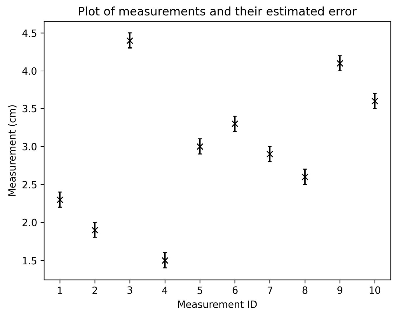
The resulting plot is shown in Figure 2.4. The recorded value is shown at the x markers, and the error bar extends above and below that value by an accuracy of 0.1 cm (1 mm):

Figure 2.4 - Plot of a set of 10 sample measurements (in centimeters) with their measurement error shown
We can see here that each of the markers has a vertical bar that indicates the range in which we expect the true measurement ( -value) to lie.
How it works…
The errorbar method works in a similar way to other plotting methods. The first two arguments are the  and
and  coordinates of the points to be plotted. (Note that both must be provided, which is not the case for other plotting methods.) The
 yerr argument indicates the size of the error bars to be added to the plot and should all be positive values. The form of the value(s) passed to this argument determines the nature of the error bars. In the recipe, we provided a flat NumPy array with 10 entries—one for each measurement—which leads to error bars above and below each point with the same size (the corresponding value from the argument). Alternatively, we could have specified a 2-by-10 array, where the first row contains the lower error and the second row contains the upper error. (Since all our errors are the same, we could also have provided a single float containing the common error for all measurements.)
In addition to the data arguments, there are the usual format arguments, including the fmt format string. (We used this here as a keyword argument because we named the yerr argument that precedes it.) In addition to the formatting of lines and points found in other plotting methods, there are special arguments for customizing the look of error bars. In the recipe, we used the capsize argument to add “caps” to either end of the error bars so that we could easily identify the ends of those bars; the default style is a simple line.
There’s more...
In the recipe, we only plotted errors in the  axis because the
  values were simply ID values. If both sets of values have uncertainty, you can also specify the
  error values using the
 xerr argument. This argument functions in the same way as the yerr argument used previously.
If you are plotting a very large number of points that follow some kind of trend, you might wish to plot error bars more selectively. For this, you can use the errorevery keyword argument to instruct Matplotlib to add error bars at every nth data point rather than at all of them. This can be either a positive integer—indicating the “stride” to use to select points that will have errors—or a tuple containing an offset from the first value and a stride. For example, errorevery=(2, 5) would place error bars every five data points, starting from the second entry.
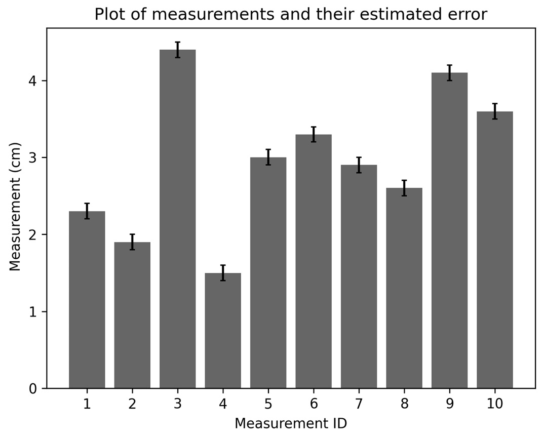
You can also add error bars to bar charts in the same way (except here, the xerr and yerr arguments are keywords only). We could have plotted the data from the recipe as a bar chart using the following commands:
ax.bar(measurement_id, measurements,
yerr=err, capsize=2.0, alpha=0.4)
If this line is used instead of the call to errorbar in the recipe, then we would get a bar chart, as shown in Figure 2.5:

Figure 2.5 - Bar chart of measurements with error bars
As before, the measurement bar is capped with an indicator of the  range in which we expect the true measurement to lie.


