


Creating related radio buttons using UI Toggles
Unity UI Toggles are also the base components if we wish to implement a group of mutually exclusive options in the style of radio buttons. We need to group related radio buttons together (UI Toggles) to ensure that when one radio button turns on (is selected), all the other radio buttons in the group turn off (are unselected).
We also need to change the visual look if we want to adhere to the usual style of radio buttons as circles, rather than the square UI Toggle default images:
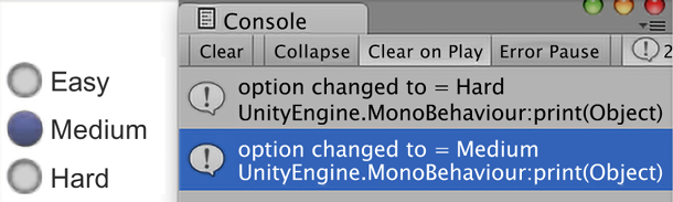
Figure 2.33: Example of three buttons with Console status
Getting ready
For this recipe, we have prepared the images that you’ll need in a folder named UI Demo Textures in the 02_11 folder.
How to do it...
To create related radio buttons using UI Toggles, do the following:
- Create a new Unity 2D project and install TextMeshPro by choosing: Window | TextMeshPro | Import TMP Essential Resources.
- In the Inspector window, change the Background color of Main Camera to white.
- Import the
UI Demo Texturesfolder into the project. - Add a UI Toggle to the scene, naming this new GameObject
Toggle-easy. - For the Label child of the
Toggle-easyGameObject, set the Text property to Easy. - Select the
CanvasGameObject and, in the Inspector window, add a UI | Toggle Group component. - With the
Toggle-easyGameObject selected, in the Inspector window, drag theCanvasGameObject into the Toggle Group property of the Toggle (Script) component.
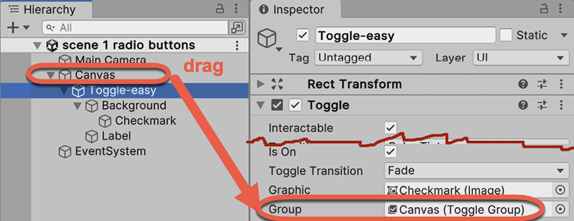
Figure 2.34: Assigning the Canvas Toggle Group to the Toggle-easy GameObject
- Assign the
Toggle-easyGameObject with a new Tag called Easy. Do this by selecting Add Tag… from the Tag drop-down menu in the Inspector window – this will open the Tags & Layers panel. Click the plus (+) button for a new Tag, and create a new Tag,Easy. Finally, select theToggle-easyGameObject again in the Hierarchy window, and at the top of the Inspector, set its Tag toEasy.
Figure 2.35: Creating new Tag called Easy
You can also create/edit Tags & Layers from the project Settings panel, accessed from the Edit | Settings… menu.
- Select the Background child GameObject of
Toggle-easyand, for its Image component, select theUIToggleBGimage in the Source Image property (a circle outline).To make these toggles look more like radio buttons, the background of each is set to the circle outline image of
UIToggleBG, and the checkmark (which displays the toggles that are on) is filled with the circle image calledUIToggleButton.
- In the Inspector for the Toggle component, ensure the Is On property is checked. Then select the Checkmark child GameObject of
Toggle-easy. In the Image component, choose theUIToggleButtonimage for the Source Image property (a filled circle).Of the three choices (easy, medium, and hard) that we’ll offer to the user, we’ll set the easy option to be the one that is supposed to be initially selected. Therefore, we need its Is On property to be checked, which will lead to its checkmark image being displayed.
- Add an instance of the
RadioButtonManagerC# script class to theCanvasGameObject:using UnityEngine; using System.Collections; using UnityEngine.UI; public class RadioButtonManager : MonoBehaviour { private string currentDifficulty = "Easy"; public void PrintNewGroupValue(Toggle sender){ // only take notice from Toggle just switched to On if(sender.isOn){ currentDifficulty = sender.tag; print ("option changed to = " + currentDifficulty); } } } - With the
Toggle-easyGameObject selected, add an On Value Changed event to the list of event handlers for the Toggle (Script) component, click on the plus (+) button to add an event handler slot, and drag theCanvasGameObject into the Object slot. - Then, from the Function drop-down menu, choose RadioButtonManager and then choose the PrintNewGroupValue method.
- Into the Toggle parameter slot, which is initially None (Toggle), drag the
Toggle-easyGameObject. This means that theToggle-easyGameObject calls thePrintNewGroupValue(...)method of a C# scripted component calledRadioButtonManagerin theCanvasGameObject, passing itself as a parameter.
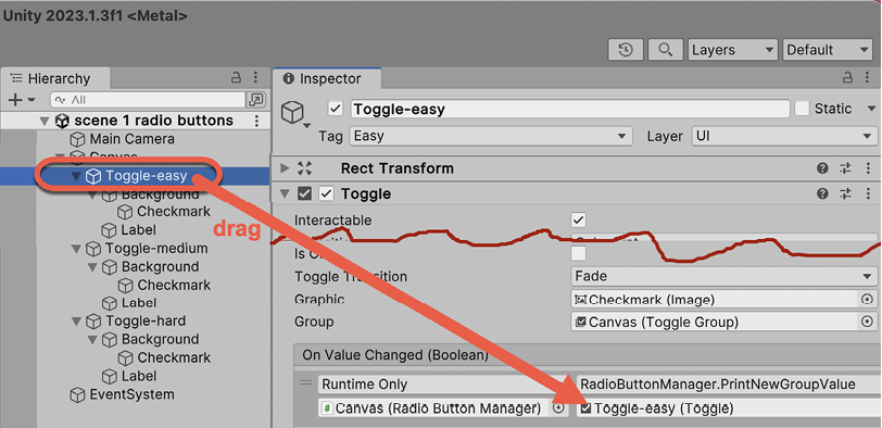
Figure 2.36: Dragging the Toggle-easy GameObject to the Toggle parameter slot
- Duplicate the
Toggle-easyGameObject, naming the copyToggle-medium. Set its Rect Transform property’s Pos Y to-25(so that this copy is positioned below the easy option) and uncheck the Is On property of the Toggle component. Create a new Tag,Medium, and assign the Tag to the new GameObject,Toggle-medium. - Duplicate the
Toggle-mediumGameObject, naming the copyToggle-hard. Set its Rect Transform property’s Pos Y to-50(so that this copy is positioned below the medium option). Create a new Tag,Hard, and assign the Tag to the new GameObject,Toggle-hard. - Save and run the scene. Each time you check one of the three radio buttons, the On Value Changed event will fire, and you’ll see a new text message printed into the Console window by our script, stating the tag of whichever Toggle (radio button) was just set to true (Is On).
How it works...
By using the UIToggleBG and UIToggleButton images, we made the UI GameObject look like radio buttons – circles that when selected have a filled center. By adding a Toggle Group component to Canvas, and having each Toggle GameObject link to it, the three radio buttons can tell Toggle Group when they have been selected. Then, the other members of the group are deselected.
Each Toggle has an On Value Changed event handler that prints out the Tag for the GameObject. So, by creating the Tags Easy, Medium, and Hard, and assigning them to their corresponding GameObjects, we are able to print out a message corresponding to the radio button that has been clicked by the user.
If you had several groups of radio buttons in the same scene, one strategy is, for each group, to add the Toggle Group component to one of the Toggles and have all the others link to that one. So, all Toggles in each group link to the same Toggle Group component.
Note. We store the current radio button value (the last one switched On) in the currentDifficulty property of the RadioButtonManager component of GameObject Canvas. Since variables declared outside a method are remembered, we could, for example, add a public method, such as GetCurrentDifficulty(), which could tell other scripted objects the current value, regardless of how long it’s been since the user last changed their option.