Structuring an HTML Document
A requirement of HTML5 is that all HTML documents are structured with a root element, the html element, and two child elements, the head element, and the body element.
HTML
The html element is the root element of an HTML document. In an HTML document, the only thing that appears outside the html element is the doctype declaration, which appears above the html element. Before we put any content on our web page, the code looks like this:
<!doctype html>
<html lang="en"></html>
The html element is the top-level element and all other elements must be a descendant of it. The html element has two children – one head element and a body element, which must follow the head element.
It is strongly recommended that you add a lang attribute to your html element to allow the browser, screen readers, and other technologies, such as translation tools, to better understand the text content of your web page.
Head
The head element contains metadata. It stores information about the HTML document that is used by machines – browsers, web crawlers, and search engines – to process the document. This section of an HTML document is not rendered for human users to read.
The minimum content the head element can have is a title element. Within a web page, the code would look like this:
<!doctype html>
<html lang="en">
    <head>
        <title>Page Title</title>
    </head>
</html>
Body
An HTML element is expected to have one body element and it is expected to be the second child of the html element following the head element.
Our minimal HTML document would therefore have the following code:
<!doctype html>
<html lang="en">
    <head>
        <title>Page Title</title>
    </head>
    <body>
    </body>
</html>
The body element represents the content of the document. Not everything in the body will necessarily be rendered in the browser, but all human-readable content should be hosted in the body element. This includes headers and footers, articles, and navigation.
You will learn more about the elements that can be the content of the body element throughout the following chapters.
Our First Web Page
In our first example, we will create a very simple web page. This will help us to understand the structure of an HTML document and where we put different types of content.
Exercise 1.01: Creating a Web Page
In this exercise, we will create our first web page. This is the foundation upon which the future chapters will build.
Note
Before beginning the exercises in the book, please make sure you have followed the instructions given in the Preface regarding installing VSCode and the extension Open In Default Browser.
The steps are as follows:
- To start, we want to create a new folder, named
Chapter01, in a directory of your choice. Then open that folder in Visual Studio Code (File>Open Folder…). - Next, we will create a new plain text file by clicking
File>New File. Then, save it in HTML format, by clickingFile>Save As...and enter theFile name: Exercise 1.01.html. Finally, click onSave. - In
Exercise 1.01.html, we start by writing the doctype declaration for HTML5:<!DOCTYPE html>
- Next, we add an HTML tag (the root element of the HTML document):
<html lang="en">
</html>
- In between the opening and closing tags of the
htmlelement, we add aheadtag. This is where we can put metadata content. For now, theheadtag will contain a title:<head> <title>HTML and CSS</title> </head>
- Below the head tag and above the closing
htmltag, we can then add abodytag. This is where we will put the majority of our content. For now, we will render a heading and a paragraph:<body> <h1>HTML and CSS</h1> <p>How to create a modern, responsive website with HTML and CSS</p> </body>
If you now right-click on the filename in VSCode on the left-hand side of the screen and select Open In Default Browser, you will see the following web page in your browser:

Figure 1.10: The web page as displayed in the Chrome web browser
Metadata
The head element is home to most machine-read information in an HTML document. We will look at some commonly used metadata elements and how they enhance a web page and how they can optimize a web page for search engines and modern browsers.
The following elements are considered metadata content: base, link, meta, noscript, script, style, and title.
We've already added a title element in the previous exercise. This is the name of your web page and it appears in the tab of most modern browsers as well as in a search engine's results as the heading for the web page's listing.
The link element lets us determine the relationships between our document and external resources. A common use for this element is to link to an external style sheet. We will look at that use case in the section on CSS later in this chapter. There are several other uses for the link element. These include linking to icons and informing the browser to preload assets.
The base element lets you set a base URL. This will be used as the base for all relative URLs in the HTML document. For example, we could set the base href and then link to a style sheet with a relative URL:
<base href="http://www.example.com">
<link rel="stylesheet" href="/style.css">
This would result in our browser trying to download a style sheet from http://www.example.com/style.css.
The meta element acts as a catch-all for other metadata not represented by the other metadata content elements. For example, we can use the meta element to provide a description or information about the author of the web page.
Another use for the meta element is to provide information about the HTML document, such as the character encoding used. This can be very important as text characters will render differently or not at all if not set correctly. For example, we normally set the character encoding to UTF-8:
<meta charset="utf-8">
This character encoding declaration tells the browser the character set of the document. UTF-8 is the default and is recommended. This gives information to the browser but does not ensure the document conforms to the character encoding. It is also necessary to save the document with the correct character encoding. Again, UTF-8 is often the default but this varies with different text editors.
It is important that the character encoding declaration appears early in the document as most browsers will try to determine the character encoding from the first 1,024 bytes of a file. The noindex attribute value is set for the web pages that need not be indexed, whereas the nofollow attribute is set for preventing the web crawler from following links.
Another meta element that is very useful for working with mobile browsers and different display sizes is the viewport element:
<meta name="viewport" content="width=device-width, initial-scale=1">
The viewport element is not standard but is widely supported by browsers and will help a browser define the size of the web page and the scale to which it is zoomed on smaller display sizes. The units of viewport height and viewport width are vh and vw respectively; for example, 1vh = 1% of the viewport height. We will dive deeper into the viewport element and other aspects of responsive web development in Chapter 6, Responsive Web Design and Media Queries.
The script element lets us embed code in our HTML document. Typically, the code is JavaScript code, which will execute when the browser finishes parsing the content of the script element.
The noscript element allows us to provide a fallback for browsers without scripting capabilities or where those capabilities are switched off by the user.
We will look at the style element in more detail when we look at CSS later in this chapter.
These elements won't appear on the web page as content the user sees in the browser. What they do is give web developers a lot of power to tell a browser how to handle the HTML document and how it relates to its environment. The web is a complex environment and we can describe our web page for other interested parties (such as search engines and web crawlers) using metadata.
Exercise 1.02: Adding Metadata
In this exercise, we will add metadata to a web page to make it stand out in search engine results. The page will be a recipe page for a cookery website called Cook School. We want the page's metadata to reflect both the importance of the individual recipe and the larger website so it will appear in relevant searches.
To achieve this, we will add metadata – a title, a description, and some information for search engine robots. On the web, this information could then help users find a blog post online via a search engine.
Here are the steps we will follow:
- Open the
Chapter01folder in VSCode (File>Open Folder…) and create a new plain text file by clickingFile>New File. Then, save it in HTML format by clickingFile>Save As...and enter theFile name: Exercise 1.02.html. Next, we will start with a basic HTML document:<!DOCTYPE html> <html lang="en"> <head> <!-- Metadata will go in the head --> </head> <body> <!-- Cupcake recipe will go in the body --> </body> </html>
- Let's add a title for the recipe page that will be relevant to users who have navigated to the page or who are looking at a search engine results page. We will add this to the
headelement:<title>Cook School - Amazing Homemade Cupcakes</title>
- Just after the opening
<head>element, we will add a metadata element,<meta>, to let the browser know which character encoding to use:<meta charset="utf-8">
- Next, we are going to add a description
metaelement below thetitleelement:<meta name="description" content="Learn to bake delicious, homemade cupcakes with this great recipe from Cook School.">
- We will add another
metaelement. This time, it is the robotsmetaelement, which is used to make search engine crawling and indexing behave in a certain way. For example, if you didn't want a page to be indexed by a search engine, you could set the value tonoindex. We will set a value ofnofollow, which means a web crawler will not follow links from the page:<meta name="robots" content="nofollow">
If you don't set this tag, the default value will be
indexandfollow. This is normally what you want but you might not want a search engine to follow links in comments or index a particular page. - The viewport
metaelement, which is very useful for working with mobile browsers and different display sizes, is added just below thetitleelement in theheadelement:<meta name="viewport" content="width=device-width, initial-scale=1">
- To finish, let's add some content to the
bodyelement that correlates with the metadata we've added:<h1>Cook School</h1> <article> <h2>Amazing Homemade Cupcakes</h2> <p>Here are the steps to serving up amazing cupcakes:</p> <ol> <li>Buy cupcakes from a shop</li> <li>Remove packaging</li> <li>Pretend you baked them</li> </ol> </article>
If you now right-click on the filename in VSCode on the left-hand side of the screen and select Open In Default Browser, you will see the following web page in your browser:
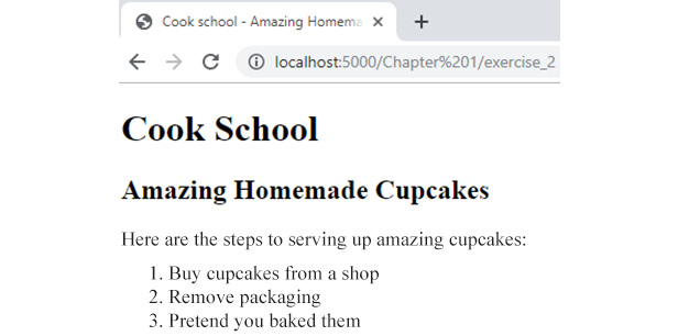
Figure 1.11: The web page as displayed in the Chrome web browser
The important thing in the relationship between content and metadata is that they should make sense together. There is no point in adding keywords or writing a description of cars if the article is about cupcakes. The metadata should describe and relate to your actual content.
There are many search engines out there and they all do things a bit differently, and often with their own bespoke meta elements. If you would like to know more about how Google's search engine understands the meta tags from your web page's source code, some information is available at https://packt.live/35fRZ0F.
Mistakes in HTML
Most browsers do their best to render a web page even if the HTML does not comply perfectly with the W3C's HTML5 standard. One area where HTML5 differs from the previous versions, including XHTML, is that the standard gives detailed instructions for browser developers on how to handle mistakes and issues in an HTML5 document. HTML5 tries to standardize how browsers handle problems and there is a lot of flexibility built into the standard (such as optional omitted end tags).
With that said, there are still many ways that an HTML document might be wrong due to typos, omitted tags, or the incorrect use of tags. Let's look at a few potential mistakes.
A common problem is a missing or mistyped closing tag. Here, we can see an example: in the following snippet of HTML, we have a paragraph with two anchor elements, both of which are pointing at different pages of the Packt website:
<p>
    Learn about <a href="https://www.packtpub.com/web-development">web     development</a>. Try out some of the <a     href="https://www.packtpub.com/free-learning">Free learning on the     Packt site.
</p>
<p>
    Lorem ipsum...
</p>
There is one problem with this code. The second link does not have a closing tag and so the anchor element never closes. This makes the rest of the paragraph and the next paragraph in the document the same anchor tag. Anything beneath the opening anchor tag (<a>) until another closing anchor tag (</a>) would become an active link due to this mistake.
We can see the result in the following figure where the link text runs on to the second paragraph:

Figure 1.12: Missing closing tag on an anchor element
Some issues are not to do with syntax error but are regarding the semantic constraints of HTML5. In other words, an element might have a specific role or meaning and having more than one instance might not make sense.
For example, the main element describes the main content of an HTML document. There should never be more than one main element visible on a web page at any one time.
The following code would not be valid:
<body>
     <main id="main1"><!-- main content here … --></main>
     <main id="main2"><!-- more main content here ... --></main>
</body>
However, if we were to hide one of the instances of the main element and only render that one when we hide the other, we would be using the main element in a way that is acceptable. The browser could still determine what the main content of our web page is. For example, the following code would be valid:
<body>
     <main id="main1"><!-- main content here … --></main>
     <main id="main2" hidden><!-- more main content here ... --></main>
</body>
Look carefully and you will see that we have added the hidden attribute to the second instance of the main element. This means there is only one visible main element in the web page.
You will learn more about main and other structural elements in the next chapter.
Sometimes, mistakes are caused by not knowing the specification. Take, for example, Boolean attributes such as the disabled attribute. We can apply this attribute to some interactive elements such as form inputs and buttons.
A button element creates a clickable button UI on a web page. We can use this element to trigger form submissions or to change the web page. We can use the disabled attribute with this element to stop it from submitting or taking any action.
If we add the disabled attribute like this, <button disabled="false">Click me!</button>, we might expect this element to be enabled. We've set the disabled attribute to false, after all. However, the specification for the disabled attribute says that the state of the element is decided by whether the attribute is present or not and the value is not regarded. To enable the element, you must remove the disabled attribute.
Because of the ways most modern browsers try to correct problems in HTML5 documents, it might not be immediately obvious what the benefits of making your HTML document valid are. However, it is good to keep in mind that, while developing for the web, you could have an audience on a variety of browsers – not all of them the most modern. Equally, it is still very easy to make mistakes that will cause obvious rendering issues. The best way to solve these is to make sure your document is valid and therefore working as expected.
There are tools available to help you check that your web page is valid. In the forthcoming exercise, we will look at how we can use an online tool to validate a web page.
Validating HTML
Mistakes in HTML5 can cause our web pages to render in ways we are not expecting. They can also cause problems for screen reader technologies that rely on the semantic meaning of HTML elements. Thankfully, there are some really useful tools out there to automate the validation of our HTML document and to keep us from making costly mistakes.
In this section, we will introduce the W3C's Markup Validation Service, an online tool that will validate a web page for us. We will then try out the tool with the help of exercises.
W3C's Markup Validation Service is an online tool that lets us validate a web page. The tool is available at https://packt.live/323qgOI. Navigating to that URL, we will see the tool as in the following figure:
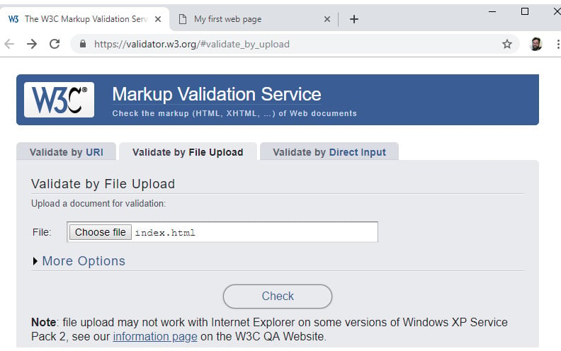
Figure 1.13: The W3C's Markup Validation Service
There are several options available, depending on how you wish to provide the validator a web page to validate. The options are:
Validate by URI– choose a publicly accessible URL you wish to validateValidate by File Upload– validate a file uploaded from your computerValidate by Direct Input– copy and paste code to validate
As well as these input options, you have some more advanced options under the More Options heading, as seen in the following figure:

Figure 1.14: The More Options panel of the W3C's Markup Validation Service
With these options, you can:
- Set the character encoding and document type
- Group error messages
- Show source code
- Set the level of output (verbose)
Once you hit the Check button on the validator, it will run the tool and your results will appear in the results panel. You will either see a message telling you your document is valid or you will see a list of errors describing where the document is invalid and possible reasons.
We will see examples of both these results in the next two exercises.
Exercise 1.03: Validation
In this exercise, we will validate a web page using the W3C's Markup Validation Service. The steps are as follows:
- For this exercise, we need a web page to validate. Create a new file within the
Chapter01folder by clickingFile>New File. Then, save it in HTML format, by clickingFile>Save As...and enter theFile name: Exercise 1.03.html. Copy the following content into the file:<!DOCTYPE html> <html lang="en"> <head> <meta charset="utf-8"> <title>Valid HTML document</title> <meta name="viewport" content="width=device-width, initial-scale=1"> </head> <body> <h1>Valid HTML document</h1> <p>This document is valid HTML5.</p> <!-- This document will not throw errors in W3C's Markup Validation Service --> </body> </html>
- In a browser, navigate to https://packt.live/323qgOI. This will take you to the W3C's online Markup Validation Service.
- You can validate web pages by URI, file upload, or copy and paste. We will use the file upload method. Click the
Validate by File Uploadtab. - Click the
Choose filebutton to select theExercise 1.03.htmlfile. - Click the
Checkbutton.
If all went well, we should see a results page similar to that shown in the following figure, where there is green highlighted text saying Document checking completed. No errors or warnings to show. This means we have a valid HTML document:
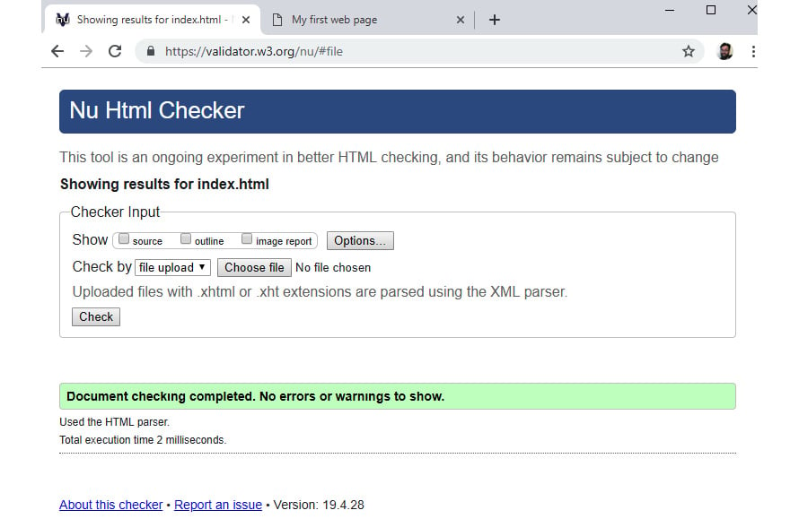
Figure 1.15: W3C's Markup Validation Service results page with no errors
Exercise 1.04: Validation Errors
Now we will see what happens if the HTML document does not validate. Here are the steps:
- Firstly, we need a web page with some errors in its source code. Create a new file under
Chapter01folder by clickingFile>New File. Then, save it in HTML format, by clickingFile>Save As...and enter theFile name: Exercise 1.04.html. - In
Exercise 1.04.html, we will add the following content:<html lang="en"> <head> </head> <body> <p>Hello world!</p> <title>My first web page</title> </body> </html>
This HTML document has some problems that should cause validation errors when this page is run through the W3C's validation service.
- Repeat the steps from Exercise 1.03, Validation, uploading the
Exercise 1.04.htmlfile in place of the valid file.The results should look like the following figure. Each error is flagged with a line number. In our case, there should be three errors because the doctype is missing, a
<title>element is expected in the<head>element of the document, and<title>is not allowed as a child of the<body>element.The error messages can point out issues with the content model, such as the
<title>element missing in a<head>element, as well as issues where an opening tag does not have a corresponding closing tag:
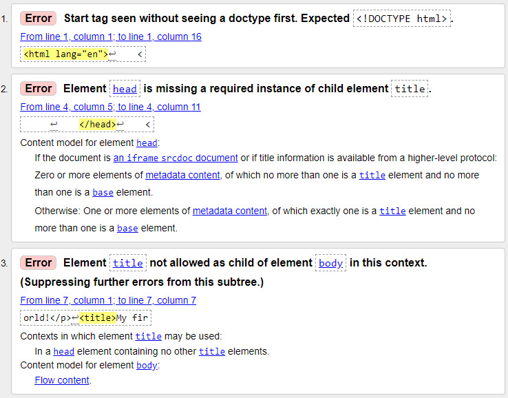
Figure 1.16: Validation errors in the W3C's Markup Validation Service
The HTML5 standard is pretty robust and tries to handle things such as omitted closing tags, but it is still possible to cause errors with typos or missed tags, and so the validator is a very useful tool. A valid HTML document is likely to be better optimized for performance, cause fewer bugs in JavaScript or CSS, and be easier for web crawlers, search engines, and browsers to understand.
Activity 1.01: Video Store Page Template
We've been tasked with creating a website for an online on-demand film store called Films On Demand. We don't have designs yet but want to set up web page boilerplate that we can use for all the pages on the site.
We will use comments as placeholders to know what needs to change for each page that is built on top of the boilerplate template. For visible content in the body element, we will use lorem ipsum to get an idea of how content will flow.
The following figure shows the expected output for this activity:
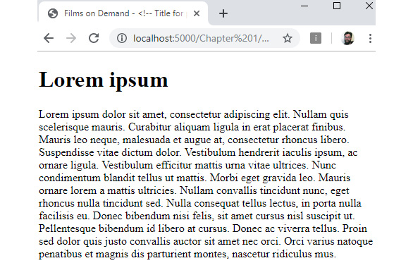
Figure 1.17: Expected output for the video store page template
The steps are as follows:
- Create a file named
Activity 1.01.html. - We want the page to be a valid HTML5 document. So, we will need to add the following:
The correct doctype definition.
Elements to structure the document: the
htmlelement, theheadelement, and thebodyelement.A title element that combines the Films on Demand brand with some specifics about the current page.
Metadata to describe the site – we'll set this to
Buy films from our great selection. Watch movies on demand.Metadata for the page character set and a viewport tag to help make the site render better on mobile browsers.
- We want to add placeholders for a heading (an
h1element) for the page, which we will populate with lorem ipsum and a paragraph for the content flow, which we will also populate with the following lorem ipsum text:"Lorem ipsum dolor sit amet, consectetur adipiscing elit. Nullam quis scelerisque mauris. Curabitur aliquam ligula in erat placerat finibus. Mauris leo neque, malesuada et augue at, consectetur rhoncus libero. Suspendisse vitae dictum dolor. Vestibulum hendrerit iaculis ipsum, ac ornare ligula. Vestibulum efficitur mattis urna vitae ultrices. Nunc condimentum blandit tellus ut mattis. Morbi eget gravida leo. Mauris ornare lorem a mattis ultricies. Nullam convallis tincidunt nunc, eget rhoncus nulla tincidunt sed.
Nulla consequat tellus lectus, in porta nulla facilisis eu. Donec bibendum nisi felis, sit amet cursus nisl suscipit ut. Pellentesque bibendum id libero at cursus. Donec ac viverra tellus. Proin sed dolor quis justo convallis auctor sit amet nec orci. Orci varius natoque penatibus et magnis dis parturient montes, nascetur ridiculus mus."
Note
The solution for this activity can be found via this link.
CSS
Cascading Style Sheets (CSS) is a style sheet language used to describe the presentation of a web page. The language is designed to separate concerns. It allows the design, layout, and presentation of a web page to be defined separately from content semantics and structure. This separation helps keeps source code readable and it is important because a designer can update styles separately from a developer who is creating the page structure or a web editor who is changing content on a page.
A set of CSS rules in a style sheet determines how an HTML document is displayed to the user. It can determine whether elements in the document are rendered at all, whether they appear in some context but not others, how they are laid out on the web page, whether they are rendered in a different order to the order in which they appear within a document, and their aesthetic appearance.
We will begin by looking at the syntax of CSS.
Syntax
A CSS declaration is made of two parts: a property and a value. The property is the name for some aspect of style you want to change; the value is what you want to set it to.
Here is an example of a CSS declaration:
color: red;
The property is color and the value is red. In CSS, color is the property name for the foreground color value of an element. That essentially means the color of the text and any text decoration (such as underline or strikethrough). It also sets a currentcolor value.
For this declaration to have any effect on an HTML document, it must be applied to one or more elements in the document. We do this with a selector. For example, you can select all the <p> elements in a web page with the p selector. So, if you wanted to make the color of all text in all paragraph elements red, you would use the following CSS ruleset:
p {
  color: red;
}
The result of this CSS ruleset applied to an HTML document can be seen in the following figure:

Figure 1.18: Result of a CSS rule applied to <p> elements in HTML
The curly braces represent a declaration block and that means more than one CSS declaration can be added to this block. If you wanted to make the text in all paragraph elements red, bold, and underlined, you could do that with the following ruleset:
p {
  color: red;
  font-weight: bold;
  text-decoration: underline;
}
The result of this CSS ruleset applied to an HTML document can be seen in the following figure:

Figure 1.19: Several CSS declarations applied to <p> elements in HTML
Multiple selectors can share a CSS ruleset. We can target these with a comma-separated list. For example, to apply the color red to p elements, h1 elements, and h2 elements, we could use the following ruleset:
p, h1, h2 {
  color: red;
}
Multiple CSS rulesets form a style sheet. The order of these CSS rules in a style sheet is very important as this is partly how the cascade or specificity of a rule is determined. A more specific rule will be ranked higher than a less specific rule and a higher-ranked rule will be the style shown to the end user. We will look at cascade and specificity later in this chapter:

Figure 1.20: A CSS ruleset explained
Adding Styles to a Web Page
There are several ways to add your styles to a web page:
- You can use inline styles, which are applied directly to an element in the HTML document using the
styleattribute. The value of thestyleattribute is a CSS declaration block, meaning you can apply a semicolon-separated list of CSS declarations to the element. - You can use a
styleelement to add style information to an HTML document. Thestyleelement can be a child of either theheadelement orbodyelement of a document. Theheadelement tends to be preferable as the styles will be applied to your page more quickly. - You can provide a style sheet as an external resource using the
linkelement. One of the rationalities behind style sheets is the separation of concerns, which is why this approach is often recommended.
We will try out each of these methods in the following exercises.
Exercise 1.05: Adding Styles
In this exercise, we will be styling web pages by adding styles within the HTML document itself.
Here are the steps:
- Open the
Chapter01folder in VSCode (File>Open Folder…) and we will create a new plain text file by clickingFile>New File. Then, save it in HTML format, by clickingFile>Save As...and enter theFile name: Exercise 1.05.htmland start with the following web page:<!DOCTYPE html> <html lang="en"> <head> <meta charset="utf-8"> <title>Adding styles</title> </head> <body> <h1>Adding styles</h1> <p>First paragraph</p> <p>Second paragraph</p> </body> </html>
Without any styles, this web page would look like the following:

Figure 1.21: The unstyled web page
- We've decided to use a nicer font and make some of the text red. To do this, we will add a
styleelement to theheadelement. We can add the following code under thetitleelement:<style> h1 { font-family: Arial, Helvetica, sans-serif; font-size: 24px; margin: 0; padding-bottom: 6px; } p { color: red; } </style>The results of this code change are that we should now have styles applied to the
h1element and to both of thepelements, all of which will have red text. The result will look similar to the following figure:
Figure 1.22: The web page with styles applied
- Finally, we will give the first paragraph element a different style by overriding the style set in the
headelement. Let's add an inline style to the first paragraph, setting the color to blue and adding aline-throughtext decoration as follows:<p style="color: blue; text-decoration: line- through">First paragraph</p>
If you now right-click on the filename in VSCode on the left-hand side of the screen and select Open In Default Browser, you will see the following web page in your browser:

Figure 1.23: The web page with inline style applied
Something to note is that the inline style, applied to the first paragraph, takes precedence over the more general CSS rule applied to all p elements in the style element in the head element of the document. We will look at specificity and the rules of the cascade later in this chapter, but first, let's try moving these style rules into an external file.
Exercise 1.06: Styles in an External File
In this exercise, we will separate the concerns of presentation and structure of Exercise 1.05, Adding Styles, by moving all the styles to an external file.
The steps are as follows:
- Open the
Chapter01folder in VSCode (File>Open Folder…) and create a new plain text file by clickingFile>New File. Then, save it in HTML format, by clickingFile>Save As...and enter theFile name: Exercise 1.06.html. - Add the same web page as in Exercise 1.05, Adding Styles, to the file:
<!DOCTYPE html>
<html lang="en">
    <head>
        <meta charset="utf-8">
        <title>Adding styles</title>
    </head>
    <body>
        <h1>Adding styles</h1>
        <p>First paragraph</p>
        <p>Second paragraph</p>
    </body>
</html>
- We will add a
linkelement to reference a.cssfile below thetitleelement:<link href="styles/Exercise_1.06.css" rel="stylesheet">
- Create a
stylesdirectory in the same directory asExercise 1.06.html. Next, create a file namedExercise_1.06.csswithin the styles directory. - Now, add the following styles to
Exercise_1.06.css:h1 { font-family: Arial, Helvetica, sans-serif; font-size: 24px; margin: 0; padding-bottom: 6px; } p { color: red; } - To get the equivalent styles that we had at the end of Exercise 1.05, Adding Styles, without using an inline style, we have to have a specific way of targeting the first
pelement. We will use the:first-of-typepseudo-class. You will learn more about CSS selectors later in this chapter. For now, add this CSS rule to the bottom ofExercise_1.06.css:p:first-of-type { color: blue; text-decoration: line-through; }
The result will be as seen in Figure 1.23 – the same result as in Exercise 1.05, Adding Styles. The difference is that we have removed all references to styles from the HTML document into their own external resources. We have successfully separated concerns.
Both these methods add styles to the HTML document when it loads. Similar to the HTML DOM, we can manipulate CSS programmatically with JavaScript. This is because the styles are also represented as an object model called the CSSOM.
CSSOM
The CSS Object Model (CSSOM) is similar to the HTML DOM, which we described earlier. The CSSOM is an in-memory representation of the styles in the document as they are computed on elements. It is a tree-structure with nodes that mirror those in the HTML DOM, and the objects associated have a list of style properties where all CSS rules have been applied.
The CSSOM represents all the styles that have been created in the document as objects with properties that we can change with JavaScript. We can access these styles and change the values of style properties.
We mostly access these styles via the style property of a DOM element, as here:
const boldElement = document.querySelector('.aBoldElement');
boldElement.style.fontWeight = 'bold';
In JavaScript, we can also access the CSSOM with the getComputedStyle method on the window object; for example:
const boldElement = document.querySelector('.aBoldElement');
window.getComputedStyle(boldElement);
This will return a computed styles object for an element with the aBoldElement class attribute. This method returns a read-only styles object with all computed styles for the element.
In the next section, we will look at the different CSS selectors we can use to apply our styles to a web page.
CSS Selectors
To target elements in the HTML document with CSS, we use selectors. There are a lot of options available to help you select a wide range of elements or very specific elements in certain states.
Selectors are a powerful tool and we will look at them in some detail as the different options available can help with both web page performance and making your CSS more maintainable.
For example, you can use a selector to target the first letter of a heading, like you might expect to see in a medieval book:
h1::first-letter {
  font-size: 5rem;
}
Or you could use a selector to invert the colors of every odd paragraph in an article:
p {
  color: white;
  background-color: black;
}
p:nth-of-type(odd) {
  color: black;
  background-color: white;
}
We will explore a variety of the options available to us when creating selectors.
Element, ID, and Class
Three commonly used selectors are:
- Element type: For example, to select all
pelements in an HTML document, we use thepselector in a CSS ruleset. Other examples areh1,ul, anddiv. - A class attribute: The class selector starts with a dot. For example, given the HTML snippet
<h1 class="heading">Heading</h1>, you could target that element with the.headingselector. Other examples are.postand.sub-heading. - An
idattribute: Theidselector starts with a hash symbol. For example, given the HTML snippet<div id="login"> <!-- login content --> </div>, you could target this element with the#loginselector. Other examples include#page-footerand#site-logo.
The Universal Selector (*)
To select all elements throughout an HTML document, you can use the universal selector, which is the asterisk symbol (*). Here is an example snippet of CSS that is often added to web pages; a value is set on the html element and then inherited by all descendant elements:
html {
  box-sizing: border-box;
}
*, *:before, *:after {
  box-sizing: inherit;
}
Using the inherit keyword and the universal selector, we can pass a value on to all the descendants of the html element. This snippet will universally apply the border-box model to all elements and their pseudo-elements (that's the reason for :before and :after). You'll learn more about the box model and layout in the next chapter.
Attribute Selectors
Attribute selectors let you select elements based on the presence of an attribute or based on the value of an attribute. The syntax is square brackets, [], with the suitable attribute inside. There are several variations that you can use to make matches:
[attribute]will select all elements with an attribute present; for example,[href]will select all elements with anhrefattribute.[attribute=value]will select all elements with an attribute with an exact value; for example,[lang="en"]will select all elements with alangattribute set toen.[attribute^=value]will select all elements with an attribute with a value that begins with the matching value; for example,[href^="https://"]will select all elements with anhrefattribute beginning withhttps://, which links to a secure URL.[attribute$=value]will select elements with an attribute with a value that ends with the matching value; for example,[href$=".com"]will select all elements with anhrefattribute that ends with.com.[attribute*=value]will select elements with an attribute with a value that has a match somewhere in the string; for example,[href*="co.uk"]will select all elements with anhrefattribute matching.co.uk.http://www.example.co.uk?test=truewould be a match, as wouldhttps://www.example.co.uk.
Pseudo-classes
To select an element when it is in a particular state, we have several pseudo-classes defined. The syntax of a pseudo-class is a colon, :, followed by a keyword.
There are a great number of pseudo-classes, but most developers' first experience of them is when styling links. A link has several states associated with it:
- When an anchor element has an
hrefattribute, it will have the:linkpseudo-class applied to it. - When a user hovers over the link, the
:hoverpseudo-class is applied to it. - When the link has been visited, it has the
:visitedpseudo-class applied to it. - When the link is being clicked, it has the
:activepseudo-class applied to it.
Here is an example of applying styling to the various pseudo-class states of an anchor element:
a:link, a:visited {
    color: deepskyblue;
    text-decoration: none;
}
a:hover, a:active {
    color: hotpink;
    text-decoration: dashed underline;
}
In the following figure, we can see the first link with the :link or :visited styles applied and the second link with the :hover or :active styles applied:
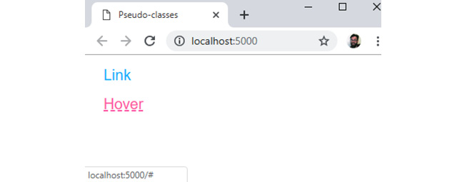
Figure 1.24: Link with and without the hover state
The cascade can cause some issues with styling links. The order in which you specify your CSS rules for each state of the link is important. If, for example, we applied the a:hover rule before the a:link rule in the previous example, we would not see the hover effect. A mnemonic exists for remembering the order: love-hate. The l is for :link, the v is for :visited, the h is for :hover, and the a is for :active.
Some other useful pseudo-classes for selecting elements in a particular interactive state include :checked, :disabled, and :focus.
There are several pseudo-classes that help us select a pattern of children nested under an element. These include :first-child, :last-child, :nth-child, :nth-last-child, :first-of-type, :last-of-type, :nth-of-type, and :nth-last-of-type.
For example, we can use :nth-child with an unordered list to give a different style to list items based on their position in the list:
<style>
  ul {
    font-family: Arial, Helvetica, sans-serif;
    margin: 0;
    padding: 0;
  }
  li {
    display: block;
    padding: 16px;
  }
  li:nth-child(3n-1) {
    background: skyblue;
    color: white;
    font-weight: bold;
  }
  li:nth-child(3n) {
    background: deepskyblue;
    color: white;
    font-weight: bolder;
  }
</style>
<!-- unordered list in HTML document -->
<ul>
    <li>Item 1</li>
    <li>Item 2</li>
    <li>Item 3</li>
    <li>Item 4</li>
    <li>Item 5</li>
    <li>Item 6</li>
    <li>Item 7</li>
</ul>
The following figure shows the result. The :nth-child pseudo-class gives you a lot of flexibility because you can use keywords such as odd and even or functional notation such as 3n - 1:
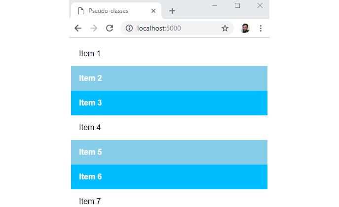
Figure 1.25: Using the :nth-child pseudo-class
Pseudo-elements
Pseudo-element selectors are preceded by two colons (::) and they are used to select part of an element. The available pseudo-elements include ::after, ::before, ::first-letter, ::first-line, ::selection, and ::backdrop.
These pseudo-elements give us a handle we can use to add stylistic elements without adding to the HTML document. This can be a good thing if the pseudo-element has no semantic value and is purely presentational, but it should be used with care.
Combining Selectors
What makes CSS selectors particularly powerful is that we can combine them in several ways to refine our selections. For example, we can select a subset of li elements in an HTML document that also has a .primary class selector with li.primary.
We also have several options, sometimes called combinators, for making selections based on the relationships of elements:
- To select all the
lielements that are descendants of aulelement, we could useul li. - To select all the
lielements that are direct children of aulelement with theprimaryclass, we might useul.primary > li. This would select only the direct children oful.primaryand not anylielements that are nested. - To select an
lielement that is the next sibling oflielements with theselectedclass, we could useli.selected + li. - To select all of the
lielements that are the next siblings oflielements with theselectedclass, we could useli.selected ~ li.
The following figure shows the difference between using li.selected + li and li.selected ~ li:
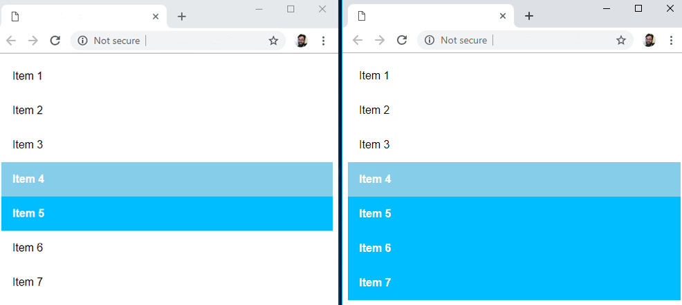
Figure 1.26: Selecting the next adjacent sibling compared to selecting all of the next siblings
Let's try out some of the selectors we've learned about in an exercise.
Exercise 1.07: Selecting Elements
In this exercise, we will differentiate list items by styling the odd items. We will use a class selector to style a selected item and a next-siblings combinator to style the elements after the selected item.
The steps are as follows:
- Open the
Chapter01folder in VSCode (File>Open Folder…) and we will create a new plain text file by clickingFile>New File. Then, save it in HTML format, by clickingFile>Save As...and enter theFile name: Exercise 1.07.html. Now, copy the following simple web page with aullist element and nine list items:<!DOCTYPE html> <html lang="en"> <head> <meta charset="utf-8"> <title>Selectors</title> </head> <body> <ul> <li>Item 1</li> <li>Item 2</li> <li>Item 3</li> <li>Item 4</li> <li>Item 5</li> <li>Item 6</li> <li>Item 7</li> <li>Item 8</li> <li>Item 9</li> </ul> </body> </html>
- So that we can style a selected item differently, we will add a
selectedclass to the fifth list item:<li class="selected">Item 5</li>
- Next, we will add a
styleelement to theheadelement with the following CSS:<head> <meta charset="utf-8"> <title>Selectors</title> <style> ul { font-family: Arial, Helvetica, sans-serif; margin: 0; padding: 0; } li { display: block; padding: 16px; } </style> </head>This will remove some of the default styling of the unordered list in the browser. It will remove margins and padding on the list and set the font style to Arial (with Helvetica and sans-serif as a fallback).
- Next, we will style the odd list items with the
:nth-childpseudo-class. We can use theoddkeyword for this. With this style, anyoddlist item will have a blue background and white text:li:nth-child(odd) { background-color: deepskyblue; color: white; font-weight: bold; }This gives us the stripy effect that we can see in the following figure:

Figure 1.27: Stripy list using :nth-child(odd)
- We can style the selected class selector:
li.selected {
     background-color: hotpink;
}
This overrides the striped effect for the selected item as seen in the following figure:

Figure 1.28: Stripy list with a selected item
- Finally, we will style the
oddlist items after the selected item using the all-next-siblings combinator:li.selected ~ li:nth-child(odd) { background-color: orange; }
If you now right-click on the filename in VSCode on the left-hand side of the screen and select Open In Default Browser, you will see the following web page in your browser:
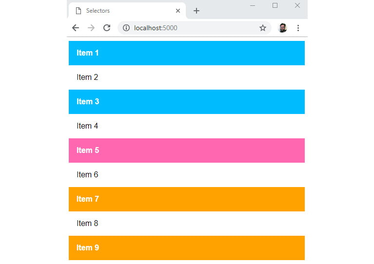
Figure 1.29: Combining selectors to style a list
Style sheets can have a large number of style rules and combinations of selectors. It is good to understand why one rule takes precedence over another one. This is where CSS specificity comes in.
CSS Specificity
If we have two CSS declarations that have an effect on the same style property of an element, how do we know which of those declarations will take precedent?
There are several factors that decide the ranking of a CSS declaration and whether it is the style the browser will apply. The term for these factors is specificity.
A style attribute that adds inline styles to an element has the highest specificity value. An ID selector has a greater specificity value than a class selector and a class selector or attribute selector has a greater specificity value than an element type. We can calculate the specificity value by giving points to each of these specificity values.
The most common way of representing this is as a comma-separated list of integers, where the leftmost integer represents the highest specificity. In other words, the leftmost value is the inline style attribute; next is an ID selector; next is a class selector, pseudo-class, or attribute selector; and the rightmost value is an element.
An inline style would have the value 1, 0, 0, 0. An ID selector would have the value 0, 1, 0, 0. A class selector would have the value 0, 0, 1, 0, and an h1 element selector would have the value 0, 0, 0, 1.
Let's look at a few examples with more complex selectors:
li.selected a[href]has two element selectors (lianda), a class selector (.selected) and an attribute selector ([href]), so its specificity value would be0,0,2,2:
![Figure 1.30: Calculating the specificity of li.selected a[href]](https://static.packt-cdn.com/products/9781838824532/graphics/image/C14506_01_30.jpg)
Figure 1.30: Calculating the specificity of li.selected a[href]
#newItem #mainHeading span.smallPrinthas two ID selectors, a class selector (.smallPrint), and a span element, so its specificity value would be0,2,1,1:

Figure 1.31: Calculating the specificity of #newItem #mainHeading span.smallPrint
Comparing the two selectors, we can see that the selector in the second example is more specific than the selector in the first example.
The Special Case of !important
The !important value can be appended to the value of any CSS declaration. It is a special keyword that can be applied to selectors to override the specificity value. It trumps any other specificity value. In terms of specificity value, it would add another column to become the value 1, 0, 0, 0, 0. It would even take precedence over an inline style.
For example, we might want to create a style rule that is reusable and lets us hide content on a web page. Something like this:
.hide {
  display: none;
}
If we apply this class to an element, we want that element to be hidden and to not be rendered on the web page. We might use this to later reveal the element using JavaScript. However, consider the following example:
<style>
 div.media {
  display: block;
  width: 100%;
  float: left;
 }
 .hide {
  display: none;
 }
</style>
<div class="media hide">
 ...Some content
</div>
We might expect our div element to be hidden because the .hide class appears second in the style sheet. However, if we apply the specificity calculations we've learned about, we can see that div.media scores 0, 0, 1, 1 and .hide only scores 0, 0, 1, 0. The div.media rule for the display property with block value will override the none value of the .hide class. We can't really use this instance of the .hide class as we don't know whether it will have any effect.
Now consider the same .hide class but using the !important keyword:
.hide {
  display: none !important;
}
Adding the !important keyword will make this .hide class much more reusable and useful as we can pretty much guarantee that it will hide content as we desire.
We've learned a lot about CSS in this part of the chapter. Let's apply some of this knowledge to an activity.
Activity 1.02: Styling the Video Store Template Page
In the previous activity, we were tasked with creating boilerplate HTML for a web page for the Films On Demand website. In this activity, we are going to add some style to that template page.
The following figure shows the expected output for this activity:
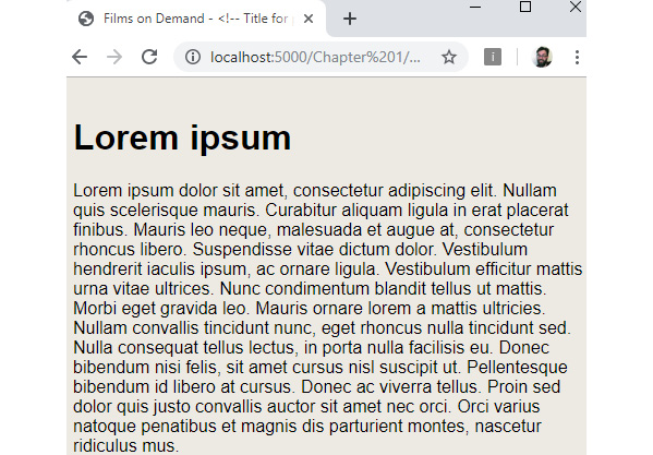
Figure 1.32: Expected output for styling the video store template page
The steps are as follows:
- We will start with the template from Activity 1.01, Video Store Page Template, which we will save as
Activity 1.02.html:<!DOCTYPE html> <html lang="en"> <head> <meta charset="utf-8"> <title>Films on Demand - <!-- Title for page goes here -- ></title> <meta name="description" content="Buy films from our great selection. Watch movies on demand."> <meta name="viewport" content="width=device-width, initial-scale=1"> </head> <body> <h1>Lorem ipsum</h1> <p> Lorem ipsum dolor sit amet, consectetur adipiscing elit. Nullam quis scelerisque mauris. Curabitur aliquam ligula in erat placerat finibus. Mauris leo neque, malesuada et augue at, consectetur rhoncus libero. Suspendisse vitae dictum dolor. Vestibulum hendrerit iaculis ipsum, ac ornare ligula. Vestibulum efficitur mattis urna vitae ultrices. Nunc condimentum blandit tellus ut mattis. Morbi eget gravida leo. Mauris ornare lorem a mattis ultricies. Nullam convallis tincidunt nunc, eget rhoncus nulla tincidunt sed. Nulla consequat tellus lectus, in porta nulla facilisis eu. Donec bibendum nisi felis, sit amet cursus nisl suscipit ut. Pellentesque bibendum id libero at cursus. Donec ac viverra tellus. Proin sed dolor quis justo convallis auctor sit amet nec orci. Orci varius natoque penatibus et magnis dis parturient montes, nascetur ridiculus mus. </p> </body> </html>
- We are going to link to an external CSS file. One of the difficulties with styling web pages is handling differences between browsers. We are going to do this by adding a file to normalize our default styles. We will use the open source
normalize.cssfor this. Download the file from https://packt.live/3fijzzn. Add the file to astylesfolder and link to it from theActivity 1.02.htmlweb page. - We are going to add a
styleelement to theheadelement ofActivity 1.02.html. In thestyleelement, we want to set some styles used across all pages. We want to do the following:Set
box-sizingtoborder-boxfor all elements using the universal selector (*).Add a font family with the
Arial,Helvetica,sans-serifvalues and a font size of16pxto the whole page.Add the background color
#eeeae4for the whole page. To do this, we will add adivelement wrapper with thepageWrapperID, where we will set the background color and padding of16px, and afull-pageclass, where we will set the minimum height to100vh(100%of the viewport height).Add an
h1element selector that sets themarginto0and addspaddingof16pxto the bottom of theh1element.Note
The solution for this activity can be found via this link.
We've learned a lot about HTML and CSS in this chapter. In the next section, we will learn a little bit about the Chrome developer tools and how we can use them to better understand our web page.
Dev Tools
Most browsers come with some tools to help web developers create and change web pages. One of the most useful of these tools is the built-in developer tools that come with the Chrome browser.
You can access the developer tools on any web page with the Command + Option + I keyboard shortcut (on Mac) and F12 or Control + Shift + I (on Linux and Windows).
On opening the developer tools, you should see something similar to the following figure:
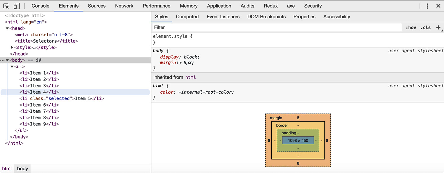
Figure 1.33: Chrome developer tools (Elements tab)
There are a lot of options available in the developer tools. We will not cover all of them here but will focus on the top bar and the Elements tab in this chapter.
The Top Bar
The top bar gives you access to several options and tools, including access to all the other sections of the developer tools via the tabs:

Figure 1.34: Chrome DevTools top bar
The top bar has the following tools and options:
- Select tool – You can use this tool to select an element from within the web page.
 Devices toolbar – Changes the view so you can select the view size of various devices.
- Tabs – We can access various tools from the top bar menu such as
Console,Elements,Sources,Network, andPerformance. We will focus on theElementstab.  Configuration – Gives you access to various settings for the developer tools.
 Close – Closes the developer tools.
While developing the HTML and CSS for a web page, one of the tabs we use the most is the Elements tab.
The Elements Tab
The Elements tab has two areas – the left-hand panel shows the current HTML DOM and the right-hand panel shows details about the selected element.
You can use the left-hand panel to select an element from the HTML DOM and you can also edit an element to change its attributes:
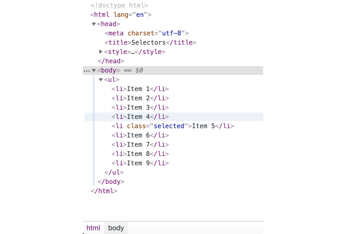
Figure 1.35: Selectable HTML DOM in the left-hand panel of the Elements tab
Once you have an element selected, you can see a lot of information about the element in the right-hand panel. This information is divided into tabs and the first tab shows the styles:
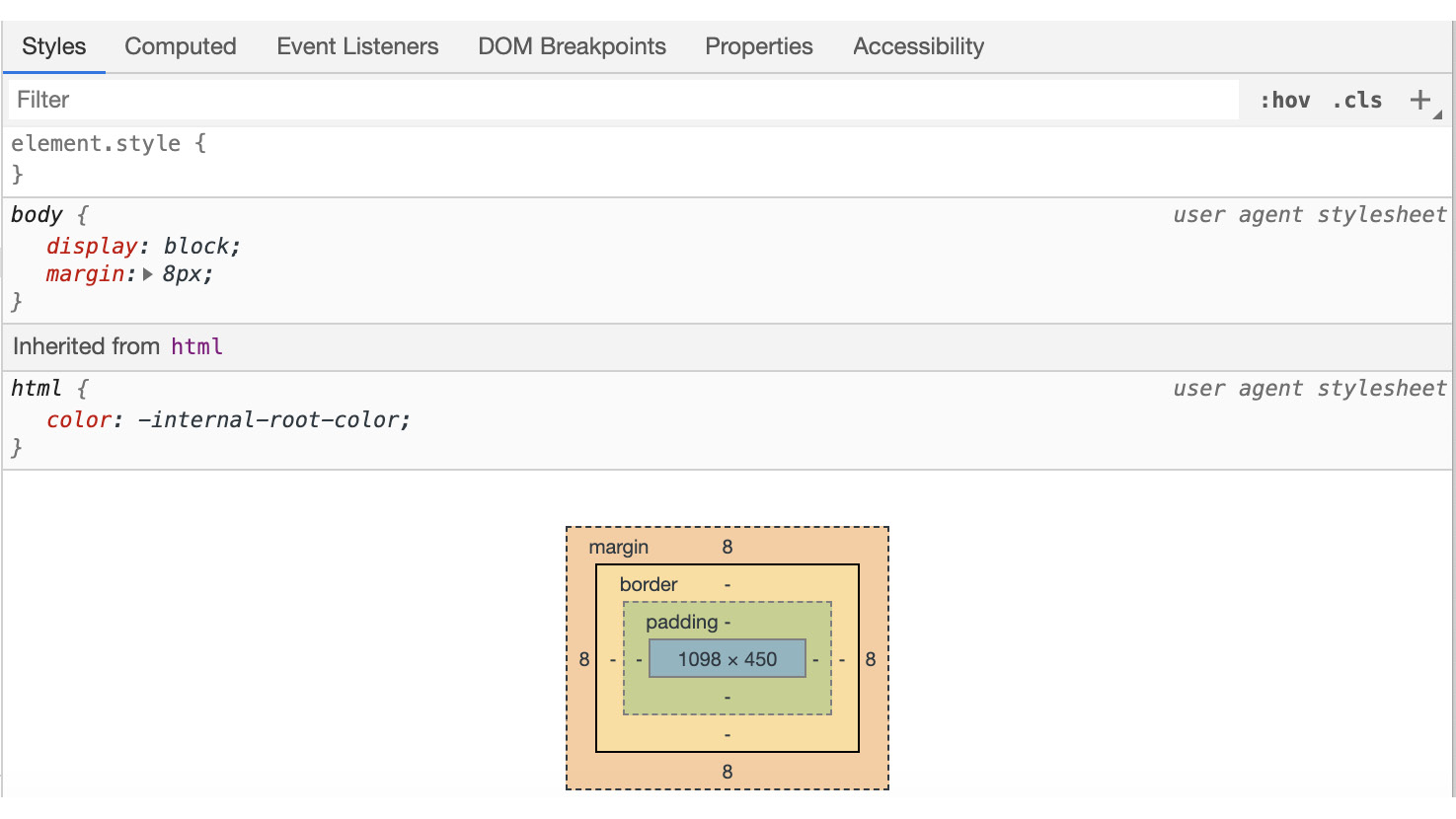
Figure 1.36: The Styles tab of the right-hand panel of the Elements tab
Essentially, the Styles tab shows a representation of the CSSOM. You can look at the styles associated with the element, including the cascade of styles, showing you where a style is inherited from and where it has been set but overridden. The topmost element is the most specific. You can also use this tab to edit the styles of an element and to check different states, such as the hover state.
The Computed tab shows styles as they have been computed for the element.
There are also tabs to show you the event listeners and properties associated with an element.
Having had a glimpse at the power of Chrome's developer tools, let's finally consider how the browser works with HTML and CSS technologies to render a web page.
How a Web Page Renders
How does a web page render in the browser? We've learned a lot about HTML and CSS in this chapter, but let's see how these technologies are put together by the browser to render our web page.
The following figure shows a flowchart of the process, which is further explained below:
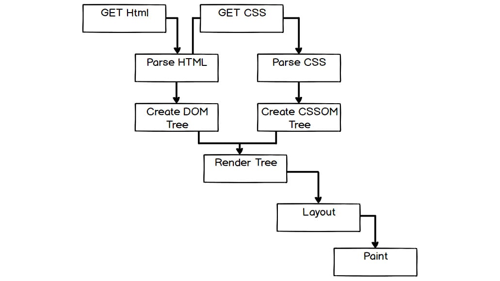
Figure 1.37: Flow chart of the web page render process
To summarize the process:
- The user starts by navigating to a URL, possibly via a hyperlink or by typing the URL into the address bar of their browser.
- The browser will make a
GETrequest to the disk or a network. It will read the raw bytes from that location and convert them to characters (based on character encoding such as UTF-8). - The browser then parses these characters according to the HTML standard to find the tokens that are familiar as HTML elements, such as
<html>and<body>. - Another parse is then made to take these tokens and construct objects with their properties and based on the rules appropriate to that token. At this point, the objects are defined.
- Finally, the browser can define the relationships between these objects and construct the HTML DOM for the web page.
- At this point, we have a DOM but not a rendered web page. The next task is to construct the CSSOM. Again, the browser will load any style sheet resources it needs to, which were found while parsing the document. It will then construct the styles associated with nodes in the tree structure, which gives us the CSSOM.
- With the information gathered in the DOM and the CSSOM, the browser can create a render tree. The render tree is constructed by combining information from the CSSOM and the HTML DOM. Nodes in the HTML DOM that will not be rendered (for instance, those with the
display: none;style) are excluded from the render tree. Those that are rendered are enriched with their computed style rules. - Now the browser has all the information it needs, it can begin to calculate the positions of elements in the rendered viewport. This is called the layout stage. The browser lays elements out based on their size and position within the browser viewport. This stage is often also called reflow. It means the browser must recalculate the positions of elements in the viewport when elements are added to or removed from the page or when the viewport size is changed.
- Finally, the browser will rasterize or paint each element on the page, depending on their styles, shadows, and filters to render the page the user will see.
That is a brief and simplified summary of the rendering of a web page. Think about how many resources might be loaded on a relatively complicated website and with JavaScript running events and we can see that much of this process happens frequently and not in such a linear manner. We can start to see the complexities of what a browser is doing when it renders your web page.


