Search icon CANCEL
Subscription
0
Cart icon
Your Cart (0 item)
Close icon
You have no products in your basket yet
Arrow left icon
Explore Products
Best Sellers
New Releases
Books
Videos
Audiobooks
Learning Hub
Conferences
Free Learning
Arrow right icon
Arrow up icon
GO TO TOP
R for Data Science Cookbook (n)

You're reading from   R for Data Science Cookbook (n) Over 100 hands-on recipes to effectively solve real-world data problems using the most popular R packages and techniques

Arrow left icon
Product type Paperback
Published in Jul 2016
Publisher
ISBN-13 9781784390815
Length 452 pages
Edition 1st Edition
Languages
Tools
Arrow right icon
Author (1):
Arrow left icon
Yu-Wei, Chiu (David Chiu) Yu-Wei, Chiu (David Chiu)
Author Profile Icon Yu-Wei, Chiu (David Chiu)
Yu-Wei, Chiu (David Chiu)
Arrow right icon
View More author details
Toc

Table of Contents (14) Chapters Close

Preface 1. Functions in R FREE CHAPTER 2. Data Extracting, Transforming, and Loading 3. Data Preprocessing and Preparation 4. Data Manipulation 5. Visualizing Data with ggplot2 6. Making Interactive Reports 7. Simulation from Probability Distributions 8. Statistical Inference in R 9. Rule and Pattern Mining with R 10. Time Series Mining with R 11. Supervised Machine Learning 12. Unsupervised Machine Learning Index

Introduction


When analyzing data, our primary goal is to efficiently and precisely deliver the findings to our audience. An easy way to present data is to display it in a table format. However, for larger datasets, it becomes challenging to visualize data in this format.

For example, the following table contains regional sales data:

Region

Jul-12

Aug-12

Sep-12

Oct-12

Nov-12

Dec-12

Alberta

22484.08

65244.19

15946.36

38593.39

34123.56

34753.98

British Columbia

23785.05

51533.77

44508.33

57687.6

19308.37

43234.77

In table format, it is hard to see which region's sales performed best. Thus, to make the data easier to read, it may be preferable to present the data in a chart or other graphical format. The following figure is a graph of the data from the table, which makes it much easier to determine which region performed best each month in terms of sales:
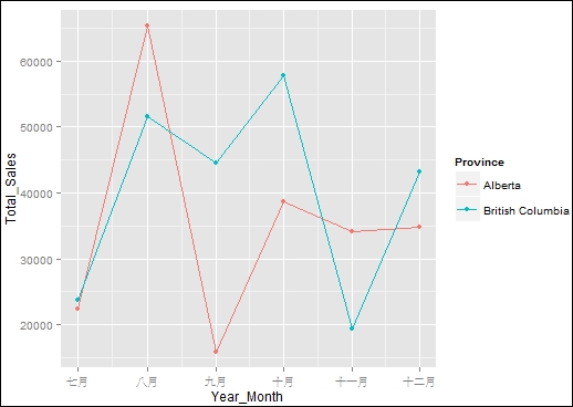
Figure 1: Sales amount by region

One of the most attractive features of R is that it already has many visualization packages...

lock icon The rest of the chapter is locked
Register for a free Packt account to unlock a world of extra content!
A free Packt account unlocks extra newsletters, articles, discounted offers, and much more. Start advancing your knowledge today.
Unlock this book and the full library FREE for 7 days
Get unlimited access to 7000+ expert-authored eBooks and videos courses covering every tech area you can think of
Renews at $19.99/month. Cancel anytime