Histogram
A histogram is a visualization consisting of rectangles whose area is proportional to the frequency of a variable and whose width is equal to the class interval.
The height of the bar in a histogram represents the number of observations in each group. In the following example, we are counting the number of observations for each type of job and marital status. y is a binary variable checking whether the client subscribed a term deposit or not (yes, no) as a response to the campaign call.
It looks like blue-collar individuals are responding to the campaign calls the least, and individuals in management jobs are subscribing to the term deposit the most:
ggplot(data = df_bank_detail) +
  geom_bar(mapping = aes(x=job, fill = y)) +
  theme(axis.text.x = element_text(angle=90, vjust=.8, hjust=0.8))
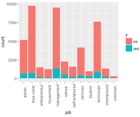
Figure 1.11: Histogram of count and job