Search icon CANCEL
Subscription
0
Cart icon
Your Cart (0 item)
Close icon
You have no products in your basket yet
Save more on your purchases! discount-offer-chevron-icon
Savings automatically calculated. No voucher code required.
Arrow left icon
Explore Products
Best Sellers
New Releases
Books
Videos
Audiobooks
Learning Hub
Free Learning
Arrow right icon
Arrow up icon
GO TO TOP
SAP BusinessObjects Dashboards 4.1 Cookbook

You're reading from   SAP BusinessObjects Dashboards 4.1 Cookbook Over 100 simple and incredibly effective recipes to help transform your static business data into exciting dashboards filled with dynamic charts and graphics

Arrow left icon
Product type Paperback
Published in Mar 2015
Publisher
ISBN-13 9781784391959
Length 452 pages
Edition 1st Edition
Concepts
Arrow right icon
Toc

Table of Contents (17) Chapters Close

Preface 1. Staying in Control 2. Data Visualization FREE CHAPTER 3. From a Static to an Interactive Dashboard 4. Dynamic Visibility 5. Using Alerts 6. Advanced Components 7. Dashboard Look and Feel 8. Dashboard Data Connectivity 9. Exporting and Publishing 10. Top Third-party Add-ons 11. Performance Tuning 12. Increasing Productivity A. Real-world Dashboard Case Studies B. Additional Resources – Supported Excel Functions and System/Software Requirements C. The Future of Dashboarding with SAP Design Studio Index

Adding alerts to a column chart

When looking at a column chart, we might want to see which items are below or above a particular threshold. In this recipe, you will learn how to add alerts to a column chart. Our example will consist of a column chart with a list of regions and their sales. Each region column will be colored appropriately, depending on its sales value versus threshold.

Getting ready

Make sure you set up the sales data and threshold values as shown in the following screenshot. You'll also need to insert a Column Chart component into the canvas.

Getting ready

How to do it...

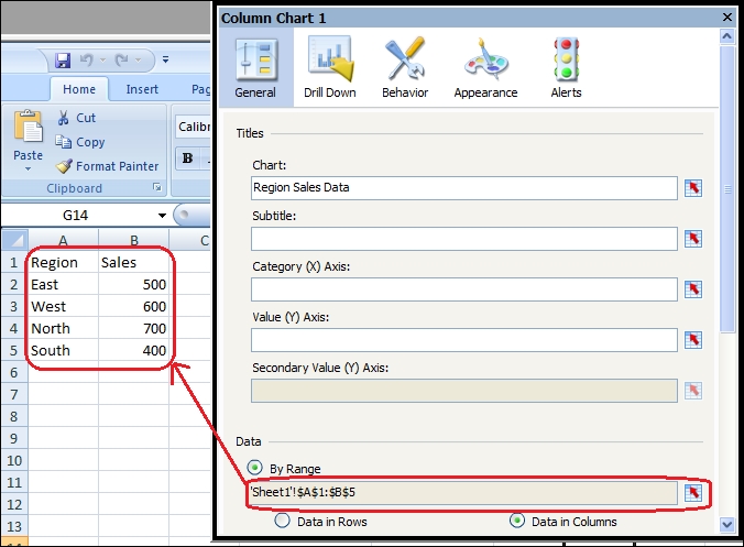
  1. First, bind the sales data to the chart as shown in the following screenshot:
    How to do it...
  2. Go to the Alerts section of the chart properties and ensure that Enable Alerts is checked.
  3. Select alerts By Value as we will be comparing our sales data to the threshold values.
  4. In the Alert Thresholds section, click on the Use a Range checkbox. Bind the data to the threshold data that was set up in the Getting ready section.
  5. In the Color Order...
lock icon The rest of the chapter is locked
Register for a free Packt account to unlock a world of extra content!
A free Packt account unlocks extra newsletters, articles, discounted offers, and much more. Start advancing your knowledge today.
Unlock this book and the full library FREE for 7 days
Get unlimited access to 7000+ expert-authored eBooks and videos courses covering every tech area you can think of
Renews at $19.99/month. Cancel anytime
Banner background image