Creating visualizations with Power BI
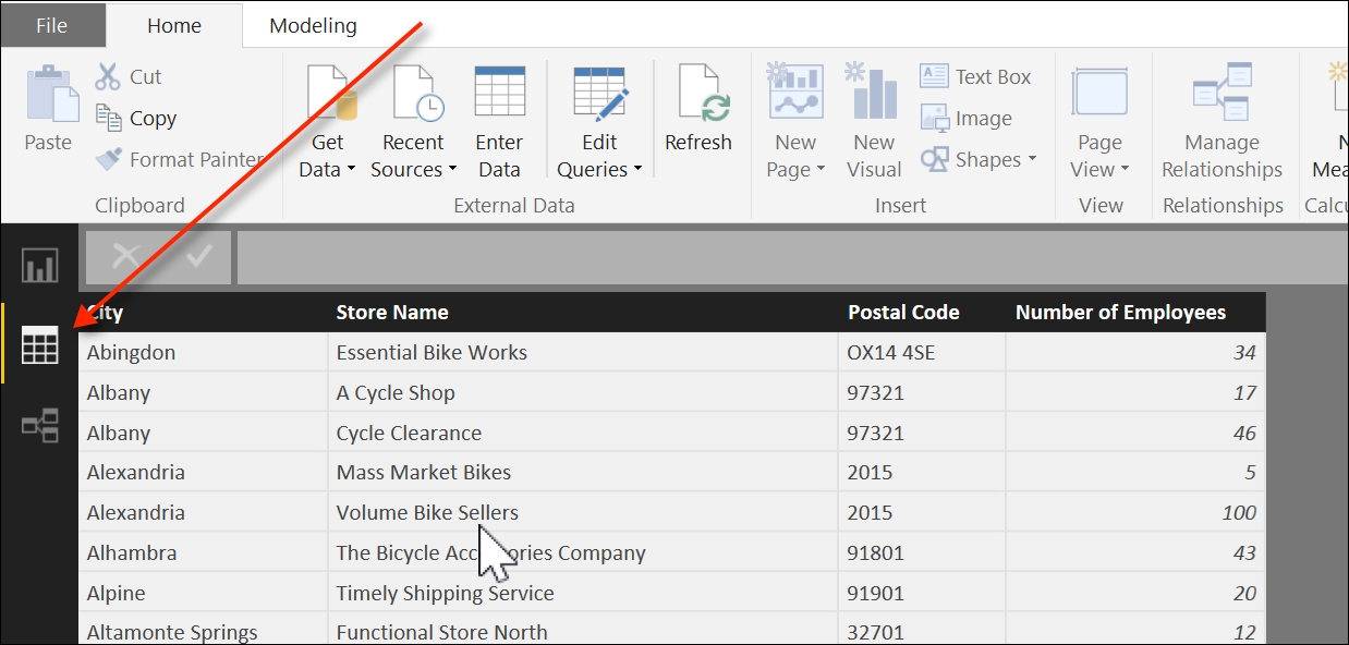
Once the data is loaded into Power BI, we can preview the results by clicking on the Data icon, below the Report icon, as seen in the following screenshot:

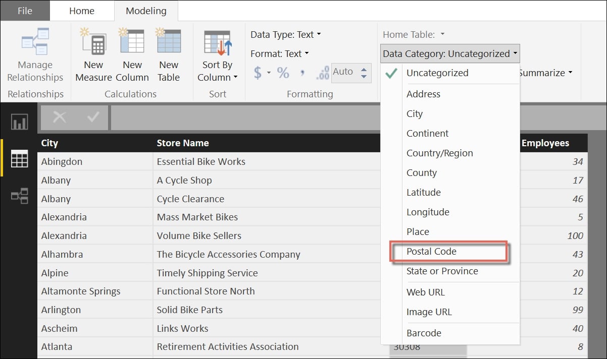
This gives us an opportunity to format the data in a way that will be most suitable to us for building a map chart. While selecting the Postal Code column header in the Modeling tab, we can change the format type from Uncategorized to Postal Code, as seen in this screenshot:

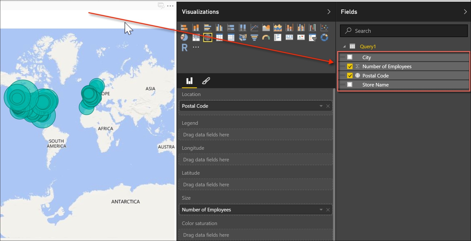
This modification ensures that the Postal Code column will be treated as a location identifier within the map. Once that is complete, return to the report mode, which is above the data model, and select the Number of Employees and Postal Code fields from your query, as shown in the following screenshot:

A map is automatically generated with green circles highlighting the volume of employees by postal code.
The next step is to add a new bar chart to the right of the map with the city name as well as the employee count. In order...


