Search icon CANCEL
Subscription
0
Cart icon
Your Cart (0 item)
Close icon
You have no products in your basket yet
Save more on your purchases! discount-offer-chevron-icon
Savings automatically calculated. No voucher code required.
Arrow left icon
Explore Products
Best Sellers
New Releases
Books
Videos
Audiobooks
Learning Hub
Newsletter Hub
Free Learning
Arrow right icon
timer SALE ENDS IN
0 Days
:
00 Hours
:
00 Minutes
:
00 Seconds
Arrow up icon
GO TO TOP
Jupyter for Data Science

You're reading from   Jupyter for Data Science Exploratory analysis, statistical modeling, machine learning, and data visualization with Jupyter

Arrow left icon
Product type Paperback
Published in Oct 2017
Publisher Packt
ISBN-13 9781785880070
Length 242 pages
Edition 1st Edition
Languages
Tools
Arrow right icon
Author (1):
Arrow left icon
Dan Toomey Dan Toomey
Author Profile Icon Dan Toomey
Dan Toomey
Arrow right icon
View More author details
Toc

Table of Contents (11) Chapters Close

Preface 1. Jupyter and Data Science FREE CHAPTER 2. Working with Analytical Data on Jupyter 3. Data Visualization and Prediction 4. Data Mining and SQL Queries 5. R with Jupyter 6. Data Wrangling 7. Jupyter Dashboards 8. Statistical Modeling 9. Machine Learning Using Jupyter 10. Optimizing Jupyter Notebooks

Analyzing changes in college admissions


We can look at trends in college admissions acceptance rates over the last few years. For this analysis, I am using the data on https://www.ivywise.com/ivywise-knowledgebase/admission-statistics.

First, we read in our dataset and show the summary points, from head to validate:

df <- read.csv("Documents/acceptance-rates.csv")summary(df)head(df)

We see the summary data for school acceptance rates as follows:
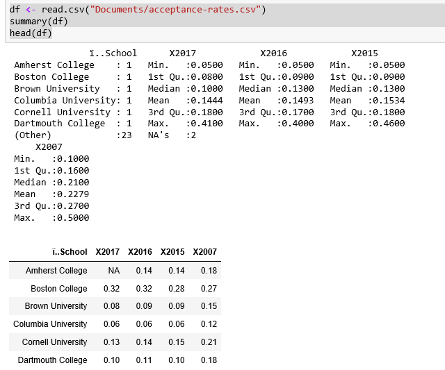
It's interesting to note that the acceptance rate varies so widely, from a low of 5 percent to a high of 41 percent in 2017.

Let us look at the data plots, again, to validate that the data points are correct:

plot(df)

From the correlation graphics shown, it does not look like we can use the data points from 2007. The graphs show a big divergence between 2007 and the other years, whereas the other three have good correlations.

So, we have 3 consecutive years of data from 25 major US universities. We can convert the data into a time series using a few steps...

lock icon The rest of the chapter is locked
Register for a free Packt account to unlock a world of extra content!
A free Packt account unlocks extra newsletters, articles, discounted offers, and much more. Start advancing your knowledge today.
Unlock this book and the full library FREE for 7 days
Get unlimited access to 7000+ expert-authored eBooks and videos courses covering every tech area you can think of
Renews at $19.99/month. Cancel anytime
Banner background image