Formatting considerations when creating layout in InDesign
Requirements for accessibility do not demand document design alterations; however, a simple, legible layout is always the best way to make a publication easy to read and easy to convert to a logical document structure as a PDF.
Here are some guidelines to follow:
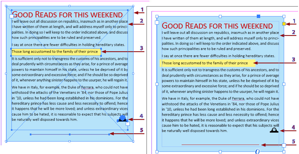
- Simplify page layout and learn how to use all properties for each element. For example, do not create a color background box, place a textbox on top, and then place other elements on top of that if they can all become a single story, placed in a frame and formatted using properties. Here is an example:

Figure 10.1 – A streamlined layout using frame and text properties
The desired layout, which looked the same when printed, was accomplished in two ways:
- On the left: By placing multiple objects on a page
- On the right: By placing one text frame and using formatting properties for both frame and text


