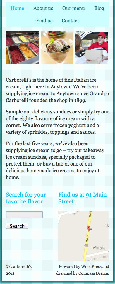
Time for action—rearranging the sidebar widgets for phones in portrait mode
Once again, let's start by seeing how this part of the site is looking on the screens of this width:

In portrait mode, having the widgets side by side simply makes them too narrow. The search box is too small to tap comfortably and the map is too small to be able to see any detail. Let's make them sit beneath each other. Perform the following steps for doing so:
1. First, we will find the media query for phones in portrait mode as follows:
/*smartphones in portrait mode*/
@media screen and (max-width: 320px) {
/*make header icons and text larger*/
#header-right address h2 {
font-size: 18px;
}
#header-right #socialmedia img {
height: 30px;
margin: 10px 3%;
}
#header-right .CTA {
font-size: 18px;
/*padding: 1em 1em 1em 40px;*/
margin: 10px 3% 10px 0;
}
/*increase size of navigation text*/
#access {
font-size: 17px;
}
#access a {
padding: 0 7px;
}
}
2. Below this, but inside the braces of the media query, we will add the...


