Creating a donut chart
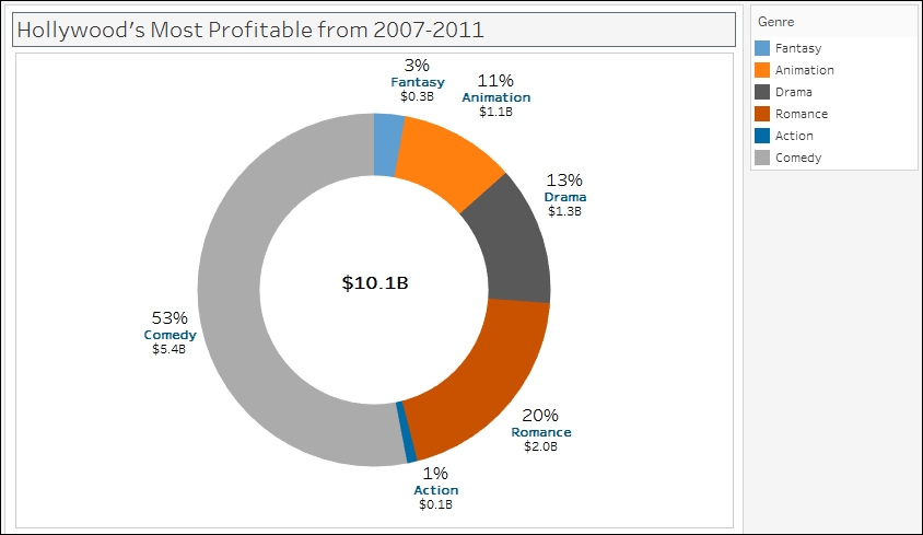
A donut chart, like a pie chart, shows part-to-whole relationships. And like a traditional donut (the sweet, edible kind), it has a hole in the middle.
In this recipe, we will create a donut chart that shows the breakdown of Hollywood's top movies from 2007-2011 by genre.

Getting ready
To follow this recipe, open B05527_02 – STARTER.twbx. Use the worksheet called Donut, and connect to the HollywoodMostProfitableStories data source.

How to do it...
The following are the steps to create a donut chart:
Change the mark type to Pie in the Marks card.
From Measures, drag Worldwide Gross Amount to Angle in the Marks card.
From Dimensions, drag Genre to Color in the Marks card.
To make the pie easier to view, set the chart to show as Entire View from the toolbar.

Right-click on the Genre pill in the Color in the Marks card and select Sort….
Sort the slices by the Sum of the Worldwide Gross Amount in Ascending order.

From Dimensions, drag Genre to Label in the Marks card.
From Measures...


