Implementing animations in Compose
Animation in Android is the process of adding motion effects to views. This can be achieved using images, text, or even starting a new screen where the transition is noticeable using motion effects. Animations are vital in Modern Android Development since modern UIs are more interactive and adaptive to smoother experiences, and users like them.
Furthermore, applications these days are rated based on how great their UI and user experiences are, hence the need to ensure your application is modern and robust. In this example, we will build a collapsing toolbar, an animation that is widely used in the Android world.
Getting ready
We will continue using the Compose Basics project.
How to do it…
We will be building a collapsing toolbar in this recipe; there are other great animations you can now build utilizing the power of Compose. The power is in your hands:
- We will not need to add any dependency to this recipe. We already have everything in place. So, let us go ahead and create a new package and add a Kotlin file,
collapsingtoolbar. - Inside the Kotlin file, go ahead and create a new composable function,
CollapsingToolBarExample():@Composable fun CollapsingToolbarExample() {...} - We will have all our needed composable functions in a box; you can refer to the previous recipe to refresh your memory on that. We will also need to define the height at which we will start to collapse our view, and this can be based on preference; for our example, we can set
heightto260.dp:private val height = 260.dp private val titleToolbar = 50.dp
- Let us go ahead and add more composable functions with dummy text data to display once we scroll our content. We can assume this app is used for reading information about the cities we display:
@Composable fun CollapsingToolbarExample() { val scrollState: ScrollState = rememberScrollState(0) val headerHeight = with(LocalDensity.current) { height.toPx() } val toolbarHeight = with(LocalDensity.current) { titleToolbar.toPx() } Box( modifier = Modifier.fillMaxSize() ) { CollapsingHeader(scrollState, headerHeight) FactsAboutNewYork(scrollState) OurToolBar(scrollState, headerHeight, toolbarHeight) City() } } - In our
CollapsingHeaderfunction, we pass in the scroll state and theheaderHeighta float. We decorate Box with aModifier.graphicLayer, where we set a parallax effect to make it look good and presentable. - We also ensure we add a
Brush()and set the colors we need, and specify where it should start:Box( Modifier .fillMaxSize() .background( brush = Brush.verticalGradient( colors = listOf(Color.Transparent, Color(0xFF6D38CA)), startY = 1 * headerHeight / 5 ) ) ) ...
FactsAboutNewYorkis not a complex composable function, just dummy text; then, finally, inToolBar, we utilizeAnimatedVisibilityand declare ourenterandexittransition:AnimatedVisibility( visible = showToolbar, enter = fadeIn(animationSpec = tween(200)), exit = fadeOut(animationSpec = tween(200)) ) { ...- Finally, run the
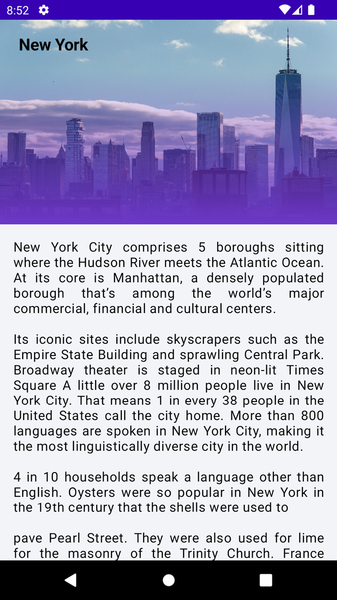
@Previewfunction, and you will have a collapsible toolbar, which brings a smooth experience to your UI. In addition, get the entire code in the Technical requirements section.

Figure 2.10 – A collapsible toolbar
How it works…
In Modern Android Development, the Jetpack Compose library has many animation APIs that are available as composable functions. For example, you might want your image or text to fade in and fade out.
Hence, if you are animating appearance and disappearance, which can be for an image, a text, a radio group, a button, and so on, you can use AnimatedVisibility to achieve this. Otherwise, if you are swapping content based on the state and want your content to crossfade, you can use CrossFade, or AnimatedContent.
val headerHeight = with(LocalDensity.current) { height.toPx() } provides density, which will be used to transform the DP and SP units, and we can use this when we provide the DP, which we will do and later convert into the body of our layout.
You can call the modifier and use graphicsLayer to update any of the content above it independently to minimize invalidated content. In addition, graphicsLayer can be used to apply effects such as scaling, rotation, opacity, shadow, or even clipping.
translationY = -scroll.value.toFloat() / 2f basically sets the vertical pixel offset of the layer relative to its top bound. The default value is always zero, but you can customize this to fit your needs. We also ensure the gradient is only applied to wrapping the title in startY = 1 * headerHeight / 5.
EnterTransition defines how the target content should appear; a target here can be an image, a text, or even a radio group. On the other hand, ExitTransition defines how the initial target content should disappear when exiting the app or navigating away.
AnimatedContent offers slideIntoContainer and slideOutOfContainer, and it animates its content as it changes based on the target state, which is remarkable. In addition, you can also encapsulate a transition and make it reusable by creating a class that holds all your animation values and an Update()function, which returns an instance of that class.
It is also fair to mention that, as with the old ways of doing animation in Android using MotionLayout, there are many ways to do transitions in Jetpack Compose. For instance, in Table 2.1, you will see the different types of transitions:
|
EnterTransition |
ExitTransition |
|
|
|
|
|
|
|
|
|
|
|
|
|
|
|
|
|
|
|
|
|
|
|
|
Table 2.1 – A table showing different types of transitions
In addition, you can add your own custom animation effects in Jetpack Compose beyond the already built-in enter and exit animations by simply accessing the elemental transition instance via the transition property inside the content lambda for AnimatedVisibility. You will also notice any animation states that have been added.


