


Plotting pie charts
To compare the relative importance of quantities, nothing like a good old pie—pie chart, that is.
How to do it...
The dedicated pie-plotting function pyplot.pie() will do the job. We will use this function in the following code:
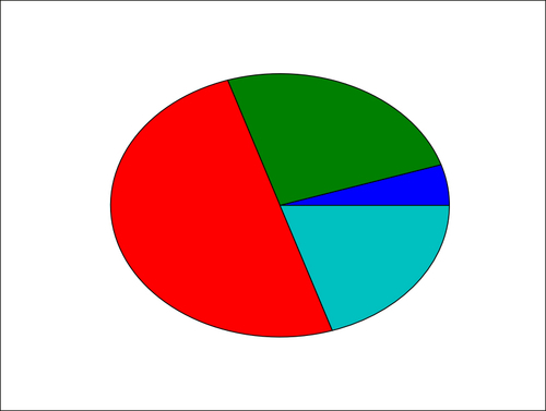
import matplotlib.pyplot as plt

data = [5, 25, 50, 20]

  plt.pie(data)
plt.show()
The preceding simple script will display the following pie diagram:
How it works...
The pyplot.pie() function simply takes a list of values as the input. Note that the input data is a list; it could be a NumPy array. You do not have to adjust the data so that it adds up to 1 or 100. You just have to give values to matplolib and it will automatically compute the relative areas of the pie chart.


