Chapter 5. Producing a Film Title Project Using Text Animator
In this chapter, we will learn how to create a film title. Film titles are shown at the beginning of a movie. These short sequences not only provide the name of the movie, but also set the tone for the film. Contemporary film titles were created by Saul Bass. His films, such as Psycho and the Man with the Golden Arm, revolutionized film titles. He elevated film titles to an art form.
In this chapter, we will learn the following:
- How to create a mood with exciting type!
- Special 3D effects for our type to give it depth
- How to use trackmates to add texture
Creating a film title
Imagine this: you are in a movie theater and the film starts; then you see a dramatic title on the screen. This title not only provides the name of the film, but it puts you in the mood for the movie you're about to watch. Any seasoned After Effects artist knows how to create film titles. In this chapter, we will build on our tools and skills from previous lessons, such as type design. But we will also dive into new skills, such as using more effects and using After Effects lights. Let's get started!
Setting up your project
The first thing we're going to do is create a 1,920 x 1,080 comp in After Effects. Let's set this up by going through the following steps:
- Make this comp five seconds long.
- Name it
NIGHT KINGDOM(or the name of your film title). - Make it
29.97. - Create five folders. Name them
Precomp,Main, andImages.
Now that you have your project set up, we are going to add a solid background to our composition. Make this background solid black, by selecting the option shown in the following screenshot. This background will be at the bottom of our layers:

New solid
Now we are going to create a text layer by selecting the option shown in the following screenshot:

Text layer
When you add a text layer, it will come into your composition centered, but completely blank. It's up to you to add text to it. You can do this by going through the following steps:
- Type
NIGHTon the first line - Type
KINGDOMon the second line - Change your font to Constantia or to any sans serif font
- Parent the
KINGDOMline of type with theNIGHTline of type
When creating titles, you will need to make sure your text is lined up and conforms to title-safe guidelines. Take a look at where these guidelines are located. Turn on the Title/Action Safe option, as shown in the following screenshot. Familiarize yourself with these guides and add them to your arsenal of tools when creating any type in After Effects:

Title safe
Adjust the scale of the NIGHT type so the entire title fits into the title-safe guideline, as shown in the following screenshot:
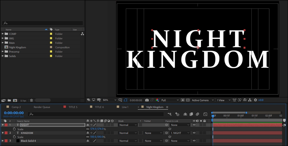
We are going for a stylized fantasy look for our title sequence. To achieve this, we will scale up the first letter of each line by going through the following steps:
- Select your text tool.
- Select the first letter of each line of type.
- Go over to the text-sizing parameter in the upper-left corner of the character panel.
- Drag the sizing parameter up so your first letter is scaled up, as shown in the following screenshot:

Scale text
Repeat this process for the K in KINGDOM.
Creating 3D-looking text with bevel emboss
We want to further stylize this text by creating a 3D-looking effect for the title. Let's use the bevel emboss layer style. Layer styles are a great way to add additional features to your layers. To begin with, we need to precompose both of our type layers and then name this precomp type. Go through the following steps to add a bevel emboss style to your text:
- Go to your text precomp.
- Select the
NIGHTtext layer. - Go to Layer and navigate to Layer Styles.
- Click on Bevel and Emboss to apply this to your text, as shown in the following screenshot:

Bevel emboss
Next, we are going to tweak our bevel settings. To adjust the settings, simply scroll down our text settings and reveal the layer styles. Look at the settings in the following screenshot and adjust your settings as I have. The main change to make is to switching your technique to Chisel Hard, as shown in the following screenshot:

Bevel emboss settings
Now that you have your emboss settings configured, you can copy your layer style and paste it on to you KINGDOM text, as shown in the following screenshot:
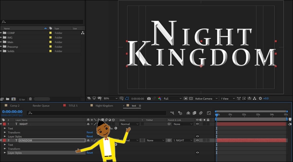
Layer style paste
We want to give our text more dramatic lighting, so we are going to add an effect called CC Glass by going through the following steps:
- Go back to your main title comp.
- Go to the Effects panel.
- Add the effect called CC Glass to your text precomp, as shown in the following screenshot:

CC Glass
You may notice that you get a bit of shiny lighting effect to your type. Let's go on a little adventure and explore the settings for CC Glass. This effect is used to give things a shiny glass-like look. However, we are going to use it to give our text light effects. The first setting to adjust is the light settings. We want to add a light to our scene by going through the following steps:
- Go to Layer.
- Navigate through the New tab.
- Choose Light..., as shown in the following screenshot:

Add light
Take a look at these Light Settings. We are creating a point light with the color white. Ensure that you check Casts Shadows, as shown in the following screenshot:

Light setting
We will go into lights in much more detail in future lessons. For now, it's enough to know that this light mimic is an actual light in your composition. Objects will respond as if it's an actual light. Let's make some adjustments to our light by going through the following steps:
- Create a null object
- Parent your light with it
This will allow you to move your light easily. When you want to move your light, simply move the null object by going through the following steps:
- Select your text precomp.
- Go to the CC Glass parameters.
- Scroll down the Light settings.
- Choose Using | AE Lights, as shown in the following steps:

CC Glass settings
Move your null object around. You should see that the light follows it. You're there—real light glints on your text! How awesome is this? You are ready to rock and roll with CC Glass settings to further improve your sexy text! I am going to leave the tweaking of these settings up to you; I set my softness at 45 percent—this soothes out the glass effect. You can copy my settings if you want; they are all in the preceding screenshot.
Take a few moments here to adjust your Light settings. I'll provide you an image with my settings, but you can adjust yours more or less as you see fit. You can find your Light settings by scrolling down the light layer and selecting the Light Options setting, as shown in the following screenshot:

Light setting
As you can see, I increased the intensity to 287. We may change this later, but as you can see, this is how you increase the light amount.
Next, we are going to tweak our glass setting further and add a level effect. The levels are found in the effects. Double-click on this to add this effect to your text precomp. We will tweak these setting to get a sharper contrast for our text, as shown in the following screenshot:

Levels
Adjust your Levels settings (the histogram) so that you can crush your blacks and whites. This will give your text more contrast. Let's set this up by going through the following steps:
- Change your CC Glass height setting to 40
- Change your CC Glass softness to 25
Let's take a moment and take stock of what we have so far. We have some 3D text that's lit well with a light. Next, we need to give it more drama and atmosphere. We are going to animate our light and add some atmospheric smoke to the scene. This is a fantasy movie, so we want our environment to look and feel mysterious and otherworldly.
Light animation
Let's animate our light in this scene by animating the null object that the light is parented with. We can set this up by going through the following steps:
- Select your null object.
- Press P for Position.
- Start at the beginning of the timeline and animate to the 2 second mark in the timeline, as shown in the following screenshot.
- Animate your light so that it moves from left to right over your text:

Light animation
Next, let's scroll down our light options to reveal the Color options for our light. Change the Color of your light to a light blue, as shown in the following screenshot:
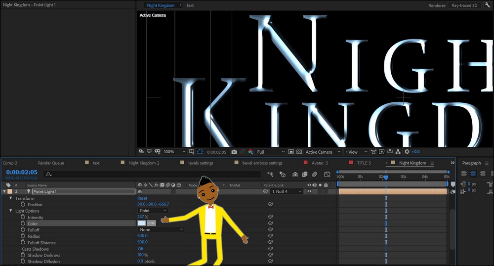
Color adjustment
Using track mattes
This is looking good so far. Let's improve our titles by giving them some texture. Choose the Grunge texture. We will use this as the texture for our type.
Go into your text precomp and select both lines of text, as shown in the following screenshot:

Text selection
Next, precompose these text layers. We can now put a texture on both of these at the same time. Find the Grunge layer and bring the Grunge image into the text layer with the precomped text. Put the Grunge layer under the text layer, as shown in the following screenshot:

Grunge layer 1
Nice! Now we can add a track matte to our texture. Track mattes allow you to use a layer or mask as a matte. The program will use the text as a stencil for the texture.
Choose the texture and select the Alpha track matte by going through the following steps:
- Select your Grunge layer.
- Look the right-hand side of the Track Matte tab.
- Scroll down the Track Matte tab.
- Choose the Alpha Matte "[text2]", as shown in the following screenshot:

Alpha track matte
Track matte is a fierce tool. You can fill anything with the texture of your choice. This empowers you to use a variety of images and create interesting realistic objects. I encourage you to dive deep into using track mattes. Experiment and have fun with all the possibilities.
But there's a problem: we've lost our 3D effect. When you add a track matte to a layer, it will fill your layer with that image, flattening your text. Here's a simple solution:
- Duplicate your text layer.
- Make sure it's turned on.
- To the right, you will find the blend modes.
- Select Overlay, as shown in the following screenshot:

Overlay blend modes
Blend modes is a helpful set of tools to have to hand. Blend modes are like Photoshop modes, where you can determine how the layers blend with each other. Now that you have the overlay blend mode on, you can see that the text layer is overlaying its visual properties on top of the Grunge layer.
If you're at all like me, you like to tweak your settings until they are perfect. Let's tweak our levels to ensure that most of the texture is coming through on our text, as shown in the following screenshot:

Level adjustment
This is looking good! Let's add some atmosphere to our title by going through the following steps:
- Add an adjustment layer
- Add a Fog lights effects to the adjustment layer
- Name your adjustment layer Fog light
This is a great effect that will work for you without further adjustments. It will give you a fog-like background with animation. If you look at the fog-light layer, you will notice that this effect comes with its own keyframes. You're free to move these keyframes to make the fog move faster or slower, as shown in the following screenshot:

Fog lights effect
Let's add some additional color to our background by going through the following steps:
- Select the Fog lights layer.
- Add the Hue/Saturation effect.
- Check the Color option in the Hue/Saturation effect panel.
- Adjust the hue until the color turns blue.
- Adjust the lightness to make the background a bit darker, as shown in the following screenshot:

Hue/Saturation
Lens flares
As we head our discussion to Lens Flares, it is imperative to know that it is an art form of its own. Through this feature you can create unique effects that is bound to evoke the drama your project needs. Let's create a custom lens flare effect by going through the following steps:
- We are going to create a new comp for a lens flare.
- Create a new composition that is 500 x 500.
- Name this
flare, as shown in the following screenshot:
New comp
- Create an adjustment.
- Create a new black solid.
- Add a lens flare effect to the adjustment, as shown in the following screenshot:

Flare
- Next, let's mask our flare.
- Select the ellipse mask tool and mask around our flare.
- Mask your flare.
- Feather out your mask, as shown in the following screenshot:

Mask and feather
- Now bring this flare precomp into our title composition.
- Switch the blending mode to Add.
- Add the Hue/Saturation effect.
- Check the color box.
- Adjust the color to yellow.
- Scale this flare down, as shown in the following screenshot:

Hue/Saturation
You're doing great work here. Let's animate the opacity of the light on. Make sure your flare doesn't have a square border; feather your mask in the precomp to achieve this. The final step is to render the title. This is a five-second movie, so make your composition for this project render only five seconds in length.
Summary
Title design is an essential skill set that you need as a motion designer. For this project, we put into practice the lessons that we previously learned about type design, and we learned about 3D bevel effects. We also learned how to work with texture using track mattes. You should master this and keep practicing with track mattes. This will help you tremendously in your growth as a motion graphic animator. We also learned how to create a lens flare effect and we started working with lights.
In the next chapter, we will work with sports graphics. We will use more text-related skills, learn about motion tracking, and much more.
Questions
- What is a track matte?
- How do you add a light?
- What is a bevel effect?
- What is a hue/saturate effect?
- What is a lens flare?
- What are levels?
- What does title-safe mean?
Further reading
Check out these revolutionary film titles by Saul Bass:
