Search icon CANCEL
Subscription
0
Cart icon
Your Cart (0 item)
Close icon
You have no products in your basket yet
Save more on your purchases! discount-offer-chevron-icon
Savings automatically calculated. No voucher code required.
Arrow left icon
Explore Products
Best Sellers
New Releases
Books
Videos
Audiobooks
Learning Hub
Newsletter Hub
Free Learning
Arrow right icon
Arrow up icon
GO TO TOP
Big Data Analytics with Java

You're reading from   Big Data Analytics with Java Data analysis, visualization & machine learning techniques

Arrow left icon
Product type Paperback
Published in Jul 2017
Publisher Packt
ISBN-13 9781787288980
Length 418 pages
Edition 1st Edition
Languages
Concepts
Arrow right icon
Author (1):
Arrow left icon
RAJAT MEHTA RAJAT MEHTA
Author Profile Icon RAJAT MEHTA
RAJAT MEHTA
Arrow right icon
View More author details
Toc

Table of Contents (15) Chapters Close

Preface 1. Big Data Analytics with Java FREE CHAPTER 2. First Steps in Data Analysis 3. Data Visualization 4. Basics of Machine Learning 5. Regression on Big Data 6. Naive Bayes and Sentiment Analysis 7. Decision Trees 8. Ensembling on Big Data 9. Recommendation Systems 10. Clustering and Customer Segmentation on Big Data 11. Massive Graphs on Big Data 12. Real-Time Analytics on Big Data 13. Deep Learning Using Big Data Index

Histograms


A Histogram is a special kind of bar chart. A histogram depicts some quantitative value on the x axis and frequency of that value on the y axis. The main feature of a histogram is that in a histogram, the x axes are grouped into bins and we treat each bin as a category. Thus, for a particular value, we take both the x axis bin and the frequency on the y axis into account.

Let's try to understand a histogram using the same cars.json dataset, which we used earlier. For the quantitative variable on the x axis, we will be using the number of cars grouped by each country and depict that on the x axis. The Y axis will denote the frequency of the number of counts, that is, the percentage or probability of countries with that amount of cars in the dataset. The diagram is as shown next:
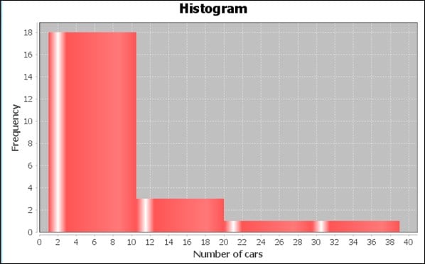
As you can see in the preceding chart, the maximum number of countries have a number of cars between 0 and 10 count. Next is the countries with cars between 10 and 20 count, and the remaining few between...

lock icon The rest of the chapter is locked
Register for a free Packt account to unlock a world of extra content!
A free Packt account unlocks extra newsletters, articles, discounted offers, and much more. Start advancing your knowledge today.
Unlock this book and the full library FREE for 7 days
Get unlimited access to 7000+ expert-authored eBooks and videos courses covering every tech area you can think of
Renews at $19.99/month. Cancel anytime
Banner background image